

"Never judge a book by its cover" is a familiar phrase, but how often do any of us really follow it? Especially in a world of visual media.
It's the primary thing we as readers notice when we're browsing for our next adventure. The initial image serves as an introduction to the story and conveys what the reader should anticipate. Therefore, isn't it logical that we would determine the quality of the story by the quality of its cover? (Duh!)
I bring this up because I'm struggling with the cover art for my own book. Now, I'm no graphic designer, but I feel like I've taken a good stab at creating the right atmosphere and mood for my story with the use of stock images, fonts, AI imagery, and textures- all in Canva! It's amateur work at best, but a good representation of what I want.
(My story is a fantasy adventure set in a world of peril and mystery.)
-Side note: I am considering hiring a professional artist for the finished edition, but I feel like I need to have some samples they could work with.
Problem is, I'm very picky and attached to my vision and I'm not even sure what it is yet! (I'm going to be a joy to work with 😉). Obviously, like any other author, I want my cover to be unique and visually appealing. I'm not looking for a masterpiece, but it needs to capture the essence of both the story and the protagonist, with a few hidden gems that hint at the story's twists and turns.
I've taken the time to research the different types of fantasy covers that are popular and have a similar theme to my own. Targeting the same audience based on the subgenre and subject matter is key- according to my research. Not that I'm scoping out the competition per se. I'm just merely looking for inspiration. Because that's the point, right? We all became writers because we've been inspired by others. Surely, it can't be just me. (Kidding)
Anyway, from what I've gathered from multiple sources is; following the trends of genres in your category is the best way to go about creating a cover. Yet don't be too restricted to just the trends. Explore other options so you don't end up with something that looks like everyone else's. But also, don't get too crazy with your cover and make it too abstract. Don't be cliché. But be mainstream.
Be original.
Be familiar.
Be eye-catching.
Be humble.
Be iconic.
Be eccentric.
Be memorable.
Be muted.
Be loud.
Be quiet.
Be direct.
Be subtle.
Be yourself.
Be like others.
Be CANDID!
How confusing!!!!
Which is it? A trend or an original idea? Simple or complex? So much to think about! You can see why I'm struggling. This whole process has been maddening, to say the least. We have to grasp the book's contents with one image- so make it count! Ideally, I'd love to have a cover that draws the eye, but isn't so over the top that it gets dismissed as "cluttered". Where's that balance? 🧐
I know some will say this is where a publisher comes in, but what about those who self-publish? Before anyone suggests to Google what those authors had to say- where do you think these "helpful" tips came from? I'm not bashing any of them. Honestly, they're still incredibly useful. I'm just expressing my struggle because I'm sure I'm not the only one who has this problem. And yes, it is a problem. As I already pointed out; having an attractive cover is a surefire way for a writer to promote their book and increase their sales. It's the best marketing strategy. And if you have a series, it sets the tone for what the next covers will look like (yet another reason to be picky!)
So what's my solution? I combined a few of these pointers and dismissed others because clearly, it's impossible to include them all since they're quite contradictory. I browse fan favorites within my genre, specifically, the ones whose material is kindred to my own, and experiment with ideas until I make a few I'm satisfied with.
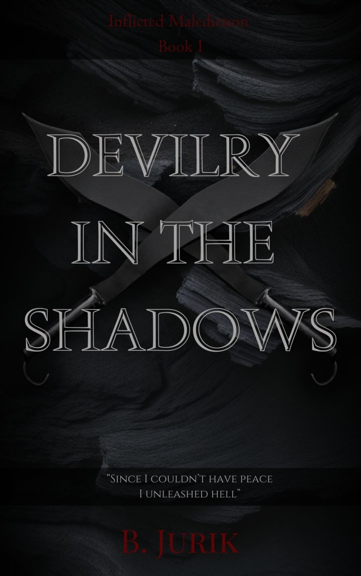
Here's one of the samples I've made for my novel. Again, I'm not a professional. This isn't flawless. I know there's a lot of empty space. This is just an example I'll eventually hand over to a skillful designer for reference and I'll beg them to fill in the blanks. (Ha!)
*
And just to show you a comparison, here's the book cover that inspired my design.
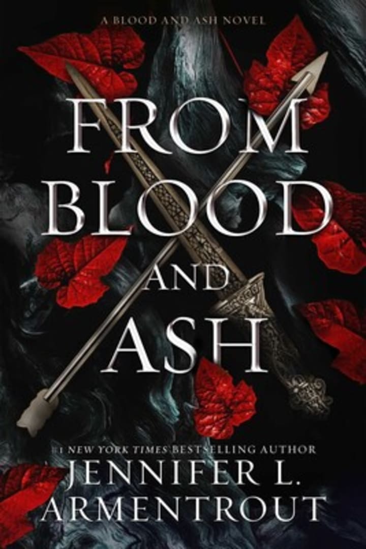
The main point I am trying to make here is that a book's cover represents its physical body, while its story is its lifeblood. No one will ever get to the heart of it unless enticed, and creating an engaging novel starts with bringing its framework to life. I know I talk about it like it's a living entity. That's because they are. We infuse essence into these worlds and characters, and it should be embodied in all facets of our work. Especially the cover.
I'm not sure whether this article offered any assistance or if I inadvertently added to the burden of writers who are already struggling. But I think we can all agree that making cover art is a pain in the ass. So to lessen your stress load, I'll reveal my checklist of how I structured my cover.
1. I already said this, but gather examples from other books in your genre for inspiration. Make sure to read the reviews. Some books might be great sellers, but readers will give feedback about whether the cover appealed to them. This matters because while this specific piece could be an exception to the rule, yours might not be as lucky.
2. Make a list of the important elements your book focuses on (i.e. a flower, tree, ocean, sand, fire, blood) and consider how you want to include it. In my example cover I used onyx and sand as the background- combining elements two enemy kingdoms are known for.
3. Make another list of the primary items you want to emphasize, or the symbols of significance that you're bringing recognition to (i.e. armor, crowns, a throne, animals, tattoos, rings, weapons, compass, flags) and include it. But don't overwhelm the graphic with it.
4. Pick a color scheme. This really sets the overall mood of your novel. If you mention colors in your story, use the key ones that give it substance. Three colors are more than enough. I chose black, white, and red as these are the three colors I often reference and are emblematic of my novel's universe.
Here are more examples I pulled from my Kindle to support my suggestions. All of which are fantasy novels.
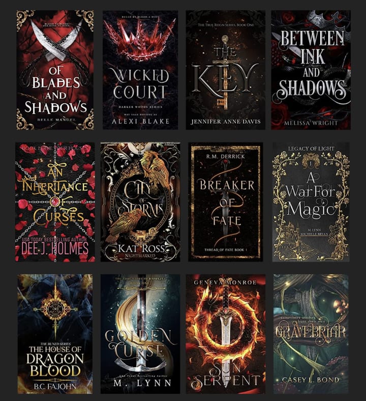
I'm sure I don't need to point it out, but I'm going to anyway. You can clearly see an element, a symbolic object, and at least three colors in most of these. If I made it look easy, that's because I think it is. At least for making a draft to send off to an experienced graphic designer for referencing. As for programs, as I said, I use Canva, but I tend to pull things from the internet and upload them since the graphics they provide are limited.
Alright, well, that concludes my tips for designing a fantasy cover. Hopefully, it was useful. :)
About the Creator
Brin J.
I have a few stories and poems inside me that I want to share. Maybe, if I'm lucky, they'll reach people who'll enjoy them. 📖
Small Town'
Willow Creek was a small town nestled in the heart of rural Pakistan, where the air was sweet with the scent of blooming flowers and the people were warmer than the summer sun. With a population of just over 5,000 residents, it was the kind of place where everyone knew everyone, and neighbors became like family.
By Isra Saleem3 days ago in Writers


Comments (4)
Very helpful, Brin.
Brilliantly written Brin ❤️👌✨
Very interesting! Sometimes the cover is more important than we want to admit 😊
This was timely for me today!