
4 Tips For Designing A High-Quality Logo
Design high quality logo


Designing a high-quality logo is essential for any business or organization. A logo should represent your company’s values, mission and purpose. It should be easy to recognize and remember. It should be timeless, yet modern and eye-catching. For these reasons, it is important to take the time to create a great logo. In this blog post, we will provide five tips for designing a high-quality logo. We will cover topics such as the use of illustrations, colors, fonts, and shapes. We will also discuss how to make sure your logo stands out from the crowd.
1) Keep it Simple
When it comes to logo design, the old saying “less is more” rings true. A logo should be easy to recognize, and this means avoiding complicated designs. When you’re designing a logo, focus on creating something simple that is still able to communicate the core message of your business. Consider using just a few basic shapes or typefaces and limiting your color palette to no more than three colors. With thoughtful design and creative use of negative space, you can create an effective logo with minimal design elements.
By keeping the design of your logo simple, you can make sure that it will still be recognizable when it is scaled down to small sizes or used in single-color applications. Additionally, a simple design allows your logo to stand out against more complex competitors. A well-designed logo should convey the message of your company with just a few strokes, so make sure you take the time to perfect your design! Brainstorm different concepts for your logo and sketch out multiple iterations until you have one that communicates exactly what you want it to. From there, narrow down your options until you have the best version possible. If you need some help along the way, enlist the help of professional designers who have experience with logo creation. They can provide valuable insight into what works and what doesn’t. Once you have settled on a final version, don’t forget to test it out at different sizes, backgrounds, and formats to ensure that it looks great everywhere it appears. This process may take some time, but if done right, the end result will be a high-quality logo that will last for years to come.
2) Use Negative Space
Negative space, also known as white space, is an often overlooked aspect of logo design. Negative space is simply the space between elements in a design. It can be used to create subtle but powerful effects in logo design. The use of negative space helps to create visual balance and gives the logo a more professional and cohesive look.
Negative space can be used to create focus, draw attention to certain elements, and also create rhythm in your logo. To utilize negative space, start by creating your logo without any negative space. Then, add additional elements to the logo, such as lines or shapes. As you add each element, make sure to leave room for negative space. This will help create a sense of harmony in your design.
Also consider how the shapes interact with each other. Negative space can be used to show the relationship between different elements in the logo. It can also be used to create a sense of movement within the logo. Be mindful of how you use negative space as it can have a huge impact on the overall feel and look of your logo.
3) Think About Color
When designing a logo, it is important to consider color. Color can be used to evoke a certain emotion, help create brand recognition, and represent the message of your brand. Choosing the right colors is critical in creating an effective logo that stands out and conveys the desired message.
When deciding on colors for your logo, take into account what colors are associated with your brand and industry. For example, blues and greens are associated with nature and the environment, while red and yellow often evoke energy and excitement. Consider the primary colors used in your logo, as well as any accent colors that could be used to bring attention to specific features or parts of the logo.
Once you’ve chosen your colors, think about the contrast between them. A good rule of thumb is to have at least three different colors in your logo, two being primary colors and one as an accent. Contrasting colors help draw attention and make logos more recognizable, so be sure to use color combinations that make sense together.
Finally, make sure your logo’s colors look good when used on different backgrounds. Some colors may look great on a white background but not stand out as much on a colored background, so be sure to test out multiple scenarios.
By taking into account all of these elements, you can ensure that you create a high-quality logo design with the perfect balance of colors that help your brand stand out from the rest.
4) Use Contrast
Creating contrast in your logo design is an important step in creating a memorable logo that stands out. Contrast helps to separate elements, creating visual hierarchy and emphasis. One way to add contrast is by using different font weights. For example, you could use a bolder font for your brand name, while using a lighter font for the slogan or other accompanying text. You can also create contrast by varying typefaces and font styles.
Another way to create contrast is by using complementary colors in your logo design. By using a combination of light and dark shades, you can make certain elements of your logo more noticeable and bring attention to them. Additionally, you can use color to differentiate between elements or create visual interest. Consider pairing two opposite colors on the color wheel for maximum contrast, such as red and green, or yellow and purple.
Using contrast in your logo design will help your logo stand out from the crowd, attract attention, and help your brand be remembered. Make sure to take the time to explore different font weights and styles, as well as a variety of color combinations to find the best contrast for your logo
About the Creator
Delika
Hi..I am Delica Nishan. I live in Canada. My professional affiliate marking. I introduce you to website design and logo design..I introduce only people who provide high quality services..If you like, get my service..Thank you..
Enjoyed the story? Support the Creator.
Subscribe for free to receive all their stories in your feed. You could also pledge your support or give them a one-off tip, letting them know you appreciate their work.
Keep reading
More stories from Delika and writers in Photography and other communities.
The Moon is Full of Drama
I have been taking pictures of the moon for almost 20 years now. That's a long time in photography years. (What are photography years? That will have to be a whole other article). So the statement I am making is, why is the moon full of drama? I guess my reverse question to you is, how could it not be? Look at the picture above for example, this image screams “I am ready for a night out on the town” It has glitz and glam and all the makings for an evening of fun. I took this image as a few different shots, some out of focus of the stars, and then of the moon, blended to give you a feel of depth. It is a fun little photography trick.
By Nagoh Creative (Greg)26 days ago in Photography
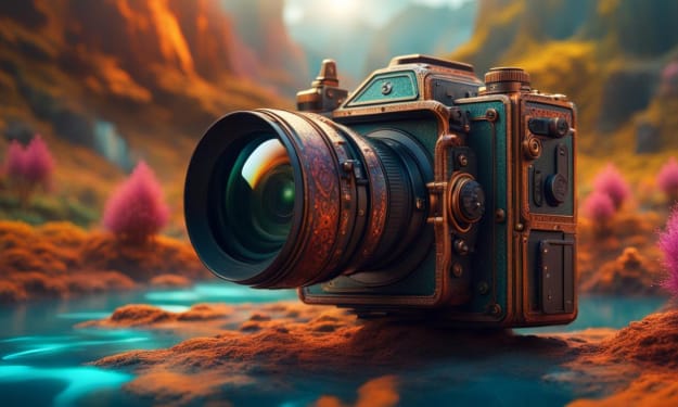
Need a Camera?
Unlock Your Photographic Potential with the Canon EOS Rebel T7 DSLR Camera In an age where smartphones seem to dominate the realm of photography, you might wonder if investing in a dedicated camera is worth it. The Canon EOS Rebel T7 DSLR Camera with its versatile 2 Lens Kit, including the EF18-55mm and EF 75-300mm lenses, makes a compelling case. Here’s why this camera package is an exceptional choice for both budding photographers and seasoned shutterbugs.
By Roosevelt8 days ago in Photography


Comments
There are no comments for this story
Be the first to respond and start the conversation.