
Color Theory in UI
Let's learn about Color Theory with an Example!
Color theory in UI/UX design is the study of how colors interact with each other and how they can be strategically used to create effective and aesthetically pleasing user interfaces. It involves understanding the psychological and emotional impact of colors on users and making informed choices to enhance the overall user experience.
In simple terms, color theory helps designers choose colors that not only look good together but also convey the right emotions and messages to users. Here are some basic principles:
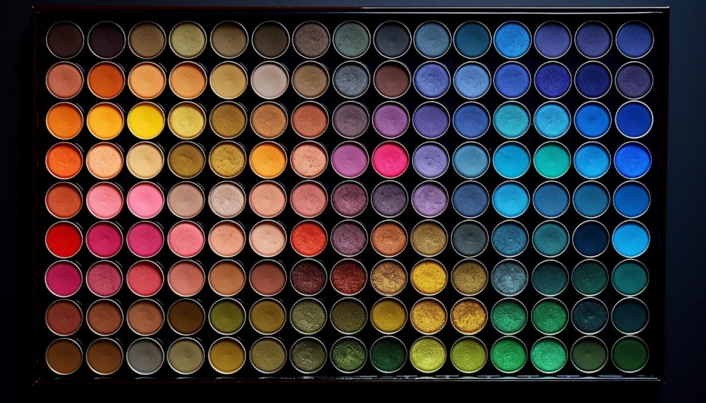
Color Wheel
The color wheel is a visual representation of colors arranged in a circle. It helps designers understand the relationships between colors. The primary colors (red, blue, and yellow) form the basis, and secondary colors (green, orange, and purple) are created by mixing them.
Complementary Colors
Colors opposite each other on the color wheel are complementary. They create a strong contrast and make each other stand out. For example, red and green are complementary colors. Using them strategically can draw attention to specific elements in a UI.
Analogous Colors
Colors that are next to each other on the color wheel are analogous. They usually match well and create serene and comfortable designs. For instance, blue and green are analogous colors, and using them together can create a harmonious feel in a UI.
Triadic Colors
This involves selecting three colors that are evenly spaced around the color wheel. This creates a balanced and vibrant look. For example, using red, blue, and yellow together can result in a visually appealing triadic color scheme.
Monochromatic Colors
This scheme uses variations in lightness and saturation of a single color. It creates a clean and elegant look. For instance, using different shades of blue throughout a UI can maintain a cohesive and calming design.
Let's take the example of a weather app.
The designer might choose a blue color scheme to convey a sense of calm and reliability. The temperature information might be highlighted in a warmer color, like orange or red, to draw attention. Complementary colors could be used for buttons that trigger important actions, creating a visual emphasis.
In summary, color theory in UI/UX design is about understanding the impact of colors on users and using that knowledge to make design decisions that enhance the overall user experience. It's a blend of aesthetics, psychology, and functionality to create visually appealing and effective interfaces.
Color System
In UI/UX design, a color system is like a carefully chosen set of colors that work together to create a visually pleasing and cohesive user interface. It's a way for designers to organize and use colors in a consistent manner throughout a website, app, or any digital product.
Think of a color system as a toolbox with a specific palette of colors. This toolbox helps designers maintain a unified look and feel across different elements of a user interface.
Here's a simple breakdown:
1. Primary Color
This is the main color that represents the brand or the overall theme of the design. It's the dominant color and often used for important elements like headers, buttons, or key visuals.
2. Secondary Colors
These are supporting colors that complement the primary color. They add variety and can be used for different purposes, such as highlighting secondary buttons, backgrounds, or other design accents.
3. Accent Colors
These are pops of color used sparingly to draw attention to specific elements. For example, an accent color might be used for call-to-action buttons, links, or alerts to make them stand out.
4. Neutral Colors
These are usually subtle tones like grays, whites, or beiges. Neutral colors provide balance and are often used for backgrounds, text, or areas where you don't want the color to overpower the content.
Having a well-defined color system helps in creating a consistent and recognizable visual identity for a product. It also makes it easier for designers to make decisions about which colors to use in different parts of the interface, ensuring a harmonious and user-friendly experience. Imagine it like painting a room – you choose a main color, a couple of supporting colors, and maybe a contrasting accent color to create a stylish and coherent look throughout the space.
Hope this helps you understand the concept of color theory!
About the Creator
Keep reading
More stories from Mithul Kandian and writers in Styled and other communities.
# Sun-Kissed Stylish: 10 European Summer Groups to Beat the Intensity in Style
Set out on a style venture through the sun-doused roads of Europe with our organized assortment of summer outfits. From blustery dresses to custom-made isolates, every gathering is created to keep you cool and stylish in the intense intensity. Embrace easy class as you investigate cobblestone back streets or parlor by the sparkling shoreline. With a mix of immortal refinement and contemporary pizazz, these outfits are your identification to sizzling summer style. #SunKissedStylish #EuropeanFashion #SummerStyle #FashionInspiration
By Muhammad Khalid Butt2 days ago in Styled
The Dangling Bead
My life is splashing before my eyes, as I precariously suspend and prepare for the end, the consumption of my Self and identity. I know that gravity will be the victor in this struggle. Like a pendant, slipping from the chain, the tension has caught me in this moment, bestowing one last gift of reflection. I cling desperately, questioning my purpose. Searching for comfort. And I remember…
By Leslie Staven6 days ago in Fiction


Comments
There are no comments for this story
Be the first to respond and start the conversation.