
Photo Editing in Different Apps
You don't need fancy software to make a photo look appealing


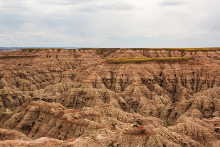
Anyone who has dabbled in photography even a little knows that it's nearly impossible to take the perfect photo while out and about with your camera. Never fear, however, for with today's technology, you can take a dark imperfect photo and work a little editing magic to make it a photo you love showing off. Today, I'm going to show you my different ways of editing a photo that I primarily use. For both examples, I'll be using the photo from above. This photo was taken during the summer of 2020 at the Badlands National Park. I shot this photo on my Canon EOS REBEL T5i. As you can see, it's a bit dark, and not necessarily the most pleasing to look at. A lot of the details are lost.
I'm going to show two different ways of photo editing today. One of those will be using the Adobe Suite Products to enhance my photo. Now, for a long time, I know I personally didn't have access to Adobe's software, and I know that's true for a lot of people out there. Therefore, for my second example of photo editing, I'm going to use something that most people have these days. I'll be using my iPhone (sorry if you're an Android user). I'm not even going to use some fancy app that you need to download. I'm going to use the base photos app on the phone. You can do quite a bit to enhance your photo with that software.
iPhone
To begin with the iPhone, you need to have the picture in your Photos app. Choose the picture that you are going to edit and choose the edit option in the upper right hand corner. It’ll pull up a screen similar to what you see below. The first option is “Auto.” We are not going to use auto. Where’s the fun in that?
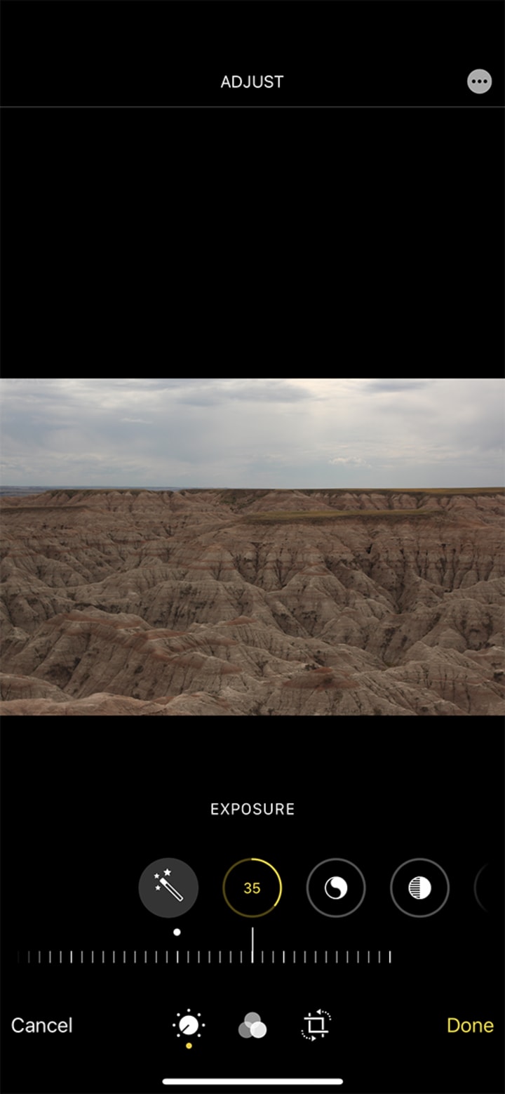
Instead, we are going to go to the second option, which allows you to adjust the exposure on a sliding scale. This particular bar lets you slide left or right, with it defaulting in the middle. If you slide to the left, it’ll darken the photo, and if you slide to the right, it’ll lighten the photo. Adjust it as needed for your photo, but be careful to not go to far in one way or the other. As you can see, for this photo, I just went a little bit on it, dialing it up to 35.
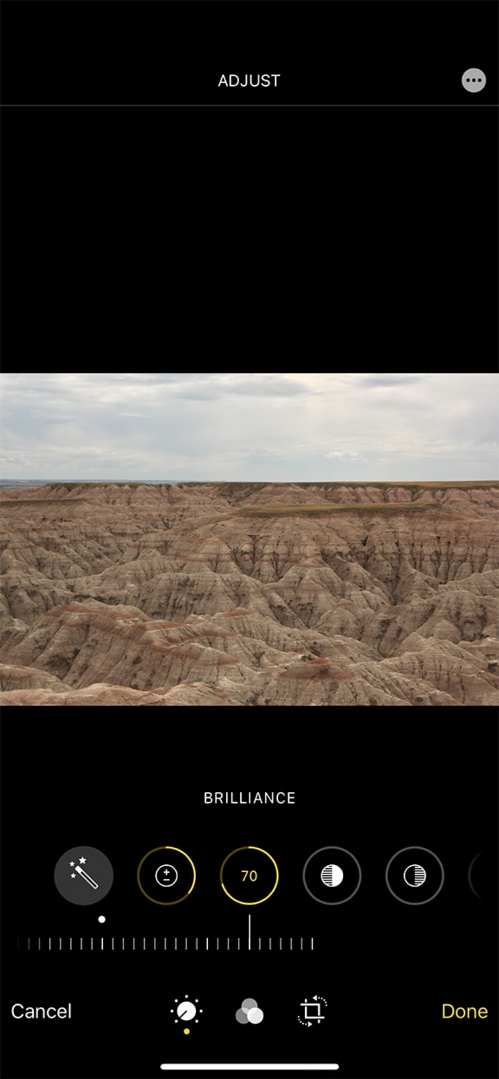
Next comes the "Brilliance" tab. As you can see, I dialed this up quite a bit. It helped brighten the image a little more and gave a bit of pop to the colors. Nothing too crazy, mind you, but it is noticeable. It also really highlights how simple it is to edit this way on the fly. You can mess with the slider as much as needed to get just the look you are going for.

You'll notice here, that on the "Highlights" tab, I actually toned it down. This, for this particular image, helped to tone down some of the extremely bright spots. It also helped to make the image appear a bit more red, which is how this particular area looked in real life. You won't always want to tone down the highlights, so feel free to mess around with the slider once again until you land at that perfect spot.

The "Shadows" tab will work opposite of the "Highlights" tab. In this instance, it allowed me to darken the shadows and really get some definition within the cracks and crevices. You'll notice as you mess around within the different tabs, that most of them are pretty subtle until you start pushing the sliders to the upper or lower limits. Sometimes, it's okay to go to these extremes depending on the stylized look you are going for.
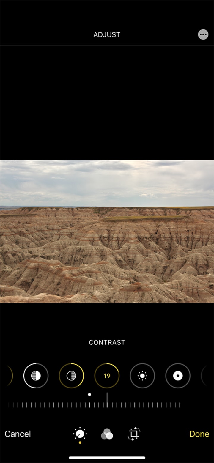
I didn't mess with the contrast too much here. This is one of the situations where too much or too little can really ruin the whole photo. My whole goal here was mostly in the sky. Try to brighten it a bit and help differentiate the clouds. There wasn't too much differentiation in the actual canyon part, though if you look closely, you will see a bit.
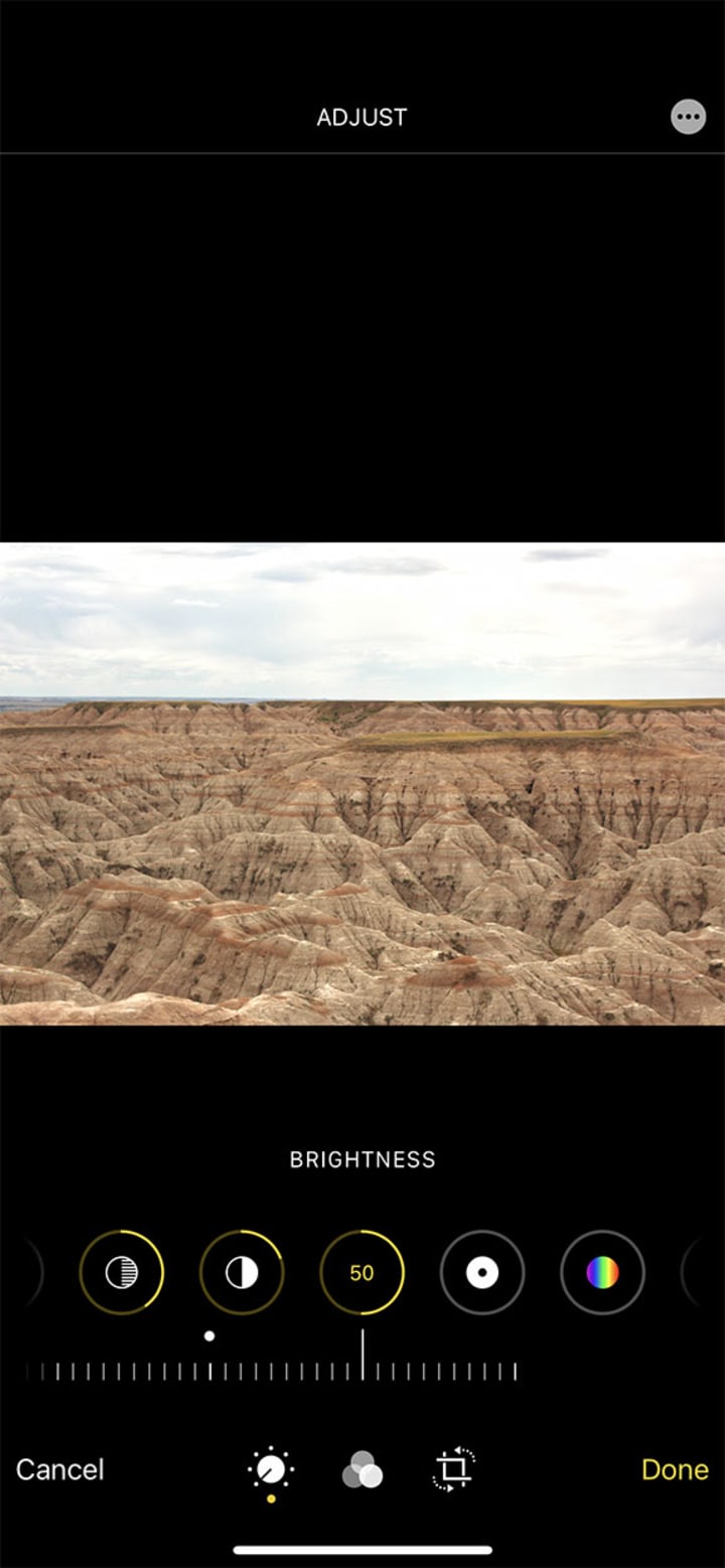
Once again, we have another tab that focuses on lightening or darkening the photo. I made it a bit brighter. It helped to make the photo look more like it did in person than the slightly faded look the last image now gives off.

The "Black Point" tab is one you have to be careful with. The more you dial it up, the darker black areas will get. The whole canyon was riddled with dark spots, which are now very prominent because of how much I turned up the black point. I'm not sure that it was the best thing to do for this photo, but it highlights the dangers of overdoing it for sure.
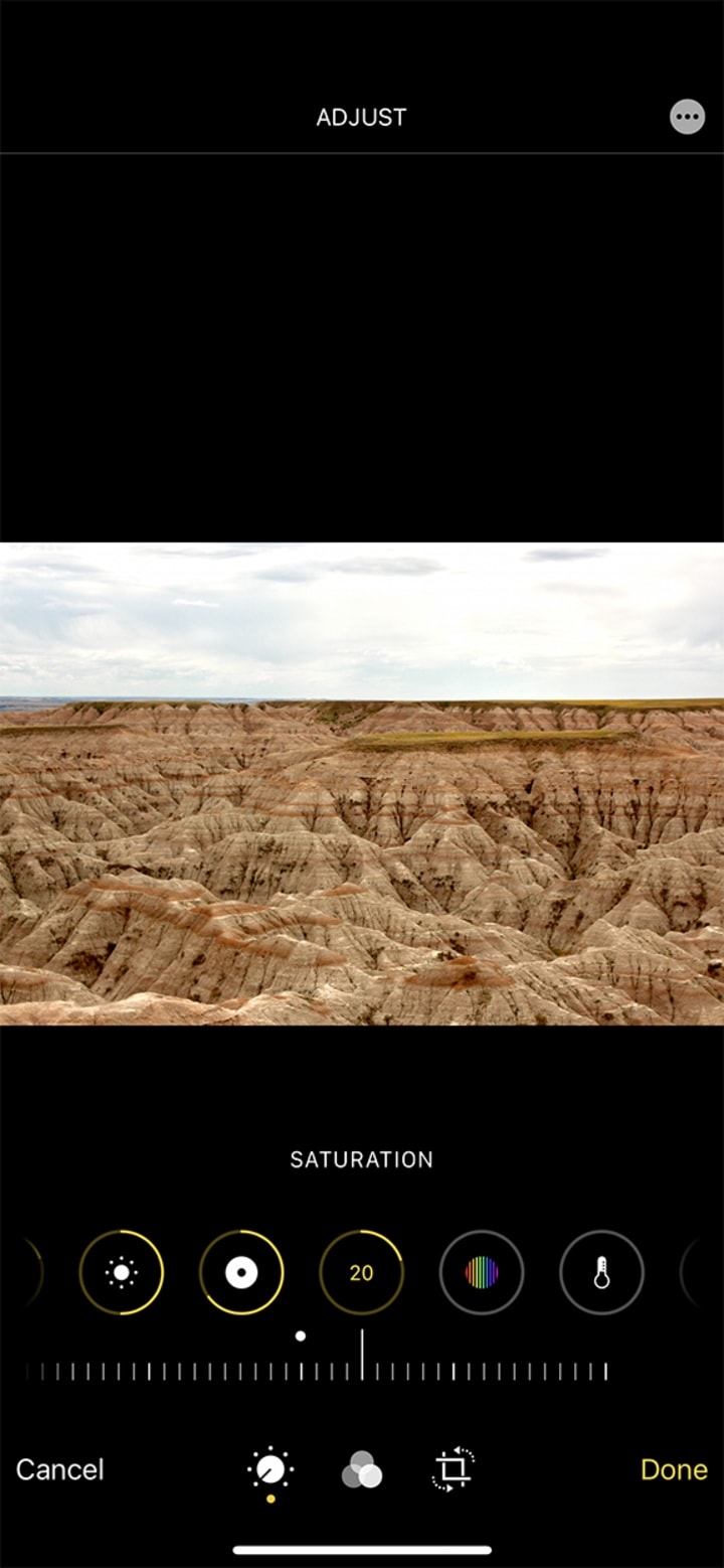
Dialing up the "Saturation" tab will determine how bold your colors are. If you slide it all the way up, the colors will be bold but definitely unrealistic looking. If you slide it all the way down, welcome to your new black and white photo. This tab gives a lot of creative power.

The last tab is the "Vibrance" tab. Vibrance is kind of a tricky thing that works very subtly. It's going to heighten the muted colors within an image without blowing out the more saturated colors. You can see it most in my picture by looking at the sky. It's much less gray and a bit more blue.
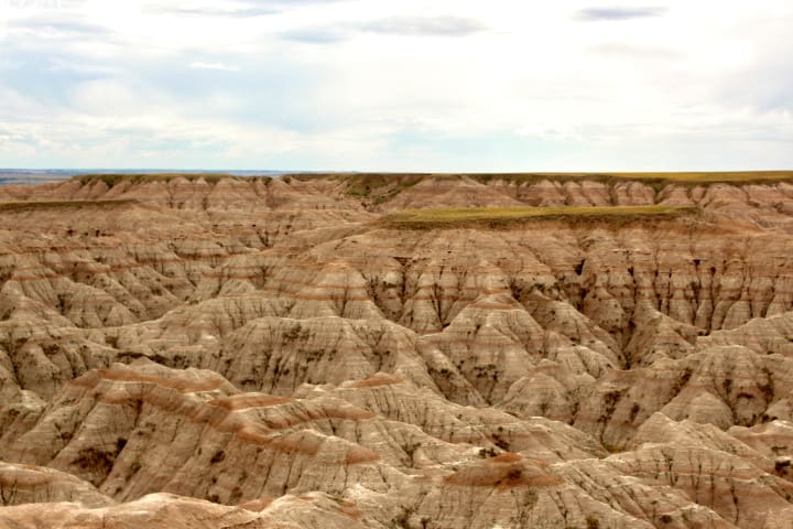
Voila. There you have it. A photo edited from start to finish using just my cell phone. Overall, I took a dark, rather muted photo, and made it into something that I'd happily post to my social media channels. Next, I'm going to switch over to using the Adobe Suite software to edit the same photo. Let's see how it compares when all is said and done!
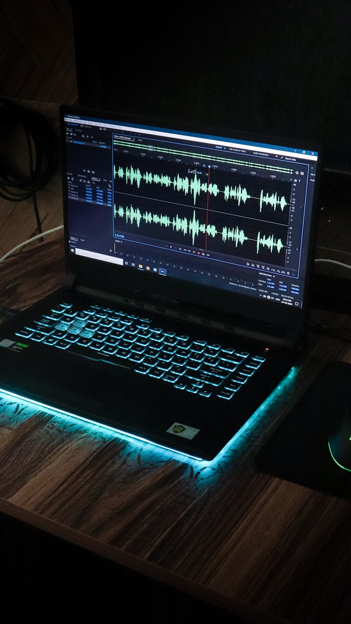
Adobe Lightroom
For this particular example, I'm going to focus on using Adobe Lightroom. It'll look pretty similar in choices to what actually came off of the iPhone. What's cool is currently Lightroom works on a variety of devices, including mobile. So it is also able to do on the go editing. I also think overall it gives you much more fine tuned controls. Take a look at my editing of the same photo and see for yourself.

It's a bit hard to see, but along the side all the similar sliders exist. This is a screenshot of just the photo, completely untouched. Let's start with the sliding!

You'll see that I've adjusted one slider. In this case, the exposure slider. Once again, my photo ends up a bit brighter and overall easier too look at.
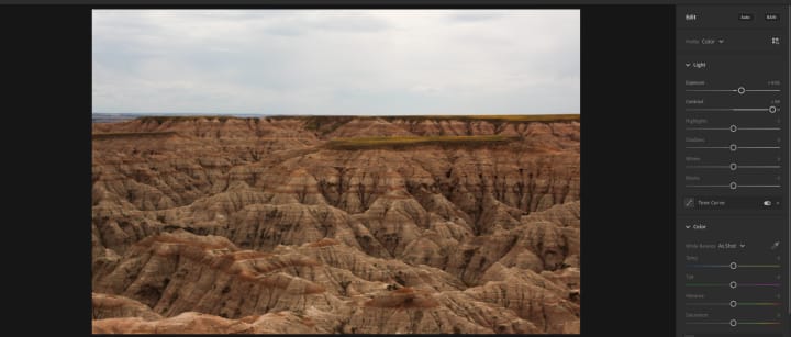
The next slider on Lightroom is the contrast tab. I really pushed it with this one, as it already is making my colors start to pop as well as stand out from each other. This also highlights how every tool you use to edit can be a little different. In the iPhone editor, contrast quickly destroyed my photo if I put it too high.

The slider that I tuned down here is the highlights tab. I have a tendency to not light super bright highlights. Other people may love it. In part, editing is very subjective, but as long as you end up with something you like, I think it's okay!

I tuned up the shadows a bit here. In Lightroom, messing with both the highlights and the shadows actually has a lot more effect on the overall photo than in the iPhone app. It makes decision making on these sliders a lot more important, but I also think it overall is more effective in making the photo look nice.

I moved two sliders in this particular image. That is the black and white sliders. This is where Lightroom is really different. On the iPhone app, you can only access the black point. Lightroom gives you both. This allows for more fine tuning.
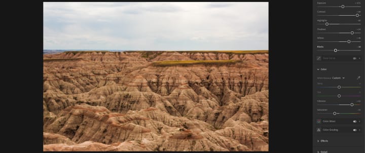
For this final photo, I moved the vibrance and saturation sliders. Since I've already said how these work on the iPhone editor, it's not much different here. So time for the big reveal of the final photo in a better quality image!
Conclusions
Overall, I got pretty similar outcomes between the two photos. I'll put the iPhone one here again for easier comparison!

I would honestly post both photos, but side by side, the Lightroom photo looks much better. There are a couple of reasons for this. First, it is just more powerful software. Second, you can see all the sliders at once, which allows for more fine tuning and going back to easily fix something. However, that doesn't mean that the iPhone one is bad by any means. I think, in a pinch, it works perfectly. Especially if you don't have the means or want to afford the Adobe Products.
So next time you have a photo you want to edit, remember this article. Mostly, thought, remember that at the end of the day, if you create an edit that you love, it doesn't matter how you got there. It doesn't matter if it's perfect or even professional. What matters is that it's yours. As I'm sure you picked up from my editing processes, I'm pretty much a wing it and go person. If it looks good, I stick with it!
About the Creator
Cody Dunnington
Just a 20 something year old with big dreams and access to word processing software.
Keep reading
More stories from Cody Dunnington and writers in Photography and other communities.
Paranormal Activity?
One of my favorite things that exist in this great big orb of a planet that we call home is the concept of the paranormal. It’s such a large umbrella term that fits so much underneath it. Ghosts, demons, monsters, creatures of lore, aliens, and even places fall within the realm of the paranormal. Now I’ll be the first to admit that I’m a bit of a paranormal junkie. I’ve seen a lot of the shows going into various paranormal places. Usually to do with hauntings or the like, and they go for so many different approaches. They’ll check for magnetic fields that shouldn’t be there. They’ll look for abnormally hot or cold spots. Anything out of the ordinary.
By Cody Dunnington3 years ago in FYI
Capturing Magic
In the world of photography, timing is the key to everything. While skilled compositions and technical proficiency are undoubtedly crucial, the perfect lighting can create the perfect photo. Nowadays, we can determine any light ourselves and are no longer dependent on any natural light source, thanks to the developed technology. We can turn every day into a night by using the right filters. And we can illuminate every night to be seen as a day. A typical process, especially in the film industry.
By Krishan Mubashar19 days ago in Photography
Sleep music soothing relaxation
Healing Piano Music for Stress Relief, Calm Music for Meditation, Sleep, Relax, Healing Therapy, Nat ► Relaxing music encompasses a wide range of genres and styles, all aimed at promoting calmness, reducing stress, and inducing a sense of relaxation.
By PeacefulMusicabout 19 hours ago in Photography


Comments
There are no comments for this story
Be the first to respond and start the conversation.