
Expose Yourself: Tips for Pretend Photographers
Here's a few tips and tricks to help you get your photography a-game on....


Over the past five years I’ve developed a love for photography. I may not take as many pictures as I would like to, and fewer yet end up online, but those that I do post I am quite proud of.
As many, if not all of you, know half the beauty of a picture lies in its editing—just the right amount of saturation coupled with the right exposure and filter equals the perfect picture.
Much of my basic photography and editing skills I learned from my good friend Ryss and I’ve tried my best to develop them over the years.
To help anyone who has trouble with picture taking or editing I’ve picked out seven of my favourite photos. Before I start though, I should sat that there really isn’t any way I’ve found of spotting a good photo, I usually just see something and think, “Oh that might make a good photo.” About 85 percent of the times I’m wrong, ha!
I use VSCO Cam for my all of my editing. I hope you find this helpful!
1. Coffee at Ozone Coffee Roasters, Shoreditch

The above image is one of the few I've taken where I would've felt confident enough to post the picture without editing it (bar straightening it slightly). But a little editing never hurts, so I caved.
Described by VSCO as a "Subtle Fade pack [that] evokes the vintage hues of the 70s" the M series is one of my favourites. I used M4 in this particular one, but only to half strength, combined with a little less exposure (brightness) and saturation (i.e. the intensity of the image's colour) and a touch more clarity and sharpness.
I find that using less exposure on images that have a lot of natural light works really well and since I was by a window when I took this pic, there was a lot of sun (because it was sunny in England for once!)
2. The Musée D'Orsay, Paris

For this photo I used P5—an old favourite. The P series on VSCO is full of lovely blues, but they don't work in all situations. P5 is my favourite in the series so I tend to stick to this if I use the series at all, but I find that when it is used on nature it tends to make it flowers and leaves look dead, so not using it to its full capacity is best—all depending on the feel you're going for, of course.
A neat little tool I used here that definitely goes unnoticed is the highlight tool (to half capacity). This made sure that the sky outside wasn't too harsh when I edited the photo and blended in perfectly with colour feel I wanted.
3. The Royal Opera House, Covent Garden

To me this photo only had two components - the sky and the lines of the glass ceiling. It was a bit tricky to edit it to my liking but eventually I settled with F1 from the, you guessed it, F series, which VSCO describes as a Mellow/Fade series.
I used F1 to 9.6/12 - it added a slight fade layer to the picture that helped separate the ceiling and sky. Then, to enhance that effect and make the ceiling's structure more prominent, I added a little clarity and a little sharpness and a slight grain (only 1.8/12) to meld it together.
When photographing blues I find it best to keep them softer - I find it really horrible when blues and oversaturated or 'scream' to much, especially since a lot of (my) pictures have blue in them.
4. Surbiton Station, Surbiton, Kingston Upon Thames

I wanted this picture to feel aged, like the station, but fresh. To achieve this, I used another filter from the F series, F3—which gives a slightly more yellow tint. I lessened the exposure and increased the contrast to lean toward a stark difference in the blue, black and white and used both sharpness and clarity to pick out the ware and tear of the station—you can see that the imperfection of the pain shows up a lot more in the edited version.
I used the grain effect to quarter capacity as I felt a bit more distant from the picture when I applied it.
5. Paris, France
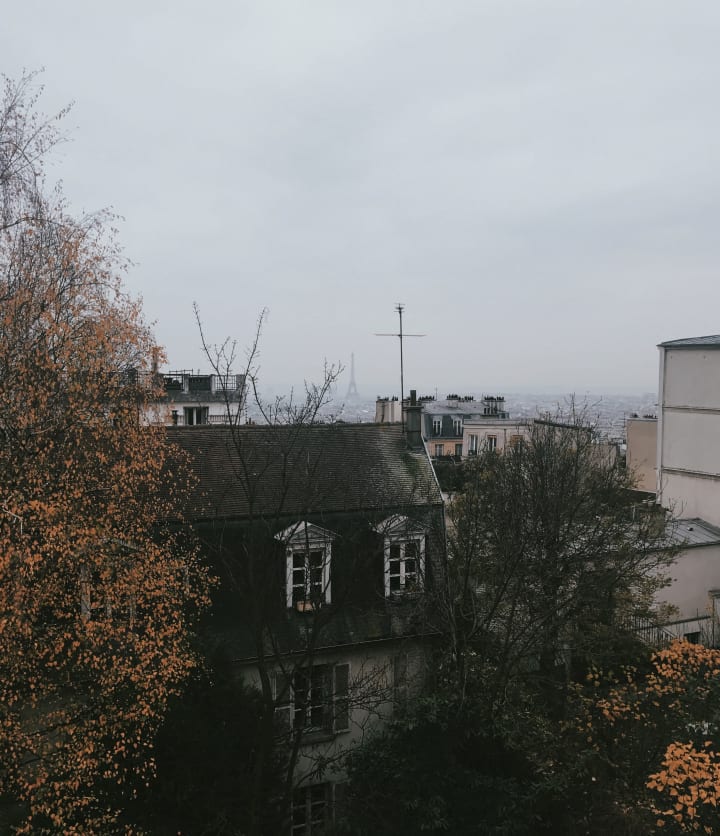
Sometimes I use two filters on one picture, like this one. The first filter I applied was from the K series—"Based on classic Kodachrome [Kodak] film, this pack emulates the bright and poppy look of its analog forefather."—K3 (to three quarter capacity) and then P5 to 1/3 capacity to give a slightly blue tint and help lessen the harshness of the leaves' colours that K3 created. If any of that made sense,
Again, the beauty of the highlight effect came in handy as it helped to soften the sky and blend it well with the rest of the picture and help the Eiffel Tower to stand out a bit - yes, it's there in the background!
6. Surbiton

This was probably the first photo I took and edited that I was truly pleased with and as a result I haven't got the original. What I really like about this photo is the two different focuses—the fence in the foreground and the tracks, train and sky behind.
I find that taking photos through fences is almost always a good idea. Judging by the colours I'm pretty sure I used P5 with a slight increase in saturation, but I clearly didn't use the highlight tool—you can tell because the blue is quite harsh, especially since I increased saturation.
7. Flowers

I very rarely photograph flowers, but I bought these for a dancer's début and took a few pictures of the bouquets. It underwent a lot of editing as you can see! I have no set way I go forward when editing flowers, I just have to play around until I find something that works with the colours.
Because the picture was taken hurriedly I had ended up zooming in on just a section to hide all the paper, the odd angle and the fact that there wasn't a particular central flower to focus on.
I added the grain effect (1/3 capacity), made it a fair bit sharper and increased the clarity—a good trick for shaky hands—and added P4 to 8.5/12 and then again a second time to 4.0/12.
Why did I add the same filter twice? P4 gives a nice deep blue feeling to the pictures, but that feeling only really hits hard coming past 9.0/12, so in order to gain from the effect I used it twice, but before the blue really set in so I didn't completely lose the colours of the flowers, but got the added richness to the leaves.
Well, that's everything for now. I hope something somewhere in here helped you and I hope you start taking some more pictures now :) You can see more of my photography over on my Instagram @katchkadeem.
Don’t forget to follow and I’ll catch you in my next blog post.
Or should that be Katch?
Kadeem

About the Creator
Keep reading
More stories from Kadeem Hosein and writers in Photography and other communities.
Capturing Magic
In the world of photography, timing is the key to everything. While skilled compositions and technical proficiency are undoubtedly crucial, the perfect lighting can create the perfect photo. Nowadays, we can determine any light ourselves and are no longer dependent on any natural light source, thanks to the developed technology. We can turn every day into a night by using the right filters. And we can illuminate every night to be seen as a day. A typical process, especially in the film industry.
By Krishan Mubashar8 days ago in Photography
Enchanting Views, Full Pink Moon Photos from April 2024
The Full Pink Moon, a celestial spectacle that captivated hearts and minds for centuries, graced the night skies in April 2024. As it adorned the heavens with its mesmerizing hue, photographers and skygazers alike marveled at its beauty.
By SIMORa day ago in Photography
Frankie's Song of the Week: Espresso - Sabrina Carpenter
A little something different from me while I deal with the strain of writers block. I thought I'd do a song of the week, because I have been surely annoying my neighbours and my friends with this absolute musical GEM. I am of course talking about Espresso by Sabrina Carpenter.
By Frankie Martinelli7 days ago in Beat


Comments
There are no comments for this story
Be the first to respond and start the conversation.