
Curious Graphs That Will Change How You See The World
With great access to data comes great responsibility.


There is a common misconception that data is boring. We imagine long, hard-to-read excel spreadsheets with rows and rows of data and start yawning immediately. Yes, data can be boring, but it's only boring if you can't relate to it. Looking at the random company's expenses for the past 15 years is a tedious task; looking at all your articles to figure out which one got the most views is not.
Telling stories with data
Do you know what makes a good chart? It's not the colors, fonts, or formatting; it's the story that this chart is trying to tell us. A good story will show achievements and failures, highlight the similarities and emphasize the differences. Sometimes, one chart is worth a thousand words.
Today, I wanted to show you some of my favorite charts that tell the most exciting stories. On top of that, they tell stories we all can relate to. Who knows but maybe some of these charts can even change the way you see the world.
Piketty's Chart
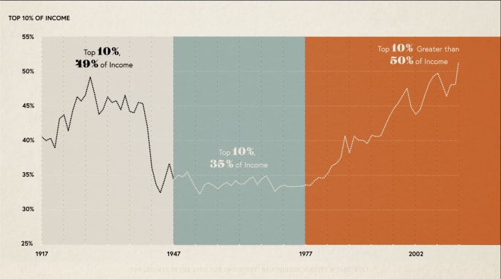
French economist Thomas Piketty spent years studying inequality and sharing his finding with the world. As one of the authors of the 2018 World Inequality Report, he knows more than anyone about the growing income gap. If you look at these charts, you'll see the trend with your own eyes. Inequality is not just a popular topic for discussions anymore, it's our reality that poses a danger to the well-being of our economy.
Malcolm Gladwell: Parenting & Wealth Graph

Malcolm Gladwell is the author whose books are mostly based on data. The studies and stories he tells are so fascinating that you keep wondering how they stayed unnoticed for years. In "David and Goliath", for example, Malcolm Gladwell examined the relationship between income and parenting. Most of us just assume that the richer you are, the easier it is for you to be a parent. Well, not quite and the chart above clearly demonstrates it. Here is a great article to read if you want to learn more about this curious graph.
Idea Diffusion Curve And The Tipping Point
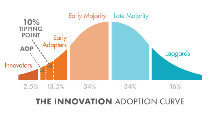
Diffusion of innovations is a curious theory that explores how, why, and at what rate new ideas and technology spread. I'm not going to go into details but basically, this chart shows the path revolutionary ideas or products tend to follow through society. You can also find a 10% tipping point somewhere on the curve. What is it?
The term entered popular consciousness almost two decades ago, thanks to Malcolm Gladwell's 2000 book. The author defines a tipping point as
"the moment of critical mass, the threshold, the boiling point."
In other words, it is the moment at which the system changes triggering dramatic, unexpected, results. According to Gladwell, ideas, like viruses, are transmitted by a few influential people through their networks; and at a certain point -the tipping point - so many people have heard about it that changes become irreversible. It's like that moment when a virus becomes an epidemic.
Antarctica Sees Huge Decline In Sea Ice
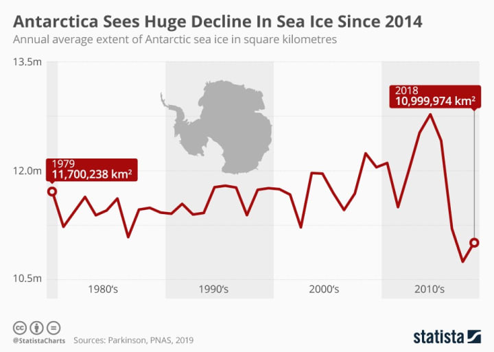
I hope I don't have to cover global warming or persuade you it's real. So let's get straight to the topic. The picture above says it all - there is a sharp decline in sea ice since 2014. There is a small optimistic rise at the end of this curve but it will take years for us to bring the curve back.
Infographic: Antarctica Sees Huge Decline In Sea Ice Since 2014
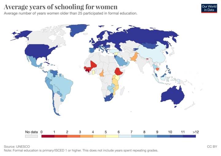
Average Years of Schooling for Women Vs Men
Is feminism still relevant? Here are two graphs from 2014 that can answer this question perfectly:

Drugs World
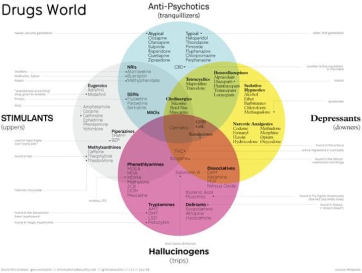
Prescription pills are practically a part of American culture. In fact, the US is the most medicated country in the world. Just look at this beautiful Venn diagram! According to the creators of this graph, most of these drugs are frequently used in the US.
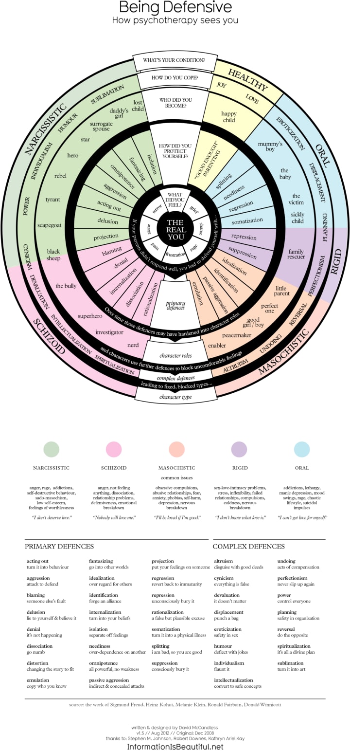
How Psychotherapy And Psychoanalysis Sees You
This is a great example of a chart that tells multiple stories at the same time:
How a Trillion Dollars Look Like
Is a trillion dollars a lot? It depends. Oh, and speaking about the growing income gap again, take a look at the giant red square at the bottom. Impressive, huh?

The Most Common Passwords
And finally, a fun interactive visualization that shows the top 500 passwords that people frequently use. If you see yours there, it's definitely a sign that you need to change it as soon as possible :)
Top 500 Most Common Passwords Visualized - Information is Beautiful
***
This article was originally published on Medium.com
About the Creator
Valeriia Muradian
I'm a software developer from Ukraine who lives in Miami and loves writing about nerdy stuff.
Keep reading
More stories from Valeriia Muradian and writers in FYI and other communities.
The Psychology Experiments That Explain A Lot About Our Behavior
You and I are way more similar than we would like to admit. Humans share a lot of common traits like a common set of emotions and the capacity for self-awareness, instincts, reflexes, abstract thinking, or knowing right from wrong.
By Valeriia Muradian3 years ago in Humans
One of the Crazy Things Rich People Do That's Scary To Think About
They impress us, and sometimes they scare us, but the ultra-rich are always interesting. Some of their famous activities include buying yachts too big to move through channels, buying ridiculously priced cars that could feed the homeless of New York for weeks, and their expensive tastes in sex workers.
By Jason Ray Morton 7 days ago in FYI
"What To Do When A Toxic Narcissist Is Close"
Family Dynamics can be complex and multifaceted (to say the very least.) filled with love, support and connection. However, there are times when family relationships can turn toxic, leading the emotional pain, stress and dysfunction. One of the most challenging aspects of dealing with toxic and/or a member of narcissism is recognizing and understanding the passive aggressive narcissism, a behavior that can be subtle (until it’s not) yet damaging. In this article, I will explore toxic family member and delve deeper into the traits of passive aggressive narcissism.
By Kristen Bansfield -Pen Name K.R.Fieldsabout 19 hours ago in FYI


Comments
There are no comments for this story
Be the first to respond and start the conversation.