
How Charts Lie: Introduction and Chapter 1 Response
By: Maya Abrams


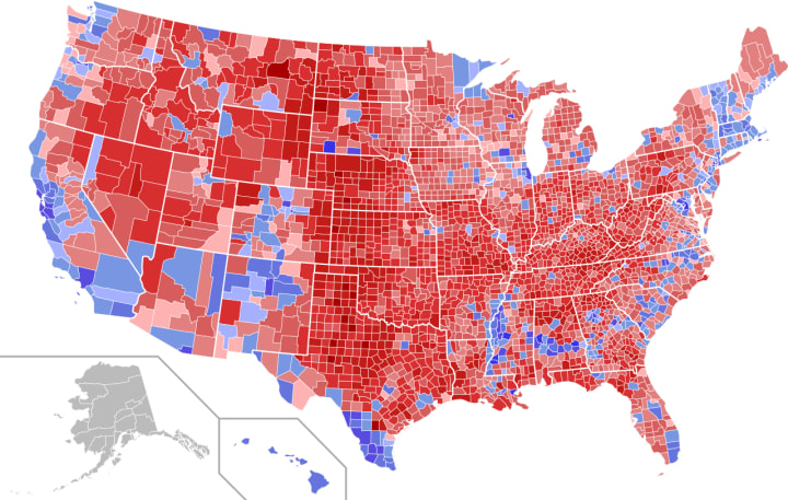
This semester I decided to take a class titled 'Introduction to Infographics and Data Visualization,' which specializes in interpreting and creating infographics to accompany educational projects or articles. The first reading for the class is titled How Charts Lie by Alberto Cairo, and the main idea of the book is explaining how political, public, and general figures either intentionally or unintentionally misread charted graphics for their personal gain. The book's introduction begins with several graphics illustrated from the 2016 Presidential Election, including this controversial image of the Electoral College votes. The key reason for bringing up the election concerned the fact that President Trump and his colleagues tend to falsify the actual results from the election, using misleading charts to convince the American people that they won by a landslide. In reality they actually lost the popular vote to Hillary Clinton, and only won the election via the electoral college where the states with the higher number of representatives voted in his favor. Cairo further explains throughout the remainder of the introduction into the first chapter how it's immensely important that people in such a technical world have a clear sense of graphicacy (graphic literacy), meaning that they can correctly interpret the thousands of charts found around news media daily. Another notion Cairo mentions to help facilitate chart interpretation is making sure that the artists make regional proportions correct to their statistics; this means that if a city, like Miami, FL, has a population of 2.7 million people, while a city, like Los Angeles, CA, has a population of 10 million people, the graphic depicting LA should be nearly four times the size of Miami's representative graphic.
Although this story is slightly unsettling, I find much relevance for it to elaborate graphicacy is in terms of peoples' personal and more important political agendas. A little backstory to this situation is that for starters I am from Dallas, Texas, which lies in the center of the Bible belt. Following up with that small fact, I also attended a conservative, Christian school for thirteen years prior to attending the University of Miami. Part of the school's curriculum consisted of speakers, Biblical devotions in the middle of the day, and even some unintentional (or usually intentional) political proclamations made when the time was necessary. The Presidential Election occurred in the middle of my senior year, making the actual inauguration on a Friday in mid-January. Friday's ended each week off with either a pep-rally or some type of speaker, and that day was a speaker that was initially expected to speak on adopting children with special needs. It was a heart warming, harmless topic, but things quickly turned left in the middle of the speech, when this man asked what seemed a simply interactive question. "What's the most dangerous place to reside in New York City?" As the entire student body yells out their response, he quickly silences us to deliver the 'correct' answer to his question. "A black woman's stomach." You could hear a pin drop. I could feel my heart drop to the pit of my stomach.


Once the silence resolved what this talk was actually about the man proceeded to spit out facts about black women having the highest abortion rates in New York and the entire country period. Although that may be true, the one statement that placed me in bewilderment was when he announced that,"Black women makeup for 60% of all abortions in New York City, meaning more than half of pre-birth death comes from one demographic." Well, when said like that it sounds like this man is accusing all black women, including myself of murder! So, since I had to relate this to the reading I decided to look up ethnic percentages of abortion rates in America. According to a line graph posted by the Guttmacher Institute, African-American make up for 27.1% of abortions nationwide, which is the highest number listed, but still lies at half the amount our lovely speaker declared during his talk. Although I understand his sentiment to promote putting children up for adoption in case of unwanted pregnancy, I still believe he did not have to lie so dramatically to make his political position known. When people make very skewed statements they never realize the ridicule and sometimes danger it places on those effected; they speak without backing up their so-called 'facts.' As a racial minority there are enough categories in life that label me as simply a high risk statistic, let alone one about about a topic as touchy as abortion in a conservative state and a school that religiously stands completely against it. It should be mandatory for any adult pursuing a higher education degree to read books under the likes of How Charts Lie to emphasize the hazards of false information being used for a powerful individual's rhetoric.
About the Creator
Maya Abrams
DTX/MIA | a sophomore in college who just likes to display her thoughts & ideas for others to view/discuss. that's all i got for now.
Twitter: _mayadania
Instagram: _mayaabrams
Keep reading
More stories from Maya Abrams and writers in Education and other communities.
Maya's Tenfold Tunes: 01/19
As I constantly find myself narrating life's events to an unintentional soundtrack every month of each year, I quickly realized that others probably have as well! It's easy to connect certain songs to particular past memories. With this key notion in mind, I thought it would be fun to rank my ten most played songs from each month from least to most favorite! I will give brief summaries containing my favorite lyrics, musical dynamics, and production characteristics of each song below. If you're intrigued by any of the details listed, I also made sure to include each artist's website, social media, a direct link to the track, and whichever album/single the song was released. Since I decided to only post cover art rather than a video link, I wanted to clarify that these songs are available on all major streaming services (Apple Music, Spotify, TIDAL, Pandora, Youtube, etc.). I hope you enjoy!
By Maya Abrams5 years ago in Beat
The story of the bundle of chopsticks
Once upon a time, in a certain village, there was a very rich man. He gave birth to five children. Because he was so rich, his children had a happy and materially abundant life. But everyday life is infinite. If you have one, ask for two. If you have an elephant, ask for a fairy. Because he was so happy, his children became greedy, selfish, and fought with each other.
By Tài khoản của tôii5 days ago in Education
Potty training When it comes to getting rid of diapers,
Potty training When it comes to getting rid of diapers, moms have a question about what to do if they don't use diapers. There are two or three things. One is that they start taking children to the bathroom from a young age. How small? As soon as your health improves a little. Yes, from two to three weeks old! Children communicate with their expressions whenever they need. Now there are so many things to do with a small child that it is an extra task that a person gets rid of. I would still say try it if you can. Illegal communication
By Muhammad Tariq7 days ago in Education


Comments
There are no comments for this story
Be the first to respond and start the conversation.