
12 Expensive Landing Page Mistakes That Are Stealing Your Conversions
How to Overcome Your Low Conversion

It happens all the time. Your ads get hundreds of clicks, but there are no conversions. You check for broken links, and you’re 100% sure that you’re targeting the right audience. Now, you’re clueless. Why won’t any visitors convert?
Brands lose millions of dollars every year because of low conversion ad campaigns. So what are they doing wrong?
Usually, the problem lies in poorly optimized landing pages.

Getting people to click on your ads is only 20% of the success. Next, you need to deliver a perfect landing page experience for them to click on the “buy” or “sign up” button.
Up next, we’ll walk through 12 serious landing page mistakes that you can easily fix to boost your advertising ROI and keep your cost-per-conversions low.
For those who lack patience, here are all the landing page mistakes listed:
1. Bad first impression
2. Your ads and landing page call-to-actions don’t scale
3. You’re targeting everyone at once
4. You’re using an unclear value proposition
5. Your call-to-actions are confusing people
6. Poor mobile experience
7. The landing page and ad designs are unaligned
8. You’re using no images
9. You’re using the wrong images
10. There are no images of your product
11. The opt-in forms and sign-up boxes are hard to find
12. FBI-worthy opt-in forms (our favorite hack of this post!)
Mistake #1: Bad first impression
After someone clicks on your ad and lands on your website, you have about 10 seconds to convince them to stay.
During the first 10 seconds, the visitor evaluates whether your website is trustworthy, interesting, and worth staying for longer.
If you’re unsure whether your website leaves a good first impression or not, check your Google Analytics data to see the average time-on-page. If the result is less than 20 seconds, it means that most of the visitors stay on your site for less than five seconds.
So how can you leave a good first impression?
The best advice I’ve heard is to ensure your landing page won’t look like it was created more than two years ago.
Here’s how Hubspot’s home page looked in 2008. (Back then, it was exactly what clients expected, but not anymore)
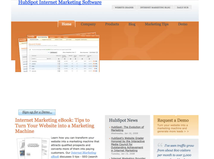
The internet’s developing at a rapid pace and what worked eight years ago isn’t relevant today. You need to keep up with the trends that people are used to seeing.
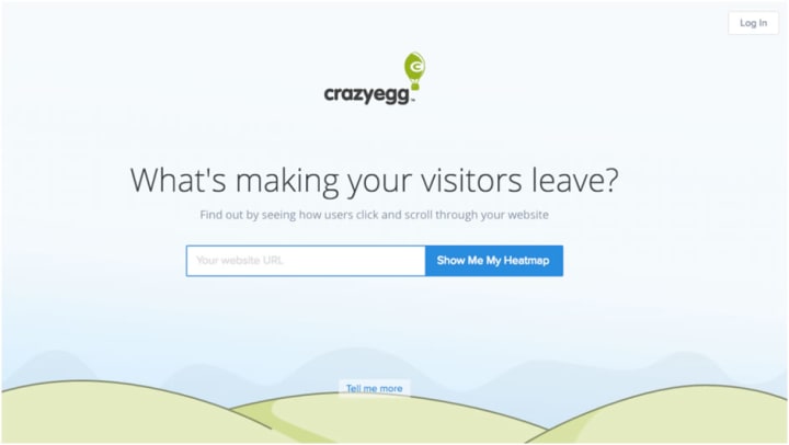
Modern websites use minimal design and light text to deliver the core messages while holding back on business jargon. See what Crazy Egg did there?
Three rules to leave a good first impression:
• Use a simple layout with professional design
• Use a clear value proposition
• Use an image or illustration that’s not a stock photo
2. Your ads and landing page call-to-actions don’t scale
Imagine you clicked on an advertisement that promised to boost your social media ROI by 50% in 7 days. Up next, you land on Buffer’s website saying “Save time managing your social media.”
This could never happen in real life.
Why? Because the smart marketers at Buffer know how important it is to keep the offers in your ads aligned with your landing page value proposition.
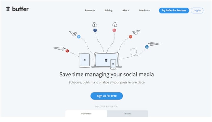
Promising one thing in your Facebook ads and then failing to keep the message consistent throughout your sales funnel is a costly mistake to make.
How to keep your value propositions aligned?
Start by finding a unique value proposition that describes your product the best. Next, use the same message throughout your advertising campaign and landing pages.
For example, Scoro uses a straightforward value proposition “Bring structure to your work.”

As you click on the ad, you land on their homepage that has the exact same message. And that’s exactly what potential customers are expecting to see.

3. You’re targeting everyone at once
We’ve previously written about the importance of targeting a closely-knit audience. The better you’re able to touch upon a small target audience’s pain points or aspirations, the higher your advertising ROI will be.
Smart Facebook marketers rarely advertise the same offer to everyone. Because it just won’t work.
Every company has multiple different audience groups, depending on the industry, lifestyle preferences, technical skills, etc. Your job as a marketer is to segment your audience and deliver highly relevant offers to them.
But you shouldn’t stop at targeting different audiences in your Facebook ad campaigns. You should also build a highly relevant landing page experience for each of these audiences.
For example, in Scoro, we created a Facebook ad campaign specifically targeting professional service agencies.
If you actually want to perfect your landing page for optimum conversion then download my full free report on "12 Expensive Landing Page Mistakes That Are Stealing Your Conversions" for FREE.
4. You're Using an Unclear Value Proposition
People are selfish. They don't care about your product's features, even if you think that your product's awesome. People who land on your website want to see what's in it for them.
One of the common mistakes marketers make is to start boasting about their product and its high-tech features.
What their website lacks is a clear value proposition telling clients why they should buy the product.
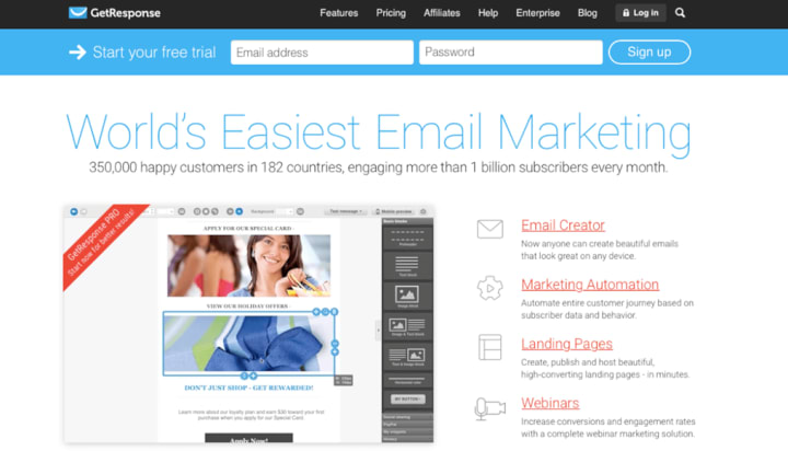
For example, GetResponse's home page says it's the "World's easiest email marketing" and is trusted by over 350,000 happy customers. But the huge headline doesn't say why it's beneficial to a particular user.
Take a look at AdEspresso's home page:

Both the headline and the sub-headline explain how you can improve your Facebook marketing while improving your ROI.
How to write a good landing page value proposition:
Remember it's all about the customer, not your product
Think about the biggest benefit your product brings to the client
Use an action verb to describe the benefit (do, get, win, improve, etc.)
5. Your Call-to-Actions are Confusing People
Call-to-actions are nice. They make people click and bring in the money.
Marketers love call-to-actions so much that they'd like to fill the entire landing page with them. If the visitor doesn't like your main call-to-action, maybe they'll click on another one, right?
But covering your landing page with CTAs is not the answer. Too many CTAs have the opposite effect of your marketing results - they start to confuse your audience.
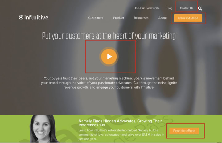
Look at the home page design by influitive. Where would you click? There are so many options, and people get stressed out when they have to make too many decisions.
The best practice is to place only a single call-to-action on top of your landing page. SEMrush's landing page uses only one call-to-action so that it's easy to understand how to get started.

How to write a high-conversion CTA button text:
Use an action verb (get, do, try, start)
Use "You" instead of "My" (Start your free trial)
Be specific about what they'll get (Get your 14-day free trial)
Quick Recap
If your Ads landing pages fail to convert, look for these common mistakes and fix them as soon as possible:
Bad first impression - improve the overall website experience
Your ads and landing page call-to-actions don't scale - use the same offers and call-to-actions on your ads and landing pages
You're targeting everyone at once - target smaller audiences with specific offers and build a dedicated landing page for each new ad campaign
You're using an unclear value proposition - be clear on how your product will help the client
Your call-to-actions are confusing people - use a clear request or action verb in your call-to-actions
If you really want to perfect your landing page for optimum conversion then download my full free report on "12 Expensive Landing Page Mistakes That Are Stealing Your Conversions" for FREE.
If you've had value in this article then give me a clap, highlight your essential takeaways, and follow or subscribe. This will just motivate me for more research.
About the Creator
Nathal Nortan
About Me:
Embark on a journey through the sultry landscape of love, science, and technology. I'm an unapologetic wordsmith and fervent explorer of the heart's deepest desires. My tales are woven with threads of deep care for humanity.
Keep reading
More stories from Nathal Nortan and writers in Education and other communities.
Keyword Research: 14 Things to Know Before Starting
Keyword research is like having a map for reaching your target audience online. Here's a quick rundown before you dive in: Identify your goals: Are you aiming for organic traffic (SEO) or paid advertising (PPC)? This will influence the type of keywords you target.
By Nathal Nortanabout a month ago in Education
Starting a Profitable Side Hustle: A Step-by-Step Guide
Starting a profitable side hustle is an excellent way to boost your income, develop new skills, and pursue passions outside of your primary job. Whether you're looking to save for a big purchase, pay off debt, or simply increase your financial security, a side hustle can provide the extra income you need. Here’s a step-by-step guide on how to start a profitable side hustle.
By Hira Waheed5 days ago in Education


Comments (1)
It is good. Thanks for sharing.