
The Understructure: Understanding Sturtevant
To open Vocal's new Art community, I wanted to share this piece that I am very proud of. As an Art History major at Yale, I discovered the subversive and exciting work of Sturtevant and wrote the following for my Pop Art class.

Until 2014, Sturtevant was an enigma to the American art world. Her most notorious works, her “repetitions” based off work by her better-known contemporaries, were seen either as curiosities or blasphemy. Like a red-headed stepchild, her name was known but her presence unsolicited. Though her work found much attention in the museums of Europe, she showed only occasionally in American galleries, a painting or two shunted into group exhibitions.
That the Museum of Modern Art would then choose her career for a 2014 retrospective entitled “Double Trouble,” an honor typically reserved for the undisputed greats, seemed a curious choice. In the foreword for a book published alongside the retrospective, Glenn D. Lowry, the Director of MoMA, calls the retrospective the “first significant overview in America of the art in Sturtevant,” and admits that “she has been largely and unduly ignored in the United states, her home country.” For this to be the first paragraph of the entire book is only fitting.
Rather than further undermining the legitimacy of her art by referencing its relative unpopularity (as it could be read), this passage acknowledges the wrongs that have been systematically leveled against Sturtevant. Lowry offers “Double Trouble” as a kind of reparations. “[This retrospective ensures] that an important artist might at last enjoy this overdue recognition in America, and that her work [will] find here the broad audience that it has long deserved.” Unfortunately, Sturtevant never got to ‘enjoy’ her moment in the American limelight. When Sturtevant died on May 7, 2016, “Double Trouble” was still six months from opening.
Perhaps this was a blessing in disguise. Just as her work was widely panned by the critics of the 20th century, the 2014 retrospective was met with a chilly reception. The various criticisms of reviewers like Holland Cotter and Peter Schjeldahl mimic their predecessors of the 1960’s and 70’s. In his review for the New York Times, Cotter repeatedly describes her early pieces as copies, a terminology that Sturtevant resolutely refuted throughout her lifetime. Schjeldahl’s piece for the New Yorker is more brutal, littered with put-downs and thinly veiled derision. He calls her “odd” and her work uninteresting, her presence “kinky” and the retrospective bearable only through the “curatorial tour de force” of Peter Eleey.
These reviews say nothing new. Just as it was at the beginning of her career, the legacy of her work remains besieged by misconceptions: most significantly, that she was a copier, a (terrible) forger, an appropriator, and a sycophant. But despite their conceptual longevity, these fallacies are grounded in nothing more than ignorance and misguided opinion (and perhaps misogyny). By examining Sturtevant’s art anew in conjunction with her own writing, the value of her work and the true tragedy of her stunted, misunderstood career becomes apparent.
Sturtevant began creating repetitions of other artist’s pieces in 1964. The men she repeated – Jasper Johns, Claes Oldenburg, Frank Stella, and Andy Warhol, to name just a few – were already noteworthy by this time, rising stars of the post-Abstract Expressionism movement that became Pop Art. In the late 50’s and early 60’s, Sturtevant had made inroads to their tightknit group but was never quite considered one of the gang. When asked in a 2007 interview with Bruce Hainley and Michael Lobel whether she was “involved with that circle,” she hedged in her response. “Not, not – I mean, I watched their dances; went to their performances… Yeah, I was sort of there.” Clearly uncomfortable with remembering her intermediate social status at this time, she quickly requested they move on to another topic.
But still, there is undeniable evidence of her acknowledged presence in this circle. Oldenburg had cast her in one of his Happenings, and invited her to the opening of The Store (1961). Johns considered her an acquaintance, and he and Rauschenberg owned a pair of her earliest works. These works, created between 1959 and 1961, were not repetitions. At most they were vaguely informed by Duchamp’s use of the paint tube as material, perhaps referencing the style of some Abstract Expressionists. On a blank white canvas, Sturtevant would slather blobs of paint thickly in blocky geometric forms and aggressive streaks. To these sparse shapes, she attached the sliced-open tube from which the paint came. One such work from this time period, Ethelred II (1961), was displayed as part of “Double Trouble".
Ethelred II oozes with latent violence. Three fields of form emerge: at the left, a flattened paint tube coated with the coagulation of its crimson innards settles like a blood clot. Its roughly rectangular form is disrupted by the removal of a square from the top-right corner. Above this rectangle, two short jabs of a thinner red track upwards, their trajectory blunted by the horizontal descent of a third jab. On the far right a small square floats hesitantly, perhaps the missing corner of the first rectangle. While it is not so assertively formed and colored as the first rectangle, its presence is stronger, more complete than that of the smudged jabs. It presents a cautious conclusion to the work’s bloody arc.
Schjeldahl refers to Ethelred II as “a sparse but visceral abstraction” that “hints at real promise,” unlike her following work. Bruce Hainley and Peter Eleey see it as a violent, decisive overture to the theoretical basis of her future repetitions. Though Hainley and Eleey are correct in designating this painting as part of Sturtevant’s transitory phase, they do not discuss the painting’s immediate implications on Sturtevant as a burgeoning artist. Hainley’s description of the “road-killed tube” is shrewd in its substantiation of this painting’s aggression. This represents Sturtevant’s desire to be taken seriously, her drive to become a statement-making artist. But what he does not discuss is the uncertain smears of the lighter color ascending only to fall, evocative of a deeper emotional yearning, a lack of confidence that dominates this work. The work’s title, Ethelred II, gives credence to this analysis.
“Ethelred” does not reference the red color used by Sturtevant (tentatively identified by Hainley as alizarin crimson), nor does the “II” indicate its belonging to a larger series. Rather, Ethelred II was the title of a long-ago king of England. Also known as Ethelred the Unready, he was a child-king, reputed to have had exceedingly poor counsel that resulted in a tragic mismanagement of various military campaigns under his reign.
Though she was almost thirty years old in 1961, Sturtevant could also be considered a child at this point in her career: on the outskirts of a circle of a brilliant, accomplished artists, desperate to be considered noteworthy as well but unsure of what path to follow. Ethelred II is the work of an artist in transition, grounded by a visceral, carnal fear of failure and driven by a desire to succeed. This raw honesty bursts off the canvas and is likely what Schjeldahl was so drawn to. It is no wonder, then, that he was so disappointed by the rest of her retrospective.
The emotional brutality and self-assertion of Ethelred II was not to be repeated in Sturtevant’s work. Rather, for the following five decades of her career, Sturtevant used her art to critically examine the Pop Art movement. “The artist calls her victims her friends,” the critic Lil Picard wrote after Sturtevant’s first exhibit at the Bianchini Gallery in 1965. Though Picard was by no means a fan of Sturtevant, and the implication of her word choice leaves much to be desired, her point remains valid: Sturtevant’s work had a cruel edge.
Instead of using her art as a lens through which she examined herself, Sturtevant’s repetions were a mirror through which she conducted an aesthetic assay. This mirror’s purpose was twofold: first, it forced viewers to face the immediate assumptions they made about a piece of art, and second, it turned back to her Pop Art contemporaries, revealing their intentions and shortcomings. These revelations were not always pleasant, as Sturtevant held a relatively low opinion of Pop Art.
In her interview with Lobel and Haines, Sturtevant repeatedly posits that her repetitions are “supposed to trigger thinking.” But before a viewer or a critic can engage thoughtfully with the theoretical aspects of her work, the work first triggers an immediate response. Ingrid Langston, one of Eleey’s curatorial assistants, tells an amusing anecdote about a pair of viewers looking at one of her Stella repetitions. “Somebody walked in and said: That’s the worst Stella I’ve ever seen. And then somebody replied, Yeah, but the best Sturtevant.”
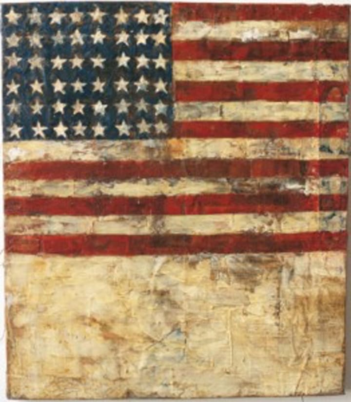
Sturtevant must have loved this story, which is so in line with the reactions she desired to inspire. When discussing her painting Johns Flag (1966), she said that she wanted the repetition “to look like a Johns flag so that when you see it you say, ‘Oh that’s a Johns flag,’ even though there’s no force there to make it exactly like a Johns. Quite the opposite – the characteristic force is lacking.” This opposition, this failure of force, is exactly what she hoped would “trigger thinking.” After the initial realization (‘Oh that’s a Johns flag’), a viewer would realize the truth of the work’s origin (‘That’s the best Sturtevant’), then be forced to find some way to rectify their impulsive reaction with reality.
Ultimately, this rectification would by necessity come to affect the viewer’s interpretation of the artist’s original work. Sturtevant saw a piece of art as consisting of three main parts: the object, the process, and the concept. In an original work, the artist is responsible for the creation of all three parts. For example, when Johns made his original Flag (1954, figure 3), these parts were inseparable. But for Sturtevant, only concept mattered. “Although the object is crucial, it is not important,” she once said, a statement followed by “Process is crucial but not important.” Sturtevant, by mimicking the original artist’s process and pulling directly from their imagery, found herself responsible only for the content of an image. This unique approach of repetition allowed her work to directly challenge the artist’s original message, or as Langston says, is how she “called out other artists on their own claims.”
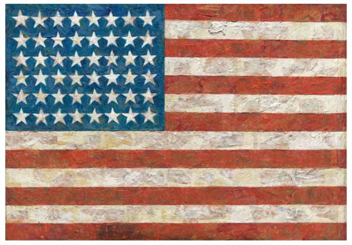
The writer Leo Steinberg postulates that for Johns, the “object and emblem, picture and subject, converge indivisibly.” In her writing on Flag, Anne Middleton Wagner isolates “how it looks and was made” as the two major keys to understanding Johns’ message. Both believe strongly that through the synthesis of object, process, and subject, Johns did not create a painting of a flag: he actually created a flag, a sign that impacts the viewer.
But how can any of this be true in the face of Sturtevant’s work? Sturtevant used the same image and the same process as Johns, but created a wholly different message. If Johns created a flag, Sturtevant created a picture of a flag. When the viewer looks at her repetition, they do not think “Oh, that’s a flag.” They think “Oh, that’s a Johns Flag.” This distinction has enormous implications for Johns’ work. By extension, when a viewer looks at Johns’ original Flag, they are not truly convinced of its signal. By merit of its recognizable style, the emblematic power of Johns’ Flag as flag must be rendered void.
So, what is left? Certainly not nothing. “I wanted to use an object that was not an object, and yet presented itself as an object, as a means of probing the understructure of painting […] to reach for the essence,” Sturtevant said. The “understructure” was one of her guiding theories. She believed that the meaning of a work of art could only be achieved through separation from its surface-level image. Instead, through “the powerful reversal of art from interior to exterior,” Sturtevant believed that she got closer to the “essence and truth” of art.
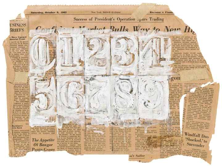
Langston’s interpretation of another of Sturtevant’s Johns repetitions, Johns 0 through 9 (1965), shows the universal truth of art that she revealed through her reversal:
“Johns has always claimed that he picked these numbers because they are completely impersonal and they just are what they are. When he originally started working with them he layered them on top of one another so that they didn’t imply any sort of sequence or meaning. [Sturtevant is] really saying, how can you say that? Of course numbers mean something. Of course art isn’t happening in a depersonalized void.”
These two Johns pieces are perfect examples of how Sturtevant’s art forced a viewer to conclude uncomfortable invalidations of great artists like Johns, accepting that his creative intent was tragically misguided and untruthful. Johns reputedly took these invalidations relatively positively, saying “Well, I think I feel how any of us felt, that she does others’ work better than she does mine.” But this calm acceptance was in fact not shared by other artists, whose reactions ran the gamut from Andy Warhol’s benign neglect to Claes Oldenburg’s explosive fury. Until 1967, Oldenburg had been a great supporter of Sturtevant’s work. That all changed when Sturtevant repeated his seminal work, The Store (1961).
Sturtevant’s The Store of Claes Oldenburg (1967) was a remarkably involved repetition. Her process (or rather, Oldenburg’s), required finding a rentable storefront, creating hundreds of sculptures, and holding regular hours for the exhibit’s month-long duration. “I wanted to do the Oldenburg store because I felt it was an important statement at the time – important enough to be revived,” Sturtevant is quoted as saying.
Perhaps it is here that Oldenburg’s anger began. The Store was his major claim to fame, a Happening that had met massive critical acclaim and successfully imparted his message: the conflation of form and function, object and content. By creating a functional store, where people could buy art as they would buy any other commercial product, Oldenburg made a powerful statement about art’s agency and purpose in a capitalist society. This remains one of the works for which he is best known. For Sturtevant to announce that this statement needed a “revival” only six years later was presumably insulting to Oldenburg, implying that his Store’s impact had died at some point in the interim.
Sturtevant has said that out of all the artists she repeated, “Intellectually, Claes was very close to really understanding the work.” If he truly understood her work, then he understood that to be repeated was to be critically examined, and potentially undermined. Like Johns, Oldenburg’s work is honored for toeing the line of art and object. “I am for an art that is political-erotical-mystical, that does something other than sit on its ass in a museum… I am for an art that takes its form from the lines of life itself,” he wrote in 1961.
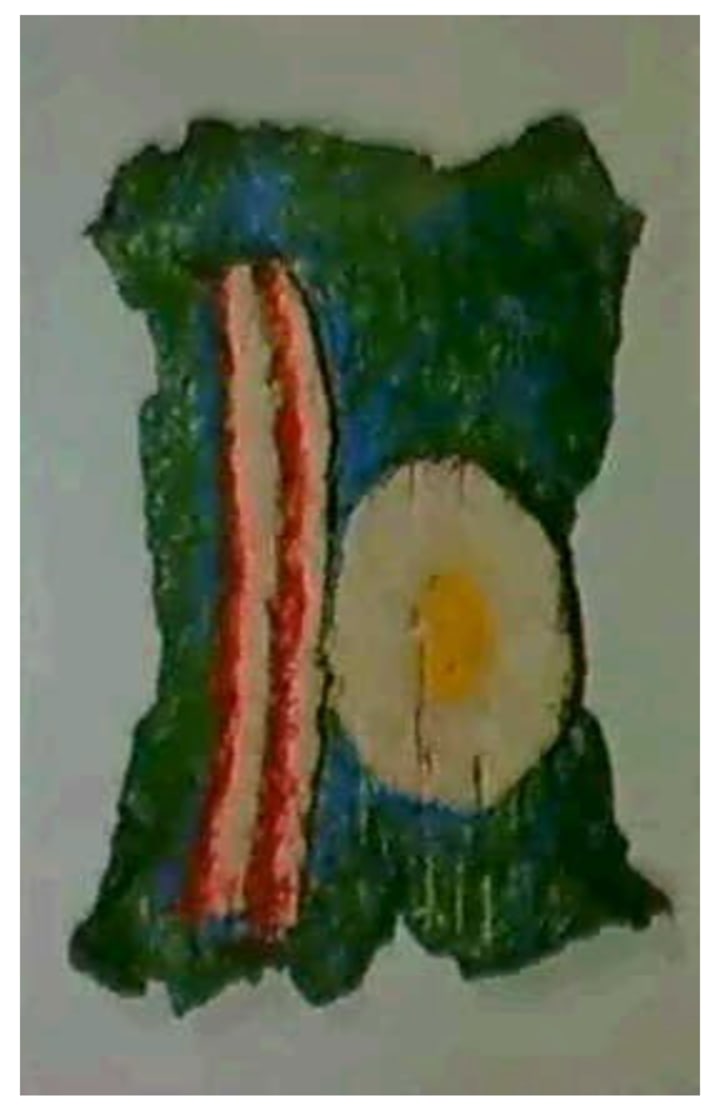
With this guiding principle in mind, his Bacon and Egg (1961) became an aesthetic meal for the mind. Each discrete part of the work (the rasher of bacon, the rounded egg, and the wrinkled green wrapper beneath them) combines to create the traditional American breakfast, presenting each visitor to The Store a purchasable object, a product whose desirability is undeniable. Of course, Bacon and Egg cannot be eaten. But the piece’s form was inspired by reality.
The same cannot be said about Sturtevant’s Claes Oldenburg: Store Object (Bacon and Egg) (1967). Its form was not taken from life, but from interpreting the surface-level of Oldenburg’s object as art. Whereas on Oldenburg’s Bacon and Egg, the thin red lines could be ketchup or grease, on Sturtevant’s Oldenburg Bacon and Egg they are simply a recreation of Oldenburg’s form. Where Oldenburg created a market, Sturtevant repeated the image of a market.

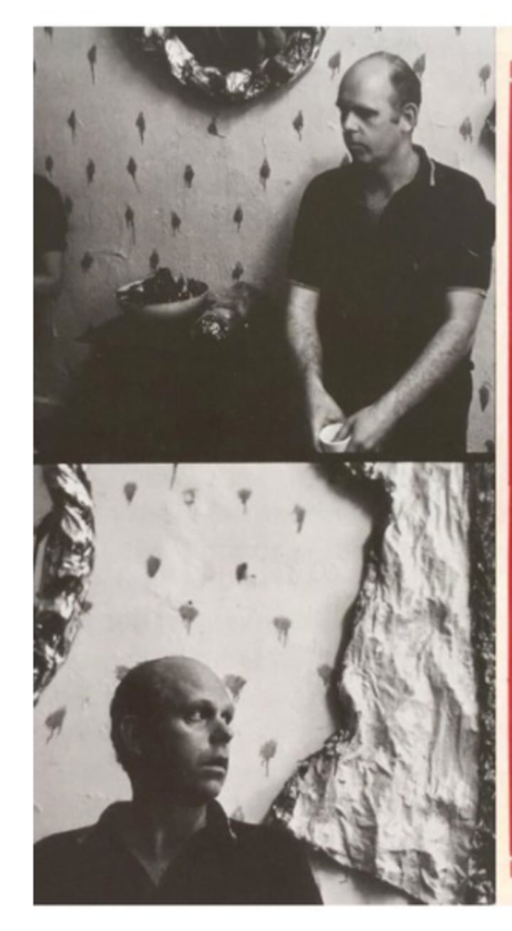
Judging by Oldenburg’s apoplectic rage, he certainly felt the power of his original statement was threatened by Sturtevant’s repetition. “Oldenburg is ready to kill me,” Sturtevant said at the time. “It all makes him dive up a wall.” A picture of Oldenburg at the opening of The Store of Claes Oldenburg shows him against a wall, looking around in dumbfounded stupefaction. Rumor has it that when Eugene Schwartz, a mutual collector of both artists, purchased an object from Sturtevant’s Happening, Oldenburg threatened to blacklist him. If Sturtevant’s apocryphal allegations are true, then Oldenburg certainly understood the implied subversion of her repetitions.
In the 2007 interview with Hainley and Lobel, Sturtevant characterized her repetition as “brutal.” In her piece “Powerful Reversals,” Sturtevant wrote that “subjective art without the transcendence of universals is perhaps still art, but puts art in the awkward position that then anyone can be an artist.” For Oldenburg, who saw The Store as his unique contribution to the “aesthetic battle” of the art scene, the implication that anyone else could have done his work was an attack. The further implication that his work, so groundbreaking to him and his fans, was devoid of any truth about art, was a further insult.
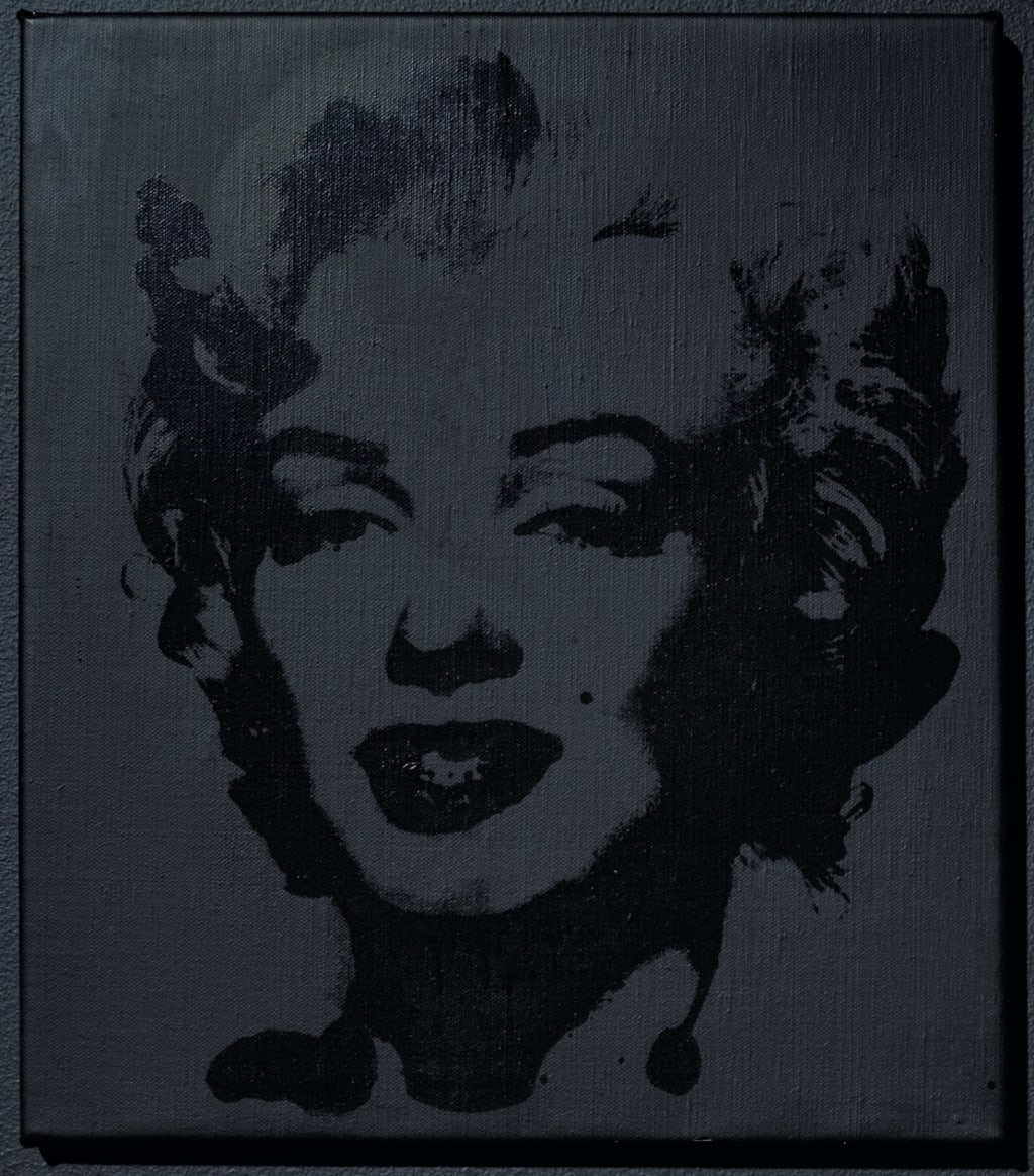
On the other end of the spectrum, Andy Warhol’s response to Sturtevant’s repetitions of his work could be characterized as detached amusement and magnanimous tolerance. He permitted her access to his studio and use of his silkscreens in order to create her repetitions of his Flowers and his Marilyn. Both images became prominent series in her work, particularly the Warhol Marilyn, which Sturtevant repeated over thirty times between 1965 and 2004.
The idea of repetition, both by himself and others, actually fascinated Warhol. “I think it would be great if more people took up silkscreens so that no one would know whether my picture was mine or somebody else’s,” he was quoted as saying, an attitude which most likely informed his response to Sturtevant’s repetitions. On his own work, he once said that he “liked the way that repetition changed the image.” In her prose-like lecture entitled “Inherent Vice or Vice Versa,” Sturtevant said that “repetition is difference,” a statement which closely resembles Warhol’s.
Rather than interpreting Warhol’s benign approach to her work as a sign of aesthetic affinity, Sturtevant read it as indifference: “Everyone says, ‘So, Andy really understood!’ Well I don’t think so. I think he didn’t give a fuck. Which is a very big difference, isn’t it?” As Oldenburg’s anger arose from understanding, Sturtevant believed she and Warhol exhibited fundamental differences in their approaches to the importance of repetition, the surface of an image, and the purpose of an icon.
She thought that Warhol’s series were not repetition, they were simply “repeated.” This difference implied a vapidity on his part, a banal obsession with the appearance of things, rather than her focus: the all-important understructure, or the content, of the image. Nowhere is this disparity clearer than in Sturtevant’s rendition of Warhol’s Marilyn.
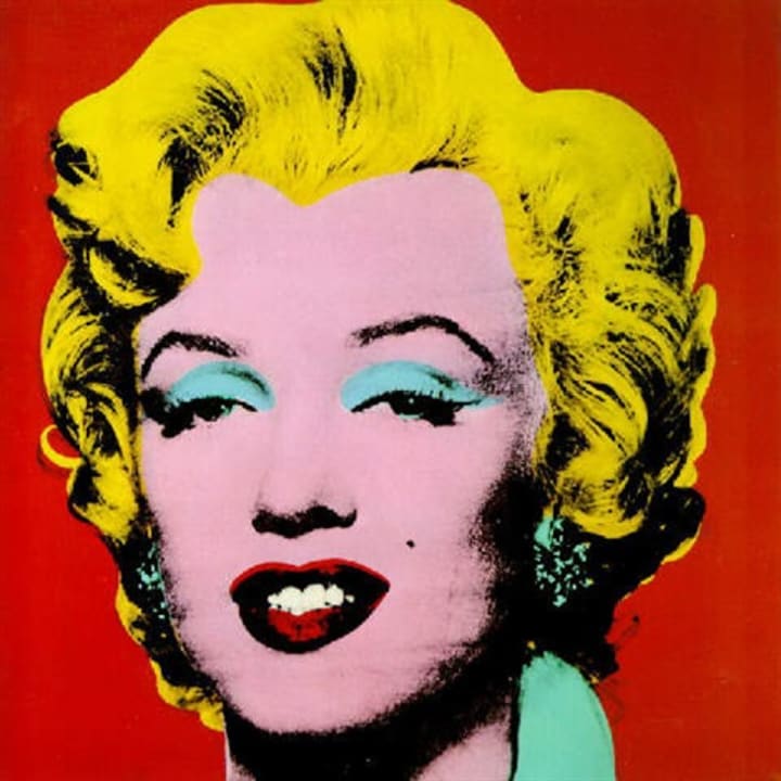
Warhol created his original Marilyn (1962) just weeks after Marilyn Monroe’s tragic suicide. He capitalized on the public’s interest, using a publicity photo from one of her films to create his silkscreen. In true Pop Art fashion, his reproduction of her image served to further the impact of her public image. Even with its blunt outlines and haphazard color application, the image created is immediately recognizable as the popular starlet – a viewer would look at his image and say “That is Marilyn Monroe.”
Through its frequent reproduction in Warhol’s studio and its prodigious dissemination through varied media, Warhol’s original Marilyn participated in the building of Monroe’s public image, reifying her iconic appearance and fanning the flames of her cult-like celebrity worship. His Marilyn is less a rumination of the concept of identity than a contribution. To read a deeper meaning would go against Warhol’s artistic guidelines: he liked to keep things close to the surface. “If you want to know all about Andy Warhol, just look at the surface of my paintings and films and me, and there I am. There is nothing behind [the surface],” he said. Sturtevant definitely agreed, saying often that his “brilliance” lay in the simplicity of his surface image.
But in an almost predictable fashion, Sturtevant’s Warhol Marilyn series departs drastically from the original. Due to the original’s popularity, one cannot look at Warhol Marilyn (1965) and think anything but “Oh that’s a Warhol.” With this step of separation, Sturtevant refused to participate in the building of Monroe’s celebrity. Her image, unlike Warhol’s, did not capitalize on the tragedy of Monroe’s death – that was relatively old news by the time of its creation. Rather, Sturtevant used her Warhol Marilyn to disrupt what Patricia Lee calls the “consumer spectacle” of the original.
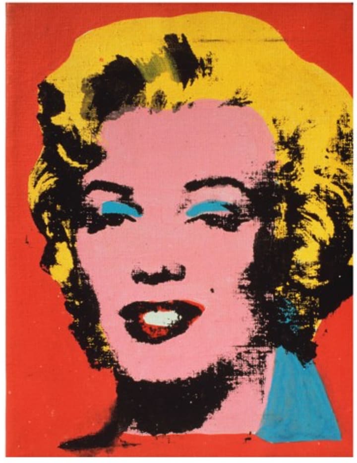
Especially in comparison to the original, but even alone, the unique nature of Warhol Marilyn is clear. The less-experienced Sturtevant produced a hazy image with poorly matched color fields. The boundary between the image’s cheek and hairline fuzzes into a dark smudge. Thin commas of turquoise sit haphazardly above the Warhol Marilyn’s eyes, just barely mimicking eyeshadow. The image’s surface is further flattened by the angry, sloppy smudge of red that slashes across its lips. This image does not glorify pop culture: it lambastes it, showing the dissolution of the known image in the hopes that it will convince the viewer to more critically examine their reaction to the originals of both Warhol and the media.
In her prose piece “Michael Jackson was my Lover,” Sturtevant wrote the following as a treatise on fame and the image.
Fame most certainly transforms a person to object. The energy of millions of fans, placing their identity on the object of their transgressive desire, creates a hollow figure that is to be filled with hot yearning for fame, attention, money and a fantasy of klieg lights beaming while you sing, play or shout. But this tight focus eliminates the discipline, intense work, talent and the anguish of fear that wraps around fame.
Her message is clear. Unlike Warhol, she found no enjoyment in the creation or the exploitation of celebrity. That her art would then further participate in such behavior would be counterproductive to her professed opinions. Her Warhol Marilyn can then only be understood as a critical examination of the destructive powers of celebrity and image.
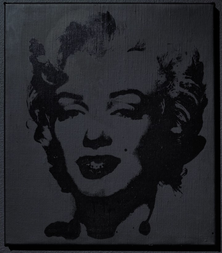
The principal thinkers on Sturtevant all attempt to place Sturtevant the woman within her Marilyn works, particularly the unsettling finale to her Warhol Marilyn series, Warhol Black Marilyn (2004). This monochromatic image is the only iteration that does not have a passable twin in Warhol's oeuvre. Lee labels the Warhol Black Marilyn as a gendered ‘avatar’ for Sturtevant’s career. Eleey takes this a step further, describing the image as “the logo for the one-woman société anonyme that Sturtevant herself had founded.” He continues to attempt to place Sturtevant, as a female artist, into a narrative artificially constructed from the handful of female figures she includes in her five decades of work.
These instincts, though evocative, are misguided and run the risk of becoming the newest fallacy attributed to the already-maligned artist. Sturtevant spent the overwhelming majority of her career stolidly erasing her presence from her art. Anne Dressen, the curator at ARC Paris, notes that Sturtevant not only erased her own gendered first name (Elaine) from all public creation, but also refused to conform to any gendered determination in her art, instead allowing her figures to float ambiguously through her art as she pleased. After such a clear refusal to restrict herself or her figures to a category, to pigeonhole her identity posthumously would be unfortunate.
For further proof of her total non-self-relation to the Warhol Black Marilyn, one need only look to her prose piece “Anonymous and Autonomous,” which continues the themes of self-erasure and the vapidity of fame first introduced in “Michael Jackson was my Lover.”
The fear of presenting the self,
the fear of ‘being there,’
this fear of an interior self that
is only outside;
knowing what we are,
what we have become,
with no time except
to hate,
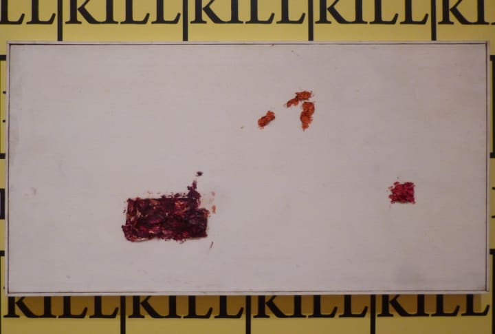
to kill,
to be stupid.
Our powerful and dominating
cyber fold is defeated only by
death:
our ultimate anonymity,
our ultimate autonomy.
All this and more
creates a suffocating
desire to pack a small bag
and go elsewhere.
To this point, it could be argued, her words propagate the hypotheses of the aforementioned writers: That Sturtevant has produced all her Warhol Marilyns out of a feeling of kinship with the tragic figure. Marilyn Monroe found an escape from her true self in the banality and glamour of the surface, the newfound fame and recognition. The Warhol Black Marilyn, then, represents Sturtevant’s desire to escape the vapidity of fame: just as Marilyn Monroe found her escape through the autonomy of death, Sturtevant found her escape through anonymity. But the illusion of these thoughts’ validity is shattered by the poem’s conclusion:
But this is not
the way to go.
With certainty,
this is not the way to go.
This is not the way to go.
With these words, the Warhol Black Marilyn becomes another artistic conceit, and not her identity as an artist. The dark conclusion of her stories tells a different story, brutally but respectfully acknowledging the understructure of Marilyn Monroe’s life and death.
After Claes Oldenburg's dramatic reaction to her repetition of his Store, Sturtevant did in fact pack a bag and flee to France with her husband and children. For more than ten years, she said she played tennis and did not think about art. One wonders why she returned.
Sources:
Cotter, Holland. “Taking Copycatting to a Higher Level.” New York Times, November 13, 2014.
The Editors of Encyclopaedia Britannica. “Ethelred the Unready.” Encyclopaedia Britannica, https://www.britannica.com/biography/Ethelred-the-Unready. Accessed December 15, 2016.
Eleey, Peter. Double Trouble. New York: Museum of Modern Art, 2014.
Hainley, Bruce. Under the Sign of [sic]: Sturtevant’s Volte-Face. Semiotext(e). 2013.
Hochdörfer, Achim. “From Street to Store: Claes Oldenburg’s Pop Expressionism.”
“Interview with Elaine Sturtevant.” Conducted by Hainley, Bruce and Lobel, Michael. New York, Archives of American Art. July 25 and 26, 2007.
Lee, Patricia. Warhol Marilyn. London: University of the Arts London. 2016.
McNelis, Ashley. Interview with Langston, Ingrid. “Sturtevant: The Troublemaker.” New York: IFAcontemporary. February 20, 2015.
Schjeldahl, Peter. “After Image.” The New Yorker. November 24, 2014.
Steinberg, Leo. “Jasper Johns: the First Seven Years of His Art,” in Other Criteria: Confrontation with Twentieth-Century Art. New York: Oxford University Press, Inc. 1972.
Sturtevant, Elaine. The Razzle Dazzle of Thinking. Paris: ARC / Musée d’Art modern de la Ville de Paris. 2010.
Wagner, Anne Middleton. “Jasper Johns’s Flag,” in A House Divided: American Art since 1955. California: University of California Press.
About the Creator
Reader insights
Outstanding
Excellent work. Looking forward to reading more!
Top insights
Eye opening
Niche topic & fresh perspectives
Expert insights and opinions
Arguments were carefully researched and presented
On-point and relevant
Writing reflected the title & theme
Easy to read and follow
Well-structured & engaging content
Heartfelt and relatable
The story invoked strong personal emotions
Masterful proofreading
Zero grammar & spelling mistakes
Excellent storytelling
Original narrative & well developed characters
Remembering the rink
If you were there, you’ll never forget it. For decades, Durham Ice Rink was at the heart of the city’s social life. From Friday night ice discos to crowds roaring on the Wasps every Sunday, not to mention a proud history of figure skating and speed skating, the riverside rink was the place to be.
By Andy Potts5 days ago in Art
Can a Manglik Marry a Non-Manglik Person? Myth or Fact?
What is Manglik dosh? Manglik dosh is an astrological condition in Vedic astrology, also referred to as Mangal dosha, Kuja dosha, or Chovva dosham. It happens if a person's natal chart has Mars (Mangal) in specific positions. It is thought that the illness has a big impact on marriage and other areas of life.
By Vedic Meet 3 days ago in Art


Comments (3)
This was so good!! I hadn't heard of Sturtevant, so I'm really glad I got to learn about her through this piece. The concept behind her art is so interesting!
This was so excellently done.
I’m so glad I waited to read this. I always like to consume your stories at my leisure, so I have time to digest them. You do not have the “fast food” quality of most writing published online, and I admire that. Of course, with this being written for a class at Yale, that’s quite a different audience than Vocal. Don’t hate me, but I do think she was just a copycat. Whatever I’m supposed to get out of her work, I don’t. I think I’d have Warhol’s same reaction. It is “Anonymous and Autonomous” that has me crying.