
Photography - From Lackluster to Legendary
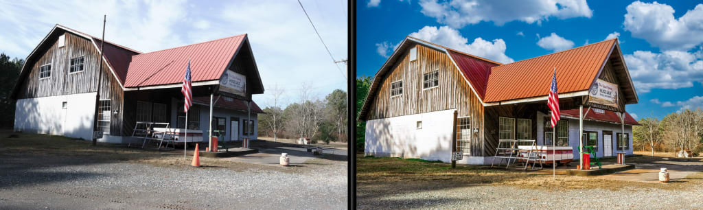
Before and After

Are you happy with your photography?
Are you ever disappointed with an image you took?
Do you look at other photographer's work and wonder why yours don't look that way?
Background
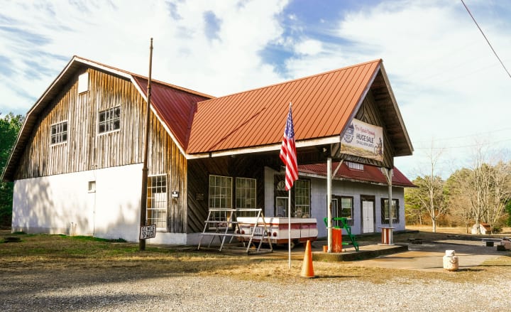
I have been a photographer for about twenty years and have processed tens of thousands of images. And although my skill with a camera has improved, my skill with post-processing and technological advances have made the biggest difference. Today, I want to walk you through the post-processing of one of my images. From the before to the after you can see above.
If you spend any time reading about photography, you will hear the phrase, "Get it Right in Camera." And while I don't disagree with that, I don't agree with those who look down their nose at post-processing. They call it fake. I call it art. Not many people know this, but the great photographer Ansel Adams spent much more time in the darkroom than he did in the field. And I bet he would have had a blast if he could have used Photoshop.
The thing is, despite what you do in the camera, everyone post-processes their images. Even if you set your camera to JPG and don't do anything to it, the camera has processed it for you. I prefer to do that myself. And although I shot in raw format for many years, I have since come to shoot in JPG. I use minimal processing in-camera, but the technology in newer cameras is such that I no longer feel the need to shoot in raw.
Fake is a relative term. I point to the classic on-location portrait session where the model is in sharp focus, but the background is blurred, what they call bokeh. Were those mountains blurry in reality? No. Is that fake? It's all relative. To wind up the editorial portion of my article, I recall a photographer who was looking at one of my images. He asked me if the sky was real. I told him no, those were just pixels on his computer screen. The real sky is outside.
Getting The Shot
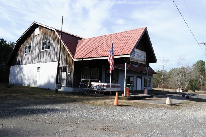
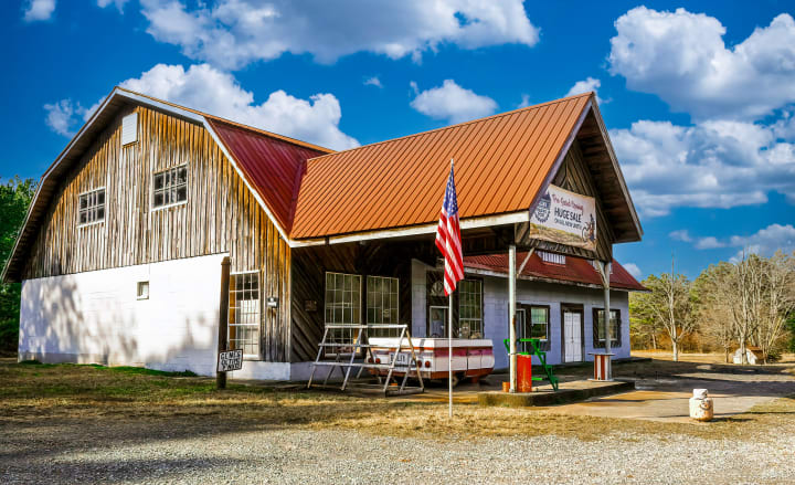
So, as shown above, below is the image I started with. I was driving through North Georgia on a winter's day. There was light snow on the ground at higher elevations. I had just left Amicalola Falls, where I had hoped to find ice formations, but it was just a little too warm. I decided to head up to the "Apple Capital of Georgia," Elijay.
Apple season had long passed as it was early February, but the road I was on went by dozens of Apple orchards and closed fruit stands. It was a drab and mostly grey day, but I made a note to come back through in the spring and again in the fall during apple season.
But this place caught my eye, with its barn-like architecture, the red roof, and the American flag out front. Plus, the first blue I had seen in the sky all day was peaking out in the background. As with many images, proper exposure is a balancing act. I wanted as much shadow detail under the front as possible but didn't want to blow out the white wall. The sky didn't concern me too much. I knew I could bring it out, and if need be, replace it.
The image I came home with was not the one I envisioned when I pulled off the road, so it was time to get processing.
I have used virtually every piece of post-processing software, and I own copies of most. But for overall efficiency as well as the quality of the finished product, I always start in Adobe Lightroom. That is where my catalog of 50,000 active images is stored and a second catalog of 270K offline archived photos.
For the majority of my images, that is all I need. If I need to do more work, I will use Adobe Photoshop, one of the Topaz products, Luminar, and a host of lesser-known and more specialized products. So, once my image has been imported from the card into Lightroom, I get started processing.
The Beginning
The first thing I always do is to use Lens Correction and Transform to get the image to what I consider the starting point. I accept defaults for both of those. Then I use the crop tool to crop and straighten.
Pro Tip: If you want to mark yourself as an amateur, just leave the horizon crooked.
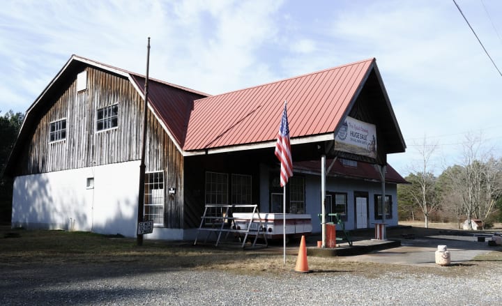
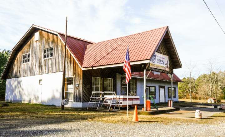
Here is the cropped and straightened image. Lens Correction didn't do much, but Transform straightened up a bit of the architecture. There was no true horizon, but I used the building's vertical lines to straighten the image. I also cropped a bit of the right side and most of the gravel lot in the foreground.
In hindsight, I should have shot wider to give me a bit more room at the back. Always shoot a bit wider than you think you will need. With today's modern cameras, you can crop in a lot without quality loss, and when you start straightening an image, you will lose some around the edges.
There are many presets you can use, and I have both created and purchased many. They will give you one-click results that are often very good. Worst case, they can give you a starting point or an idea for processing. But for this image, I wanted to walk you through the entire creative process so everything is done manually.
The first thing we need to deal with is the light. If the light isn't right, everything else will fail. There are as many ways to deal with this as there are photographers. Curves, sliders, exposure, whites, blacks, contrast, shadows, highlights - the variables can be mind-boggling. But this is how I have done it for years, and it works for me. Most tools have almost identical sliders, so these guides should work for everyone.
The Basics
In Lightroom, the sliders in the Basic panel are laid out so that going top-down will work for many images, and that is what I generally do, but with each slider, I know in the back of my mind what is coming next and consider that. For instance, I know I will do most of my exposure compensation with the Whites and Blacks sliders, so I go easy on the Exposure slider until later.
A word on exposure in general. When I am shooting, I turn on the setting that gives me clipping warnings. Refer to your camera manual to learn how to do that. Most of us call these blinkies, as the LCD will blink where there are blown highlights. I also do the same thing in processing, although I will allow a little clipping in the whites in certain circumstances, and I'm not afraid of black shadows.
But, I start at the top with White Balance. Even though I shoot in raw, I am still able to make minor corrections in White Balance. I tend to like a scene like this a bit warm, so I pushed that slider to the right just a bit. Too far, and the trees start to look yellow.
This image was pretty bright to begin with outside the shadows, so I left Exposure alone. I typically like to push Contrast a little, but that was wreaking havoc with the shadows, so I only moved it a touch. Processing is an iterative process, so I will find myself moving up and down the panels multiple times to get it where I want it.
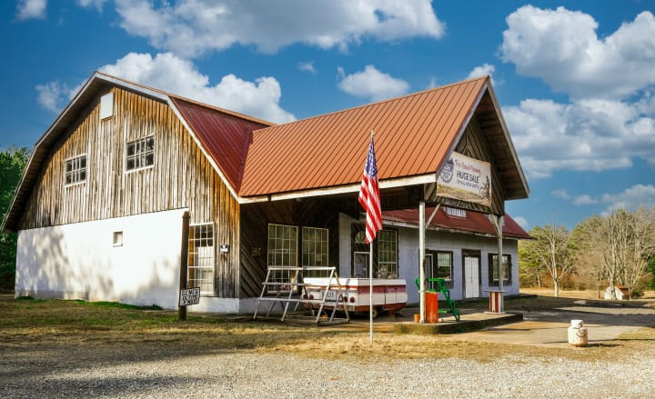
I left Highlights alone, although I knew I would be back there before I was done. Before I got down to business with the Whites and Blacks, I wanted to bring out those shadows, so I slid that one quite a bit to the right. This gave me the following image. You can see there is already some improvements.
I usually do most of my work with exposure and contrast from the Whites and Blacks sliders. First, I make sure the clipping warnings are turned on. This is like the blinkies in the camera, but clipped whites will show as red and clipped blacks with show as blue.
Only a little of the deepest shadow was clipped, so I slid the Blacks until more of the shadows fell to black without getting too dark in the wood on the side of the barn. Next, I started moving the Whites slider to the right until I saw clipping in the white wall's brightest area. There was already a bit of clipping on the trailer from the sun reflecting off of it. In many images, it will be clipping in the clouds that signify I have gone far enough.
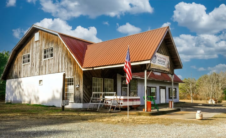
At this point, I have the exposure pretty much where I want it, so I go back through all of the sliders under Tone, making minor adjustments until I am happy with the results. I will turn the clipping highlights on and off so I can see what I am doing. The final results of that work are shown below. Now, we are getting somewhere.
Clarity and Color
Next, I continue into the next section of sliders labeled Presence. Texture and Clarity are hard to describe and are both easy to overdue. The best way to use them is to take each and slide all the way left and right. This gives you a feel for what it is doing. Then, re-center it and make tiny adjustments, checking areas at 100% until you have a look you like. You will always be moving them to the right unless you are trying to soften an image. Either of these may introduce some noise, especially in those shadows, so be prepared to deal with that.
Most people understand saturation, and that one is definitely easy to overdo. So unless I really want to push all colors in an image, I leave that one alone. But I will move Vibrance to the right. It does the same thing but leaves specific colors, like reds alone, so the image doesn't get crazy. Also, I keep in mind that I will deal with individual colors in the next section. Here is the image after adjusting the Presence sliders.
Hue, Saturation, and Luminance
Next comes the HSL/Color section. HSL stands for Hue, Saturation, and Luminance. Hue determines the overall hue of the image in a similar way that White Balance does. Is the yellow more orange or yellow? Does the blue run more aqua or deep blue? Unless you have an excellent eye for color, these sliders should be used in moderation, if at all. I do almost all of my work in Saturation and Luminance. Having said that, in this image, I pushed the Reds toward the left to reduce the orange and the Greens to the right to lessen the yellow.
Saturation does the same thing as in the Basic panel, but you get to choose individual colors. Again, it is easy to get heavy-handed here. Also, I will do some things in Luminance that gives the impression of more saturation without actually doing so. For this picture, I want the red to pop, so I pushed it pretty far to the right and added a touch of orange. I also moved green to the right to bring out what little green I had to work with. Finally, I slid the yellow a bit to the left to remove some of the yellow from the wood and trees.
The Luminance slider is where I get the most bang for the buck. Luminance is simply the brightness of the colors. Do you want the reds really bright or very dark? In this case, I went a little dark just to bring out the reds in the flag. Darkening orange actually brought out a lot of color in the roof. I went dark on green again to try and bring out a little color in the trees. This had the added benefit of making that rack by the trailer pop.
One trick I use with Luminance often is to help the sky, and this image is a perfect example. Pushing the blue slider far to the left not only helped the flag but gave me some color in the little bit of blue I had in the sky. The jury is still out on whether I will replace the sky.

Final Adjustments
That does it for Lightroom right now. I will often do a little sharpening or noise control in Lightroom, but if there is much of a need, I use Topaz DeNoise AI. It is one of the best packages to handle noise, and I think it does an excellent job of sharpening at the same time. If you need a lot of sharpening, Topaz also makes Sharpen AI. At any rate, I will be back in Lightroom at the end for any required final touch-up.
Next, I will either go to Photoshop or Luminar AI. I use them both for removing objects and replacing the sky. Photoshop is better at both, so that's what I will use now. Luminar has some lovely presets if I was going that route. It also has some pretty good processing, and enhancement features, and many people use it for all of their processing. I only use it for specialized needs.
There are a few things I want to remove, and I may replace the sky. I press Ctrl-E to make a copy of my image and send it to Adobe Photoshop. This isn't going to be a Photoshop tutorial, so I'll just walk you through what I did. There are several elements in the image I find either distracting or don't add anything, so I will remove them. These include:
- The wire in the upper right.
- The old tire in the yard.
- Pipes and wires on the white wall.
- Part of the old flagpole, leaving the bottom with the Pnut sign
- Misc debris around the building
Normally, I would remove the propane tank, but since it is wearing a hat and smiling, I'll let that go. I may take him out later if he stops smiling. One thing to remember is if you are removing an object, don't forget to remove its shadow.
While I was in Photoshop, I took another look at the sky and decided to replace it. It was nothing fancy, just a blue sky with white puffy clouds and similar lighting to what was in the original.
We're just about done now, so I will run it through Topaz AI to give a touch of sharpening and remove the noise in the shadows. If you look in the dark wood around the window, you will see a lot of improvement in the texture.
A final run-through Lightroom with minor adjustments to lighting and contrast, and I'm done.
The Results
Here is another look at the before and after image. While I could have done a better job in camera, I would never have achieved the final result without processing. I hope you found this article helpful, and happy shooting.

If you enjoyed this article, please give m a like by clicking the Heart, and if you really liked it, consider dropping me a tip below. Thanks for reading.
About the Creator
Darryl Brooks
I am a writer with over 16 years of experience and hundreds of articles. I write about photography, productivity, life skills, money management and much more.
Keep reading
More stories from Darryl Brooks and writers in Photography and other communities.
Capturing Magic
In the world of photography, timing is the key to everything. While skilled compositions and technical proficiency are undoubtedly crucial, the perfect lighting can create the perfect photo. Nowadays, we can determine any light ourselves and are no longer dependent on any natural light source, thanks to the developed technology. We can turn every day into a night by using the right filters. And we can illuminate every night to be seen as a day. A typical process, especially in the film industry.
By Krishan Mubashar14 days ago in Photography
Exploring the Best AI-Based Video Creation Tools
Artificial Intelligence (AI) has revolutionized many industries, and video creation is no exception. With the advancements in AI technology, creating high-quality videos has become more accessible and efficient. In this blog post, we will explore the best AI-based video creation tools available in the market today and how they can benefit content creators.
By Arnar Dadi3 days ago in Photography
The Golden Valley
The difference between light and dark could be as quick and simple as a flip of a switch, the drawing of a curtain, the opening of one’s eyes. It could be more gradual like the slow adjustment of the diaphragm on a microscope, the turn of a planet on its axis, the growing light as you approach the end of a tunnel. A flicker in the dark, a steady glow in the distance, a flash in the night sky.
By Alyssa Nicolea day ago in Fiction


Comments
There are no comments for this story
Be the first to respond and start the conversation.