
Digital Manipulation 101: How to Edit Photos with GIMP
Tips and tricks to tweak or transform your photos
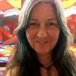

Photo editing and digital manipulation. I've been playing with them for over twenty years now. To be clear, I am not claiming expertise - like I said, I've been playing with editing photos on computers. Anything I've learned about the process has come from opening a digital manipulation program, opening a file within that program, and clicking around. And I have learned a few useful things.
I started out with Photoshop, and used it happily for several years. I tried Corel Draw, but didn't like it. These days I play with pictures on GIMP.
GIMP is the Gnu Image Manipulation Program. It has all the tools you need to tweak your photos to make them look a little better, or twist them into something else entirely. GIMP is open source, and very similar to Photoshop in functionality. You can download GIMP from the official web site: https://www.gimp.org/downloads/.
I'm going to show you a how to use GIMP to improve your pictures with a few basic photo editing techniques.
Let's take a quick look at the GIMP work space:
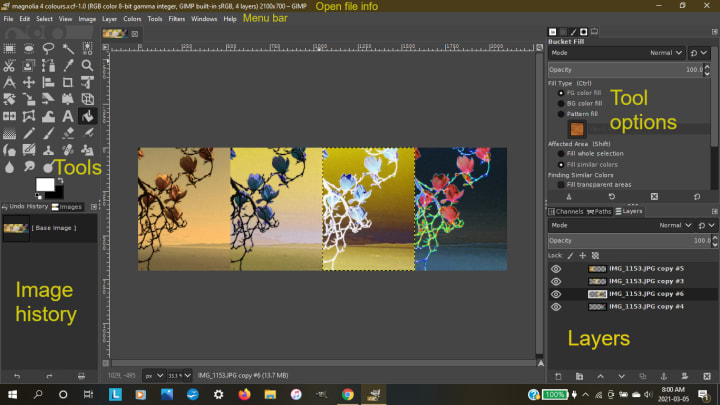
I will mainly be referring to the Menu bar, Tools, Tool options, and Layers.
So you've got your photo open in GIMP. Where do you start? By duplicating it.
D0 not make any changes to your original photo! Duplicate it, and then if you mess up you can always start again. In GIMP, with your chosen file open, either go to 'Image' in the menu bar and choose 'Duplicate' from the drop down menu, or use Ctrl-D on the keyboard. (As with many programs, operations can often be accomplished in multiple ways.)
Next step is to make sure your picture is the right size with an appropriate resolution. Go to 'Image' in the menu bar again, choose 'Scale image'. Set the image size and resolution in the dialog box. What you set them at will depend on what you want to use the picture for. If printing, make sure the resolution is set to at least 150 ppi (pixels per inch). 300 ppi is better.
Vocal recommends high-resolution pictures of at least 1280 x 720 pixels, so I use 300 ppi here. I keep the photo dimensions fairly close to those suggested, especially the height (720), so that my photos will be entirely visible on the screen at once.
One more thing to do before you get creative - within your copied, resized picture, in the 'Layers' area, right click on the layer you want to adjust (there will probably be only one layer to start) and scroll up to choose 'duplicate layer' from the list. Do this anytime you want to make more changes but don't want to lose what you've done so far. It just makes life easier. You can undo most actions with Ctrl Z, but a backup is always a good idea.
Time to edit that photo!
The first thing I do to a lot of digital photos is based on something I learned from developing film: many pictures are improved by being slightly darkened and having their contrast increased. Brightness and contrast are together in GIMP, under 'Colors' in the menu bar. You can see the difference it makes in my selfie below. The first image is the original, the second I've darkened and added contrast to. With some images, that tweak might be enough to make your photo usable. Or it's the start of the fun.
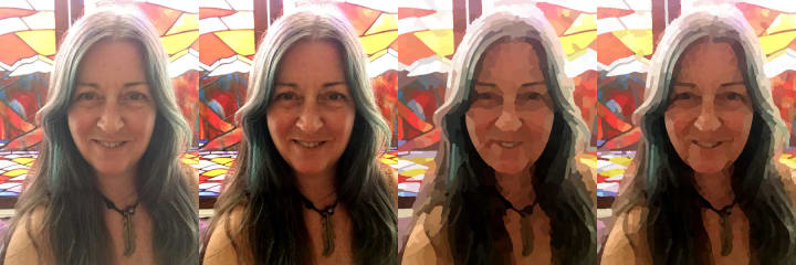
Filters can be used to give a photo various artistic and other effects. For my profile picture, I used the 'Waterpixels' filter. Go to 'Filter' in the menu bar, down to 'Artistic', and over to 'Waterpixels'. A dialog box will open in the tool options area of the workspace, in which you can change the size and regularity of the waterpixels. Play with the sliders, see what you like. The third picture above is a little too distorted for me. The fourth is what I settled on.
Choosing what to settle on can be the hardest part of photo editing. Options are almost endless. There are a lot of filters in GIMP. Some affect the image very subtly, while others change it dramatically, or even make it unrecognizable. The best way to learn them is to play with them. Open up a picture, duplicate it, and apply away...
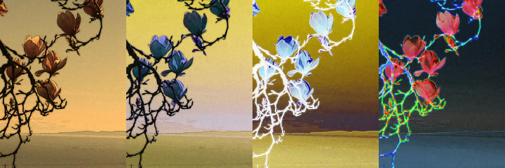
A filter that I've been using quite a bit lately is the 'Cartoon' filter. One of the issues I've been dealing with is that I mainly use my cell phone for photography, and I want to print the resulting images on blankets. The size and resolution are just not there. Simply increasing the size of an image does not make it usable at the larger size. 'Cartoon' filter to the rescue!
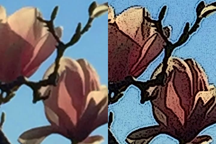
As you can see, it doesn't exactly sharpen the image, but it gives it an artistic, almost screen-printed look that works.
With this image there were a couple of other steps I went through before applying the 'Cartoon' filter.
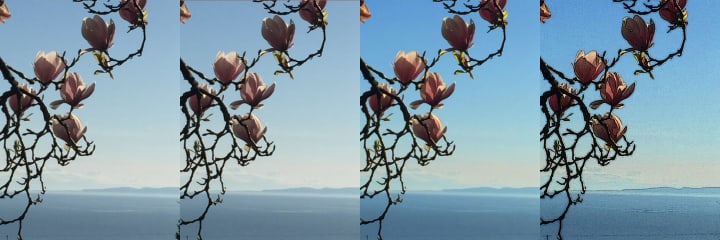
You can see that in the first picture there is a bit of a tree in the lower righthand corner. I removed it with the 'Clone' tool, the icon for which looks like a rubber stamp. The 'Clone' tool is great for removing unwanted objects, but can be tricky to use effectively, i.e., inconspicuously. What it does is copy one area of the image to another area. If the areas are much different in colour or texture, the change will be obvious.
To use the 'Clone' tool, select it, then press 'Ctrl' and click the source you want to duplicate. It should match your target area as much as possible. Go to the object you want to disappear, click and hold and move the cursor carefully. Undo if necessary, and try again. Every time you release the cursor it will return to the same starting point. To properly cover the unwanted object, you may have to create multiple starting points to clone from. You can change the brush size, which may help give you a better result.
For the picture of magnolias, after removing the tree, I amped up the colour intensity. This involved using one of my favourite colour dialog boxes, that for hue and saturation. Under the 'Colors' tab, go down to 'Hue-Saturation...' In this case I left the hue alone, but increased saturation and decreased brightness.
Final step was applying the 'Cartoon' filter. It is found in the 'Artistic' list. When you click on it, a dialog box will appear in which you can adjust the 'Mask radius' and 'Percent black'. I used the default settings in the above picture.
A more complicated procedure is removing an object from its background, not to erase it, but to use it. The more uniform in colour both the background the object are, and the more different from each other, the easier this will be. The tool I have had most success at this with is the 'Fuzzy Select Tool'. It looks like a magic wand - a stick with a star on the end of it - and selects 'a contiguous region on the basis of color.' There are basically two ways to use it: select the background, or select the object.
Let's take a look at these methods with this picture of a raven in flight:
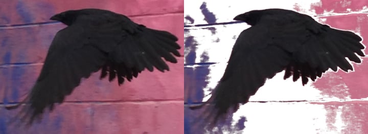
The left-hand image is the cropped original (yes, the concrete wall really is purple and pink; that's part of a mural). With that as my starting point, the first step was duplicating the layer. That way I would have it to go back to, and could duplicate it again for each try. Or at any step I'm happy with, and want to keep as a base for more manipulation.
After duplicating your base layer, right click on it and add a new layer from the options that come up. Fill the new layer with white or a colour that contrasts with those you are working on. It will be a background to work against, so you can see what you're doing. Make sure your duplicate layer is above the solid colour layer, dragging it up if necessary.
Add an alpha channel to your layer. (Right click on it and choose 'Add Alpha Channel.') This gives it the possibility of having transparent pixels.
Choose the 'Fuzzy select' tool. To remove the background, click somewhere in it and see what pixels are selected. Adjust the 'Threshold' in the dialogue box as necessary, to choose a wider or narrower range of colours. Or simply click on a different colour in the background (one very different from those in the object) and see what effect that has. Use Ctrl X in the selection to remove it and reveal the white layer below. Repeat as necessary until all the background is removed.
You can see in this image that the blurred wing tip is almost the same colour as the wall behind it, making complete separation tricky.
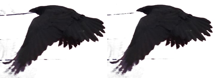
If there is a small area where the background and object are very similar in colour, the 'Eraser Tool' can be used to make a break between them so one can be selected without the other. If the area of connection is large, this is difficult and not usually practical.
On the other hand, once the background near the object is safely removed, areas of it which remain can be easily Erased with a large brush setting.
In this case, since the raven has a lower range of colours than the background, I decided to try selecting it rather than the background. This worked fairly well, but did include a few unwanted lines:
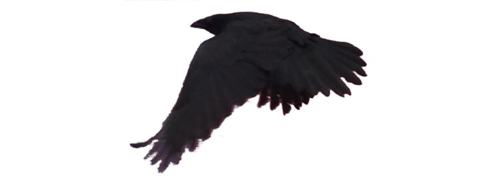
To get to this point, I used the 'Fuzzy Select' tool on the raven. Once I was happy with the selection, I copied it with Ctrl C and pasted it into a new layer with the 'Edit' dropdown menu. The top unwanted line I was able to remove with the 'Fuzzy select' tool, but the lower one was too similar in colour to the wing feathers, so I used the 'Eraser' tool to make a separation. 'Erase' the rest, and the raven flies alone!
So that's enough of the useful stuff - the rest is purely for creative fun. Like playing with the various 'Colors' options. Just get in there and slide your hues through shades both lurid and pleasing, warm your tones or turn them grey, and invert to bizarre new colour combos:
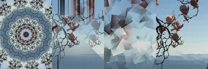
Or play with Filters. As mentioned before and illustrated below, their effects can be subtle or totally transformational. Below I've used 'Kaleidoscope', under 'Distorts'; 'Illusion', under 'Map'; 'Cubism', under 'Artistic'; and 'Simple Linear Iterative Clustering', also under 'Artistic', and with an effect much prettier than its name:
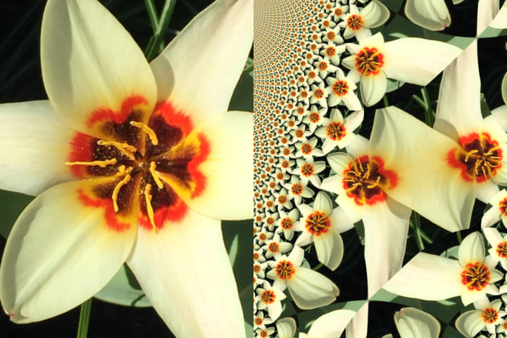
All of the filters have parameters that can be adjusted to give a wide range of effects. Most of them are totally safe. Most. There is one filter that can crash the program: 'Fractal Trace.'
Beware 'Fractal Trace'! It lurks in waiting off 'Map', and there be hidden dangers!
Seriously, though, I strongly advise that before adjusting any parameters of 'Fractal Trace', you save and close any other images you have open, and make sure the one you're working on is saved up to that point. If any of the options in 'Fractal Trace' are changed too much (and 'too' isn't 'very' in this case) the program will experience a 'fatal error'. It will crash.
It can give you some cool results, though:
So you've avoided the 'Fractal Trace' death trap, and have an image you love and want to keep. On to final steps: saving and exporting your edited photo.
Hopefully you've already saved it at some point of the process. GIMP saves multi-layered files with the extension .xcf. When you are done manipulating your photo it needs to be exported and changed to a format that other applications can use. Many options are available.
The ones I usually use are .jpg and .png, usually the former. Png (portable network graphics) files support transparency. That's the format I would use to export the above raven, separated from its background, with all unused layers either deleted or made invisible. It could then be used over top of other images.
So that's it, a few tips for editing photos with GIMP, from opening to exporting. I hope you've found them useful.
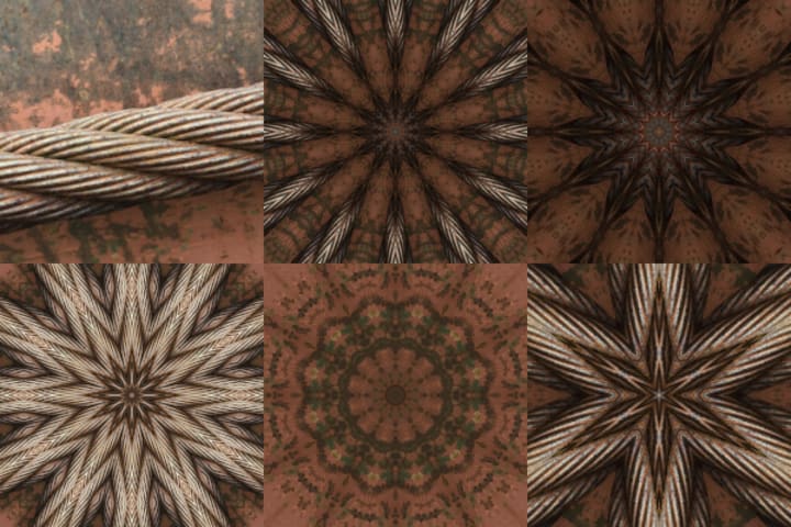
I'm going to leave you with one more 'before and after' series for inspiration: the heavy, rusted cable makes a strong, simple photo, but 'Kaleidoscope' reveals a multitude of beautiful complexities.
Thanks for reading.
Have fun manipulating!
About the Creator
Peri Livesey
An artist/writer spreading my wings.
Keep reading
More stories from Peri Livesey and writers in Photography and other communities.
Iris, Prince Don, and the Phoenix Feather Lantern, Part 2
Iris plummeted off the cliff, goggled at green rushing closer, yelled at herself, and yanked the cord to release her chute. With a jerk she was suspended, and breathed again. The bright purple of Prince Don's parachute spread below her, and hesitantly she pulled at one of the toggles on her own to steer towards him.
By Peri Livesey10 months ago in Fiction
Capturing Magic
In the world of photography, timing is the key to everything. While skilled compositions and technical proficiency are undoubtedly crucial, the perfect lighting can create the perfect photo. Nowadays, we can determine any light ourselves and are no longer dependent on any natural light source, thanks to the developed technology. We can turn every day into a night by using the right filters. And we can illuminate every night to be seen as a day. A typical process, especially in the film industry.
By Krishan Mubashar10 days ago in Photography
Offbeat Places in Malaysia: Travel Secrets
Malaysia is most popular for stunning urban areas like Kuala Lumpur and George Town. In any case, there are such countless odd spots in Malaysia anticipating nature sweethearts and travelers. We've assembled a rundown of 10 mystery objections that make us need to book a pass to Malaysia this exact instant!
By prashant soni7 days ago in Photography


Comments
There are no comments for this story
Be the first to respond and start the conversation.