
We are ready to share popular slide deck visual effects, commonly used design techniques, and ways to put infographics in place in presentations of 2021.
- What are the latest trends in slide deck design
- The evolution of infographics
- New technologies
- Audience engagement
We’ve reviewed the main trends and tendencies of this year from the perspective of graphic design, software and interaction with the audience. Check out our findings so you can upgrade your presentations in accordance with the latest fashion.
Design
Muted colors
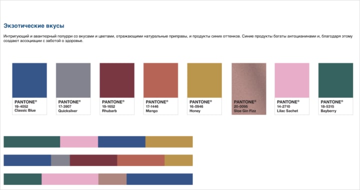
Classic blue was declared to be a color of 2020 according to Pantone. It is described as comforting, giving the sense of confidence, peace and inclusivity. The core color schemes of 2020 are designed in very calm and muted color schemes.
Eco style
Eco, bio, organic — this is a booming trend now for each and every field. It comes to design through using smooth/seamless and “lively” shapes and lines, natural colors (mostly shades of green), and floral decorative elements.
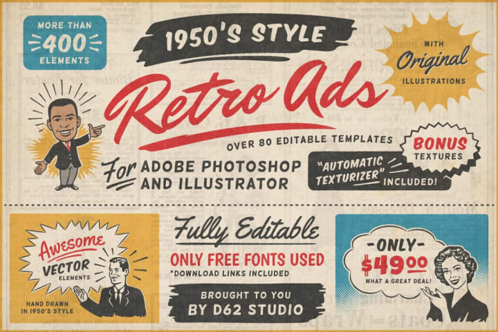
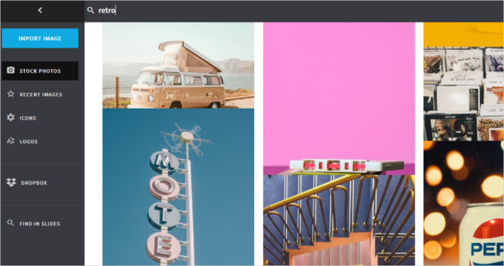
Retro
Another demanded trend nowadays is retro style: 1950s-inspired design, pale colors, minimalistic shapes, and ink. Typewriter fonts also give presentations a vintage look.
3D objects
3D graphics are rapidly developing. Volumetric shapes and objects are a great fit for presenting real estate, cars, gadgets, and technical devices. A realistic look and various angle overview add to the effect of real presence.
3D fonts are also trending now. Perspective settings help to unify the text with the background and to create the cinematic effect. 3D technologies allow us to see the text from a different angle and inevitably draw viewers’ attention.
Gradient
Another latest trend is the gradient - not necesarilly composed of different hues of one color, but also quite often made of contrasting colors. It is used in illustrations, fonts and in the shades, providing the sense of depth and highlighting texture.
Typography
Text design seems to be at the forefront in 2020 — it plays one of the main roles in slide composition. Vertical-, horizontal- and diagonal-oriented fonts are being combined in one slide, so it looks like a poster. It’s separately worth noting that simple fonts in bold are used most frequently.
Images over text
This fancy designer technique known as “the mask” implies placing images over text instead of text over images: the text appears as a window that displays the image. It comes in handy for smooth and uniform backgrounds, and it’s tricky to select the only font color.
Animation
Animation helps to breathe life into the presentation, gives a dynamic look, and definitely catches the viewers’ eye better than static images. That’s why there are numerous ways to use it: animating objects and transitions or adding GIFs. For example, MS PowerPoint suggests inserting 3D models and animate them with the help of Morph transition or inserting ready-made animated objects. Animation provides a various angle overview and better detailing if zooming in.
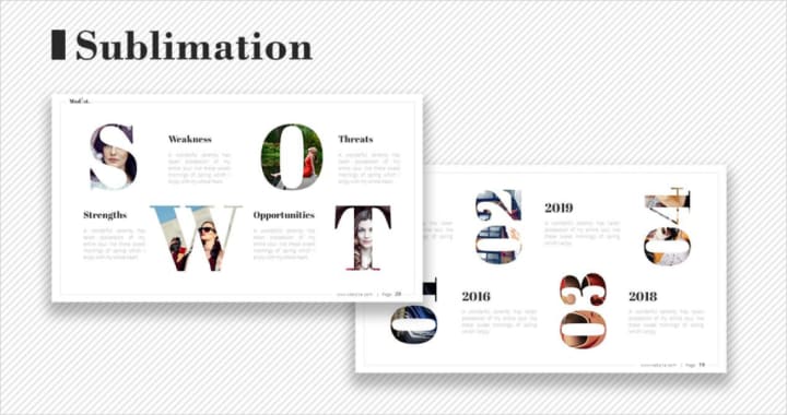
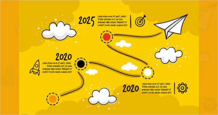
Infographics
Timelines
Data visualization is a vital component of every presentation. 72% of marketers agree that visual content is far more effective than text. They also claim that one infographic post provides a 12% faster traffic increase. One of the most popular tools now is a timeline. It’s a great way to visualize a story, especially to talk about the company’s perspectives in a lively way. Such stories are very popular as they establish an emotional connection with the audience.
Interactive transitions
Scrolling and pagination are the special techniques used in order to make infographics more interactive. Scrolling is a way to place infographics in one long image which is navigated by scrolling. Pagination stands for placing images as a gallery (just like in Instagram feed) so the users swipe to go across them.
Clickability
Another effective technique to engage the audience is adding clickable elements. Users/viewers click on these items out of curiosity and thus get actively involved, which results in better data perception and memorization.
Technologies
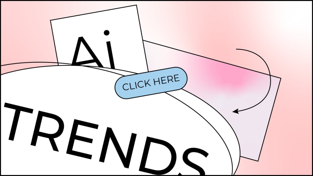
Artificial intelligence
AI implementation in presentation software is a booming trend of past years. For example, MS PowerPoint has been providing auto slide design since 2016. Nowadays, technologies are being developed in the same direction thus releasing more time for designers: AI selects an appropriate color scheme and images to illustrate slides, crops them, works on the composition, conducts translation, etc. A long-awaited launch of Pitch (link — the most effective AI slide design software — is planned for 2020
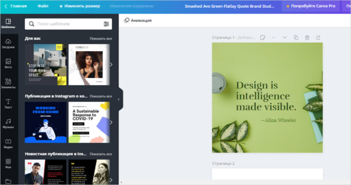
Collaborative editing
Collaborative editing tools are now provided almost in every slide design service. They all offer an option of interactive commenting, which is especially useful during the pandemic and self-isolation this year.
Communication with the audience
Video streams
Video streaming was also in high demand this year because of the self-isolation and remote working regime. Take Prezi: this soft allows you to demonstrate your slide deck in real-time to up to 100 people by just sharing a link. This feature is also provided by Apple Keynote (Keynote Live) и MS PowerPoint (Present Live).
Audience engagement
There are various tricks to keep viewers’ attention: tests and quizzes, sending comments and replies. PowerPoint offers to send reactions during the slideshow and assessing the deck by filling in a small questionnaire. Google slides provide an interactive dialogue box that is used to send questions and comments to the presenter.
Summary
The main visual trends in presentations correspond with the basic 2020 design tendencies such as eco- and retro-style, 3D modeling, gradients, and masking. As for the specific features of slide decks, the most popular features are collaborative editing and video streams as well as various audience engagement tools.
About the Creator
When the Robots Took My Job
This is for RM Stockton's Write Club prompt for the month of April: AI Please allow me to vent. For "college," I went to a scam school that is now closed. We were promised internships that were never spoken of again after admissions, and we were promised help finding jobs. The first time I went to the career counselor's office, she was completely frazzled. She had no idea what to do with us, the film majors. The second time I visited her office, I let her know that I'd found myself a job, and she was visibly relieved.
By Rebekah Conard4 days ago in Journal


Comments
There are no comments for this story
Be the first to respond and start the conversation.