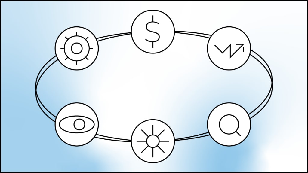
Icons are used to illustrate an object or an action. It’s a kind of universal language that is clear to everyone. Since icons are perceived way faster than words, they speed up data processing and help to highlight the key points. Besides, icons are easily remembered.
Icons may consist of one or more graphic symbols together making up a balanced composition.
A simple example of icons in use is a digital interface. Icons help to leapfrog over the command line — the user only needs to click on the icon to perform an action.
We can find icons not only on a device screen but also in everyday life: sign plates, road signs, and manuals. The use of icons is commonly held in public areas, say, in subway, airports, shopping malls.

Why use icons
1. To structure information
Icons draw attention and guide the audience through the content by visually dividing it and highlighting the key points, thus making it easier to remember.

2. To illustrate
Infographics aim at transforming a great deal of information into a self-contained visual piece. Icons act as paragraph dividers may appear as an element of charts, and come in handy when arranging infographics by sections.

3. To create a unique style
Icons add to designing a memorable style. It helps to make your presentation stand out.
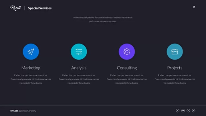
Types of icons & ways to use them
Icons may be classified into the following types: monochrome and circuit, volumetric and flat, with/without color fill.

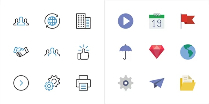

We recommend sticking to the following guidelines when choosing icons for your project:
- Stick to one type of icon. Avoid using different types of icons in one slide deck so your presentation doesn’t look fragmented and incomplete.
- Stand by one style. If the icons come from various packs, their style may look different (line thickness, corners rounding, color scheme, etc.), so it’s better to choose one style and stand by it.
- Stick to one size. Most icons are square-shaped: 8×8, 16×16, 32×32. If changing the size, it’s better to keep the proportion
- Keep it simple. We suggest that you use circuit icons. The fewer elements, the faster and easier to perceive.
- Work on recognizability. The icons should comply with the context and be recognizable. Avoid using ambiguous icons or add a description.
- Choose SVG format. This format allows us to work with the color in PowerPoint directly. In addition, unlike raster JPEG/PNG images, SVG icons are free from distortion if zooming or downsizing.
Where to find icons for your project
Icons may easily be found on the web. There are plenty of quality sources with the latest designers' work updated daily. Such services mostly offer a selection of icons free of charge as well as extended paid packs.
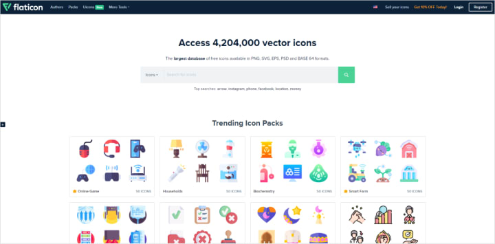
Flaticon
One of the most convenient services. The greater part of the content is free of charge. Icons can be downloaded or by piece or in a pack and filtered by format, color, and size. It’s very convenient. In case you wish to get access to an extended selection with higher quality content and download 1000 icons a day, subscribe for monthly access for €10.
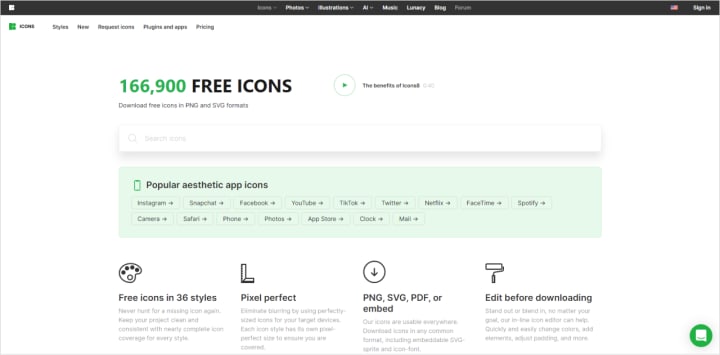
Icons8
A free library with user-friendly navigation and a convenient search tool that allows you to compare and find similar icons: if the icon doesn’t match your style, Icon 8 suggests close analogs. Please note that downloading in SVG format is a paid option.
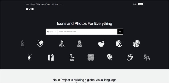
Noun Project
This resource provides more than a million icons. A massive collection with convenient search tools and fast download (but only for registered users). Icons can be used free of charge but only with a reference.
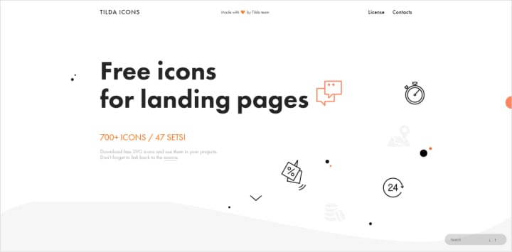
Tilda
A selection of 43 free minimalistic icon sets by Tilda. A great resource, however, be careful and don't use these icons in every project as they are pretty memorable and don’t forget to provide reference.
Iconmonstr
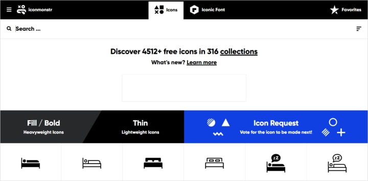
A tiny library with simple monochrome icons in a uniform style - a great fit for minimalistic presentations and interfaces. Free download.
IconStore
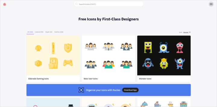
A huge library of 234 icon collections: from minimalistic to decorative. A convenient search tool by categories simplifies the process of finding the desired set of icons.
Iconfinder
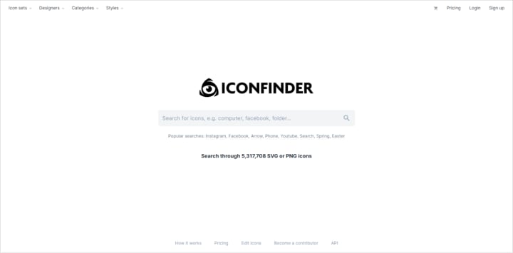
A considerable collection of full-color icons. A free option provides a selection of 17500 commonly used icons. You may also subscribe for a paid option for $10 per month and gain access to 100000 icons — go for an option that suits you best.
UI8
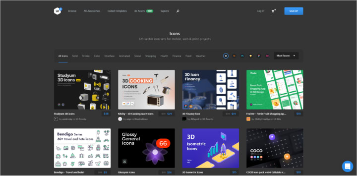
A fresh resource with quality icon sets of 50 to 1000 icons designed by the same author, so it adds to keeping the same style. Please note that every set is to be purchased separately for somewhere between $8 and $50.
Shutterstock
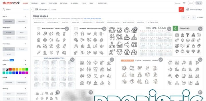
A big stock channel with paid icons. Look for icons by typing icons + keywords in the search bar. There are both huge sets of 2000 to 4000 icons and tiny themed sets of 16 to 32 icons.
View this interactive story to get a better understanding of graphic interface evolution including icons.
Want to learn how to use design awesome presentations? Register for my online course PowerPoint 101





Comments
There are no comments for this story
Be the first to respond and start the conversation.