
The history of the Pepsi logo
Many timeless brands are timeless because they keep the logos that people know and trust. Pepsi is a brilliant exception. The history of the Pepsi logo is one of constant reimagination. Over it’s 122 year history, the logo has seen 12 redesigns. And that’s not even counting the smaller changes for flavor variations like Diet Pepsi and Pepsi Max.
Before Pepsi was Pepsi, it was known as Brad’s Drink, created by pharmacist Caleb Bradham in New Bern, North Carolina in 1893. During that same era, pharmacists created a bunch of the sodas we know and love today. In 1886, Coca Cola was created to help its inventor ease his morphine addiction. Later that decade, pharmacist Charles Alderton invented Dr. Pepper to aid in digestion and as a lemon, nutmeg, caramel-flavored alternative to soda flavors of the time.
The Brad’s Drink logo was a blue wordmark against a white background. The font was bold and fairly ornate, a characteristic the Pepsi logo would hold on to for a while, even after changing colors and becoming known as Pepsi-Cola.
In 1898, Brad’s Drink became known as Pepsi-Cola, a name derived from the word “dyspepsia,” another word for indigestion. (Remember, these were the days when soft drinks were considered medicinal aids.)
From there, the Pepsi-Cola Company grew rapidly. In 1903, Bradham officially trademarked the name, and in just a year, he’d sold 20,000 gallons of Pepsi-Cola syrup. By 1910, there were 240 Pepsi-Cola bottling franchises across 24 states. As the company found its footing and grew, its logo changed three times.
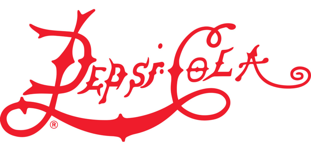
First was Pepsi-Cola’s thin, red and spiky logo.
Could not connect to the reCAPTCHA service. Please check your internet connection and reload to get a reCAPTCHA challenge.
Enter your email to get the ebook, along with creative tips, trends, resources and the occasional promo (which you can opt-out of anytime).
Get the ebook!
By completing this form, you agree to our Terms of Service and Privacy Policy. This site is protected by reCAPTCHA and the Google Privacy Policy and Google Terms of Service apply.
When Brad’s Drink became Pepsi-Cola, the logo’s main color changed to an eye-catching red. The serifs and mid-height letter spikes that decorated the original font became longer, fang-like spikes protruding from the tops and bottoms of the letters and the final “A” stretched out and coiled upward like a tail.
One thing that didn’t change was Pepsi-Cola’s branding as a health aid. During this time, Pepsi-Cola’s tagline was “Exhilarating, Invigorating, Aids Digestion.”
In 1905, the logo became a bit softer. The spikes retracted and the letters got just a bit wider. Overall, the logo kept its wavy, swoopy shape, and that last “A” kept its tail curl. In this version of the logo, a long banner extends from the top of the “C” in Cola, making this version of the logo feel a little closer to symmetrical than the first version.
Then just a year later, the logo changed again. It was still red, it was still wavy and it still looked a lot like a certain other cola brand’s logo (more on that in a minute). The 1906 iteration of the Pepsi-Cola logo made the letters thicker again and condensed the wordmark, making the letters “P” and “C” just a bit taller than the rest of the letters.
Let’s take a moment to talk a bit about the similarities between Pepsi and Coca-Cola during this time period. Pepsi was still decades from being branded as the young, hip alternative to Coke. Both beverages were marketed as health drinks, and both wavy, swooping, semi-cursive wordmark logos in red and white.
The 1920s and 1930s were a challenging time for Pepsi-Cola and at times, it looked like they’d be the losers in the burgeoning cola wars. As Coca-Cola opened bottling plants in Europe and came under the leadership of Robert Woodruff, who would lead the company for the next 60 years, Pepsi-Cola declared bankruptcy and was then purchased by Craven Holdings Corp. In 1930, Pepsi-Cola filed for bankruptcy a second time.
By 1933, Pepsi-Cola found their first way to differentiate themselves from Coca-Cola, just by upping the size of their bottles to 12 ounces while keeping their five cent price tag. Put beside Coca-Cola’s 6.5 ounce bottle, which brand delivered the better value was obvious. And if it wasn’t obvious enough, their 1930s jingle made their unique selling point absolutely clear:
About the Creator
The Earliest Vs Modern Uses of Brass Knuckles:
Brass knuckles are weapons of metal or other hard material shaped into a set of knuckle guards which include an open center so as not to leave any part of one's hand exposed while still providing light protection from blunt trauma. The knuckles and guards are typically fashioned in such a way as to have a sort of 'box' shape. While, at first glance, they appear to be one solid piece of metal, they can be separated into two pieces, giving them their unique shape.
By Mai Sophia6 days ago in Humans
Lifting the Curtain to a Successful Month
April has been a fantastic month for me in terms of writing endeavors. I’d like to share what’s been so great about it just as many other writers would do. Share successes. I’ve noticed other writers or artists have shared successes and when you just see the snippet of their success, it appears everything has been going right for them all along. But we haven’t seen behind the curtain, we haven’t seen their hard work and their failures and those months that were fraught with disappointment. In everyone’s case, it’s far from the truth. But for the outside observer it isn’t always apparent.
By Stephen Kramer Avitabile4 days ago in Writers


Comments
There are no comments for this story
Be the first to respond and start the conversation.