
The most popular tools for Dashboarding in Python
A comparison — choosing the right option for the right project.

Numbers do not speak for themselves!. We make them talk.
An essential part of data analysis is communication. We need to arrange information in a comfortable and digestible way to communicate, highlight and visualise critical areas.
Dashboards take your data visualisation to the next level. They connect different visualisation components and make a whole and integrated data visualisation stories. Web application Dashboards also allow users to interact with the data and the visualisation, offering them to see and adjust what they want or need.
It has never been easier to create a dashboard in Python. We have several dashboard tools at our disposal to make coherent data visualisation stories without using the traditional Dashboard powerhouses like Tableau or Power BI.
In this article, I will list out the four most popular Dashboarding tools in Python. I will highlight what they are suitable for, their functionalities and the learning curve.
Streamlit
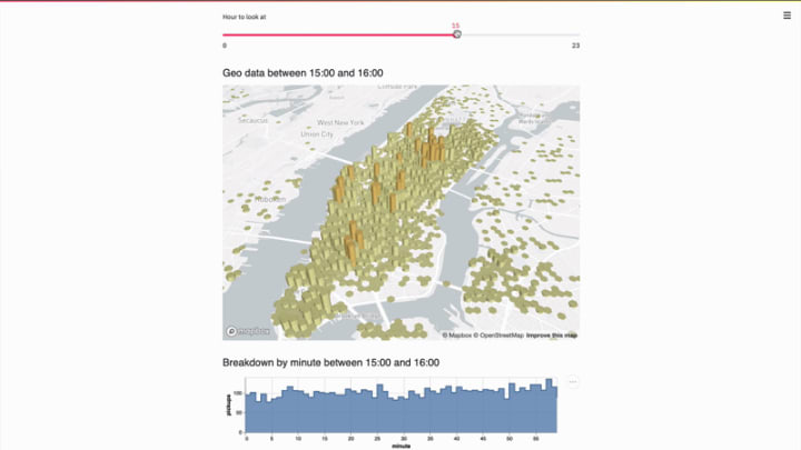
Do you want to create dashboards quickly in Python?. — Streamlit is your best option.
Streamlit revolutionises creating web applications with easy to use API and constant feature development. It was only last year October when this open-source tool was launched and no doubt its popularity has increased rapidly in the data science community.
Today, Streamlit boosts more functionalities with its recent introduction of streamlit component, where the developer community adds new functionalities.
Sharing and Deploying Streamlit apps has also become super easy with the new one-click deploying service from streamlit (In Beta). You can now develop and create web applications and dashboards, and deploy them in minutes rather than days, Thanks to Streamlit.
What I like about streamlit is that it has the shortest learning curve of all Python Dashboard creating tools in this list. It offers simple API with excellent documentation and lets you develop applications with less code in pure python.
In simple terms, Streamlit empowers you to focus on what matters rather than thinking about front-end back-end technology stacks to use for your project.
Panel
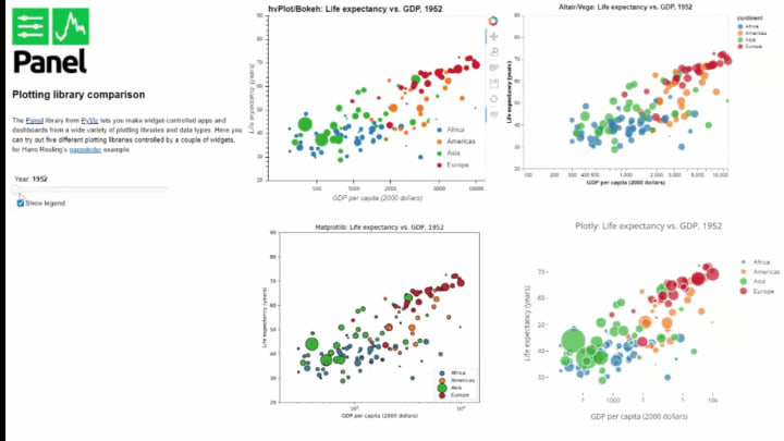
Do you want to create powerful and advanced dashboards in Pure Python with declarative and reactive programming? — Panel is your best bet.
Panel is an open-source Python library that lets you create custom interactive web apps and dashboards by connecting user-defined widgets to plots, images, tables, or text.
While it is possible to work Streamlit in Jupyter notebooks, we use primarily with Python files. If your favourite data science tool is Jupyter Notebook, then Panel offers extensive support for all plotting libraries.
The learning curve is steeper than Streamlit. However, it is simple to create an interactive web application in Panel, using less code with widgets and parameters.
Deploying and sharing your web applications and dashboards in Panel is easy. You can display your dashboards inside Jupyter Notebooks, render it as Ipywidgets, run it from the command line, or deploy it using popular tools like Heroku, MyBinder or even other cloud platforms.
Voilà
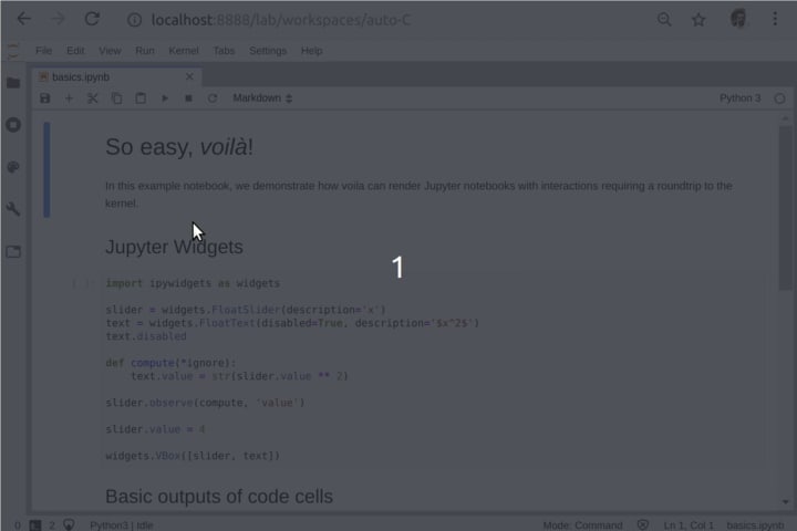
Do you want to turn your Jupyter Notebooks quickly into standalone web applications? Voilà is for your service.
Voilà — Rendering of live Jupyter notebooks with interactive widgets.
Voilà is primarily a native Jupyter rendering tool. However, you can create interactive reports with widgets in Jupyter notebook using Ipywidgets. You can also use Viola to render any content on Notebooks into Dashboards.
Quick Jupyter notebook deployment into dashboards is the strong side of Viola but also its downside. You can make coherent Dashboards with Voilà, but that needs you to format your experiments and code in Jupyter notebooks accordingly or suppress and hide unused code and markdowns.
Plotly Dash
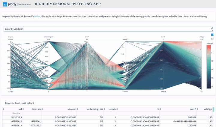
Do you need more advanced and production-grade level dashboards in Python? — Plotly Dash covers that.
Plotly Dash focuses on production and enterprise dashboard creation but also offers free and open-source options in Python, R and Julia. It is the most mature option on this list.
Although Dash empowers users to build and deploy web applications without full-stack and DevOps tools in hours, it has the steepest learning curve of all the options in this article.
That is also changing with the introduction of Plotly Express — easy to use and high-level API for creating figures with Plotly Libary. I find the Plotly Express library one of my favourite data visualisation tools in Python.
Deploying your Plotly Dashboards in your local environment is easy, and you need to deploy it to a server if you need to share it outside.
Final Thoughts
The choice of your dashboard tool depends on your project needs. Streamlit is for creating quick and versatile dashboard apps with an easy learning curve and less code. I find Streamlit the easiest and the best tool out there to create data visualisation web apps.
Viola and Panel serve primarily for Jupyter Notebook users, and you can combine them with any plotting libraries of your choice. Finally, use Plotly Dash for more advanced and production level dashboards.
About the Creator
Keep reading
More stories from writers in Geeks and other communities.
Before Sylvester the Cat, there was Sylvester the Dog
Sylvester was a Merrie Melodies canine Sylvester, the Cat, is a beloved Looney Tunes character who debuted in March 1947 in the animated short Life with Feathers. The iconic Mel Blanc once said that he enjoyed voicing Sylvester, one of his favorite characters. The cartoon short that was near and dear to Blanc's heart was Bird's Anonymous which starred the popular cat.
By Cheryl E Preston4 days ago in Geeks
Is Sprina over as we know them know them on General Hospital?
Nicholas Chaves is rumored to not be returning Belinda from Soap Dirt is revealing information that Sprina fans probably will not enjoy hearing. She reports an unnamed source at General Hospital suggests that Nicholas Alexander Chaves may not return as Spencer Cassadine.
By Cheryl E Preston6 days ago in Geeks


Comments
There are no comments for this story
Be the first to respond and start the conversation.