
Hajime Sorayama Interview
In his own words, Hajime Sorayama offers a unique insight into the brilliance of the great erotic sci-fi artist.

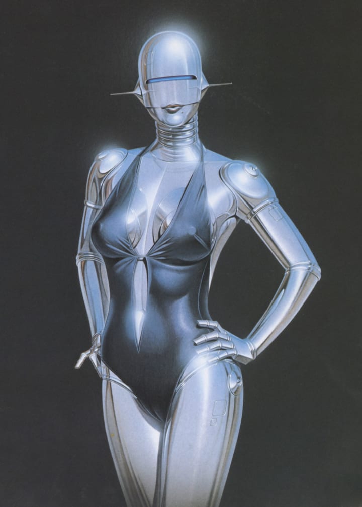
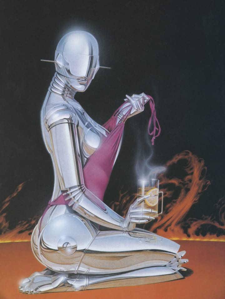
The book Sexy Robot and the art it contains were born of Haijme Sorayama’s desire to combine robots and eroticism. The issue he faced was where to leave a touch of human biology. The lips, the breasts, and the hips, which had been the prevalent areas of emphasis throughout his career of sci-fi erotica, were the natural choices. Throughout his career, within his fantastical artistic images, you feel the movement of the human body manifested within the cold, smooth lines of technological perfection. In an interview excerpt from Sexy Robot, Sorayama explores the mystique of erotic sci-fi art.
Illustration: You drew your first robot in 1978 and a sexy robot in 1979. The boom has lasted a long time, hasn't it?
Sorayama: It's lasted five years already. The work still comes in today. They say they want to use a robot for its fresh look. It seems space and robots and the like have a feeling of the new about them and probably it's easy to convince the clients with them. If the robot work continues in the future too, it will be fun as an illustrator to work on one thing, making slight twists.
One can say that by changing the situation the number of variations possible is limitless.
That's so, but since they're ads they have to be tied to a product, that's the hard part. One has to think up robots tied to products like television sets or cassette tapes. In the case of advertising, there's also the problem of how far you can show nudity. For robots, too, the clients object if there's a closeup of a breast. Since the rough sketches don't convey the actual feel of the finished illustration, those unfamiliar with them regard them as real women. That's because for everything I do the sketch is just a rough idea in pencil. As I don't show the final feeling, in some cases it's just the shapes.
It seems to me that the interest of them as pictures comes from the abstracting of eroticism through their being robots.
Isn't it a sort of filter or catalyst? It's imaging human nudity through the medium of robots. I think that's what it is. The robots clearly have a different feel but through that one has the image of the nudity of the real thing.

When you look back over the past five years…
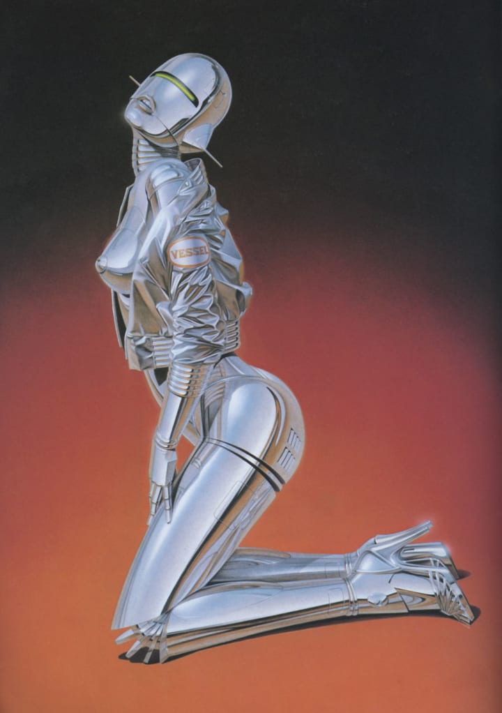
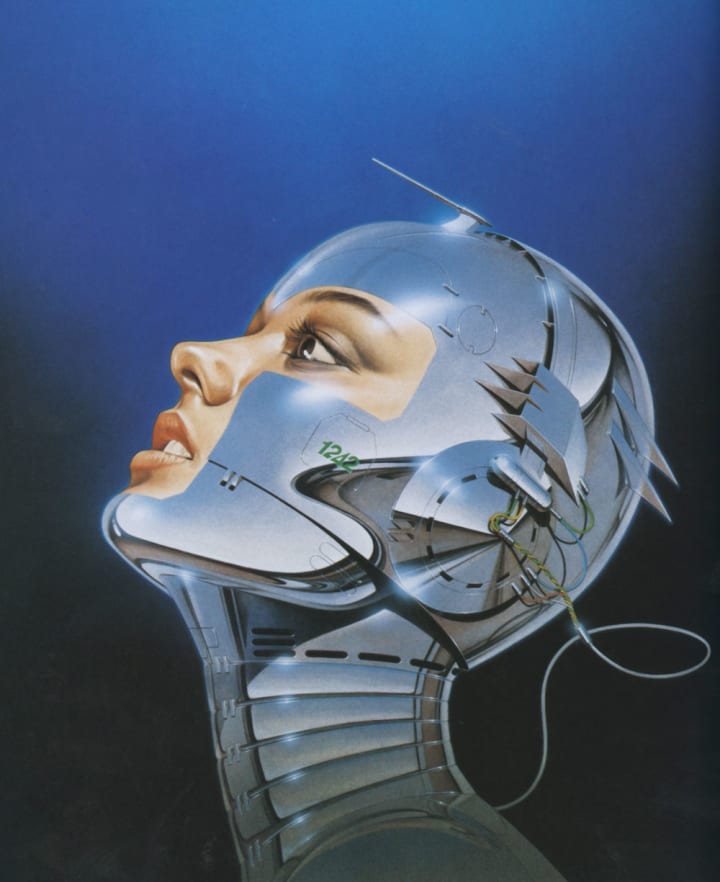
I've become good at them. Five years ago I was still awkward at it. That is, because I was new at it. I didn't know that at certain angles they wouldn't show to best advantage, etc. For example, the back is extremely difficult to draw. That's because it's all subtle movements. Something like the arm makes rather primitive movements. We move through the mutual working of muscle and bone. Therefore, something like the fingers are easy to draw while the palm of the hand is hard to do. It works through bone and muscle, but one is drawing skin and, on top of that, one has to show the setup of the bones. If you don't it doesn't give the feeling that it is about to move. In the case of female robots, one is drawing skin and body fat. Fat beneath skin. If you look at a woman wearing a bra, there's a depression in the flesh there. That's how you can portray fat. For the hips as well, there's a part protruding when they are sitting down.
Through portraying that sort of thing, one can get a certain sexiness. But there's no element at all like that for the back. When seen from the back, all you can do is show a depression at the waist.
The swelling of muscle, the cutting into the flesh of the straps of a bra that you've talked about, can't be portrayed in a metal robot, can they?
Therefore one must draw that sort of thing as a lie, a poetic truth. Where there wouldn't actually be anything, at the edge of panties or the like, one deliberately puts a seam or joint in the metal. If one were to actually build such a robot, that sort of thing would be unrelated to its movements. Therefore it's not necessary for the basic expression. I think you can't give a feeling of a robot that can't move to the viewer. That's the difficult part. One can tell just by making a rough sketch first whether or not it will be possible to make that into a robot. Some things are suited to it and some aren't. A match whose outcome you can see in advance isn't so interesting.
Did you have a hunch that it would be so successful?
No, I didn't. But it was popular. The “How to Draw" section in Illustration (No. 5, January 1980) had a tremendous impact. If that coverage and its timing hadn't been right, it probably would have just died out. Next there was the cover for the inaugural issue of Number. That make a splash too. At first advertising job orders from "hard" product companies were most numerous. From so-called heavy industry. I guess the work they do is actually close to robots. After that office automation, computers, etc. At that time you didn't even need a written plan or anything. If you showed one robot picture, the sponsor would OK it right away. I think it was just then, around 1979, that the mass media was giving a lot of coverage to office automation and computers. That's probably why robots caught the public fancy and the advertising world successfully rode that trend. That's my interpretation anyway.
After that your clients widened to "soft" ones?
Little by little. Cassette tapes and so on...anything will do. The point is one can say that these robots are cool but are also human—although some find them off-putting. This humanness is clearly different from actual robots doing welding or the like in a factory. But it's good to have something human for PR materials to improve the image of industry (laughs).
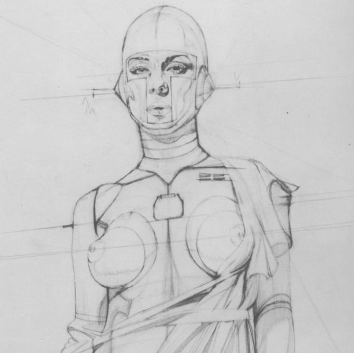
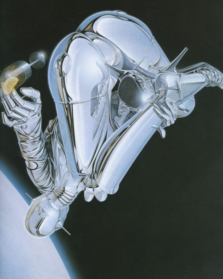
Robot sketch by Hajime Sorayama
When you did a robot sitting in a formal Japanese pose, you had a talk with the art director Koichi Hara about robot design philosophy. The theme that clearly came out then of a human, sexy robot seems to have been the secret of its success.
I don't know really. It's funny for me to say. It's others that evaluate it. Why, if I understood it, I'd be making a fortune going from one hit to another (laughs).
What does an illustrator think about while working in the vortex of such a boom?
Well, to tell the truth, it's boring to be working on the same thing. It's not just robots, I always get tired of it when doing two works on the same motif. It's easy to identify an illustrator with one motif like Masao Sato with vegetables and fruit or Hiroshi Nagai with swimming pools and palm trees, but I don't think that's accurate. For me, Nagai is not palm trees but a good feeling of an absolutely clear world, refreshing and with a pellucid atmosphere. I would like my own work to be thought of in that way, but of course that's just my own wish and no one does so (laughing). Any illustrator doing realistic work ought to be able to do a portrayal conveying the feel of the subject. Whether it's soft or hard. Therefore there's more to me, too. There's a part that's not just robots.
Others type people with one thing—the ball player Fukumoto (Hankyu) with running, Egawa with his fastball, the young singer Iyo Matsumoto with the Lolita complex, etc.—but the person himself is using various resources. They want to be recognized as having various abilities but only one part is recognized by others. The person himself is struggling to escape that. The singer Kenji Sawada is particularly skilled at such metamorphoses. I think he must be quite bright. He's always changing and getting hits, hitting home runs. One who doesn't do so is, say, Kentaro Shimizu (laughs). Being like a singer who disappears after one hit is the worst thing for an illustrator, too. Therefore, even though I may be in the middle of a boom, I'm also thinking about what's ahead as well. It's stupid not to do so. So when directors come, I try to sell on brainwork, to show them works using other techniques.
As it's already recognized I'm good at stainless steel, there are various ways of showing that—how it would be with a bathing suit, what if part of the bathing suit was wet, how it would be with drops of water, and so on. From that, second-stage and third-stage jobs come in one after the other. The sharper that director is the greater the possibility of that is. If I did the whole thing in stainless steel, the finished work would end up dull and uninteresting. It's also more interesting as work the more variations there are. When robot orders came in, I suggested lots of supporting and supplementary ideas. Of course lots of them were rejected. Generally speaking, many have an image of space and robots together. Therefore some say that space isn't all that new anymore. And in addition, they can only imagine the background for space as being dark blue or black. It has to always be dark. I think pink or a clear blue would be better for the client. However it's extremely difficult to make any changes because at the presentation (the showing of a sketch of what the design will be like and getting the client's approval before doing the actual work when making a poster etc.) the OK was for space and robots. For the painter, it's easier to do something white (a stainless steel robot) against something dark and the impact is also stronger. But if I do just that, it's like cutting my own throat because it becomes typecasting.
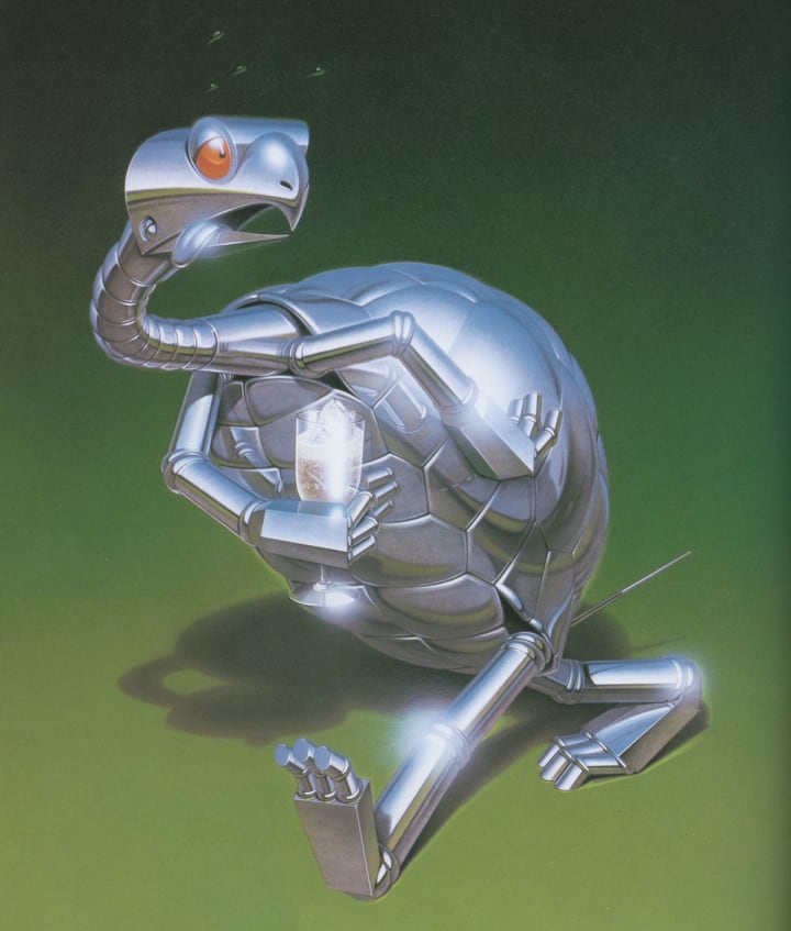
You've also done a lot of animal robots...
Among the very first robots I did for Suntory was a dog. At that time I really liked dogs. I drew Snoopy. Even while thinking it was treating Schulz badly (laughs). Many toy makers have come to me wanting to make sexy robot toys. But it would be hard to make them movable. A dog might be OK. With animals, it's enough if they're cute. There are a lot of misses with sexiness. In my drawings, about one out of five is really sexy. One who is really tempting. The batting average is higher for cuteness. What is sexy differs completely from person to person. Some find women in bathing suits sexy while others feel the nape of the neck is sexy. Some are attracted by the face while others have to have her naked to the waist. Sexiness is really a difficult motif. In that sense, dogs were better. I still like them even now. The theme is easier to narrow down for animals—to cuteness or fearlessness, for example.
Are animals easier to portray than humans because their movements are more mechanical?
Lies, lies. All I drew was lies. I drew a black bass and its dorsal fin was completely different from the real thing. I'm very familiar with trout, but I didn't know much about black bass.
When it's swimming fast, the dorsal fin is completely retracted and it swims powered by this fin alone. Therefore to draw it strictly accurately, you must draw all of the dorsal fin in collapsible form. In the editorial office, they get letters from sticklers for accuracy pointing that out. But after all, ultimately sexy robots and animal robots are both lies. When I drew dolphins, I showed them leaping up with a curved line. (Laughs) To be curved like that actually a joint would be necessary, but that's a real nuisance to do and if one put it in the feeling of dolphins would be spoiled. The question is where to lie to give the greatest verisimilitude. One has a different aim in each case. For drawing a black bass, will the treatment well received by perfectionists showing the collapsible construction be successful or one for viewing by large numbers of people like a form of "fishie" aimed at children? One is free to choose either one, but that choice affects the reputation of the artist.
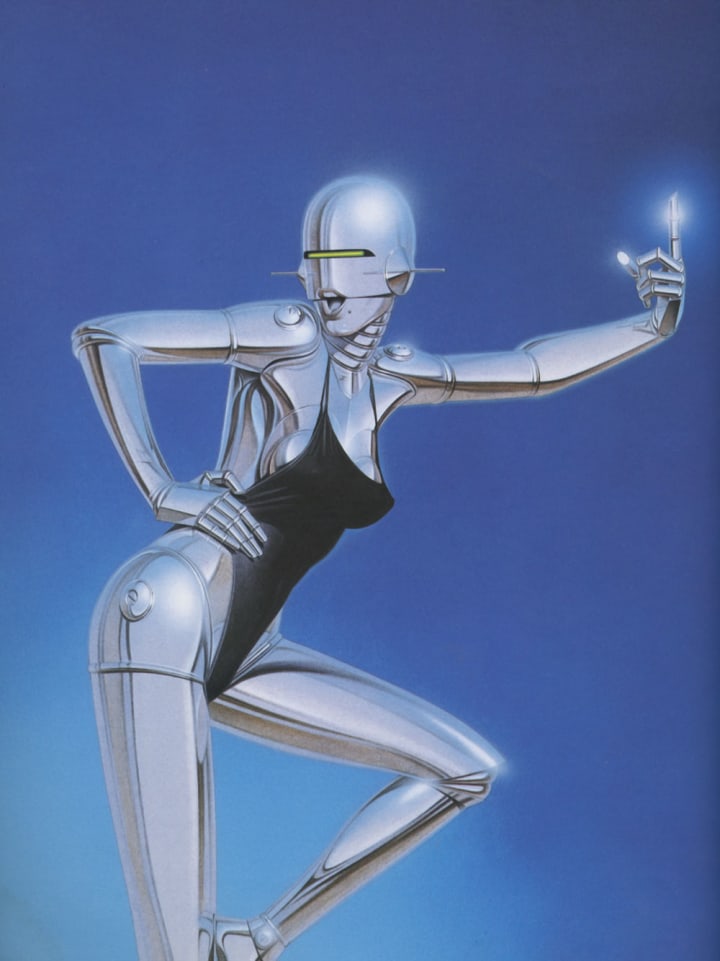
Using the two colors blue and brown as the keynote for the reflections onto the robots was also successful.
Those are the colors everyone is most familiar with, the earth and sky. Even if it's the bumper or headlights of a car or stainless steel pipe, it always has the sky or the ground reflected in it. The earth is after all earth-colored. And the sky is blue. I use black, too, but black is for a difference in brightness, for accent in white things. I use brown for the lips, too, but that's not a reflection but because it gives a disagreeable sensation if the lips aren't a tint from the warm colors.
You limited reflections to the simplest elements then, didn't you? Abstracted them, in a manner of speaking.
That sort of thing is a matter of experience. First I did a male and a dog robot on top of a rock. Second was a surfing robot. At that time I thought them out very rigorously. The sky and the sea are blue so only blue is reflected. Therefore it's on the monotonous side. I went too far in rigorousness. I did it without much lying. Since I made the sky and sea dark, I felt the robots wouldn't go with them if they weren't dark too. I worried over that. I can say now that I've broken out of that. It became much easier after I started to deal with it by simply cutting out things. That also became a technique | used when drawing things other than robots. That is, one can get by by putting in some brown. That's a lie, but if it gives the real feeling or lays emphasis then actually it's much more accurate. Sticklers for accuracy may complain, but the way I did it is right. I say that if they don't like it, they should try to do it themselves. When singing groups like Tanokin or Imokin, for example, become famous there are people who say, “Oh they're not so great," but that's no good. In the last analysis, they're the major league. The major league is right. No matter what you say, Louis Vuitton wins.
You are always adding new techniques. For instance, drawing lids for inspection of the inside workings in the stainless steel surface, an area for stressing the curve of that part.
That's a problem of the virtual image and the real image. The virtual image is reflected on the surface. Through that reflection, one can imagine the shape of that part. It is not the case that if one adds some real image, that makes clearer the real shape of that part. There's a wire frame in computer graphics. It's the same as that. In other words, it's the same as the three-dimensional feel of a globe of the earth being produced when one draws a circle and adds latitude and longitude lines. As a technique the same as that, I add written letters or stick on metal tape. One can easily create a three-dimensional feel by sticking on metal tape. That's the sort of technique to be used at times of failure. When I haven't been able to express the shape, real feeling, transparent feeling, etc. through reflections alone, then I draw a lid, make a joint there, or wrap around tape. When I was first doing robots, I hadn't noticed that sort of thing. Therefore the ones I've done later have much more the feel of the real thing. There is a groping in the dark, a certain dilemma, at the beginning. One doesn't know the limits, how far one should lie and how far one should follow the truth in drawing them.
Do you gain a lot in continuing to draw one thing?
No, I think there's an accumulation from all the things one's done before. There's an adaptation of what one learned drawing motorcycles or television antennas. What could be called the fundamentals of reflection are the same so logically one can do a certain amount of ad libbing. If one can't do those fundamentals well, no matter what one does it will look like aluminum or a kind of lacquer. I was going through a process of trial and error trying to find out how to get a feeling of pellucidity while portraying various things before the robots.
Read the Complete Sexy Robot
Whether you wish to own the art Sorayama so passionately discusses or explore the content that accompanied this interview, Sexy Robot by Hajime Sorayama will guide you through the world of sci-fi erotica.
Haijme Sorayama’s Sexy Robot presents a compilation of detailed erotic sexy robots. The artistic nudity of Surayama’s art has been featured in projects by Nike, Sony, George Lucas, Aerosmith, Playboy, Penthouse, Marvel Comics, Star Trek and Disney. Complete with Sorayama’s sexy robots, a documentation of his life story, an interview with the artist himself, and a "how-to" section, Sexy Robot is sure to indulge the inner artist of any sci-fi or Sorayama fan.
About the Creator
Futurism Staff
A team of space cadets making the most out of their time trapped on Earth. Help.
Enjoyed the story? Support the Creator.
Subscribe for free to receive all their stories in your feed. You could also pledge your support or give them a one-off tip, letting them know you appreciate their work.
Keep reading
More stories from Futurism Staff and writers in Futurism and other communities.
Ray Bradbury Interview
Ray Bradbury worked and wrote in a two-room office on Wilshire Boulevard in downtown Los Angeles. The rooms exploded with yellow brightness, and a visitor leaving the uproar of the street below might have felt that he had somehow walked into the middle of the sun. A gigantic, 15' high, stuffed Bullwinkle sat in the outer room, covered with hats and comic-book clippings, child's drawings and baseball cards. It set the tone for the man it served. "The problem with so many of the modern American writers," said Bradbury, "is that they exist in a world without children. I don’t believe they were ever young."
By Futurism Staff8 years ago in Futurism
The Great Uncoupling of 2229
“I realize there are still aspects of humanity that my kind cannot understand or appreciate….” The soft, airy voice resonating from the orb that trailed Teyhx through the hallway of her dorm pleaded with her to see reason. Though, ultimately, the decision was not hers anyways.
By Adam Clost25 days ago in Futurism
The Dawn of Harmony
In the year 2145, Earth had become a model of environmental and technological harmony. After decades of rapid climate change, resource depletion, and social upheaval, humanity had found a path to sustainability and unity. The world was now a place where technology and nature coexisted seamlessly, and society had embraced a new way of living that prioritized balance and well-being.
By Roman Dwi Kurniaabout 3 hours ago in Futurism


Comments
There are no comments for this story
Be the first to respond and start the conversation.