
The Banana rule in UX/UI design
The yellow brick road to User-Friendly Design. You’re still not using it?


The yellow brick road to User-Friendly Design. You’re still not using it?
The “banana rule” in UX/UI design is a simple yet powerful principle that can help ensure that a website or application is easy to understand and use. The idea behind this rule is that users should be able to understand the purpose of a website or application at a glance, much like how a banana’s shape clearly indicates that it is a food item. This concept is closely related to the idea of “affordances” in design, which refers to the visual cues that a product gives about how it can be used.
In UX/UI design, the banana rule is often applied to the layout and design of a website or application’s home page. This page is often the first point of contact that a user has with a product, and it is essential that it clearly communicates the product’s purpose and functionality. A website or application that follows the banana rule will have a layout that is clear, uncluttered, and easy to navigate.
One of the key elements of the banana rule is the use of a clear hierarchy of information. This means that designers should be intentional about the order in which different elements are presented on the page, with the most important information placed prominently and in a way that is easy to understand. This can be achieved by using different font sizes, colors, and layouts to differentiate between different types of information. For example, the main heading of the page should be larger and more prominent than the subheadings, which in turn should be larger and more prominent than the body text.
Another important aspect of the banana rule is the use of clear and consistent navigation. Users should be able to easily find their way around the website or application, and understand where different sections and pages are located. This can be achieved by using a clear and consistent navigation menu, with labels that are easy to understand. Additionally, designers should be mindful of the placement of buttons and calls to action, making sure that they are prominently displayed and easy to find. It is also a good practice to use breadcrumb navigation so users can easily track their location within the website.
A good example of a website that follows the banana rule is the home page of Apple’s website. The page is simple and clean, with a clear hierarchy of information. The top of the page features a large, attention-grabbing banner with a product image and a clear call to action. Below the banner, the page is divided into sections that showcase different products and services, each with its own clear call to action. The navigation menu is located on the top right corner of the page, and it is easy to understand.
Another example is Google Store. The website has a clear and consistent navigation menu, with labels that are easy to understand. This allows users to quickly and easily find the products or services they are looking for. The website also clearly displays product information, including images, specifications, and pricing. This allows users to easily compare products and make informed purchasing decisions. The checkout process is simple and straightforward, with clear calls to action and minimal required information. This makes it easy for users to complete their purchases quickly.
In contrast, a website or application that does not follow the banana rule might have a cluttered layout, with too many elements competing for the user’s attention. This can make it difficult for users to understand the purpose of the product, and to find the information or functionality that they are looking for. Additionally, the navigation menu might be confusing, with labels that are hard to understand or not consistent throughout the website.
Furthermore, not following the banana rule can also lead to poor user experience, which can result in users leaving the website or application without taking any action. This can be detrimental to the success of a website or application, as it can lead to low conversion rates and poor
In conclusion, the banana rule is an important principle of UX/UI design that can help ensure that a website or application is easy to understand and use. By following the banana rule, designers can create products that are intuitive and user-friendly, which can lead to greater user engagement and satisfaction. Additionally, by following the banana rule, designers can ensure that users have a positive experience while using the website or application, which can increase the chances of them becoming loyal customers. The importance of user experience and design in today’s digital landscape cannot be overstated, and following the banana rule is a step in the right direction to create a successful product.
Please let me know your thoughts on this story by clapping or leaving a comment with suggestions for future topics.
THANK YOU
About the Creator
Keep reading
More stories from Meshack Asankomah and writers in Education and other communities.
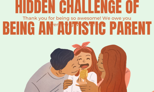
The 7 Hidden Challenge Of Being An Autistic Parent
The world is familiar with and supportive of neurotypical parents who have autistic kids, but there is a loud silence on parents who are on the spectrum. Many autistic people, like myself, have reported a lack of support when becoming a parent, particularly when autistic parents have neurotypical children.
By Meshack Asankomah10 months ago in Education
Introducing ChatGPT-4o
"Introducing ChatGPT-4o: Redefining Conversational AI with Enhanced Understanding and Natural Interaction" In the rapidly evolving landscape of artificial intelligence, ChatGPT-4o emerges as a pioneering advancement in conversational AI technology. Built upon the robust foundation of its predecessors, ChatGPT-4o integrates cutting-edge natural language processing techniques to offer users a transformative experience in dialogue. Whether tackling complex queries or engaging in casual conversation, ChatGPT-4o excels in delivering accurate, contextually aware responses with unparalleled depth and coherence.
By vinod kumar2 days ago in Education
I Am Grateful For So Many Things
I am grateful that I had the opportunity to experience _________. Rupi Kaur's Gratitude Writing Prompts I am grateful that I had the opportunity to experience my children growing up to be kind and loving human beings, that are raising families and work in areas that are making a difference.
By Denise E Lindquist2 days ago in Writers


Comments
There are no comments for this story
Be the first to respond and start the conversation.