
INTRODUCTION TO ANALYTICS AND BASIC STATISTICS
Business analytics (BA)

Business analytics (BA) refers to the skills, technologies, applications and practices for continuous iterative exploration and investigation of past business performance to gain insight and drive business planning
There are three main categories of analytics:
1.Descriptive — the use of data to find out what happened in the past and what is happening now.
2.Predictive — the use of data to find out what could happen in the future.
3.Prescriptive — the use of data to prescribe the best course of action for the future.
Common Business Problems in Telecom:
Customer churn is a common term used both in academia and practice to de-note the customers with propensity to leave for competing companies. Ac-cording to various estimates in European mobile service markets, churn rate reaches twenty-five to thirty percent annually. On the other hand financial analysis and economic studies are in agreement that acquiring new customers is five times as expensive compared to retaining existing customers.
Common Business Problems in Retail:
1.Increase customer value and overall revenues
2.Reduce costs and increase operational efficiency
3.Develop successful new products and services
4.Determine profitable sites for new stores and improve existing stores
5.Communicate effectively between departments for better decision making.
Types of Data Analysis
Exploratory Data Analysis (EDA) makes few assumptions, and its purpose is to suggest hypotheses and assumptions. An OEM manufacturer was experiencing customer complaints. A team wanted to identify and re-move causes of these complaints. They asked customers for usage data so the team could calculate defect rates. This started an Exploratory Data Analysis. The investigation established that a supplier used the wrong raw material.

Discussions with the supplier and team members motivated further analysis of raw material, and its composition. This decision to analyze raw material completed the Exploratory Data Analysis.
The Exploratory Data Analysis used both data analysis and process knowledge possessed by team members. The supplier and company conducted a series of designed experiments which identified an improved raw material composition. Using this composition, the defect rate improved from .023% to .004%. The experimental design and its analysis was Confirmatory Data Analysis (CDA). Note that the experimental design required a hypothesis generated by the Exploratory Data Analysis.
Exploratory Data Analysis uncovers statements or hypotheses for Confirmatory Data Analysis to consider.
Properties of Measurement
1. Identity: Each value on the measurement scale has a unique meaning.
2. Magnitude: Values on the measurement scale have an ordered relationship to on another. That is, some values are larger and some are smaller.
3. Equal intervals: Scale units along the scale are equal to one another. This means, for example, that the difference between 1 and 2 would be equal to the difference between 19 and 20.
4. Absolute zero: The scale has a true zero point, below which no values exist.
Scales of Measurement
Nominal Scale: The nominal scale of measurement only satisfies the identity property of measurement. Values assigned to variables represent a descriptive category, but have no inherent numerical value with respect to magnitude. Gender is an example of a variable that is measured on a nominal scale. Individuals may be classified as “male” or “female”, but neither value represents more or less “gender” than the other. Religion and political affiliation are other examples of variables that are normally measured on a nominal scale.
Ordinal Scale: The ordinal scale has the property of both identity and magnitude. Each value on the ordinal scale has a unique meaning, and it has an ordered relationship to every other value on the scale. An example of an ordinal scale in action would be the results of a horse race, re-ported as “win”, “place”, and “show”.

We know the rank order in which horses finished the race. The horse that won finished ahead of the horse that placed, and the horse that placed finished ahead of the horse that showed. However, we cannot tell from this ordinal scale whether it was a close race or whether the winning horse won by a mile.
Interval Scale: The interval scale of measurement has the properties of identity, magnitude, and equal intervals. A perfect example of an interval scale is the Fahrenheit scale to measure temperature. The scale is made up of equal temperature units, so that the difference between 40 and 50 degrees Fahrenheit is equal to the difference between 50 and 60 degrees Fahrenheit. With an interval scale, you know not only whether different values are bigger or smaller, you also know how much bigger or smaller they are. For example, suppose it is 60 degrees Fahrenheit on Monday and 70 degrees on Tuesday. You know not only that it was hotter on Tuesday; you also know that it was 10 degrees hotter.
Ratio Scale: The ratio scale of measurement satisfies all four of the properties of measurement: identity, magnitude, equal intervals, and an absolute zero. The weight of an object would be an example of a ratio scale. Each value on the weight scale has a unique meaning, weights can be rank ordered, units along the weight scale are equal to one another, and there is an absolute zero. Absolute zero is a property of the weight scale because objects at rest can be weightless, but they cannot have negative weight.
Types of Data
Quantitative Data: In most of the cases, we will find ourselves using numeric data. This type of data is the one that contains numbers.
Qualitative Data: The other type of data is string type data. A string is simply a line of text and could represent comments about certain participant, or other information that you don‘t wish to analyze as a grouping variable.
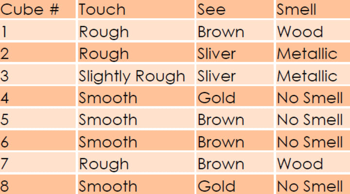
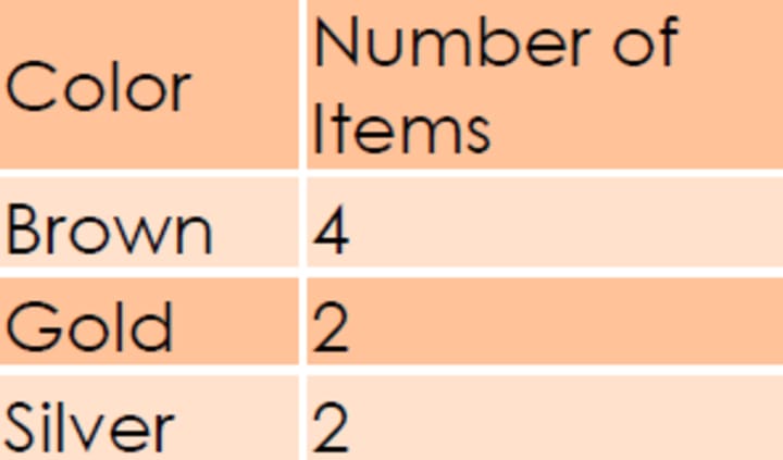
Categorical Data: The third type of data is categorical data represented by a grouping variable. For example, you insert a variable called gender and insert Male‘ or Female‘ under this variable as observations. In this case we can group the entire data with respect to gender. Here gender is a grouping variable.
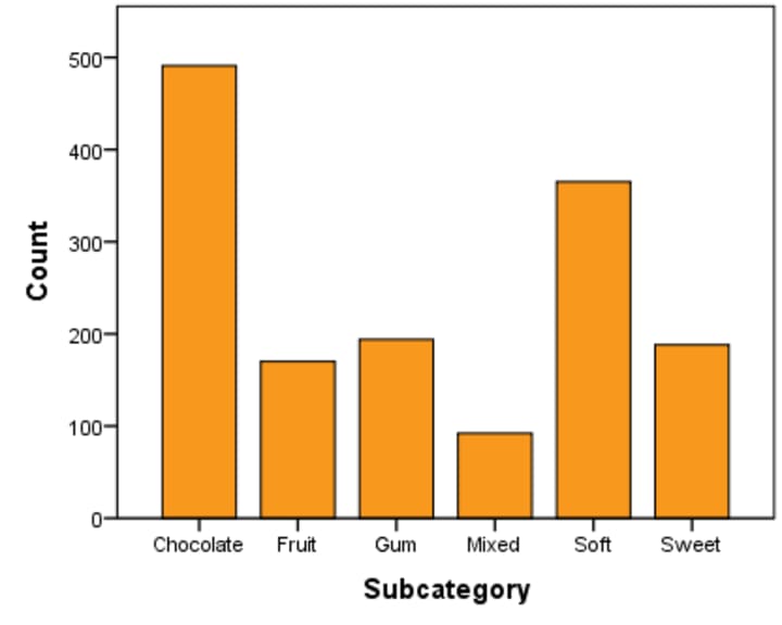
Presentation of Qualitative Data
Graphical Presentation

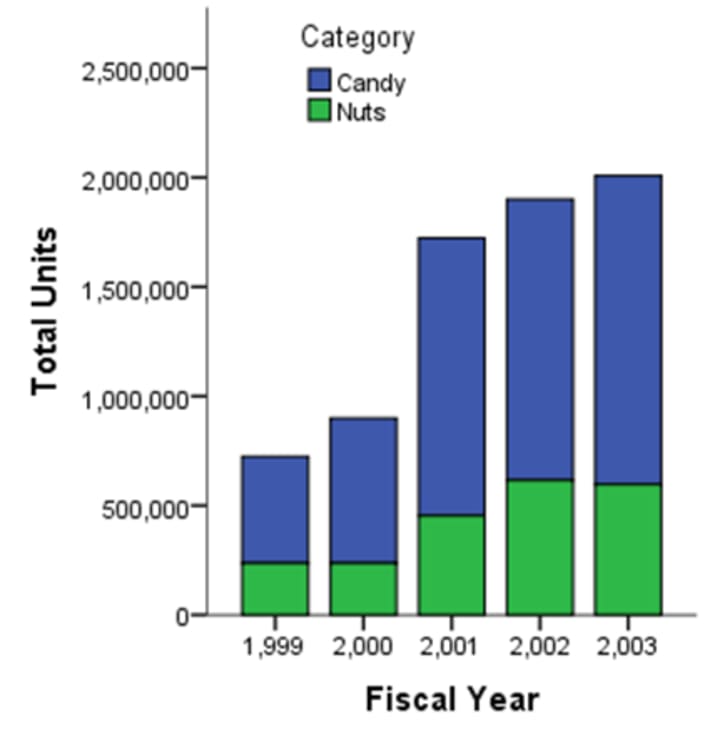
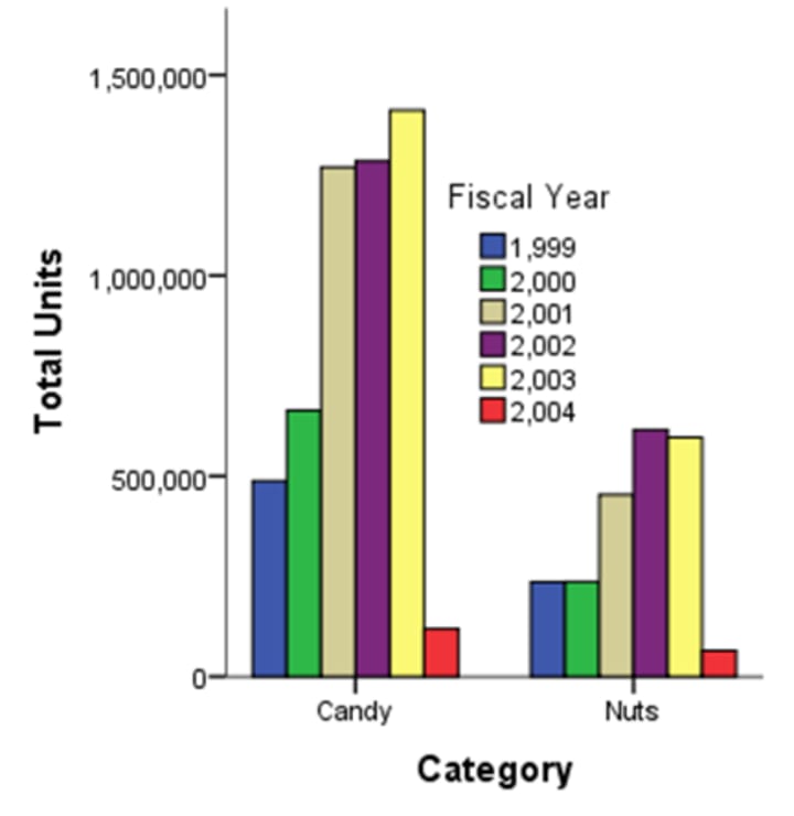
Presentation of Quantitative Data
Graphical Presentation
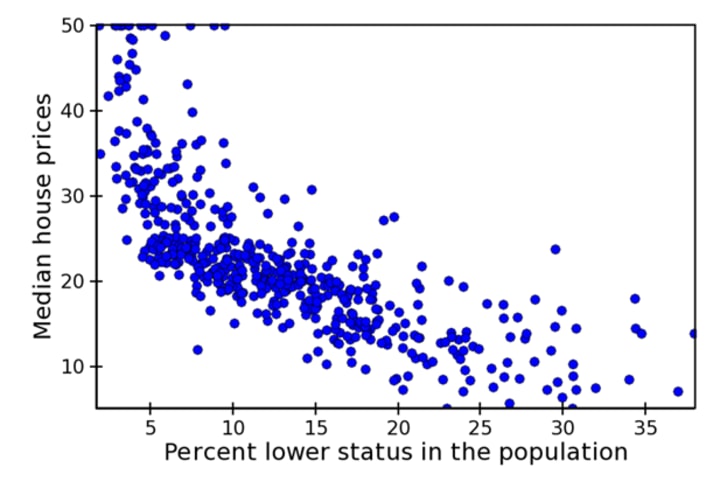
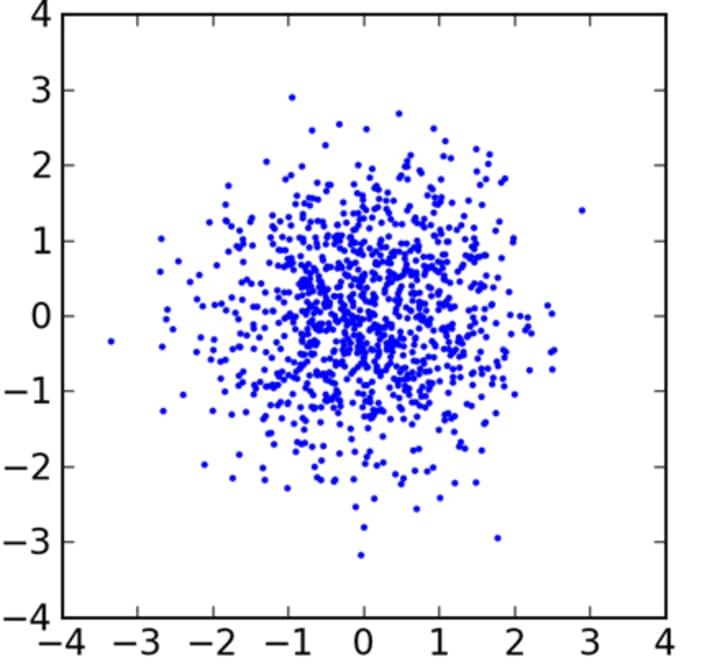
Various Types of Scatter Plots
Measure of Central Tendency
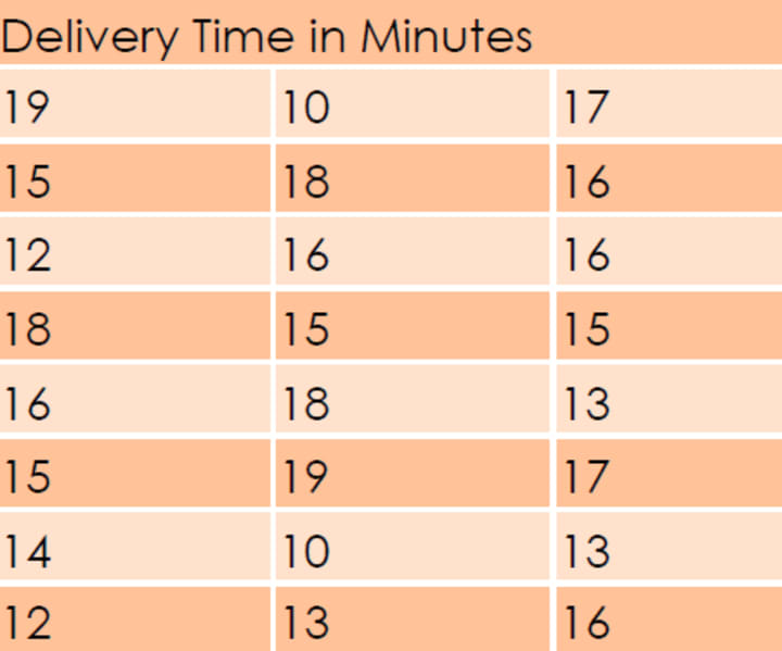
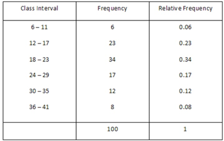
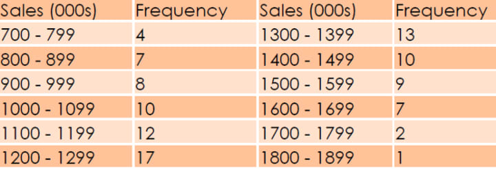
The vice president of marketing of a fast — food chain is studying the sales performance of the 100 stores in the eastern part of the country. He has constructed the following frequency distribution of annual sales:
There are precisely three ways to find the central value: Arithmetic mean, Median and Mode.
Arithmetic mean is the simple average of the data. The problem with arithmetic mean is that it is influenced by the extreme values. Suppose, you take a sample of 10 persons whose monthly incomes are 10k, 12k, 14k, 12.5k, 14.2k, 11k, 12.3k, 13k, 11k, 10k. So the average income turns out to be 12k. So that‘s a good representation of the data. Now if you replace the last data with 100k, then the average turns out to be 21k which is very absurd as 9 out of 10 people earns way below that mark.
This problem of Arithmetic mean can be reduced though the use of Geometric and Harmonic mean. But the effect of outliers can be almost nullified by the use of Median. Median is the mark where the entire data is split into exact halves, that is, 50% of the data lie above the mark and the rest lie below. In intuitive sense, it is the proper measure of central tendency. But for various computational reason, Arithmetic mean is the most popular measure.
Whereas median looks for half mark, Mode looks for the value with the highest frequency, that is highest number of occurrence.
So using central tendency, we are trying to find out a value around which all the data are clustering. This property of data can be used to deal with the missing values. Sup-pose, some of the income data is missing, then you can replace the missing values with the mean or the median values. If some city name is missing, one may replace those by using the mode, that is the city which appeared most of the times.
Measures of Dispersion
As the name says, here we are trying to access how disperse the data is. A measure of central tendency without any idea about the measures of dispersion don‘t make any sense. Why it is so? Look at the following charts.
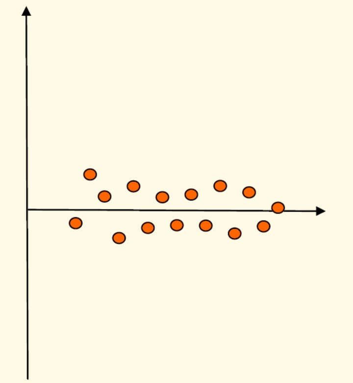
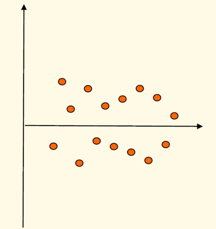
The horizontal data is the central value in both the cases. But for the first case where the data is less dispersed, the data is really clustered around the central line. Whereas in the second case, data is so dispersed that central value is not that meaningful, as you cannot say that the horizontal line is a true representative of the data. So there is a need to measure the dispersion in the data.
Broadly there are two measures of data, one is absolute measures like Range or Variance and the other is relative measure like Coefficient of Variation.
Range is the simplest measure. It is basically the difference between the maximum and the minimum value in a data. The other absolute measure Variance is a bit complicated to express in plain words. It basically comes from the sum of squared difference of the each data from the arithmetic mean of the data. Now as you go on in-creasing the number of data, the sum basically increases. So we take the average. Now if you take the square root (e.g. square root of 9 is 3), we get the Standard Deviation of the data. If you like you can memorize the following expression:
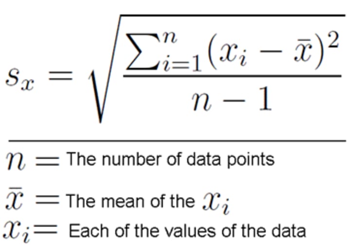
Some of you might find difficulties with the denominator being n-1 instead of n. The reason is that here we are calculating the sample standard deviation. If it had been population standard deviation, we could have used n.
Apart from understanding the dispersion in the data, standard deviation can be used for transforming the data. Suppose, if we want to compare two variables like the amount of money persons earn and the number of pair of shoes their wives have, then it is better to express those data in terms of standard deviations. That is, we simply divide the data by their respective standard deviations. So here the standard deviation acts as a unit or we make the data unit free.
Now if you want to understand which data is more volatile, personal income or pair of shoes, you better use Coefficient of Variation. As mentioned earlier, it is a relative measure of dispersion and is expressed by standard deviation per unit of central value, i.e. mean. If you have income in dollar terms and income in rupee terms, and if the first data has less coefficient of variation than the second one, use the first data for analysis. You will find more meaningful information.
Measures of Location
Using Measures of Location, we can get a bird‘s eye view of the data. Measures of Central Tendency also comes under the Measures of Location. Minimum and maxi-mum are also measures of location.
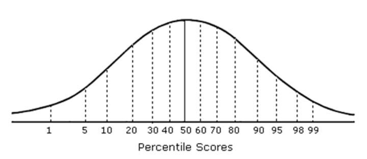
Other measures are Percentiles, Deciles, and Quartiles. For example, if 90 percentile denotes the number 86, the it is implied that 90% of the students have got marks which are less than 86. Now the 90 percentile is the 9th Deciles.
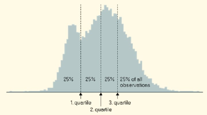
For quartiles, we are basically dividing the total data into four equal parts. So we are looking for 3 points Q1, Q2, and Q3. The other name for Q2 is Median. So we have 25% of the data be-low Q1, 25% within Q1 and Q2, similarly 25% within Q2 and Q3 and finally, rest of the 25% above Q3.
Statistics Related to The Shape of The Distribution
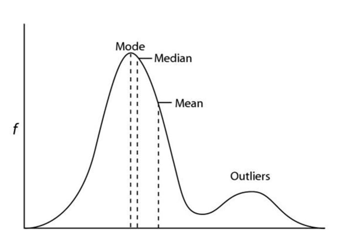
As we look at the shape of the histogram of a numeric data, we have various under-standing about the distribution of the data. We have two statistics that are related to the shape of the distribution: Skewness and Kurtosis. If the distribution has a longer left tail, the data is negatively skewed. The opposite is for the positively skewed. So we are basically detecting whether the data is symmetric about the central value of the distribution.
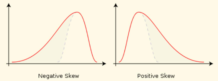
In options markets, the difference in implied volatility at different strike prices represents the market’s view of skew, and is called volatility skew. (In pure Black–Scholes, implied volatility is constant with respect to strike and time to maturity.) Skewness causes the Skewness risk in the statistical models, that are built out of variables which are assumed to be symmetrically distributed.
Kurtosis, on the other hand, measures the peaked-ness of the distribution as well as the heaviness of the tail. Generally heavy tailed distributions don‘t have a finite variance. In other words, we cannot calculate the variance for these distributions.
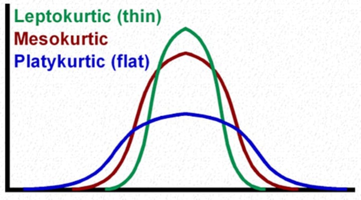
Now if we consider that the distribution is not heavy tailed and build the model on this assumption, it can lead to Kurtosis risk of the model. For instance, Long-Term Capital Management, a hedge fund cofounded by Myron Scholes, ignored kurtosis risk to its detriment. After four successful years, this hedge fund had to be bailed out by major investment banks in the late 90s because it understated the kurtosis of many financial securities underlying the fund’s own trading positions. There can be several situations as shown in the chart. The value of kurtosis for a Mesokurtic Distribution is zero. For Platykurtic it‘s negative and for Leptokurtic it‘s positive. Kurtosis is sometimes referred as volatility of volatility or the risk with-in risk.
Box Plot for Detecting Outliers
An outlier is a score very different from the rest of the data. When we analyze data we have to be aware of such values because they bias the model we fit to the data. A good example of this bias can be seen by looking at a simple statistical model such as mean. Suppose a film gets a rating from 1 to 5. Seven people saw the film and rated the movie with ratings of 2, 5, 4, 5, 5, 5, and 5.
All but one of these ratings is fairly similar (mainly 5 and 4) but the first rating was quite different from the rest. It was a rating of 2. This is an example of an outlier. The box-plots tell us something about the distributions of scores. The boxplots show us the lowest (the bottom horizontal line) and the highest (the top horizontal line).
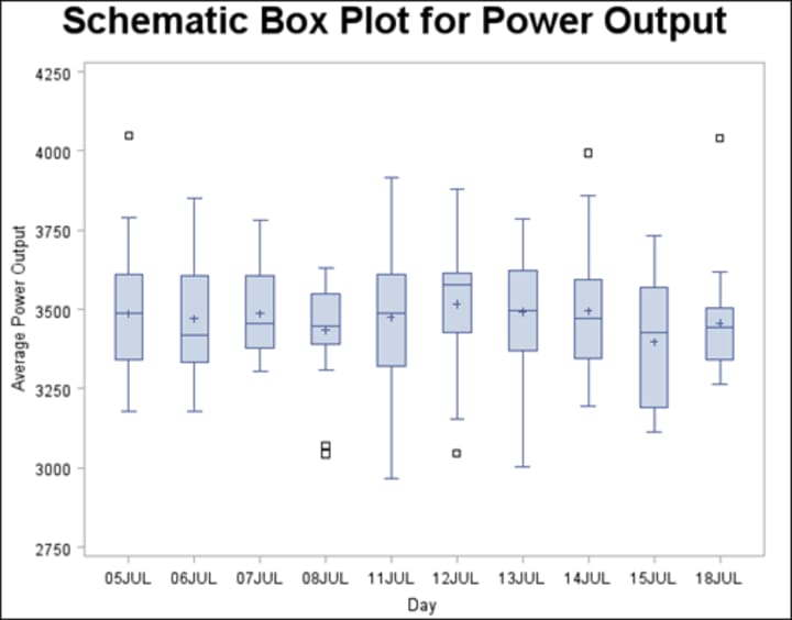
The distance between the lowest horizontal line and the lowest edge of the tinted box is the range between which the lowest 25% of scores fall (called the bottom quartile). The box (the tinted area) shows the middle 50% of scores (known as interquartile range); i.e. 50% of the scores are bigger than the lowest part of the tinted area but smaller than the top part of the tinted area. The distance between the top edge of the tinted box and the top horizontal line shows the range between which top 25% of scores fall (the top quartile). In the middle of the tinted box is a slightly thicker horizontal line. This represents the value of the median. Like histograms they also tell us whether the distribution is symmetrical or skewed. For a symmetrical distribution, the whiskers on either side of the box are of equal length. Finally you will notice small some circles above each boxplot. These are the cases that are deemed to be outliers. Each circle has a number next to it that tells us in which row of the data editor to find the case.
Correcting Problems in the data
Generally we find problems related to the distribution or outliers while exploring the da-ta. Suppose you detect outliers in the data. There are several options for reducing the impact of these values. However, before you do any of these things, it‘s worth checking whether the data you have entered is correct or not. If the data are correct then the three main options you have are:
1.Remove the Case: It entails deleting the data from the person who contributed the outlier. However, this should be done only if you have good reason to believe that this case is not from the population that you intend to sample. For example, if you were investigating factors that affected how much babies cry and baby didn‘t cry at all, this would likely be an outlier. Upon inspection, if you discovered that this baby was actually a 10 year old boy, then you would have grounds to exclude this case as it comes from a different population.
2.Transform the data: If you have a non-normal distribution then this should be done anyway (and skewed distributions will by their nature generally have outliers be-cause it‘s these outliers that skew the distribution). Such transformation should re-duce the impact of these outliers. For transformation we use the compute variable facility.
Log Transformation (log Xi): Taking the logarithm of a set of numbers squashes the right tail of the distribution. However, you cannot get a log value of zero or negative numbers, so if your data tend to zero or produce negative numbers you need to add a constant to all the data before you do transformation.
Square root transformation (√Xi): Taking the square root of large values has more of an effect than taking the square root of small values. Consequently, taking the square root of each of your scores will bring large scores closer to the center. So this can be a very useful way to reduce positively skewed data. But we still have the problems related to negative numbers.
Reciprocal transformation (1/Xi): Dividing 1 by each of the scores reduces the impact of large scores. The transformed variable will have a lower limit of zero. One thing to bear in mind with this transformation is that it reverses the scores in the sense that scores that were originally large in the data set become small after the transformation, but the scores that were originally small become big after the transformation.
3. Change the score: If transformation fails, then you can consider replacing the score. This on the face of it may seem like cheating (you are changing the data from what was actually collected); however, if the score you‘re changing is very unrepresentative and biases your statistical model anyway then changing the score is helpful. There are several options for how to change the score. The first one is next highest value plus one. We can replace our outliers with mean plus three times standard deviation derived from the rest of the data. A variation of this method is that we can use two instead of three time standard deviation.
About the Creator
Keep reading
More stories from writers in Education and other communities.
Evaluation - First time in College Kitchen
"Today was the first time that I was able to cook in the college kitchen with my partner Nicole Daoud. Being the first time that I was experimenting in a new kitchen with new surroundings it was quite nerveracking, although i do believe that in the end i did quite a good job. My aim was to produce a great and edible 'Salad Roll Up' that would display my techniques thoroughly. To begin with it took quite a while to get use to where everything was placed and this was something that i think Nicole and I struggled with. Although, in the future I am sure that we will find the equipment and utensils needed with much more simplicity now that we have experience.
By Esha Taylorabout 18 hours ago in Education
Lifting the Curtain to a Successful Month
April has been a fantastic month for me in terms of writing endeavors. I’d like to share what’s been so great about it just as many other writers would do. Share successes. I’ve noticed other writers or artists have shared successes and when you just see the snippet of their success, it appears everything has been going right for them all along. But we haven’t seen behind the curtain, we haven’t seen their hard work and their failures and those months that were fraught with disappointment. In everyone’s case, it’s far from the truth. But for the outside observer it isn’t always apparent.
By Stephen Kramer Avitabile2 days ago in Writers


Comments
There are no comments for this story
Be the first to respond and start the conversation.