
“Data Visualization
Best Practices for Google Data”

---
Once upon a time, in a bustling city, there lived a diligent data analyst named Emily. She worked for a digital marketing agency that relied heavily on Google Data to measure the success of their campaigns. One sunny morning, Emily's boss approached her with an urgent request.
"Emily," her boss said, "We have a crucial client meeting next week, and we need to present our Google Data in a way that's not only informative but also visually engaging. Can you work your magic and come up with a compelling data visualization?"
Emily nodded, accepting the challenge. She knew that presenting data effectively was both an art and a science. She decided to embark on a journey to discover the best practices for data visualization using Google Data.
**Chapter 1: The Quest for Clarity**
Emily's first stop was a local library, where she delved into books on data visualization. She learned that the primary goal of data visualization was to convey information clearly and concisely. Armed with this knowledge, she set out to organize her Google Data.
In Google Data Studio, she carefully structured her data, ensuring that each metric and dimension had a specific purpose. She embraced the mantra "Less is more" and eliminated any unnecessary clutter. Her charts and graphs began to take shape, telling a story without overwhelming the audience.
**Chapter 2: The Colors of Insight**
Next, Emily turned her attention to colors. She knew that colors could evoke emotions and enhance understanding. She spent hours studying color theory and its application in data visualization. With Google Data Studio's customization options, she selected a color palette that not only looked appealing but also aided in interpreting the data.
For instance, she used vibrant colors to highlight important trends and muted tones for background elements. Emily realized that striking the right balance between colors was vital to prevent visual overload.
**Chapter 3: The Tale of Typography**
Typography played a crucial role in Emily's data visualization journey. She discovered that using consistent and legible fonts improved the readability of her reports. She selected Google Fonts that complemented her design, making the text both aesthetically pleasing and easy to digest.
Furthermore, Emily used font size strategically to emphasize key points and headings. She aimed for a harmonious blend of text and visuals to create a seamless narrative.
**Chapter 4: The Art of Interactivity**
In her exploration of Google Data Studio, Emily uncovered the power of interactivity. She knew that static charts could only tell part of the story. To engage her audience fully, she added interactive elements.
She implemented filters and date range selectors, allowing viewers to explore the data from different angles. Emily's reports became dynamic, enabling clients to interact with the data and discover insights on their own.
**Chapter 5: Storytelling with Data**
As Emily continued her journey, she realized that data visualization was not just about charts and graphs; it was about storytelling. She attended workshops on narrative structure and began to infuse her reports with compelling narratives.
She used annotations and text boxes in Google Data Studio to guide her audience through the data's journey. She started each report with a clear introduction, built tension with rising action, and concluded with a meaningful resolution. Her reports now told stories that captivated her clients' attention.
**Chapter 6: The Feedback Loop**
Emily understood that her journey was a continuous one. To refine her skills further, she sought feedback from her colleagues and clients. She encouraged open discussions about the data visualizations, welcoming constructive criticism.
She learned that each audience was unique, and tailoring her visualizations to their specific needs and preferences was crucial. By being receptive to feedback, Emily evolved as a data visualization artist.
**Chapter 7: The Grand Presentation**
The day of the client meeting arrived, and Emily felt a mixture of excitement and nervousness. She had poured her heart and soul into the data visualizations, following the best practices she had discovered on her journey.
As she presented her reports, she noticed her clients' eyes light up with understanding and appreciation. They engaged with the interactive elements, asked insightful questions, and nodded in agreement with the narratives she wove. Emily's data visualizations had not only conveyed information but had also left a lasting impact.
**Chapter 8: The Legacy**
Emily's success at the client meeting spread like wildfire within her agency. Her colleagues sought her guidance, and she gladly shared her knowledge, helping them embark on their own data visualization journeys.
Over time, Emily became known as the go-to expert for data visualization with Google Data. Her journey had transformed her from a diligent data analyst into a masterful data storyteller.
And so, the story of Emily's quest for data visualization excellence became a legend in the digital marketing world. Her legacy lived on, inspiring others to embrace the art and science of presenting data effectively with Google Data.
---
In the end, Emily's journey illustrates the importance of data visualization best practices when working with Google Data. These practices can transform raw data into a compelling narrative that informs and engages audiences, leaving a lasting impact.
About the Creator
Keep reading
More stories from Donald Etim and writers in Education and other communities.
“The Triumph of Perseverance:
--- Once upon a time, in a small town nestled between rolling hills, there lived a young woman named Sarah. She was known throughout the town for her infectious laughter and unwavering optimism. However, beneath her cheerful exterior was a story of perseverance, resilience, and the pursuit of lasting happiness.
By Donald Etim8 months ago in Poets
Top 20 gadgets of 2023
In the bustling city of Techopolis, where innovation thrived and technology reigned supreme, a young inventor named Alex eagerly awaited the unveiling of the year's most anticipated event: the Tech Expo showcasing the top 20 gadgets of 2023. With a passion for all things tech and a knack for creativity, Alex dreamed of one day revolutionizing the world with their own inventions.
By Daniel Daniel5 days ago in Education
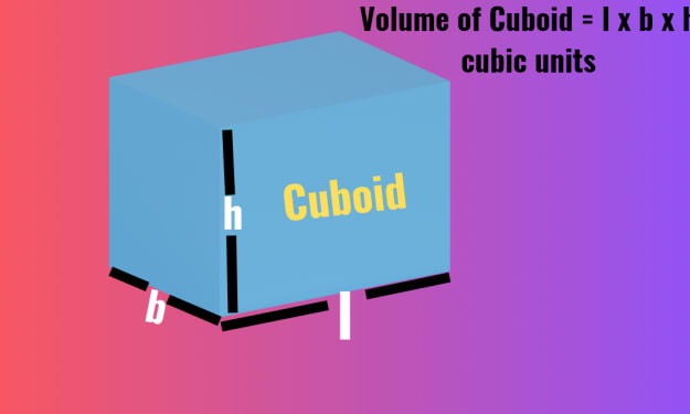
Volume of a Cuboid
Introduction: The world around us is filled with various fascinating geometric shapes, each has its own unique properties and applications. Among these, the cuboid stands out as a fundamental figure, known for its simplicity yet versatility. In this article, I will try to delve into the depths of the cuboid, exploring Volume of a Cuboid– a crucial concept in mathematics and various fields of science and engineering. From its definition to practical applications, join with me on a journey to unravel the mysteries of the cuboid.
By champak jyoti2 days ago in Education
Dog Number 13
May 15, 2023 Strange things are happening. Good-strange, bad-strange, and strange-strange. For starters, me and all my litter mates are able to stand. Some of us can even wiggle around in a clumsy manner. I say wiggle because it isn’t quite walking but it isn’t quite crawling. We just sort of stand and wiggle and fall and take a few steps and then crawl and then get up again. It is in this manner we are able to move around to some degree and explore our surroundings. Naturally we cannot go far. Which is ok, I suppose, because I am very small and I need my mother for food and my siblings to keep me warm and I feel very loved and comforted by them in some way, so I don’t know why I would need to go very far. Having four legs, I must admit, is very strange. It is not a surprise to me that it is challenging to coordinate them to move in the order they need to move. But I can get around a little bit, my eyes can stay open for much longer periods of time now, and it is easier to understand what is happening. So this is new.
By Morgan Longfordabout 18 hours ago in Chapters


Comments
There are no comments for this story
Be the first to respond and start the conversation.