
CSS for Beginners
Course level: Beginner


Contents:
1. UNITS
2. SPECIFICITY
3. THE !Important RULE
4. MATH FUNCTIONS
5. PADDING
6. COMBINATORS
7. SUMMARY & QUIZ
Welcome! To this exciting course for CSS. It is the language that rules the programming world. It would be best to learn CSS because all intermediate programming languages are based on it. Let’s start and play with the alterations using CSS.
1. Units
It is necessary to use appropriate units because each unit contains a change concerning the given dimensions. Suppose you measure a length of a table in meters and then in centimeters. The length will be different in both cases due to the units applied. The same scenario is applied to CSS elements, and we will learn how they work.
We usually use units in our daily life to specify a specific size for any object. While in CSS, we also have such units to give specific lengths to an element according to our considerations. The CSS length property includes Width, Margin, Padding, Font-size where you can play with increasing or decreasing it using CSS units.
For example:
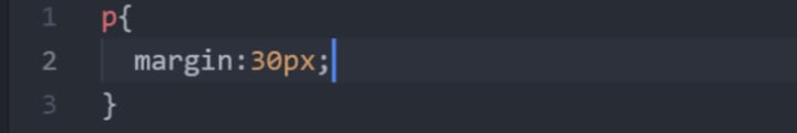
Suppose you want to add the margin of a paragraph in CSS. Use the code editor which you wish to. In this case, the margin element is the property, and 30 is the magnitude of length, whereas px(pixel) is the unit of applied margin.
We have two major categories for units. It’s up to you which you want to use; both will increase and decrease, but choosing the right one at the right place is necessary, which you will learn in this course. Let’s discuss the units and see how they make changes to our websites.
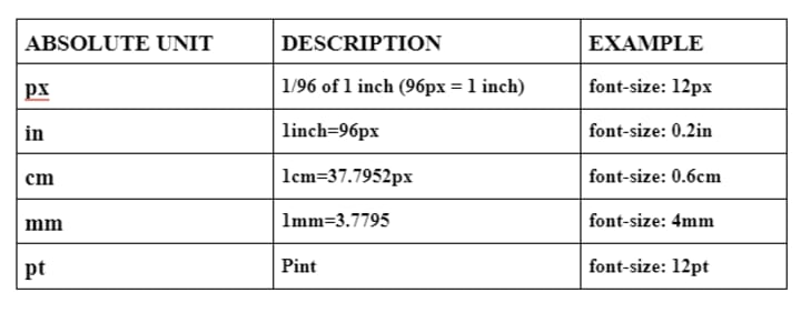
1. Absolute units
Absolute units are used where the website’s responsive designs don’t matter. They will never scale themselves when the screen size changes because of the fixed lengths. It remains the same because it does not depend upon the parent element or window size. Absolute units are usually used in desktop apps because they can’t be resized. After all, we style them with the dimensions provided.
Pixels(px) is typically the unit we use in CSS for display, whereas centimeters, meters, and inches are for printing purposes. 1 px in CSS could be 2 or 3 on the main screen, so use the unit wisely and check each after applying.
Let’s look at the units table and apply them to see the changes.
All the above-mentioned units work well with CSS. You can choose the preferred option to which you want to apply. Let’s see an example to see how it works on your website.
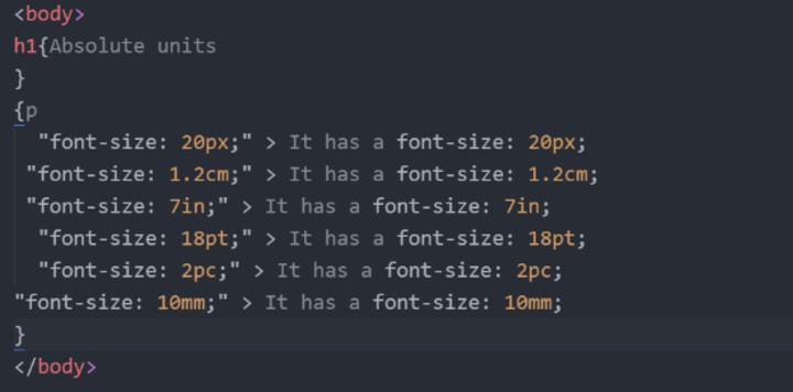
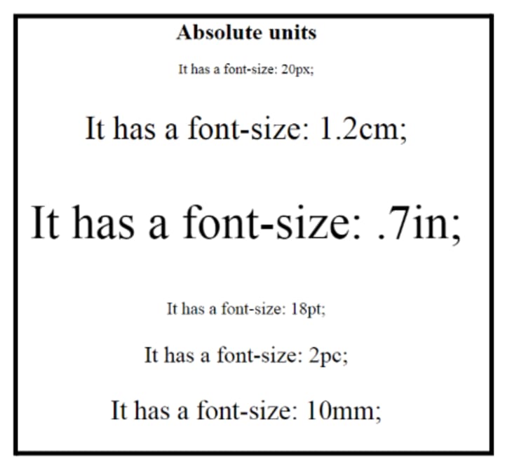
If you apply this coding to your website, the font size will be like this.
2. Relative Units
We use relative units because they can change the content according to the screen size. It will make your content responsive, so you don’t have to zoom in on the browser to read. It will relatively increase the size according to the browser settings. Let’s see the necessary units and understand each.
a. Percentage (%)
We use this unit in our daily life, which is relevant to us. It is relative to the parent element on your website. It represents a fraction of the elements and varies with the magnitude applied.
b. Character (ch)
This unit does not mean that it will contain the mentioned characters on a line. It is relative to the width 0 on your font. You can use it when you want a readable width of your text. For the best readable text, choose the ch size between 50-70 characters.
c. em
em is relative to the font size of the current element. You can change the size or the width of an element using the em.
d. rem
It is the same as em, but it is related to the default font size instead of the current.
Selection of the correct units:
Use px for the border size.
Use em for margins and paddings.
Use rem for the font sizes.
2. Specificity
Specificity is an algorithm used to determine which selector takes precedence first. The selectors have specific precedence. Browsers calculate the specificity according to the importance of elements. In other words, it calculates the weight of the applied CSS declaration. If there were more than two selectors, then the highest one would get precedence. I will show you an example through which all your confusion will vanish.
It is necessary to understand the weight of each element; otherwise, your selected style will not be applied.
Specificity Hierarchy
The default selectors have their place in specificity. To understand that, we need first to know the categories of all available selectors.
- Inline Styles
These are the most used elements in XHTML documents. It has the highest specificity among all. We have a specific algorithm to write this selector. It will be attached directly to the elements which we want to style. They have a specificity score of 1-0-0-0, so they quickly take precedence over other selectors.
For example:
<h1 style=“color: #black;”>
- ID selectors
These are the second highest in terms of specific weight. It has a specificity score of 0-1-0-0. ID elements are the identifiers of your page elements.
For example:
#div, #modal
- Class, Pseudo-class, and Attributes
These are the third highest, which have a specificity score of 0-0-1-0.
For example:
.football, : hover, [href]
- Elements & Pseudo elements
These contain the elements from which CSS styling is incomplete without them. The elements contain (h1, p, a, div), and the pseudo-elements include double colon elements like (::after, ::before). They have the lowest specificity of all.
- Universal Element
(*) is a universal element in CSS; it has 0 specificities at all. The parameters of these elements don’t matter, and their specific weight is almost negligible.
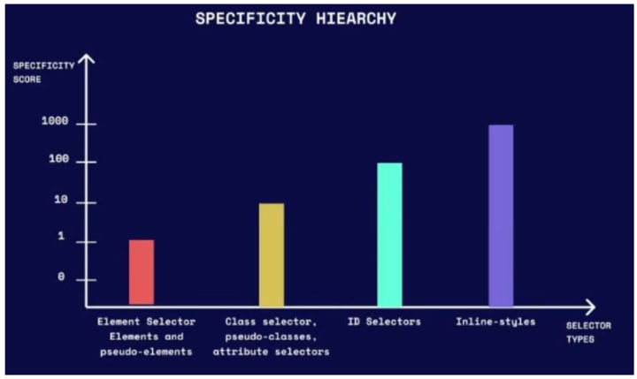
This graph helps determine the specificity for each element in CSS so that you will never find it complicated.
Examples of specificity to understand the concept
I will give you some examples to make the concept feasible for you. You can clear all the concepts and play with them flawlessly.
1. Specificity Comparison for three columns
This algorithm works on the principle that it calculates the specificity from left to right for each place of the selector component. Let’s see how it works
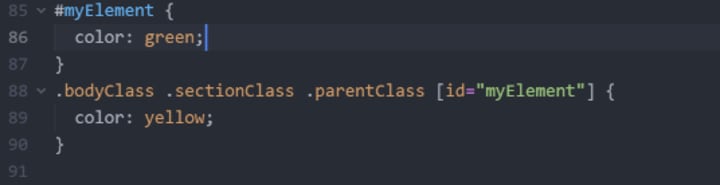
If you look at this example, we have an ID element in the first, while we have three classes and one ID element in the second one. If we calculate the specificity score, it will be 1-0-0 for the first and 0-4-0 for the second.
According to the left-to-right rule, the first one wins because it has a value in the first column, no matter if the other has larger values in the second column.
2. Equal specificity example
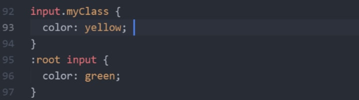
In this example, the specificity is equal in both cases. The first one has a class and an element, while the other one has an element and a pseudo-class, so the specific weight for both will be the same. If you count the weight for the first one, it will be 0-0-1, and the second one will be 0-0-1, so both are the same, but the second one will win because it comes later.
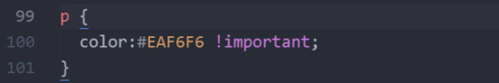
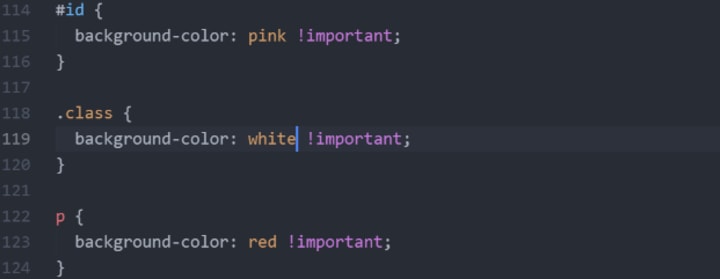
3. The !important rule
The !important rule in CSS excludes all the properties applied before. If you use this property with an element, it will mark it as important and executes this only after ignoring all consequent rules. This rule must be placed before the semicolon at the end of the CSS code. You can control such properties using this rule for the accessibility of your documents, including large fonts or color combinations. Let me show you an example from which you can quickly determine the place to use !important rule.
Use of !important rule
For the debugging of website, specificity rule is more effective than any other. Use !important rule to overcome the complications in some cases. If it makes the changes to your web browser, remove !important and reverse the specificity applied to fix that bug.
Sometimes the overuse of !important rule can change the process of your CSS coding because it will never manage such changes.
Suppose you are working with an inline style and wish to override the earlier style, so it must be practiced !important rule for a clean and clear style sheet. Let’s learn where to use !important rules to understand their importance of it.
- Classes
It is probably good in the case of classes. Suppose you used a class of buttons on your style sheet and applied different styles. You can use !important rule to appear precisely the same as the applied font, margins, and borders. This will never take the browser’s precedence over it.
- Exclude the rules for the user style sheet
If you use !important rule for the elements you applied on your website will appear the same in the user’s view. It will never override, no matter which screen reader the user uses.
- To reverse the order
In case of declaration, the order of precedence will be reversed due to !important rule. Reversing the order will benefit the user to ensure its particular needs. It is important to override the author’s style. In some cases, you get exhausted applying which inline style, so this will be the best option to use this rule.
Examples of !important rule
Let’s discuss some examples to make this rule handy for you. You must examine all the steps and the results we are getting for each.
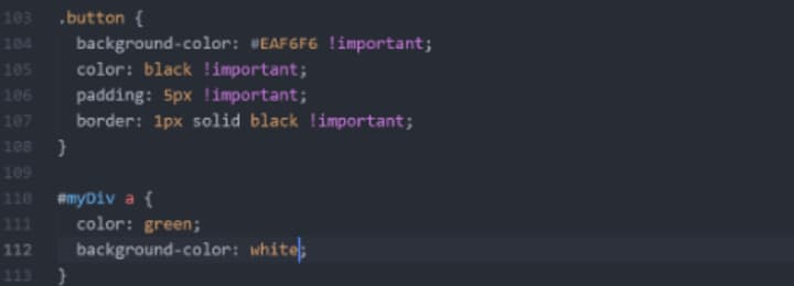
If you look at this example in terms of specificity, then the ID element will take precedence over the class element. It will first apply the rule for higher priorities for the ID element, but if you use !important in classes, it will automatically reverse the order and give all the importance to the class element instead of the ID element.
Disadvantage of !important
This rule is excellent in some places, but it isn’t easy to understand the precedence for multiples. The simultaneous use of this code creates a conflict to which element it will be applied. Let’s see an example.
4. Math functions
CSS has some built-in basic math functions that will help you deal with different cases. These are one of the most powerful in the sense of their use and capability to perform the expressions efficiently. Front-end developers usually use it for mathematic and basic arithmetic calculations in their coding. We have four essential functions in CSS, which we will discuss in this course and give you some examples to understand, so let’s start.
- calc()
From this function, you will be able to perform basic operations in your CSS. You can use addition, subtraction, division, and multiplication on CSS’s numbers and the length units. It takes an expression using the function and gives the result in a single value.
Suppose you want to subtract your navbar height from the viewport’s height using the calc function. The syntax for this progression will be:
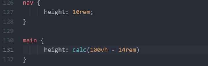
In this example, we have the navbar’s height of 10rem. The main tag has a height of full screen minus 14rem. It will automatically create a 4rem gap between the navbar and the main content of a website.
- clamp()
We have to input three values to define a specific range in the clamp function. It has three comma-separated expressions. The syntax contains a minimum value, target value, and maximum value. Let’s take an example to understand the syntax.
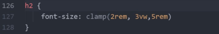
In this example, we have defined a minimum value for h2 as 2rem, an ideal value of 3vw, and the maximum value should be 5rem. You can also use multiple arithmetic operators containing max and min functions.
- max()
This function will return the larger value between the two values. It takes one or more comma-separated values as inputs. The higher the value, the greater the effect will be applied.
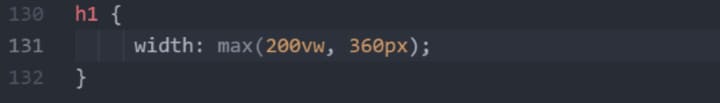
In this example, the larger value is 360px, which will be applied to your h1 tag.
- min()
This function will return the smaller value between the two values. It takes one or more comma-separated values as inputs. The lower the value, the lower the effect will be applied.
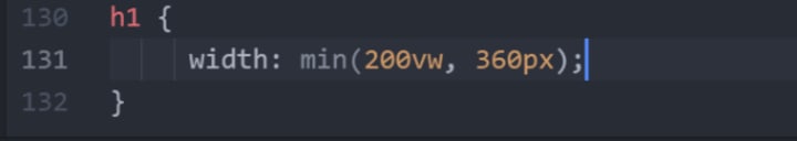
The smaller value of 200vw will be applied to your h1 tag.
5. Padding
The padding is used to create space around a box element that has certain borders. It is actually the space between an element and its borders. We have multiple types of properties for padding, and we can alter them separately. You can set the values in percentages and length, but it does not take any negative value. The default values for padding in CSS will be zero for all containers.
The four basic categories for padding are as follows:
- Padding-top
It will add padding from the top between the element and the container borders.
- Padding-right
This code will take effect from the right border of the element.
- Padding-bottom
This will take effect from the bottom border to the inside element.
- Padding-left
This will increase the padding from the left of the element from its borders.
Example of padding
In this example, the syntax and how to write padding are given below. You have to give it a value after the semicolon, and you can check after applying whether it looks good or not.
Cases for shorthand padding
We have four cases to understand shorthand paddings to neglect long-term codes; instead, we use shorthand codes because we want a list of clean codes. Let’s discuss the cases and new shorthand syntax.
- Case 1:
This case consists of 4 padding values, which are as follows:
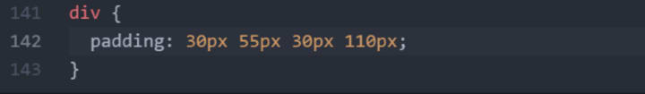
In this case, the example code means:
- 30px is the top padding.
- 55px is the right padding.
- 30px is the bottom padding.
- 110px is the left padding.
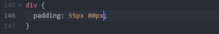
- Case 2:
This case consists of 3 padding values, which are as follows:
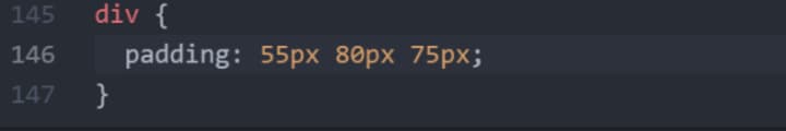
In this case, the syntax refers to:
- Top padding as 55px.
- Right padding as 80px.
- Bottom padding as 75px.
- Case 3:
This case consists of 2 padding values, which are as follows:
In this case, we have:
- Top and bottom paddings as 55px.
- Right and left paddings as 80px.
- Case 4:
This case only consists of 1 padding value. Let’s go through an example.
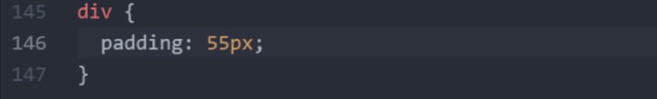
This syntax means that all the paddings have a value of 55px.
6. Combinators
Combinators are the relationship between the two selectors which determines the parent element, child element, and the branches of it. We have four types of combinators in CSS, which are as follows:
1. Descendant Combinators
This combinator is denoted by a blank space between the two selectors. It refers to the child element that is nested in the parent selector. To use this combinator, you must apply a space between the parent and child element.
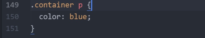
The above stated example states that it will act on the p element because it is the descendant of the .container selector.
2. Child combinators
The child combinators will take effect on the selector, which is a direct child of the parent element. It takes no children-children element while executing only the direct connected child. We represent child combinators with a greater than (>) symbol.
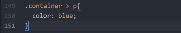
In this example, it will apply the blue color only on the second p because it is a direct child element of .container.
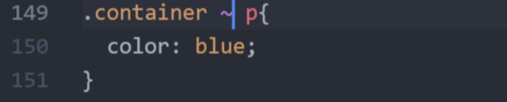
3. Sibling combinators
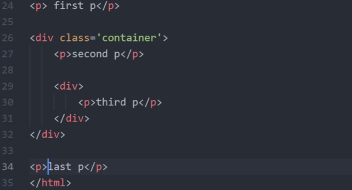
The sibling combinators make changes on the very first element, which is directly linked with the main element. This combinator is denoted by a tilde(~) sign, and the example is as follows:


In this example, the sibling combinator will only take effect on the last p and another last p because these are the sibling selector for the p present in the .container class. The selection will take place after the div.
4. Adjacent combinators
This is the same as the sibling combinator, but it differs in that it will style only the first sibling element, which you can say is an immediate sibling element. This is denoted by the (+) sign.
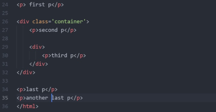
The CSS style will only affect the first sibling element, the last p. You can apply and check for the selector on your website.
7. Summary & quiz
Applause! You have now upgraded from a beginner to an advanced level. You are now all set to play with the properties mentioned in this course. Let’s start a couple of quizzes to grip that course properly.
Question 1: What does CSS stand for?
A: Cascading Style Sheet
B: Cover Short Sheet
C: Cascading Short Style
Question 2: We have ________ types of units in CSS.
A: Two
B: Three
C: Six
Question 3: Absolute units do not work for ________ designs.
A: Non-responsive
B: Responsive
C: Restriction
Question 4: ______ is the correct unit for border margin.
A: px
B: em
C: rem
Question 5: What is the best range for the ch unit?
A: 50-70
B: 100-120
C: 10-20
Question 6: Specificity is the ________ of elements.
A: Arrangement
B: Size manipulations
C: Precedence
Question 7: If we have equal specificity, then CSS will prefer the ________ one.
A: Latest
B: Middle
C: Last
Question 8: Universal elements(*) have ________ specificity score.
A: 1-0-0
B: 1-0-1
C: 0
Question 9: We apply !important rule before?
A: Semicolon
B: Colon
C: Full stop
Question 10: The clamp math function has ________ inputs.
A: One
B: Three
C: Nine
Question 11: The max() function executes the ________ value.
A: Middle
B: Lower
C: Higher
Question 12: Padding is used to create space around the element and ________ of the container.
A: Display
B: Border
C: Header
Question 13: What does this div{padding:55px;} syntax represent?
A: All the paddings should be 55px
B: Bottom padding will be 55px
C: Top padding will be 55px
Question 14: Child combinator is denoted by:
A: >
B: ~
C: <
Question 15: Adjacent combinator is similar to:
A: Descendant combinator
B: Sibling combinator
C: Child combinator
About the Creator
Felicia Edwards
I am an aspiring writer with a unique flair for capturing the essence of tech, celebrity news, and digital marketing. With a keen eye for trends, a passion for storytelling, and a knack for engaging readers.
Keep reading
More stories from Felicia Edwards and writers in Education and other communities.
Enchanting Bedtime Stories for Sweet Dreams
Enchanting Bedtime Stories for Sweet Dreams Do bedtime stories hold the secret to peaceful and restful nights for your little ones? While it may seem like a simple tradition, bedtime stories have a magical power that goes beyond providing entertainment for children. They have the ability to transport young minds to enchanting worlds, nurture their imagination, and build cherished memories. But what truly makes a bedtime story captivating? How do you choose the perfect story to lull your child into a blissful slumber? Join us as we explore the fascinating realm of bedtime stories and discover the secrets to creating a magical nighttime routine.
By HICHAM NOUR EL YAKINE6 days ago in Education
Cauliflower Farming in India: An Informative Guide
Cauliflower is one of the most popular winter-season vegetables grown in India. It belongs to the Cruciferae family and is also known as Gobhi in India. Although this vegetable is cultivated in almost every state, the key producers are states like U.P., Bihar, Orissa, Assam, M.P., Gujarat, and Haryana. In addition, it is an important part of the human diet because it’s good in taste and has nutritional value.
By The Sustainable Seedling7 days ago in Education


Comments
There are no comments for this story
Be the first to respond and start the conversation.