
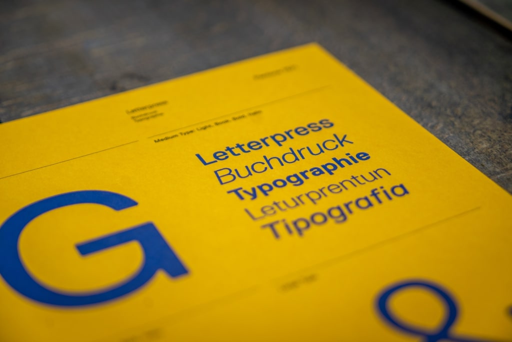
Bad Kerning in Typography: Here Are Also The Examples and Tips
Bad Kerning in Typography

Designing an advertisement is tricky because you need to consider many factors, including the fonts. However, some designers underestimate this factor which results in bad kerning. Do you know what is the meaning of this typography’s term? Let’s find the definition under the explanations below! Without further ado, let’s jump into it now!
What is Bad Kerning?
Before digging deeper, you need to know what kerning is. It is a space between two letters which can be a number or any character.
Kerning is known as an adjusting act to give a space between characters. Simply put, bad kerning is an act by designers who underestimate space, which leads to misunderstanding.
Commonly, this kind of mistake is normal, and many designers are used to it. However, you cannot repeat it since it may influence the advertisement.
Even worse, people may misread and make jokes about your designs. So please give more attention to your work so that your clients will be happy and may increase sales.
Also Read: What Is The Difference Between Kerning Tracking And Leading In Typography?
Examples of Bad Kerning
You learn enough about the definition. To fulfill your curiosity, I will attach four different examples. So take a guess which mistakes the designer makes in the following pictures. Here they are!
1. Massage Therapist
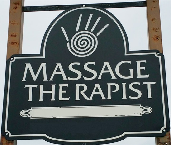
After looking at the picture above, I know you guess it right. The text on the advertisement above should be “Massage Therapist”. Unfortunately, the designer gives a space that changes the meaning.
It is unforgivable words because the message is out of the topic. The mistake leads to “Massage The Rapist”, which is dangerous to several factors. Hence, you need to double-check your design before releasing and printing it out to your ad location.
2. Shitake

By the time you see the picture above, I bet you are laughing out loud! You do, don’t you? This mistake is funny yet tragic because it must be written “Shitake”, a kind of mushroom.
Unfortunately, the designer misspells it to be “Shit Ake”, which is out of the box. Even though the mistake is funny, the owner of this product must not be happy with the spelling. So please be careful while spelling your client’s product’s name.
3. Box Out The Been Done

Who says bad kerning only relates to the letter’s space? Definitely, not! You can say that the image above is also bad due to the unpleasing look and irregular placement of the letters.
Truthfully, the designers may write “the” letters regularly without giving too much space. However, they make this mistake which makes readers slightly hard to read and understand. So, please consider the letter’s place so that it can be arranged neatly.
4. 10 Flickering Lights
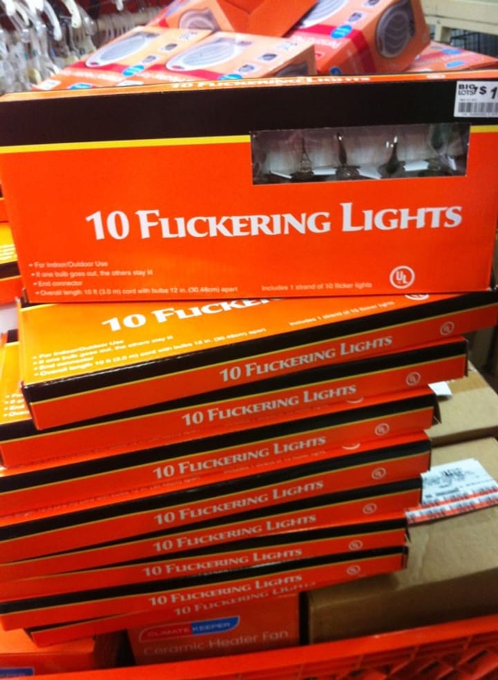
Last but not least, the mistake comes due to the similar look of the “li” to the “u” letter. This is unforgettable because the real writer must be “Flickering”. However, the designer underestimates the font, which results in “Fuckering”.
I know that you are the designer, but please avoid making this kind of mistake because it may give disadvantages to the clients. Hence, please be more cautious in choosing the fonts.
Also Read: What Is Tracking In Typography? With Tips and Examples
Tips on Bad Kerning
So what should you do to avoid bad kernings? Then, here are two tips to consider to satisfy your clients!
1. Avoid Underestimate Tricky Letters
First things first, you need to avoid underestimating tricky letters. Please give more attention to this kind of letter because it may disadvantage your design, name, and even your clients.
It is better to check on another font that gives a better look. If your clients insist, then give them the understanding that this font may lead to misspellings and misreading.
2. Give Letters Room to Breathe
To avoid bad kerning, you can give room to your letter to breathe. This tip is important because it may lead to a better understanding for the readers or customers.
So not only is the design look more readable, but also it can attract more people. Do not forget to double-check and ask for your client’s approval before launching the design. Hence, you can make your clients satisfied and not result in any misunderstanding.
Let’s Be More Meticulous to Avoid Bad Kerning!
Designers can avoid bad kerning if they give more attention to their chosen fonts. It is not easy but still, you need to do it so that people will not misunderstand. Merely follow the two tips above and you will get better results. So, get yourself together, and let’s design a perfect font for your clients now!
About the Creator
Creatype Studio
Type Designer & Lettering to design a font. Visit to www.creatypestudio.co
Keep reading
More stories from Creatype Studio and writers in Education and other communities.
What Is The Difference Between Kerning Tracking And Leading In Typography?
If you are a beginner graphic designer, one of the techniques that you first need to master is typography. In typography on its own, there are some basics that you have to learn as well, namely leading vs kerning vs tracking.
By Creatype Studioabout a year ago in Education
The Future of Commercial Security, Trends to Watch in the Next Decade
In today's rapidly evolving world, it is more critical than ever. As technology advances, so do the methods and strategies for protecting commercial properties. Over the next decade, we can expect significant changes in how businesses approach security. This guide will explore the future of commercial type security, focusing on emerging trends and innovations that are set to shape the industry.
By Alpine protection services2 days ago in Education
A retreat infused with 5 Elements in Landour
In the ancient philosophy of wisdom, the universe is perceived as a harmony of five elements: sky, air, fire, water, and earth. These elements serve as both the foundation of the world around us and the essence of our own being. Our existence hinges upon the nurturing embrace of fertile earth and rich soil; the sustaining flow of water, which nurtures life and maintains ecological harmony; the life-giving breath of air that fills our lungs with essential oxygen; and the radiant warmth of the sun, whose luminous energy sustains all life on Earth. From the solid ground beneath our feet to the tools we wield, everything is intricately woven from the fabric of these elemental forces, connecting us to the vast tapestry of existence.
By Heartoflandourabout 23 hours ago in Education


Comments
There are no comments for this story
Be the first to respond and start the conversation.