
As a schoolboy in Soviet Russia in the 1960s, my hands were almost never clean. Don’t get me wrong – I washed them as much as anyone else. But the school rules made us practise our penmanship in ink, which came in violet. It was the only colour of ink allowed, and it was precariously stored in a small jar, along with a wooden pen with replaceable metal nibs. Ink jars had a bad habit of constantly falling over, squirting my hands, face, uniform, notebooks and textbooks with violet blots that stayed for days. The blots, and my endless violet scribbles, are the main memories of my early education. Why did the USSR’s Communist Party leaders opt for violet ink to teach the young generation? That’s a mystery we might never be able to crack.
In contrast, though, outside of school, violet was hard to find, be it in paintings or everyday life. I am a painter, and early in my career I noticed that neither the teachers in my painting classes nor my fellow students used violet pigments.
Decades later, walking along Oxford Street in London one rainy day in the late 1990s, I was stunned to see that shops were brimming with women’s clothing in a myriad of violet shades. My mind went back to my Soviet childhood and those everlasting violet smudges on my hands, and to my art classes. I realised that, in my childhood, I’d never seen anyone in a violet blazer, shirt, tie or dress, holding a violet umbrella.
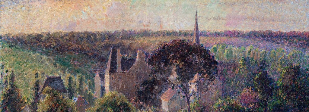
Intrigued, I went to the National Gallery in central London and, after checking the entire collection, found just one violet painting made before the Impressionist era began in 1863. Strangely, it looked like the greatest artists of the past epoch had ignored this colour – until the French Impressionists embraced it. Why so? I decided to find out.
Over the past 20 years, I visited 193 museums in 42 different countries. Equipped with 1,500 Munsell colour chips – the world-standard samples for colour science – I examined 139,892 works of art, searching for violet. I concluded that there were indeed only a very few artworks before the 1860s that contained this colour from my childhood. But from the second half of the 19th century, violet became very popular. This striking conclusion made me wonder why the status of violet had changed so drastically, at such a well-defined point in time? Clearly, more research was needed, and I was determined to do it.
Along with two colour scientists, Eric Kirchner and Elena Fedorovskaya, I selected 14 of the world’s largest art museums that had made large parts of their collections available in high resolution online. We collected hi-res digital photographs from a total of 4,117 paintings. We included objects from ancient civilisations, and from the Middle East and Asia, dating from the 4th century up to the mid-19th.
Until the mid-19th century, the colour violet had appeared in fewer than 4 per cent of paintings
We also needed a definition of violet. Developments in colour science led to reliable image analysis tools to recognise the colour categories red, orange, yellow, green and blue. However, no such algorithm existed yet for violet. To make matters worse, international surveys showed that people tend to be unsure about exactly what constitutes the colour violet. The same person who describes an object’s colour as violet today might describe it as purple, blue, magenta, fuchsia or burgundy tomorrow. Language plays a role, too – there’s a difference even between British English and American English. The colour beyond blue on the spectrum is called purple in the US, but violet in the UK. Reddish-purple is sometimes called violet in the US, but hardly so in Britain. The complete range of colours between red and blue is often called purple in British texts, but sometimes the word violet is used, too.
Our research led us to a first working definition for the colour violet: all mixtures of red and blue for which blue dominates. We observed more than 1,500 colour chips from the Munsell colour system in a light-booth, ensuring well-defined light, and selected 51 colour chips that we thought of as violet.
As we examined paintings using this definition, we confirmed my prior findings. Until the mid-19th century, the colour violet had appeared in fewer than 4 per cent of paintings. But in the second half of the 19th century, this rate quickly rose to 37 per cent, and spiked to 48 per cent in the 20th century. We still didn’t know what sparked that sudden change, so we looked for some explanations.
Source link to read more
About the Creator
Keep reading
More stories from Mia Lee and writers in Confessions and other communities.
I Do Not "Gentle Parent" My Children, I Teach Them
In the last few years, there has been a lot of focus on child psychology and 'gentle parenting' techniques that are supposedly 'better' methods to use to raise our children. And yeah, they are better... they are much better alternatives to the "beat the crap out of your kids until they are obedient" method that the older generations are used to.
By Hope Martin6 days ago in Confessions


Comments
There are no comments for this story
Be the first to respond and start the conversation.