
Where to Begin a Watercolor Painting?
How to organize and simplify each step of a painting for beginners!

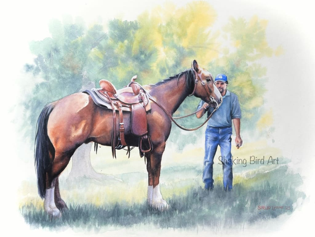
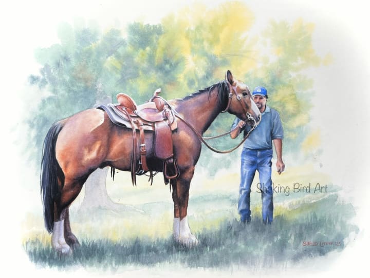
It can be difficult to know how and where to begin a watercolor painting. Between the parts we want to work on, the parts we know we should work on, and the parts we're afraid to touch, it can be daunting to choose! Here are three things to keep in mind as you begin your painting. We'll take a look at the process behind creating a recent watercolor of my own, "Mr. Moon and Dave," to illustrate each point.

1: Work from back to front. Fill in background (if any) and the most distant areas first, and keep them lighter than you think they'll need to be. Lightening background details will keep them from competing with your subject. Working from back to front, also prevents your background from accidentally overlapping any finished areas in the foreground, which can mess up both perspective and colors. Lastly, it's easier to judge accurate colors and values for the main subject of your painting, if you're not working on a blank white page. White paper is notorious for tricking the mind into misjudging relative shadows and hues!
If your hand isn't the steadiest, or if you have a lot of details to work around, it may be a good idea to apply a layer of masking fluid over and around any shapes you want to protect from contamination from the background colors (see above photo). This gives much more freedom and reduces anxiety when sloshing large areas of wet paint around in the back, because the important details are protected. Once the paint is completely dried, remove the masking fluid and proceed with the next step. It's not usually a good idea to apply masking fluids on top of already-painted paper, as it can potentially lift or lighten those pigments.
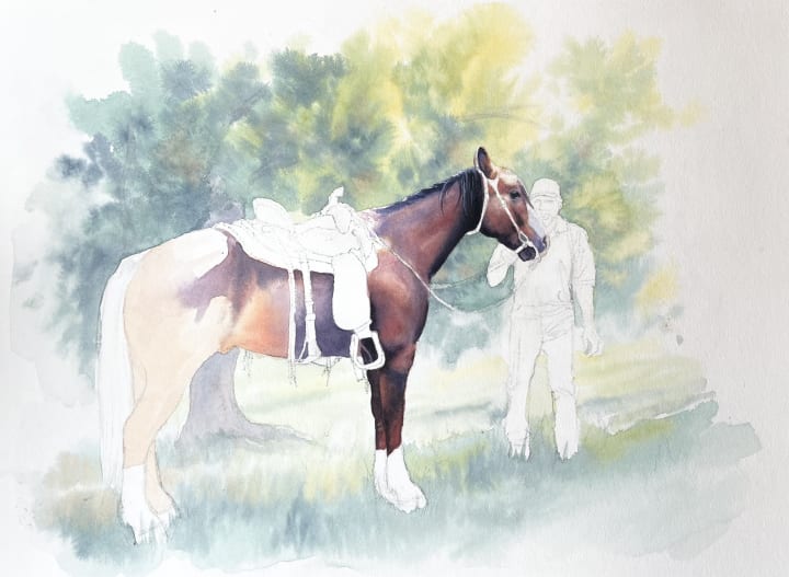
2: Work from light to dark. Layer, layer, layer! Remember, the first application of paint isn't meant to be the final one, and isn't expected to be perfect. Begin by layering undertones, creating broad washes, and blocking in large, generalized shapes of color or shadow. Keep in mind: large to small, general to specific. Simplify to the most basic blocks of color you can imagine. It helps if you squint at your reference photo so hard, all you can see are large shapes. Start with those and sneak up on the details gradually! You can go back over these areas again and again, adding more colors layer upon layer, saving the darkest washes for last. Allow your painting to dry completely in-between layers to avoid either damaging your painting surface, or muddying your colors.
In the above photo, on the horse's haunches, you can see where I began by layering with warm golds that would show through the lit portions of the horse, and cooler purples to block in shadow shapes. Towards the front of the horse, more layers have begun to be applied already, honing in on specific shapes of shadows and colors.
When choosing your first washes, think, "What color will look good when it shows through the end product? What harmonizes all available colors? What will tie both highlights and shadows together?" I recommend beginning with either mid-tones or lighter. If you're familiar with color theory, try choosing light layers of complimentary colors to map out light and shadow shapes. In this painting, the compliments are mainly purple and gold.

3: When in doubt, begin with the most important elements. Focus on the subject of your painting. Whether this is the main object in a still life, the eyes in a portrait, the main character of an illustration, etc. Keep in mind, the eye of a viewer will be drawn to areas we spend the most time and energy on.
In the above painting, after filling in the background, I chose to begin with the horse and bring him to completion first, as he was the most important element of the portrait. Further breaking it down, I began with Mr. Moon's face, as the area of central focus. From his face, I worked my way back through his body, then finally his tack, in order of importance.
As this was commissioned to honor the memory of Mr. Moon, it was vital to get his details correct from the beginning. Both his saddle, and the gentleman Dave were secondary considerations. This helped me to know how to choose colors and tones for the rest of the painting, which would compliment the horse. This also lessened the risk that, had I begun with Dave, I'd have chosen colors that might have caused him to compete visually with the subject of the painting (such as, an overly vibrant shirt, for example). Begin with what matters most, and work your way outwards.

Bonus tip: Organize how much detail you add and how much you simplify, by order of importance. I made sure Mr. Moon would have the highest level of detail and attention, simplifying both Dave and the background, to drive focus where it needed to go. For a portrait like this one, a highly detailed background would have only distracted from the main subjects, for example. From the horse, I was able to expand outwards to balance the other shapes, colors and shadows of the painting to make sure they drove focus to, and not away, from Mr. Moon.
I hope this has been helpful to you! If you have any questions, or suggestions for new articles, please drop a comment. If you found this article of value, feel free to leave a tip, as well. It's very much appreciated, and I thank you in advance!
Of course, you are also welcome and encouraged to follow me on Social media! Links here:
YouTube: Shaking Bird Art
Facebook: Shaking Bird Art
Instagram: @shaking_bird_art

Shelby Lynne is a professional artist and art instructor. Her favorite artistic disciplines are portraiture and botanical illustration, and she enjoys challenging herself to copy the colors and details of nature as vividly and realistically as possible. She is inspired by the natural scenery and wildlife around her home near the beautiful Rocky Mountains of Colorado. Her great passion is to share her knowledge of the art world with others, and promote a culture of curiosity, enjoyment and kindness through creativity.
About the Creator
Shaking Bird Art
Shelby Lynne is a professional artist and art instructor. Her great passion is to share her knowledge of the art world with others, and promote a culture of curiosity, enjoyment and kindness through creativity.
Keep reading
More stories from Shaking Bird Art and writers in Art and other communities.
Enroute
The stars and planets all whipped by as Deirdre's crystalline craft sped past them. Her people, the Vlondans, had discovered that the mineral Dianthium which grew so readily on their home world not only kept their hair pink but also was a perfect material for engineering spacecraft from.
By Alicia Anspaugh13 days ago in Art
How Meal Kit Services Revolutionized My Cooking Routine: A Personal Odyssey
Introduction: In the fast-paced whirlwind of modern life, finding the time and energy to cook nutritious meals can often feel like an impossible task. As someone who has always enjoyed cooking but struggled to maintain a consistent routine, discovering meal kit services was nothing short of a game-changer. Join me on a personal journey as I recount how these convenient culinary companions transformed not only my approach to cooking but also my overall well-being.
By IBRAHIM AHMAD3 days ago in Art


Comments
There are no comments for this story
Be the first to respond and start the conversation.