
OMG, You Paint With BLACK?!
Addressing the controversy of using black and white paints in watercolor

Trigger warning: I have a VERY unpopular opinion to share this time. Please hold the rotten tomatoes and fainting fits until you've heard me out.
Let's tackle the great big, ugly taboo: Black.
Premade black, specifically.
I've consistently encountered distress among watercolor beginners who have been taught that they should never, on any account, use black paint. Instead, they're taught that the only right way to achieve black is to mix their own by combining highly pigmented primary colors. This combo results in a more luminous and satisfying black, without being flat or dull. That anything less, is the greatest travesty of our time and can't be called true art, blah blah blah.
This is only half true.

Yes, I concede. It is, indeed, a better color if you can mix your own black, and I think all students should eventually learn how to mix their own blacks, browns, greys, and all colors simply to understand how, and to make the best use of their available paints. It's excellent practice and a lot can be learned from mixing colors. But there is a certain snobbiness among professionals about using premade blacks, which I believe is a little unfair. Pushing beginners to ONLY use their own mixes is simply too high of a burden for those who are still struggling with the basics. Is it right to put such a stumbling block in the path of beginners which may dishearten them to the point of giving up? Let's walk before we run, shall we?
And let's be honest! When was the last time you looked at a painting by a pro and said, "Yup, it's great . . . or would have been. They ruined it by using a premade black. Dis-GUS-ting!" Unless they know what they're looking for, and are looking for it specifically, most people aren't going to notice a difference. Black is my own most-used color in watercolors, (cue collective gasp and upraised fists), and I don't believe my art suffers from its use. Instead, time saved from unnecessary color mixing more than makes up for any little loss in luminance, to me.

THAT BEING SAID . . .
There is a happy way to compromise! More than one, as a matter of fact.
My own favorite "black" is Payne's Grey, which is actually a highly concentrated blue grey. I enjoy the bluish tint to it because it cools down shadow areas, mixes well with other colors and causes dark backgrounds to recede more than warmer blacks, such as Ivory Black, Lamp Black or Mars Black. However, I always, ALWAYS, recommend layering other colors first, before adding your final black. This makes for seamless transitions from your lighter colors to your darkest, and harmonizes your composition without the dreaded "flatness" of pure black paint. The colors in the under layers also provide your painting with the extra depth and luminance you desire, without the hassle of mixing your darks from scratch. For example, when I paint the blackest subjects such as the pupil of an eye, a midnight sky, or ethnic hair, I always layer either blue, purple, or a combination first. This has the added benefit of preventing the white tooth of the paper from showing through.

Coincidentally, there exists a similar attitude towards the use of white in watercolor paintings. "It has to be the preserved white of the paper, or bust. No use of white paints are permitted!" To which I shrug and say,
"If you have a tool, why NOT use it?"
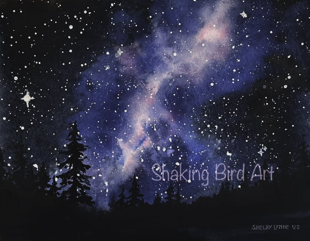
Yes. The best, more brilliant and clean whites for watercolor paintings will always come from the preserved white of the paper. No paint can compare to the purity and brilliance of preserved paper. However, sometimes we fail at preserving enough, or change our minds about a detail, or need to brighten a highlight or redefine an edge a bit. In such cases, I routinely use whites in my watercolor art. You can use white acrylic (such as for the stars in the galaxy painting at the top of this article), although it does dry permanently and cannot be reworked once applied, so proceed with caution. White gouache is also an artist favorite, and has the added benefit of being water soluble so it can blend well with your other paints. Gell pens are also okay for punching up small highlights and details, such as the glint in an eye or whiskers. My personal favorite, however, is Titanium White by Holbein. It is, in fact, watercolor, and the most opaque white I've found for the job. I used it extensively in the above painting "Shark Wrangler" to define the waves, although the clouds are preserved paper.
Key takeaways: Yes, it's a good thing to know how to mix your own blacks and practicing this will help you to understand color mixing better in general. However, it's not completely necessary and you can absolutely get away with using a premade color. If you layer it over other colors first, you'll get the best results! On the other hand, if you enjoy making your blacks from scratch, then more power to you and go for it! Also, experiment with white paints, and you may find a new tool you enjoy to use! Or maybe you hate it. But as I tell my students: Try everything! And then you'll know by experience what works best for you.
If you still feel like throwing tomatoes, please leave a comment below and I'll be interested to hear your side of the story. If a fainting fit is more your style, please do so surrounded by cushions and watch your head. However, if you found this article of value, feel free to leave a tip! It's very much appreciated, and I thank you in advance! Also, comment what art advice you would like to read about in the future and I'll make it happen, if I can!
Of course, you are also welcome and encouraged to follow me on Social media. Links here:
YouTube: Shaking Bird Art
Facebook: Shaking Bird Art
Instagram: @shaking_bird_art

Shelby Lynne is a professional artist and art instructor. Her favorite artistic disciplines are portraiture and botanical illustration, and she enjoys challenging herself to copy the colors and details of nature as vividly and realistically as possible. She is inspired by the natural scenery and wildlife around her home near the beautiful Rocky Mountains of Colorado. Her great passion is to share her knowledge of the art world with others, and promote a culture of curiosity, enjoyment and kindness through creativity.
About the Creator
Shaking Bird Art
Shelby Lynne is a professional artist and art instructor. Her great passion is to share her knowledge of the art world with others, and promote a culture of curiosity, enjoyment and kindness through creativity.
Keep reading
More stories from Shaking Bird Art and writers in Art and other communities.
Where to Begin a Watercolor Painting?
It can be difficult to know how and where to begin a watercolor painting. Between the parts we want to work on, the parts we know we should work on, and the parts we're afraid to touch, it can be daunting to choose! Here are three things to keep in mind as you begin your painting. We'll take a look at the process behind creating a recent watercolor of my own, "Mr. Moon and Dave," to illustrate each point.
By Shaking Bird Art6 months ago in Art
Enroute
The stars and planets all whipped by as Deirdre's crystalline craft sped past them. Her people, the Vlondans, had discovered that the mineral Dianthium which grew so readily on their home world not only kept their hair pink but also was a perfect material for engineering spacecraft from.
By Alicia Anspaugh15 days ago in Art
Elevate Your Style: Discovering Boston Harbour Leather Jackets for Women
In the realm of women's fashion, certain pieces transcend seasons and trends, capturing the essence of timeless elegance and sophistication. Among these, the Boston Harbour leather jacket stands out as a symbol of enduring style and versatility. Crafted with precision and imbued with a rich heritage, this iconic garment effortlessly elevates any ensemble, exuding confidence and grace. In this blog post, we delve into the allure of Boston Harbour leather jackets for women, exploring their design, styling tips, and care, and addressing common queries through FAQs.
By great dubai4 days ago in Art
Can You Drive a Ford Fiesta Through a Desert?
I’m flying down the B1 highway from Windhoek to Keetmanshoop with a map and a boot full of camping gear. I’m excited for the first stop of my Namibian road trip: the Quiver Tree Forest. I spot the sign and turn onto the C17, off the tarmac and onto the gravel. I’ll be there soon; it’s only ten miles or so. I am unprepared for what comes next. The car slides and slips across the road. I am not fully in control anymore. I slow to a crawl. The car judders and shudders, the noise deafening, the vibrations rattling the teeth in my skull. It takes me around an hour to drive the ten miles. I arrive at the campsite relieved to be in one piece, even if it feels like all my bones have been shaken slightly out of place. I will later learn that this is what happens when the gravel road becomes “corrugated”, and that the roads authority goes round once a week to “grade” them. Seems I arrived about 6 days after the grader had last been round.
By Jenifer Nim3 days ago in Wander


Comments
There are no comments for this story
Be the first to respond and start the conversation.