
The Evolution and Symbolism of BMW’s Iconic Logo
Unveiling the History and Meaning Behind BMW's Emblem

BMW Logo’s Story of Symbolism
How acquainted are you with the BMW logo? Chances are, you’ve encountered this iconic emblem while cruising on the road or passing by a BMW showroom. Whether you’re a proud BMW owner or have noticed the logo on other vehicles, the origin and meaning of this symbol may remain a mystery.
In our exploration today, we’ll delve into the current state of the BMW logo, unravel its history, and uncover its intended symbolism. Discover the artistry behind this emblem, reflecting the excellence of professional logo design in the USA, with a touch of Dallas logo design finesse.
Our journey introduces you to the work of a logo design firm and the prowess of a professional logo designer, showcasing the evolution and significance of the BMW logo.
The Early Years (1913-1917)
BMW’s journey began with the Rapp Motorenwerke logo, featuring a silhouette horse in a circular frame symbolizing speed. The logo had a black frame that included the name "Rapp Motor," two stars, and eight curved white lines. This design encapsulated the company's origins in aircraft engine manufacturing.
The First BMW Logo (1917-1933)
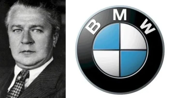
With the transition from Rapp Motorenwerke to BMW, the first official BMW logo emerged. This logo featured a circular design divided into four quadrants resembling an aircraft propeller, with blue and white colors representing the Bavarian Free State. The thick black frame housed the wordmark "BMW" in gold, indicating the company's new identity while retaining a nod to its origins.
Refinement and Boldness (1933-1953)
The logo underwent its first redesign in 1933, which was more of a subtle refinement. The golden circle frames became thicker, and the "BMW" wordmark was made bolder and sharper, enhancing the logo's visual impact without altering its core design elements.
A Shift in Palette (1953-1963)
In 1953, BMW introduced a significant update focused on the color palette. The golden circular frames were replaced with thin silver outlines, and the wordmark shifted from gold to gray. The blue and white segments inside the circular frame were lightened, making the black ring around them more prominent.
Contrasting Colors (1963-1997)
The 1963 logo update brought a contrasting color scheme with black, white, and blue elements. The circular frames and the "BMW" wordmark were rendered in white on a black ring, while the blue and white quarters were intensified. This design was clean, attractive, and authoritative.
Modernization with 3D Elements (1997-2020)
Reflecting the technological era, the 1997 BMW logo featured a modern 3D appearance. The wordmark was displayed in white on a broad circular background with silver-gray outlines. The inner blue and white colors became more vivid due to the black lines dividing the quadrants. This version of the logo was powerful and distinct, marking a significant evolution in BMW’s visual identity.
Embracing Minimalism (2020-Present)
In 2020, BMW adopted a minimalist approach, transitioning from a 3D to a 2D design. The dominant black frame was replaced with a thick white frame, and the brand's name and outlines shifted to gray. The dividing lines between the quadrants were removed, resulting in a clean, calm, and assertive logo that aligns with contemporary design trends.
Conclusion
BMW’s logo has undergone significant transformations, each reflecting the brand’s evolving identity and the changing times. From its roots in aircraft manufacturing to becoming a global automotive leader, the BMW logo symbolizes quality, innovation, and timeless style. The meticulous evolution of BMW’s emblem underscores the importance of expert logo design, highlighting how a well-crafted logo can encapsulate a brand's essence and legacy.
As we trace the historical journey and symbolic meaning of BMW’s iconic logo, it’s evident that the company’s commitment to quality and cohesive brand image has been unwavering. The BMW logo today stands as a testament to the brand’s legacy and its impact on car enthusiasts worldwide, illustrating the crucial role of professional logo design services.
About the Creator
Enjoyed the story? Support the Creator.
Subscribe for free to receive all their stories in your feed. You could also pledge your support or give them a one-off tip, letting them know you appreciate their work.
Keep reading
More stories from Lucas Jenn and writers in Art and other communities.
The JP Morgan Chase Logo Design Evolution Through the Years
The Evolution of the JP Morgan Chase Logo If you’re familiar with the US financial sector, chances are you recognize the iconic Chase bank logo. Also known as the JPMorgan Chase logo, this symbol stands as a cornerstone in the financial landscape of the nation, symbolizing stability and assurance to consumers nationwide. However, delve deeper into the history of the Chase bank logo, and you’ll uncover a fascinating journey, highlighting the expertise of a skilled logo design agency.
By Lucas Jenn12 days ago in Art
Trauma Carnival
I have unpopular opinions on one of my old favorites, The L Word. First is: Jenny is my favorite character. Second: The show was originally about Jenny, her trauma, her broken identity and the way her sexuality was explored as an awakening that brought up many memories of childhood abuse.
By Melissa Ingoldsbyabout a month ago in Art
How to Find a Reliable Interior Design Firm in Toronto
Finding a reputable and the best interior design firms Toronto might be a game changer in constructing your ideal house. With the correct knowledge, your place may be both visually appealing and functionally efficient.
By Art, Design + Learning Studioabout 8 hours ago in Art


Comments
There are no comments for this story
Be the first to respond and start the conversation.