
How to Choose the Perfect Color Palette for Acrylic Pouring (Without Making Mud)
A simple guide to understanding color theory, contrast, and layering for vibrant fluid art pieces.


Introduction
Fluid art is one of the most exciting and unpredictable painting techniques in the world. There is nothing quite like the thrill of mixing your favorite shades, pouring them into a cup, and watching them flow across a blank canvas. However, if you are a beginner, you have probably experienced that heartbreaking moment when your beautiful, bright colors slowly blend together into a dull, greyish-brown puddle.
Getting "muddy colors" is the number one frustration for most fluid art enthusiasts. When you tilt your canvas to spread the paint, the movement can easily cause different pigments to mix. If you don't choose your shades carefully, they will lose their vibrancy and bleed into each other. But here is the good news: making mud has nothing to do with your artistic talent. It is simply a matter of chemistry and basic color theory. Once you understand how different acrylic pigments interact with each other, you can create clean, crisp, and jaw-dropping compositions every single time.
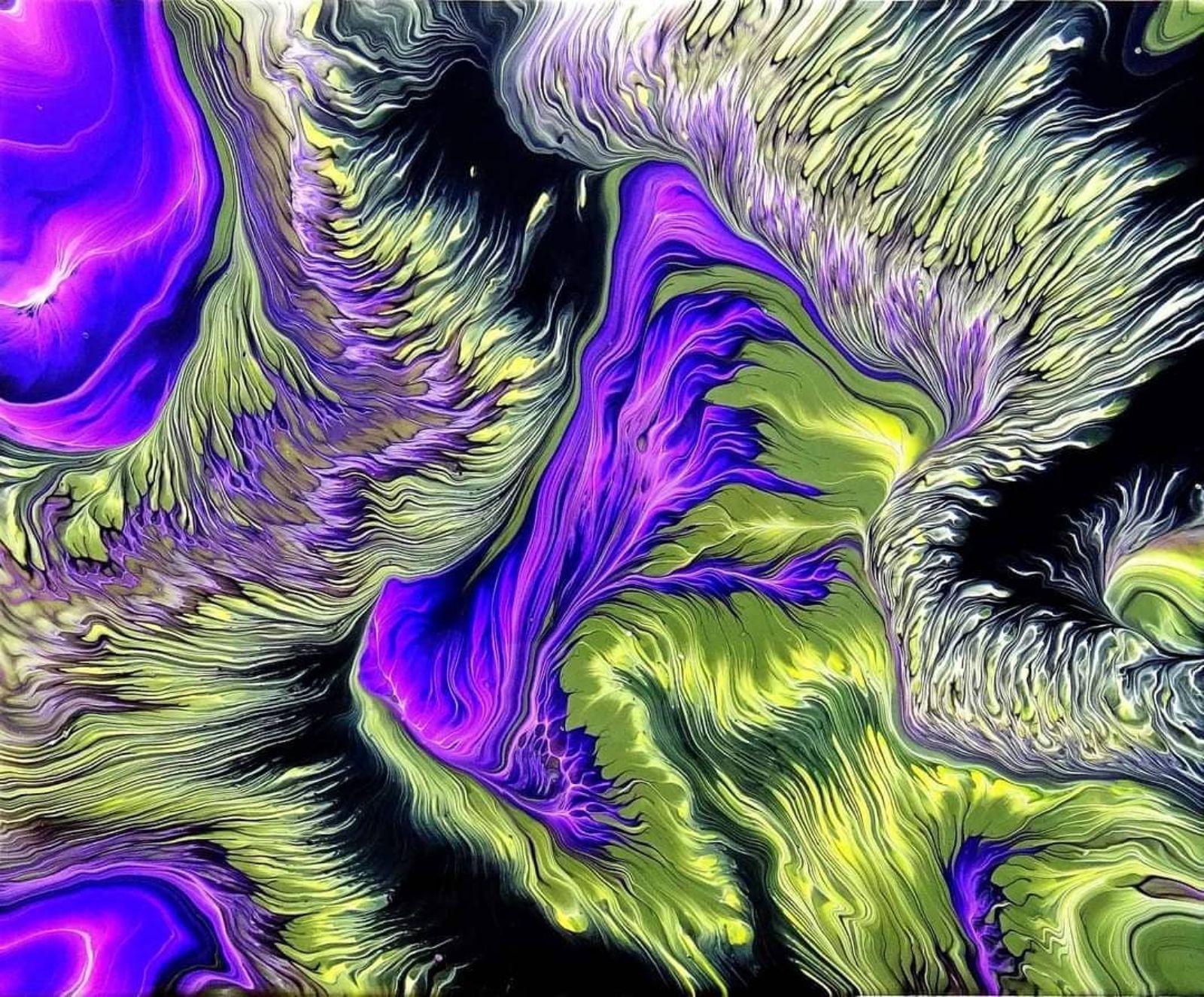
The Secret of the Color Wheel
To avoid making mud, you must become friends with the color wheel. In traditional art, we learn about complementary colors—shades that sit directly opposite each other on the wheel. Examples include blue and orange, red and green, or yellow and purple.
When you place complementary colors next to each other on a canvas, they create a beautiful, high-contrast look that makes the artwork pop. However, in fluid art, the paint is constantly moving and sliding. If complementary colors mix together while you are tilting the canvas, they will cancel each other out and instantly create a brown or gray muddy mess. If you want to use contrasting colors in your pour, you must be careful not to let them blend too much. Stick to analogous colors—those that sit next to each other on the color wheel, like blue, turquoise, and green—for a guaranteed clean and harmonious flow.
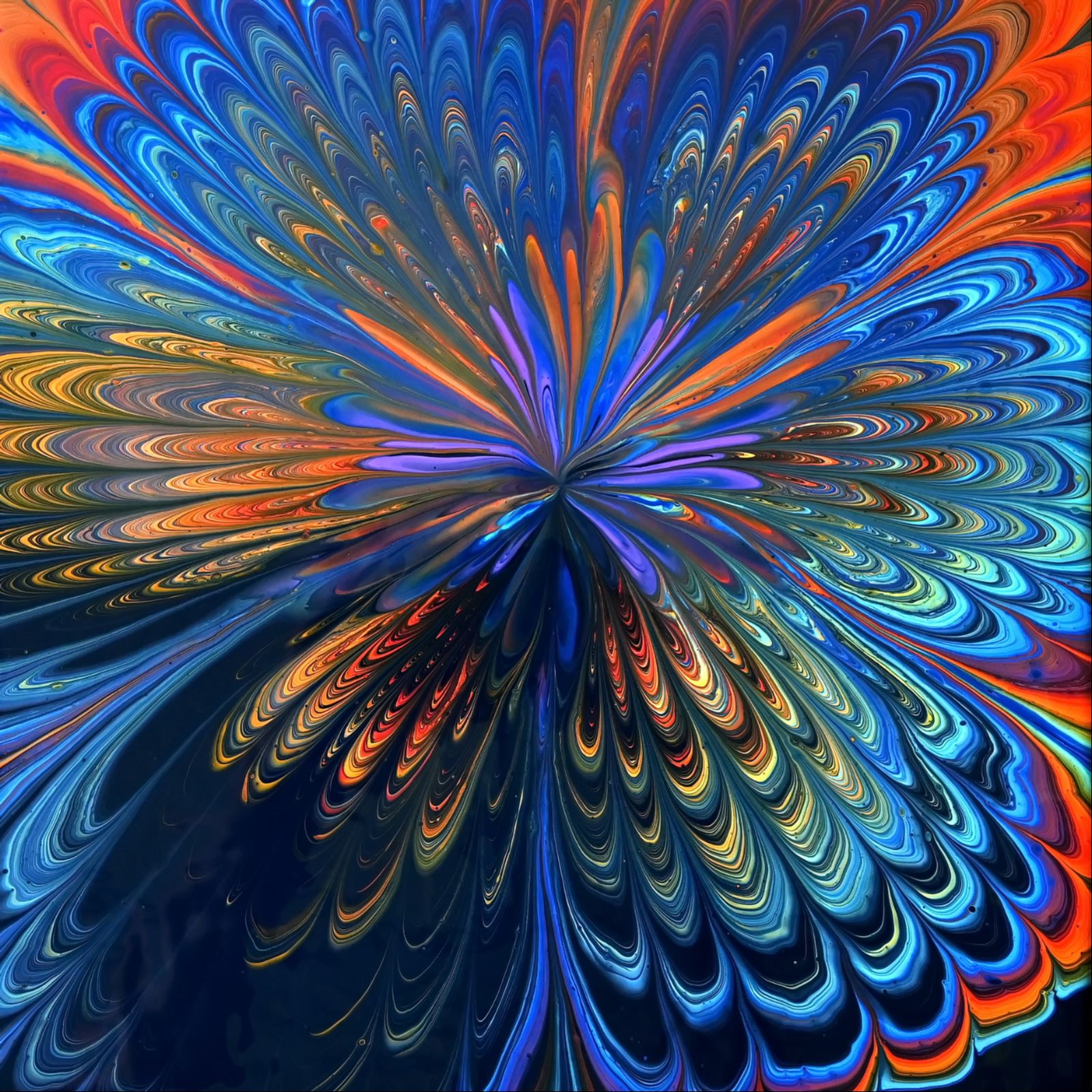
Understanding Pigment Density and Opacity
Another hidden trap that causes muddy pours is the weight and opacity of different acrylic paints. Not all acrylic pigments are created equal; some are chemically heavy and opaque, while others are light and semi-transparent. For example, Titanium White and Oxide Black are incredibly heavy, dense pigments. On the other hand, many yellows, pinks, and purples are much lighter and naturally transparent.
If you layer a heavy, opaque paint directly on top of a light, transparent color in your pouring cup, the heavy paint will physically sink to the bottom during the pour, while the lighter paint tries to rise. This internal movement forces the pigments to collide and mix mid-air or on the canvas, almost always resulting in a cloudy or muddy look. To keep your artwork crisp, always pay attention to the manufacturer's labels regarding opacity. Layer your heavier paints at the bottom of your cup and place the lighter, transparent shades near the top.
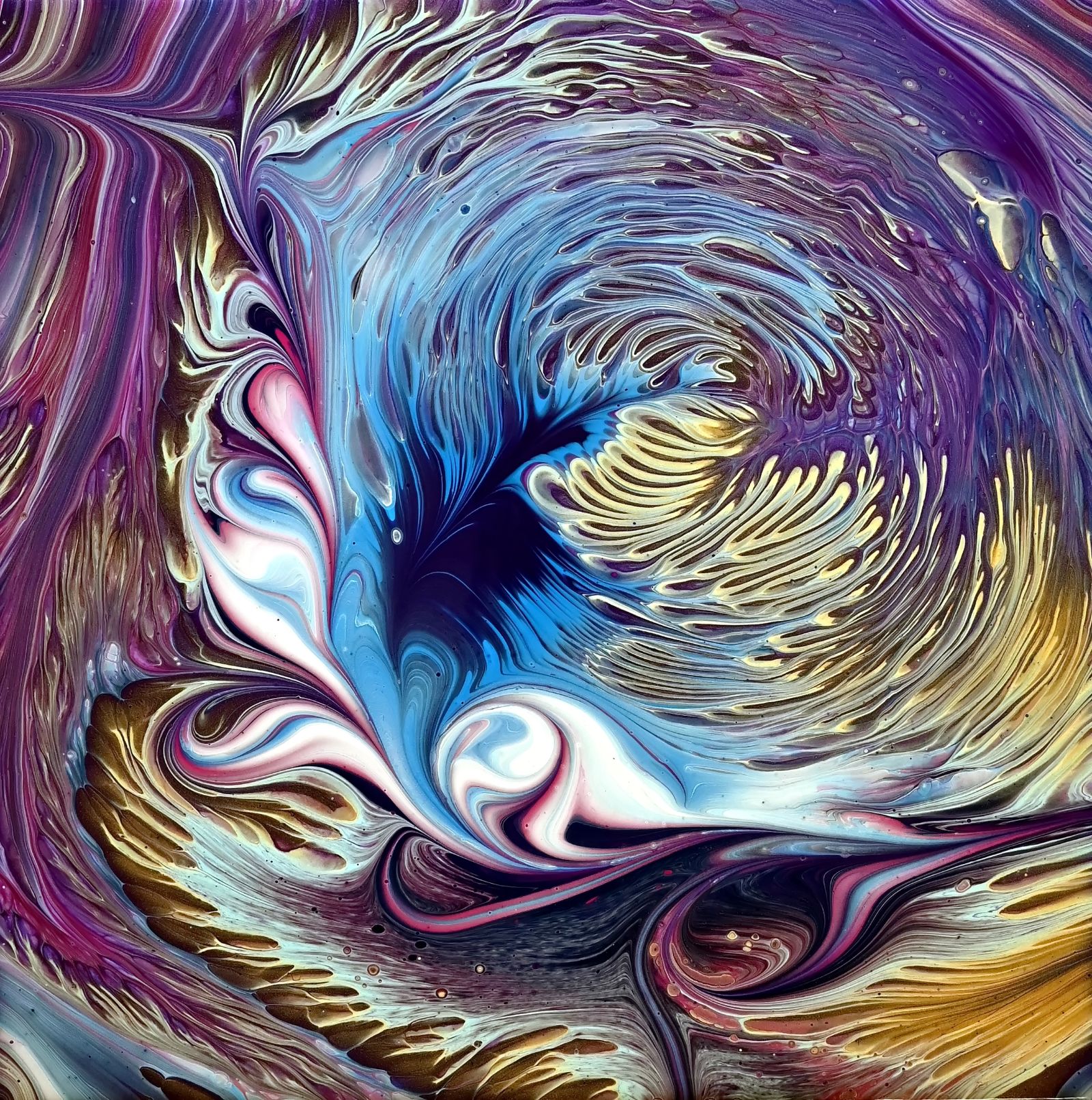
Conclusion: Trust the Process
Choosing the right color palette is a skill that improves with every single pour. By understanding basic color theory, paying attention to pigment density, and using barrier colors like white or gold, you can completely eliminate muddy results from your studio.
Don't be afraid to experiment with new combinations, but always remember to test them on a small scale first. Fluid art is all about letting go of absolute control and letting the colors find their own natural beauty. With these simple adjustments, your next artwork will be brighter, cleaner, and more vibrant than ever before. Now, pick your favorite shades, layer them carefully, and let the paint do the magic!
About the Creator
Fiona Art
Contemporary fluid artist from Slovenia. I explore pouring techniques to embrace natural, unpredictable beauty and unleash imagination through color. Specializing in fluid art and the beauty of natural flow.
Enjoyed the story? Support the Creator.
Subscribe for free to receive all their stories in your feed.
Comments
There are no comments for this story
Be the first to respond and start the conversation.