
I’ve Transferred Through Dozens of Airports. Only One Felt Effortless.
The best airport design isn’t about the roof. It’s about your feet, your patience, and whether you can find a seat.
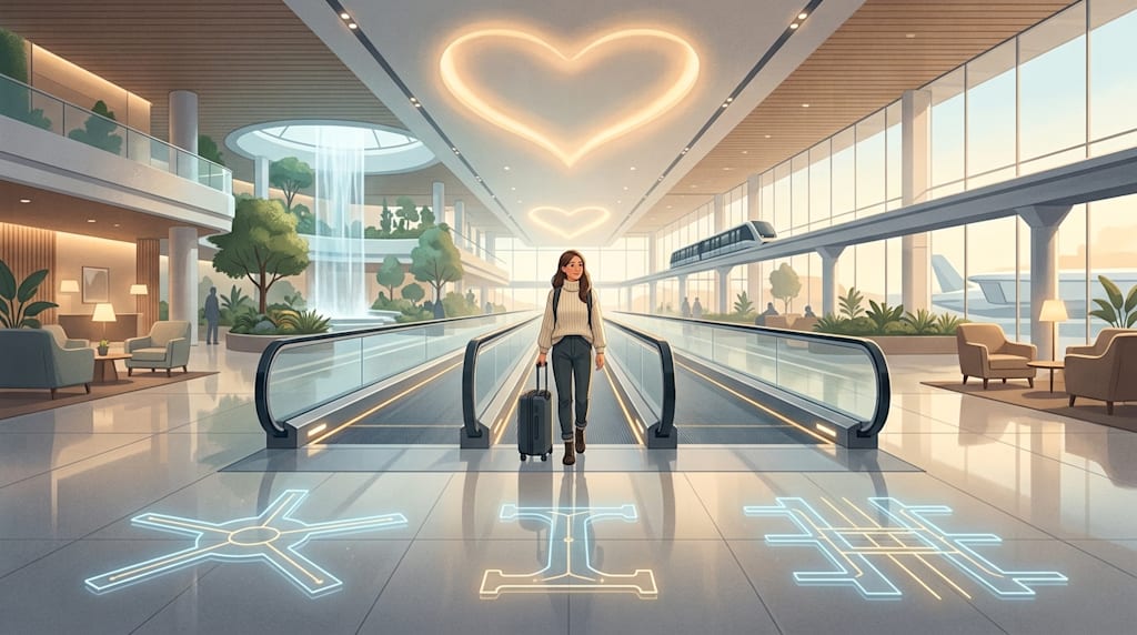
The measure of airport design is the passenger’s feet and heart
The standard for judging an airport is the passenger’s feet, eyes, and mood. The architect’s sketch comes later.
People often praise an airport because its shape looks like a starfish, a phoenix, or a cloud. But passengers do not need the awe of looking up. They need fewer moments of anxiety, fewer detours, and fewer doubts of “Am I going the wrong way?” on the stretch from check-in to the gate.
An airport is a high-pressure space. Time pressure, spatial pressure, and emotional pressure press down on the passenger at once. If an airport’s design considers only “how it looks” and not “how it works,” it easily becomes a giant maze. Passengers walk until their legs ache, queue endlessly, cannot find a charging port, cannot find a toilet, cannot find a seat. Their first or last impression of the city becomes exhaustion and irritation.
So the first goal of good airport design is flow.
Schiphol: smooth, bar none
The best airport design I have experienced is Amsterdam Schiphol, bar none.
Its strength is smoothness, not grandeur. As someone who has transferred many times on routes between China and the UK, I have hardly experienced that kind of smoothness at any other airport.
If you are connecting from China to a non-Schengen flight, you may board the next flight directly at a nearby gate. If you are connecting from China to a Schengen flight, then at most you change concourses. Since you only pass through passport control once inside security, the walking distance is also short. The time depends mainly on the queue, not on how far you have to walk through the terminal.
That sounds simple. It is hard to do. Most airport transfers are a double test of stamina and patience: go upstairs, go downstairs, take a small train, walk a long corridor, go through security again, and finally discover that the gate is at the other end. Schiphol reduces this test to a low level.
Another strength is detail. Inside and outside security, from a pot of flowers to waiting seats, from charging ports to computer areas, from sleeping to eating, there is everything, and there is always a surplus. That surplus matters. Many airports also have seats, but never enough. They also have charging ports, but they are always occupied. They also have food and drink, but the queues are always long. Schiphol gives the impression that it has reserved margin. It knows passengers will get tired, hungry, need quiet, need to work, need to stare into space.
If there is no transfer and it is only point-to-point, Schiphol is fairly ordinary. It has only one terminal, and all concourses are connected by a curved corridor. The corridor is not large, so walking distances are controlled. Its strength lies in the efficiency of its transfer system. The single building is not the point.
Abstracting Schiphol into a point: single core + multiple concourses
If you abstract that curved corridor at Schiphol and turn it into a point rather than a line, you get a type of airport design that has become popular in recent years: the single-core, multi-concourse layout.
Ticketing, security, shopping, and dining are all concentrated in a central core. After security, passengers enter the concourse where their gate is located. The example we are most familiar with is Beijing Daxing Airport.
On the plan, after passing through security or immigration at Daxing, the longest walking distance in all five directions is the same. And that walking distance, to the farthest gate, is only a little over 500 meters. From the security area to the small garden at the end of the concourse, moving walkways are provided the whole way to help increase walking speed.
This is a typical expression of “passenger first.” It does not ask passengers to take a long hike through the terminal. Instead, it tries to shorten, straighten, and equalize the circulation. You do not need to memorize complicated floors. You do not need to judge whether you are walking in the wrong direction. You just follow the concourse forward.
Daxing’s short passenger circulation is worlds apart from the absurd circulation of Capital Airport Terminal 3. The same design appears at several other airports. Istanbul Airport may also use it, but I have not experienced the new airport; the old Atatürk Airport was small, so I did not have this experience there. Qingdao Jiaodong International Airport and Urumqi Tianshan International Airport also adopt similar ideas.
Most large airport hubs built in recent years have adopted this layout. The reason they seem to be mostly in China is that only countries like China and Turkey, where aviation scale is still growing, are building airports this large. Many large airports in Europe and North America were expanded little by little, with circulation layered over by history, so it is difficult to achieve the smoothness of an integrated design.
I-shape and long strips: when scale keeps expanding
On the basis of the single core, if you branch out further and use one concourse as another core, you get a design that was popular earlier: something like the Chinese character gong, or an I-shape.
Hong Kong Airport is an example. After one main concourse splits into three, another core is added at the middle concourse, and then new concourse branches split again from that core. This core mainly contains more concentrated dining and shopping facilities, transfer areas, and, in some countries, passport control areas inside the airport.
Compared with the single-core design, this I-shape can, with the same number of gates, avoid spreading the terminal area outward in a circle. Instead, it extends in one direction, reducing total land area and taxiway area. But the cost is that the walking distance to the farthest gate is much longer than in the single-core design. Similar designs include Shenzhen Bao’an Airport, Kunming Changshui Airport, and Doha Airport.
These airports were built all at once rather than expanded bit by bit, so they are visually coherent and have good circulation. Apart from these, most other airports have grown out of natural symmetry.
Smaller airports just need a small strip after security, such as Gimhae International Airport in Busan, South Korea. Larger ones stretch that strip long, such as Shanghai Pudong Airport. If it is not convenient to stretch it too long, then concourses continue to split at both ends, such as Capital Airport Terminal 2. If it is neither good to stretch it too long nor to split it further, then two satellite concourses are built on the side, such as Denver Airport. If one or two satellite concourses are not enough, then fill it out: Atlanta.
Each of these layouts has its own logic and its own compromises. They are not all “passenger first,” but they show that airport form is shaped by passenger flow, aviation demand, and geography. Good design, within these constraints, pushes the passenger experience as far forward as possible.
Other global answers to “passenger first”
Singapore Changi Airport is the leading example of “efficiency + experience.” It has long topped the “World’s Best Airport” rankings because it fuses efficiency and experience. From fast immigration to efficient baggage handling, and then to using automation, biometrics, and big data analytics to actively eliminate congestion, everything is done to make the passenger’s process smooth. Jewel Changi has the world’s tallest indoor waterfall and a forest valley, plus a free 24-hour cinema, a butterfly garden, and more. The garden and museum concepts that Schiphol has are pushed further here.
Hamad International Airport in Doha blends comfort and luxury. Its “The Orchard” indoor garden brings calm, while efficient passenger flow design and biometric technology allow passengers to transfer easily even during peak hours.
Istanbul Airport, though one of the largest single-roof terminals in the world, is designed “with people at the center.” Through a clear layout of a central hall plus concourses, skylights, digital wayfinding terminals throughout the airport, and convenient mobile applications, it relieves the pressure and confusion passengers feel in an oversized space.
Seoul Incheon International Airport is known for “comfort” and “culture.” It has comfortable showers and loungers, is dotted with Korean artworks, and even has robot guides. While providing efficient service, it also lets passengers feel a distinctive cultural atmosphere.
Tokyo Haneda Airport is known for its cleanliness, efficient service, and punctuality. Areas such as Edo Koji inside the airport are full of Japanese cultural atmosphere, blending tradition and modernity.
Hong Kong International Airport is known for its “user-friendly” design and smooth operations. Its I-shaped layout makes transfers convenient, while the airport leaves a deep impression with high hygiene standards and spacious areas.
San Francisco International Airport, as a representative of “experience-driven design,” cares well for all passengers. Its Harvey Milk Terminal 1 is centered on passenger well-being, creating a “quiet airport” and setting up sensory rooms designed for neurodiverse passengers.
San Diego International Airport’s new Terminal 1 draws on the local natural landscape. By using sunlight, smooth circulation, and curved design, it creates a calm security experience and was selected as one of the “World’s Most Beautiful Airports” in 2026.
Thailand’s Koh Samui Airport offers a relaxed, unconventional experience. This open-air airport has outdoor rest areas where passengers can sit on beanbag chairs or swings, drink free fresh coconut juice, and even enjoy a foot massage, making the airport itself a relaxing resort.
These airports differ in what they emphasize: efficiency, luxury, culture, or nature. But they share one thing: they make the airport adapt to passengers rather than the other way around.
A checklist for a good airport
If I were to make a list of “good airports,” I would not first look at whether it has a stunning roof. I would look at these specific details: walking distance; whether a transfer requires security again; signage clear enough that you do not need to ask anyone; waiting seats; charging ports; free Wi-Fi; toilets; food prices and choice; quiet, sleep, children’s, and work zones; usable facilities for passengers with special needs; whether commercial shops force people through duty-free before the gate; and whether late at night or early in the morning the airport still feels safe, dignified, and not miserable.
This checklist is the user experience map of airport design. An airport can win architecture awards, but if passengers inside it get sore feet, feel exhausted from queuing, and cannot find a place to sit down, then it is not a good airport.
The highest level of design is not feeling the design
Return to the sentence at the beginning: a good product must put the user first, not the difficulty of development or the developer’s sense of achievement.
An airport is not a sculpture or a monument or a shot in a city promotional film. It is a system that moves hundreds of thousands of people every day. It must handle time, space, emotion, and physical pressure at once. Its most important aesthetics are circulation, order, and ease. Outline, visual impact, and awe matter less.
Schiphol’s smoothness, Daxing’s short circulation, Changi’s experience, Koh Samui’s relaxation, and San Francisco’s care all answer the same question in different dimensions: who is the airport for?
The answer is simple: for passengers.
The highest level of design makes passengers barely feel that design exists at all. They just walk in, finish the procedures, pass security, find the gate, sit down, drink a coffee, and board smoothly. Nothing is wasted. There are no inexplicable detours or infuriating waits.
Such an airport may not be the most photogenic, but it is certainly the best.
Because an airport is for use. Looking at it is secondary. And a good airport makes the beginning and end of a journey a little more relaxed.
About the Creator
Jin
Writer of reamstories
https://reamstories.com/jin
Enjoyed the story? Support the Creator.
Subscribe for free to receive all their stories in your feed. You could also become a paid subscriber, letting them know you appreciate their work.
Comments
There are no comments for this story
Be the first to respond and start the conversation.