
Logo Evaluation: Pepsi
Logo Evaluation: Pepsi
Logo Evaluation: Pepsi
•
Pepsi is one of the most liked soft drinks by teenagers as well as by adults. For years Pepsi has been changing its logo, a smart move towards rebranding. Rebranding is the process of either adding or deducting elements from a brand logo to regenerate its logo. Well established brands actually opt for rebranding after a particular interval of time. Recently even LG one which is known for electronics changed its logo. Actually it just added motion to its old logo. Do check it out once you complete reading this blog.
Honestly saying it is such a smart move by soft drink brands to change logos and create hype in the market right at the start of summer. Someone who is always curious to notice change would definitely jump to get a new bottle to see the change.
Let’s have a glimpse of the first to latest changes in Pepsi logo .
1893 Brad’s Drink
Pepsi is about 122 years old and so far it has seen 13 redesigns.
Pepsi was not its initial identity; it was known as Brad’s drink during 1893.
1898-1940: Red & Swirly
In 1898, Brand’s drink came forward with a new identity as Pepsi- Cola and it was in a booming phase( those were the days when Soft drinks were actually used as medical aid).
First was Pepsi-Cola’s thin red and spiny logo.
Soft Pepsi-Cola
There was a very minor change in logo, it was just that they made it more soft and a little symmetrical than the first version.
1905: Minor Change a year later
This year they made the logo a bit more clear, added a curved “A” at the end .
1906: More Specific Towards Simplicity
This year they kept the logo inclined , “P” & “C” kept itself taller than the rest of the letter and also they added the “DRINK” word in the logo.
In 1940 they made the logo more classic.
1950: Blue in Red
It was in 1950 when they added blue to their red logo. The wordmark remained the same but it was now tangible rather than floating. Making the logo red, white, and blue made perfect sense during the wave of patriotism that followed World War II.
1962: Goodbye to Cola from Pepsi
Now the logo bottle cap is laid flat with no “Cola”. Pepsi was now a drink “for those who think young”.
In 1964 they introduced diet pepsi in the market.
1973: It’s time to go GLOBAL
Now, Pepsi decided to make their own identity in the market. For the first time in history they added background colors red and blue to its logo.
The Pepsi logo for the globe had a minor update in 1987. And although the facelift appears to be very minimal, this update really brought about one significant modification as well as a few smaller ones.
1991: Dynamic Breakup
For the first time the globe was separated from the word “PEPSI”.
1998: All on Blue
This time they added a single-tone background color to their logo; the globe was now positioned just beneath the wordmark after the red backdrop had vanished.
2003: Hello 3D
Pepsi's new logo had a little modification in 2003. In order to give the logo a flatter appearance, the globe was altered to contain huge, noticeable white "shine" patches that gave the impression that it had been vacuum-sealed in plastic.
2006: Cool Pepsi
The logo, then completely turned to a three-dimensional globe was transformed by the logo into a chilly soda glass with sparkling condensation forming on its surface. The font remained strong and slanted forward like it did in the 2003 revision.
2008: Global Leader
The 3D globe was once again flat. Pepsi Light by Gerard Huerta took the role of the beloved Pepsi typeface that the world had grown accustomed to. There will be no more serifs, capital letters, or—possibly most revolutionary—an even, symmetrical band everywhere. The globe was now turned on its side, revealing a band that is wider where the upward-facing part of the globe is, and narrower towards the bottom.
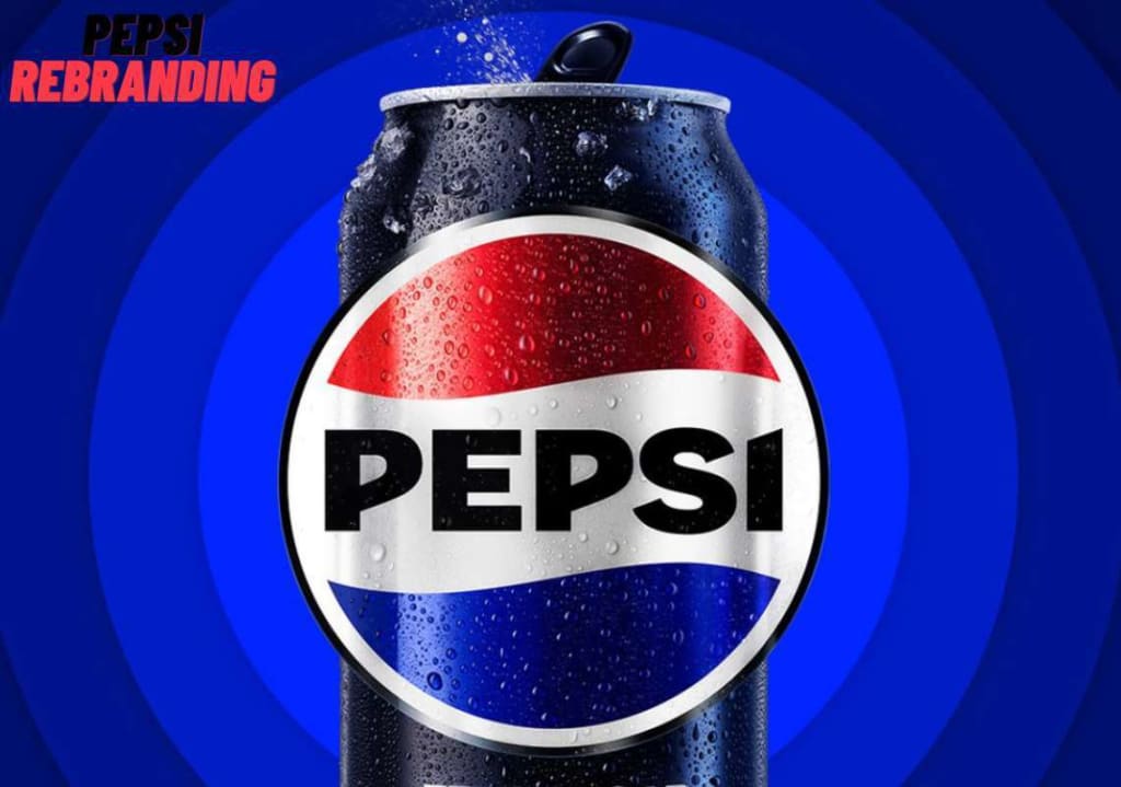
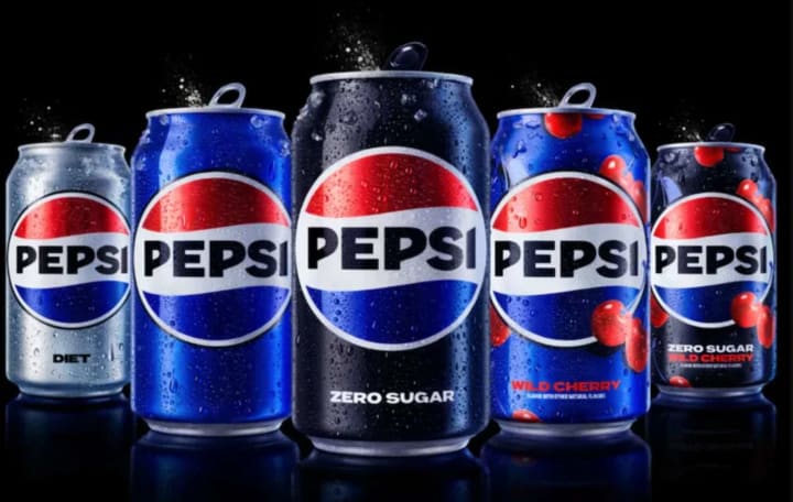
2023: Then to Now
With the launch of its newest logo, Pepsi is returning to the 1960s and 1970s in line with current fashion trends. The 125-year journey of the brand has been guided by the white stripe that we are all familiar with flowing through the centre, which is once more arranged in a wave-like arrangement.
For more information please visit Advertising agency in India - Awesomesauce Creative
About the Creator
Keep reading
More stories from Jhon F William and writers in Viva and other communities.
Logo Evaluation: Pepsi
Logo Evaluation: Pepsi Pepsi is one of the most liked soft drinks by teenagers as well as by adults. For years Pepsi has been changing its logo, a smart move towards rebranding. Rebranding is the process of either adding or deducting elements from a brand logo to regenerate its logo. Well established brands actually opt for rebranding after a particular interval of time. Recently even LG one which is known for electronics changed its logo. Actually it just added motion to its old logo. Do check it out once you complete reading this blog.
By Jhon F William11 months ago in Education
Thank You Female Product Companies For Normalizing Human
I was born in 1990. In May, smack dab early mid-year. I am quite LITERALLY the definition of a '90's' kid. I don't remember a lot of commercials from when I was younger, but I do know that growing up women in media were photoshopped, sculpted, and molded to be Barbie perfect.
By Hope Martin10 days ago in Viva


Comments
There are no comments for this story
Be the first to respond and start the conversation.