
Welcome to the Unofficial Canucks Report!
Allow me to introduce myself.

Today, for me, is a nervous, but exciting day. Currently jobless, hoping in this COVID-19 world for anything to bring me back up.
I’ve been thinking about what I could do for a long time to help me financially, but keep my happiness up while I’m at it.
And thats when I got an ad for Vocal. It hit me like a Shea Weber slapper from the point.
I could write stories about the team I love, the team I grew up admiring, and the team I would one day end up working for(thanks again bossman).
So here we are, the Unofficial Canucks Report(name TBA). During the offseason, we will talk about various rumours about the Canucks, potential trades, signings, and many more.
For the regular season(whenever that may be), we will be going in and looking at the results of the previous game, and look forward to the next one.
So, lets start with some JERSEY NEWS(oohs and ahs from the crowd inside my head).
Recently, Adidas Hockey has confirmed the new “Reverse Retro” jerseys for each of the 31 teams in the current NHL(sorry Seattle).
Let us take a look at a couple designs from designers that have caught my eye.

Okay, okay, totally joking on this one. Y’all thought I wouldn’t cause at least some PTSD in my first article?
Seriously though, let me show off one that alot of people have been talking about, from @S7Dsn on Twitter.
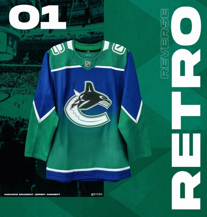
Now, I know alot of peoples feelings about the “Gradient Orca” jersey. Put away your tomatoes. But honestly, I do not hate this one. In fact, dare I say it, I would spend money on this jersey in a heartbeat.
I grew up watching the Canucks during this era. It was a different time. We had just established the West Coast Express, we had (then) young guns in the Sedins, before they became engrained in Vancouver lore, where Todd Bertuzzi was one of our best players(can’t wait to see you back in Van City, Bert!).
I had been so used to just the basic white and dark jerseys that everyone seemed to be using at the time.
Then I saw the gradient for the very first time.
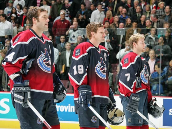
This was unlike any jersey I had seen. They didn’t go overly cartoonish like we had seen from the Ducks(a little bit more Mighty at that point). They kept it fairly more serious, with just that perfect dash of colour. Not to mention the V on the sleeves? Take my mom’s money ASAP(I was like 5 or 6 at the time, don’t judge me).
And now, we take a look at the potential 2020/21 version of the Gradient. You keep the basic idea of it, keep the V’s on the sleeves, and add the blue and green that has become so synonymous with Canucks hockey(and to a lesser extent, the Overwatch League; shoutout Vancouver Titans!).
If Vancouver does end up going this route with the gradient, I personally guarantee I’ll be first in line to pick one of these up, or do the socially distant way, and pick one up from Vanbase *wink wink nudge nudge*.
This wraps up a bit of a more fun opening to the Unofficial Canucks Report, I truly hope you enjoyed! I shall see you all next week.
Adios!
About the Creator
Lane Morrison
Welcome to my Vocal page! Here, I’ll be doing analysis on the newest Vancouver Canucks news, results, and many more! Hope you enjoy!
Keep reading
More stories from writers in Unbalanced and other communities.
2024 Division Semifinals Preview
It's here, folks! It's finally here! The 2023-24 NHL regular season is over and done with, and after six months and 1,312 games played, it's now time for the greatest championship chase in all of sports. Winning the Stanley Cup is absolutely difficult. Hell, just getting to the Final is a rough journey. Yet, for the 44th year, it will be sixteen teams fighting their way to capture the greatest trophy in sports: the Stanley Cup. Four of these 16 teams have never won it all, and one of those four hasn't even been to the Final. In addition, four of the 16 team teams in this year's playoffs are Canadian, meaning that there's a 25% chance that the three decades long Cup drought in that country will come to an end,
By Clyde E. Dawkins4 days ago in Unbalanced
Avalanche Game 82 Recap: We Are Ready!
When the 2023-24 NHL season began, one thing I wanted to do was write a game-by-game recap of the Colorado Avalanche's campaign. I was inspired by the "fan reaction" vids I've seen on YouTube, mainly Steve Dangle's "LFR" (standing for Leafs Fan Reaction) vids, which I had been watching for about five years, and really enjoyed during the pandemic-affected seasons. I wanted to do the same, and decided to use Vocal to spread my Avalanche fandom. I have really enjoyed writing these recaps, and I loved that I could bring a humorous spin to these stories. I do my best to be objective, but there are times where I have to put the Avalanche glasses on.
By Clyde E. Dawkins5 days ago in Unbalanced


Comments
There are no comments for this story
Be the first to respond and start the conversation.