
How to Read and Analyze Stock Charts
Basics to understanding charts and technical analysis (with pictures)


Hello, and thank you for taking the time out of your day to read this guide. I hope you find it useful and helpful. Now, before I begin, lets go over the information you will need to know in order to understand the guide properly.
#1: What is a stock?
Most of you may already know this. A stock is an equity, or share of a company. By purchasing a share of stock, you are purchasing a small portion of that company. There's a good chance you own stock, if you have a 401k or an investment portfolio.
#2: Why do I need to read charts?
Well, you don't need to, but based on the fact that you are reading this right now, you are probably interested. Also, if you want to trade stocks, you need to be able to read charts.
#3: What's the difference between trading and investing?
Good question. Investing is purchasing shares of a company with the intent of holding those shares over the long term in hopes of the value of said shares appreciating. Trading, on the other hand, is taking advantage of fluctuations in price on a shorter term time scale.
#4: Do I have to spend 8 hours a day watching stocks to trade?
Absolutely not. You can, if you want. More power to you. But the beauty of trading stocks is that you control practically everything involved. You control the time scale, position size, entry and exit points, etc. Some people make a living trading 30 minutes per day. Some people trade even less than that. It's all up to personal preference.
Let's get into the basics of charts and technical analysis.
Firstly, you'll need to understand what a candlestick is. These are candlesticks:

Candlesticks provide a lot of useful information. The open of the candlestick represents the price of the underlying asset when that candlestick opened for trading. The close represents the price at the end of the allotted time for that candle. The color of the candlestick denotes what direction the price went from open to close. On the left, you can see a bullish candlestick. Its color is green, and it closed higher than it opened. On the right, is a bearish candlestick. Those close lower than the open. The lines extruding from the bottom and top of candles represent the range of price action in that candle. The top of the wick is the high, and the bottom is the low. That goes for both bearish and bullish candles.
It's helpful to understand that candlesticks represent trading action or price action over a specific amount of time. If we were to draw a chart with a line instead of candlesticks, it would make a lot more sense, at first. Let me explain.

This is a line chart of ticker SNDL on December 21, 2020. You can clearly see the price moving throughout the day. The line tracks the value of each share over time. A candlestick converts a chunk of that line into a different media. A lot of people, when they see candles, they don't realize that the candle is tracking the price over time, all they see is "Oh, the price was at 45 cents per share and immediately moved up to 52 cents a share." No! No, no, no, no, no. You need to imagine the price moving throughout time. The candle opens, price moves down a bit, finds a bottom somewhere, and reverses in the upwards direction. The price finds a high, pulls back a little, and the candle closes.
Example:

This is a one minute chart. One minute meaning each candle represents one minute of trading. In the first candle, the price opened at $1.00, trended downwards until it hit a low at $0.94, and reversed for a bullish close at $1.05. The second and third candles continue this uptrend, opening at the closing price of the previous candle, and closing higher. In the fourth candle, the price opened at the price of the last candle, continued upwards, found a high and reversed. The fifth candle continued the downward trend, closing at the same close as the first candle.
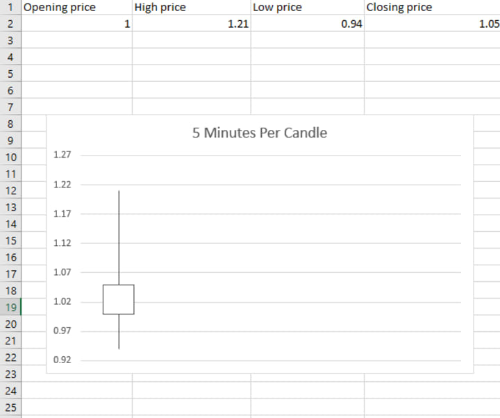
This is a five minute chart, meaning five minutes of trading per candle. This chart and the last chart represent the exact same price action. The only difference is the amount of time per candle. In this five minute candle, the price opened at $1.00, found a low at $0.94, reversed and trended up until it found a high at $1.21, and finally reversed again to close lower than the high, but still bullish on the candle, at $1.05.
You might ask: "If both charts represent the same price action, what's the point in using different charts?"
Great question. Charts with smaller timeframes show more detail in price action. Someone who is trading on a weekly or monthly basis could not care less what happens in the next five minutes of price action. However, someone trading on a much smaller timeline, such as 15-20 minutes, might need as much detail as he can get. If your goal is to buy and sell within 20 minutes, a 30 minute chart won't do you any good.
You might also ask: "If I'm planning to buy and sell within 20 minutes, why even bother looking at the five minute chart?"
Another great question.. you're on a roll! The detail is lost in translation because five one minute candles are packed into a single five minute candle. You're missing several data points, such as highs, lows, opens, and closes of the intermediate one minute candles. Yes, I know, all I've said is that a one minute chart is more detailed. Detail is not always necessary, or even beneficial, though. Sometimes, too much information can make it difficult to ascertain what the price is actually doing. You'll get caught up in what a single one minute candle is doing on the one minute chart, and lose sight of the bigger picture.
Ok, I know what a candlestick is... I'm ready to trade!!
Slow down there. Candlesticks are only a portion of the information displayed in a chart. There's a few other things we need to cover before we can get into charts.
Indicators:
Indicators use mathematical equations to display price action trends.
The easiest to understand, and most commonly used indicators are moving averages. Moving averages track the average price of the last (n) candles on a chart. For example, on a one minute chart, the 9 period moving average tracks the average price of the last 9 candles. The larger the sample size, the more data in the average, the more important that line is. Simple enough, right?
There are two types of moving averages, simple and exponential. Simple moving averages take the data from each candle at equal weight, while exponential moving averages value the most recent data the highest. Some people prefer EMA's over SMA's because they think they're getting a signal first. Personally, I think that's stupid logic, because if everyone's buy signal is price crossing an SMA, while yours is price crossing the faster moving EMA, then you've bought in before anyone else wants to buy. Sure you got a cheaper price, but what often happens, is the price crosses the EMA, you buy in, and the price rejects, or reverses off of, the SMA. Oops! Anyways, I digress.
There are lots and lots of other indicators to use. The vast majority of them are meaningless and a waste of time. The only other indicators I ever use are the MACD, which helps to measure momentum, or the rate at which price is moving, and the RSI, which measures volume against price action. I won't be going into those in this guide, though.
Let's move on to charts...
I'll be going through a couple examples of charts, and walking through my though process while analyzing said charts.
First up, ticker SNDL on the 1m, 5m, and 15m charts.

The vertical blue line is the opening price at 7:30 AM MST. Green, White, and Red lines are the 200 period, 50 period, and 20 period simple moving averages, respectively. You'll notice that the price opens and stays above the 20 period moving average for the first hour or so of trading. This is both good and bad. It's good because that means we have positive price direction. It's bad because we don't have a good place to enter.
The orange wedge at open is the initial trend. It's an up trend, again showing price strength. We see the price move up, find a high at around 8:20 AM, and pull back to the white 50 period moving average. The price attempts to break below the moving average, but can't quite do it. This would be a good entry point. We have positive price direction, an attempt at a reversal, and a rejection of said reversal.
Let's take a look at the five minute chart.

The vertical blue line is the opening price at 7:30 AM. Again, the trend is denoted by the orange lines at the first hour of trading. Notice, the moving averages are in completely different locations than on the one minute chart. This is exactly why looking at multiple charts can be useful. Everyone isn't always looking at the same chart. On this chart, the price opens above the 20, 50, and 200 period moving average. Again, a strong sign for the bulls. Other than that, though. there isn't really a good entry on this chart.
Now, for the fifteen minute chart.

Vertical line is opening price. Orange lines represent initial trend. Take a look at the moving averages. We opened above the 20 and 50 period moving averages, and hovered around the 200 period moving average for the first hour of trading. We know we have positive price strength because of the one and five minute charts. All we're looking for is a solid entry, and a break of the 200 period moving average on the 15 minute chart is exactly that. The 200 period moving average on a 15 minute chart represents the average of the last 3000 minutes of trading. That's just over 48 hours of trading. Breaking above the average of the last 48 hours of trading is a strong sign. Much stronger than breaking above the average of the last 20 minutes of trading. More charts = better picture of what's going on.
Ok, so we covered day trading. How about a more long term chart?
Real quick, before I go through those charts, it doesn't really matter what time frame you're working with. If you're trading on the daily chart, the same rules apply as with the one minute chart.
Ok, last example. For this one, I'll only be doing one chart, because in my opinion, the larger the time frame you're on, the less important multiple charts become.

What you're looking at is the last 4 months of price action on ticker SDGR. For the first two of those months, the price was in a steady downtrend. It broke out to the upside in early October, and attempted to break above the 50 period moving average. It was rejected twice, which isn't a great sign, however it found a bottom, and this bottom was higher than the previous bottom, which is generally a good sign. The price then broke above the 50 and 20 period moving averages, and just as enough data existed for the 200 period moving average to show up, the price tested it. That's where I'd buy. Right there at the green arrow. If you'd prefer a more aggressive entry, you can buy when the price breaks above the moving average, however, I'd like to point out that the price attempted to break above the 50 period moving average three times before it successfully broke above. It's generally a much better bet to wait for a retest of the moving average after breaking above.
Well, that about wraps up my guide to understanding charts. I hope you found this helpful. If you did, please share with you're friends and family. I truly appreciate the support. Thanks for reading, and have a wonderful rest of your day!
About the Creator
Zachary Zendle
I really enjoy creating things. It makes no difference to me whether I'm creating a story, a song, or even building something. I live for creativity and outside the box thinking.
Keep reading
More stories from Zachary Zendle and writers in Trader and other communities.
2020 Holiday Season Gift Guide
2020 has been one of the most difficult and unprecedented years in the past century. Many have suffered through hardships, job loss, sickness, and loss. That's why it's our job this year to raise the spirits of everyone around us. Never before has it been this important for us to come together and spread joy all around. Christmas is a time for love and for joy, and we cannot allow a measly illness to sour our moods. That is why I have prepared for you a list of not one, not two, but twenty (you read that right) great gift ideas for this year's holiday season! Without further ado, I present to you...
By Zachary Zendle3 years ago in Lifehack
How to become an Amazon Merch seller!!
In today's digital age, opportunities for creative entrepreneurs to showcase their talents and earn a living abound. One such platform that has gained significant popularity is Amazon Merch, an innovative program that allows individuals to design and sell their own merchandise directly on Amazon. From T-shirts and hoodies to pop sockets and mugs, Amazon Merch offers a wide range of products for creators to showcase their unique designs and reach a global audience.
By Willow Peddy6 days ago in Trader


Comments
There are no comments for this story
Be the first to respond and start the conversation.