
Testing Kodak Gold on Medium Format
Portraits on Kodak Gold, shot at box speed, pushed +1 stop, and compared to other 120 colour films


Most of us have shot Kodak Gold on 35mm at some point in our film photography journey. It’s arguably one of the most popular and affordable 35mm stocks available to buy and is one that I’ve enjoyed for years.

By now, you’ll have probably heard the news that Kodak have reintroduced Kodak Gold in 120, a film stock that was discontinued in the late 90s.
Kodak describes the film as a low-speed colour negative film that offers an outstanding combination of colour saturation, fine grain and high sharpness. It is designed for general picture-taking situations in daylight or with electronic flash, featuring wide exposure latitude, from two stops underexposure to three stops overexposure.
In the last few years, the outlook for film photography, despite its growing interest with younger demographics, has been looking bleak.


But whilst so many stocks have been discontinued recently, it’s great to new, or reintroduced, colour film stocks coming into the market.
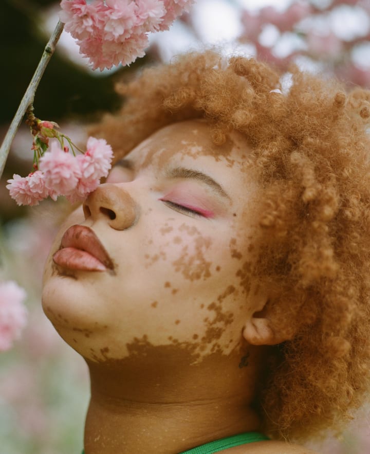
Recently, I got my hands on some of the new Kodak Gold 200 in 120 and tested it with a few portrait shoots on location and making some comparisons to some of my favourite medium format colour film stocks.
Sunlight vs Shadow
For the first shoot testing this film stock, I took to the streets of Manchester with model Moaad Shaikhi to experiment with some simple portraits, testing how the film stock performs in the shade versus in the sunshine.
As a 200 speed film, I was initially worried about the amount of light available (especially in somewhere as notoriously grey as Manchester, in England) but, despite careless light metering, I was surprised with how well Kodak Gold performed in the shadows. The latitude of the film is definitely impressive.

The film dealt really well with underexposure, as Kodak predicted in its summary of the film, and I actually prefer the shots taken in the shade to those in the sunlight, which is something I hadn't anticipated with a film stock renowned for its vibrancy and rendering of sunny scenes. There's bias in this, however, in that shooting in shadow and cloudy conditions tends to lean more towards my personal style of portrait photography.

Kodak Gold vs Kodak Portra
For the next portrait shoot, I decided to test Kodak Gold against a stock which is renowned for great colour accuracy and is notorious amongst portrait photographers: Kodak Portra 400.
Alongside my model Aise, I used one roll of Kodak Gold 200 and one of Kodak Portra 400, allocating an outfit per roll and correlating the outfits to the attributes I was expecting of the film.
For Kodak Gold, I photographed Aise in his more colourful outfit, which was complemented by the vibrancy of Gold and the way it renders colours.

I was particularly impressed by the way that blues and greens were rendered: the colour accuracy was true to life but still vibrant and impactful.

Kodak Portra, on the other hand, is known for being a more subdued and desaturated stock, despite its colour accuracy. It's also known for being a forgiving film when it comes to latitude, although I actually preferred the way in which Gold looked when underexposed compared to Portra.

In the photo below, we can see an example of Kodak Portra when underexposed and the colour cast that's created in the shadows.

Kodak Gold 200 Pushed +1 Stop
Pushing film is something that I've just started to explore with. Before this shoot, I've only ever pushed Cinestill BWXX (from 250 ISO to 800 ISO), Cinestill 800T (from 800 to 1600) and Lomography CN 800 (from 800 to 1600).
However, we're not always blessed with the best, brightest or most consistent light in the UK and it's not always possible to shoot low speed film stocks, even if it is meant to be spring.
I was really impressed with how effortlessly Kodak Gold 200 pushed to ISO 400 on this roll shot with Kyra.

The grain upon pushing this film was minimal and the colours retained their accuracy and vibrancy incredibly well.
Kodak Gold 200 pushed +1 stop vs Lomography Colour Negative 400
I’ve been an advocate for both Lomography’s Colour Negative 400 speed and 800 speed since I first tried them. One of the things I’ve loved about Lomo 400 for so long is the vibrancy of its colours when compared to a film stock like Portra.

Kodak Gold, as we've already discussed, is also a more vibrant stock than Portra and so I was really interested to see how Lomo would compare to Gold, and which I would ultimately prefer.
To really make that decision based on this roll, let’s take a look at two similar images shot on each film stock.


Upon initial glance, both film stocks look incredibly similar but there are some key differences that I've noticed from these two test rolls.
In terms of colour curves, Lomo [Lomography CN 400] looks to have more magenta tones whereas the colours lean more towards green on the Gold roll, especially in the shadows. In line with this, Gold also appears to have a generally warmer colour cast.
That being said, it seems as though the colours on Kodak Gold are more accurate than on Lomography CN, and this is especially apparent in not only the skin tones but also in the green hues.
The greens with Lomo are definitely more intense and brighter, something I've not been a massive fan of over my previous attempts with the stock, whereas the greens on Gold are warmer and resemble more of what I remember the scene to look like in real life.
Gold also appears to be a softer film stock, with less contrast and softer whites, which is something that I really enjoy and feel is reminiscent of what I think "film should look like".
Although I love Lomography and the film stocks they create, I didn’t think that I’d end up saying it, but I think that Kodak Gold has to take it on this one.
I’m really excited to shoot some more Kodak Gold over the coming months, experimenting with pushing it further, working with it in studio as well as on non-portrait shoots.
Here’s to hoping that the landscape of film photography continues in this upwards motion!
About the Creator
Sophia Carey
Photographer and designer from London, living in Manchester.
sophiacarey.co.uk
Reader insights
Outstanding
Excellent work. Looking forward to reading more!
Top insight
Heartfelt and relatable
The story invoked strong personal emotions
Keep reading
More stories from Sophia Carey and writers in Photography and other communities.
The Best Camera is the One That You Have with You
Expensive equipment, and the seeming "need" for it, is something that is rife throughout the photography community. We don't tend to award the artistic merit of a painting based on the price of the materials used but, in photography, we often believe that we must have the most expensive equipment in order to create worthy artwork.
By Sophia Carey2 years ago in Photography
Capturing Magic
In the world of photography, timing is the key to everything. While skilled compositions and technical proficiency are undoubtedly crucial, the perfect lighting can create the perfect photo. Nowadays, we can determine any light ourselves and are no longer dependent on any natural light source, thanks to the developed technology. We can turn every day into a night by using the right filters. And we can illuminate every night to be seen as a day. A typical process, especially in the film industry.
By Krishan Mubashar9 days ago in Photography
Top Modern-Day Cameras
In an era where every moment seems to demand documentation, the quest for the perfect shot has become an integral part of our daily lives. Enter the world of digital photography, where innovation knows no bounds. From the sleek sophistication of the Saneen Digital Camera, boasting 4K capabilities tailored for both photography and video, to the rugged resilience of the KODAK PIXPRO WPZ2, designed to withstand the harshest of environments, The range of options available is as diverse as the creative visions they aim to capture, offering not only cost-effective choices. And amidst this landscape of technological marvels, the 4K Digital Camera for Photography emerges as a beacon of versatility, offering auto-focus precision and anti-shake stabilization, ideal for the ever-evolving realm of YouTube vlogging. As we embark on a journey into the intricacies of modern-day photography and the evolution of cameras, these innovative tools serve as our guide, illuminating the path towards boundless creativity and endless possibility.
By Kaleb M6 days ago in Photography
The Business of Nature
Dew drops reflected the light of the sun. The inhabitants of Whispering Woods woke up to the golden droplets of water on the leaves of the flora. The oaks particularly enjoyed the light and the maples did, too. Happiness enveloped all who lived there, even the rocks that cried out in the night delighted in the morning.
By Skyler Saunders2 days ago in Fiction


Comments (2)
Excellent work
These results are unexpected and are so amazing and enhanced. I really enjoyed this post and want you to consistently post this type of content on this site and contact us for more https://www.uklogodesigns.co.uk/.