
How To Edit Warm, Bright Photos For Instagram Using Lightroom
A step-by-step guide to editing your photos for social media


After years of tweaking, I've settled on a system for a beautiful, bright Instagram feed. And today I'm sharing this system step-by-step! Grab a cup of tea and get your creative cap on, it's time to edit some photos!
In this tutorial I work with Adobe Lightroom. You can get a free trial of Lightroom here, but even if you don't use it, you can still follow along and apply these tips to whichever editing app you use.
Step 1: The Basics
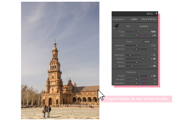
Colour Balance
First up: the basics. Begin by getting the colour balance to where you want it. I tend to like slightly warmer images, so I'll move the slider to the right to bring out those orangey tones. If you prefer cooler shades then go for that, just remember to not over do it! This is the easiest mistake to fall into when you're starting out. I used to warm my images far too much. Less is more, if you're going for a beautiful but natural edit.
Exposure
The exposure for this image was spot on, so nothing was needed there, but if it was a little on the darker side this is where I would lighten it. Brighter images tend to do better on social media, so unless you're going for a moody theme, you might want to err on the bright side.
Highlights, Shadows, Whites, Blacks
I often bring down my highlights, as this brings back the detail in the sky. I also usually up my shadows to brighten the shaded part of my image, but lower the blacks to remove the faded feel caused by upping the shadows. Of course, it's all about playing around to find what you like, so don't take my method as gospel!
Clarity
In most landscape photos I up the clarity, just slightly. It's another step that is easily pushed too far, so try not to go overboard! If you're editing a portrait, you might want to skip this step entirely, it will only bring out the subject's flaws. Or if you know your way around Lightroom, you could always boost the clarity and then rely on the adjustment brush to paint away the clarity on the face, but that's getting a little advanced for this tutorial!
Step 2: Contrast
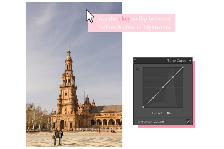
Tone Curve
Use a slight s-curve to add in contrast. You can do this by clicking 3 extra dots into your curve (the top and bottom ones should already be there). To darken the blacks and shadows, click and drag the lower part of the curve to make the bottom part of the s-shape. Next, raise the second point from the right slightly, so you have something similar to the above curve. You've lightened the whites and highlights and, voilà, there's some subtle contrast in your image. You can push this even more by hopping into your red, green, and blue channels, and creating a similar s-curve.
Step 3: Colour
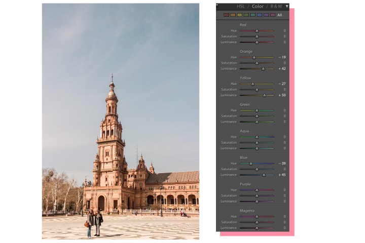
Orange and Yellow
This step is perhaps the most subjective, since it really comes down to what colour combinations you personally go for. For me, I like my oranges and yellows on the redder side, which is why I slide the orange and yellow hue to the left. Also, since I like my images to be bright, sometimes I up the luminance for these colours.
Aqua and Blue
I like to take some of the magenta out of my aquas and blues, and you can do this by moving the relevant hue slider to the left. Sometimes I lower the luminance here, if the sky has been blow out by exposure edits, but this wasn't a problem in this photo so instead I actually upped it! There were no aquas in this image which is why I haven't adjusted them here.
The orange and aqua is a colour combination trend, you know the one, where the sky is an unholy aqua-blue and everything else is super orangey-red for some reason. I would recommend keeping the effect subtle so it seems natural and doesn't look like one of those cliché images.
Step 4: Sharpen
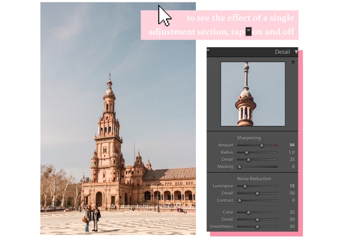
Now let's get this image looking crisp. See that square with the four lines coming out of it (in the top left corner of the adjustment section)? Tap that and then click a point in the picture that you want to see in detail.
Once you've got a part of the image to focus on, you're ready to get tweaking. I usually up the amount slider by quite a lot, and up the luminance by a little. This will depend on your camera though, so take care and see what works for your image!
Step 5: Saturation
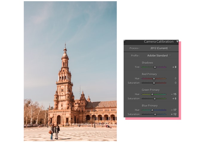
I use the Camera Calibration tool to add some saturation into the final image. Depending on the picture, I also do little adjustments to the hue. There's not much more to say about this step as I don't have a go-to method for this one. As always, just tweak until you've achieve the look you're going for!
And, you're done! Export your image as a jpg, send that image to your phone, and upload it to Instagram!
_______
Okay, okay, I know that sounds like a whole lot of work for one Instagram post. But once you've found the edit you like, you can save it as a preset, and every photo after will be a simple case of choosing your preset and making a few additional tweaks depending on the image.
I hope you found this tutorial useful! If you'd like to see a video tutorial of my editing process, including Photoshop edits, check out my course: Edit Photographs With Photoshop & Lightroom: Step-by-Step Process for Fashion & Portrait Photography.
Also, if you like my edits you'll probably like my Instagram! Come follow along, I'm @byclairep.
About the Creator
Claire Petersen
Berlin-based fashion photographer from Ireland
Keep reading
More stories from Claire Petersen and writers in Photography and other communities.
How To Find a Great Location for Your Photoshoot
No matter where in the world you are, there's a photoshoot location right around the corner. Notice how I didn't say a pretty location, or even an interesting location. I can't guarantee that you live in a vibrant city with a glistening skyline, nor that you're surrounded by beautiful natural landscapes. What I do know for sure is that you don't need to stray far from home to take some incredible photos.
By Claire Petersen3 years ago in Photography
Crafting Humble Brilliance
In a world dominated by social media and constant self-promotion, the art of sharing one's photography without appearing boastful has become a delicate balancing act. Crafting Humble Brilliance isn't just about showcasing your work; it's about doing so with grace, humility, and authenticity.
By Thomas Vasas6 days ago in Photography
Capturing Magic
In the world of photography, timing is the key to everything. While skilled compositions and technical proficiency are undoubtedly crucial, the perfect lighting can create the perfect photo. Nowadays, we can determine any light ourselves and are no longer dependent on any natural light source, thanks to the developed technology. We can turn every day into a night by using the right filters. And we can illuminate every night to be seen as a day. A typical process, especially in the film industry.
By Krishan Mubashara day ago in Photography
Stuck in Place
Amy whistled as she walked through her front yard, looking for any sticks she could pick up and throw into the pile she and her brother were making. They had a big windstorm recently; as such, all the trees in their yard had suffered some damage in some loss of sticks. Or perhaps losing those sticks was a good thing since their trees probably needed to be pruned anyway. Amy wasn't sure.
By Rebecca Patton6 days ago in Fiction

Comments
There are no comments for this story
Be the first to respond and start the conversation.