
Getting Creative With Color
A look at some of my favorite images and the workflow that went into creating them.

Finding Focus
Color has been the main focus of my photography and editing ever since I really started getting serious about it back in 2017. I wanted to be unique with my work and so I tried everything I could to pinpoint a way of doing that. I wanted to narrow down my focus to one general thing that I'd always accentuate in my images. I looked at all the work that was popular at the time and being shared all over Instagram, and then I did the opposite. Not necessarily the complete opposite of what everyone was doing, but just enough to be different.
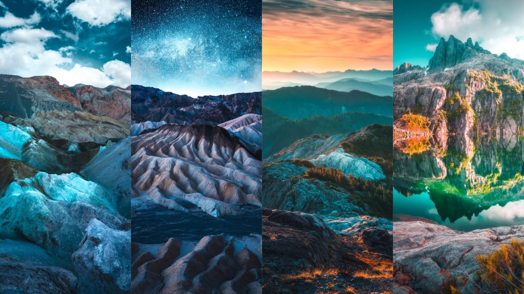
One of the most popular and cliché looks at the time of 2017, especially in the landscape and adventure community, was that really faded and desaturated look. I saw it everywhere. So many photographs had the exact same editing style. Don't get me wrong, it looked great. And pretty much all of those photographers had incredible work that was entirely deserving of all the attention they were getting. But I knew that the more this style became popular, the more difficult it would be to stand out and be unique if I didn't really switch things up. So, I decided my focus would be on color. I'd try my best to create colorful and moody imagery with my photographs. And I'd experiment with new and different techniques in Lightroom and Photoshop in order to accomplish it.
The Challenges
It wasn't easy. I had many many images that turned out quite terribly. And I was often reminded about it by others. You see, photo-editing is something that is still slowly being accepted more and more today. People seem to have this funny idea about post-processing and editing like it just shouldn't be allowed in photography. When, in fact, it's necessary in order to be unique in a world where everyone has a camera in their pocket.
Because of the fact I was aiming for a surreal and colorful look to my work, I had friends and family tell me they didn't like it because it was 'fake' and not 'real photography'. And at the time, I had very few supporters on Instagram to help me see otherwise. But the friends and family who believed in me helped me to push on and keep doing what I was doing. And by doing so, I was able to slowly turn this colorful mission into a reality.
The Results
With a few years of non-stop trial and error plus many hundreds of hours spent behind a computer mastering this colorful style, I'm happy to say I finally have a look that's unique to me. No matter how dark or bland an image may be, as long as I capture it properly while out in the field, I can transform it into a new and colorful image within 10 - 20 minutes of tweaking in Adobe Lightroom and Photoshop.
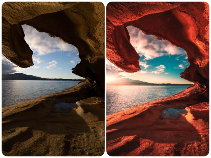
I edit every new image from scratch. Starting with the Basic panel in Lightroom and moving through the sliders to get the desired 'foundation' to my image. After that, I head directly to the bottom of Lightroom to the Calibration panel and make further adjustments from there. Just about every image of mine requires a bump in the Blue Primary slider over to the left. This helps me to get the color palette that ties all of my photos together.
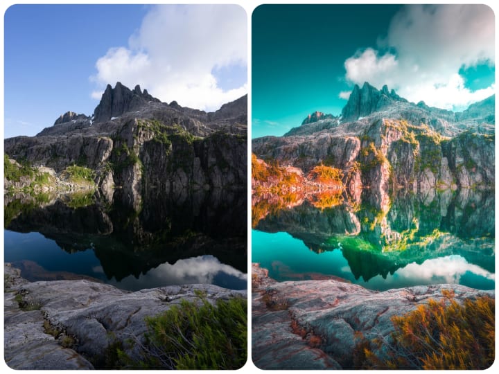
I then move up to the Detail and Lens Corrections panels and do my typical generic adjustments from there. I enable profile corrections, remove chromatic aberration, and do a sharpening mask across the entire image. Once I'm finished there, I move through the Color Grading and HSL panels, fine-tuning and boosting luminance and saturation as I go. These two panels go hand-in-hand when it comes to creating a colorful edit.
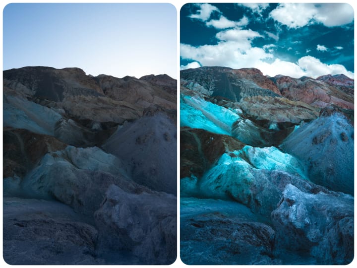
For my global adjustments, I finish up with the Tone Curve. I crush the dark areas of the image and then slowly move up through the curve, creating an S-shape as I go, while fine tuning each adjustment to get the exact balance of contrast that I want in the image. I honestly believe that full understanding of the Tone Curve is a fundamental part in post-processing. Having the ability to fine-tune and balance out those contrast values so that you can achieve a well-balanced look is key to creating a picturesque look to your images.
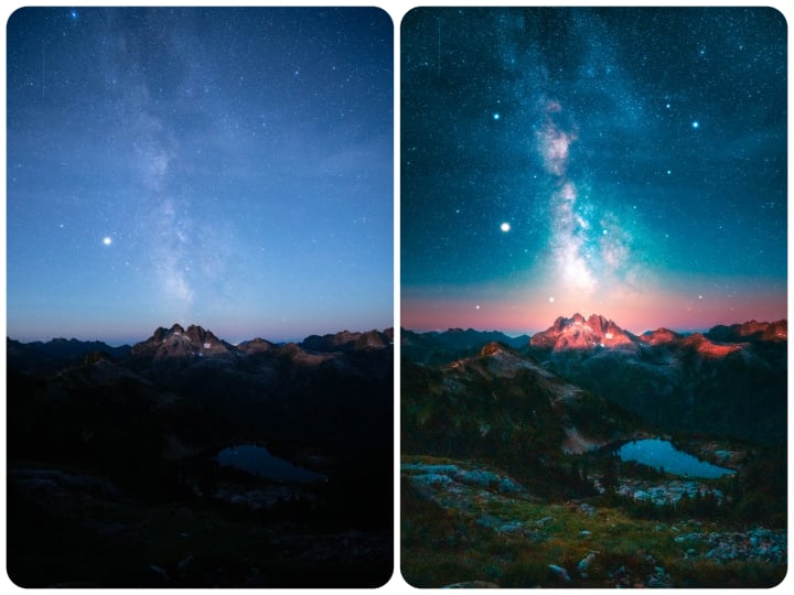
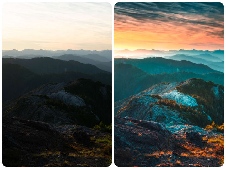
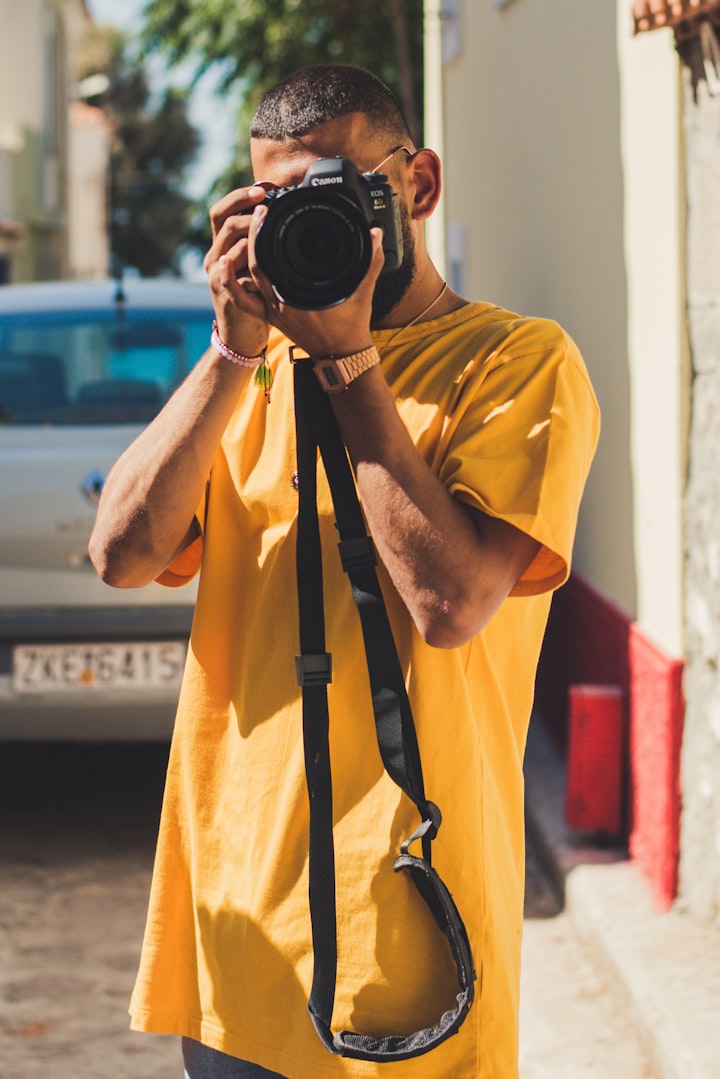
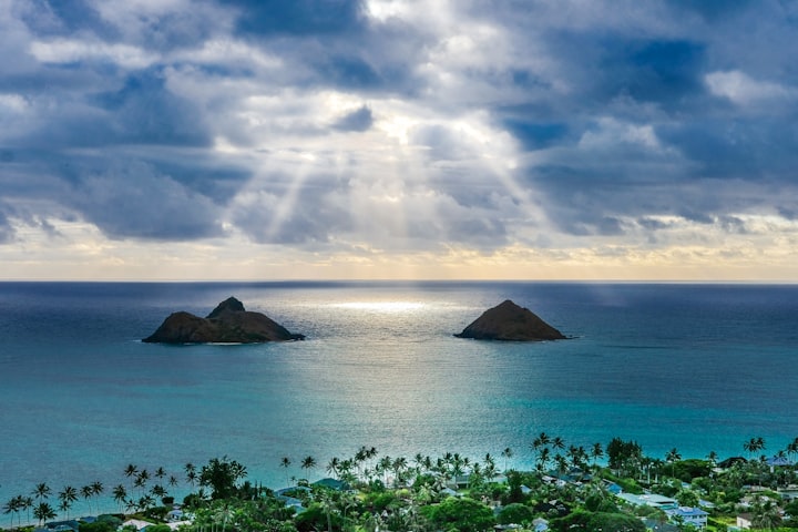
This workflow even works for really noisy and high-ISO images as the one you see above. Of course, an image like this will take extra time and fine-tuning just to make sure the final result is still balanced while not overly noisy. This is also where local adjustments really come into play. Some of my photos require very little local adjustments, while others, like this one, may require a lot. By using the adjustment brush, graduated filters, and a radial filter; I can fine-tune this image even more to get closer to that final desired result.
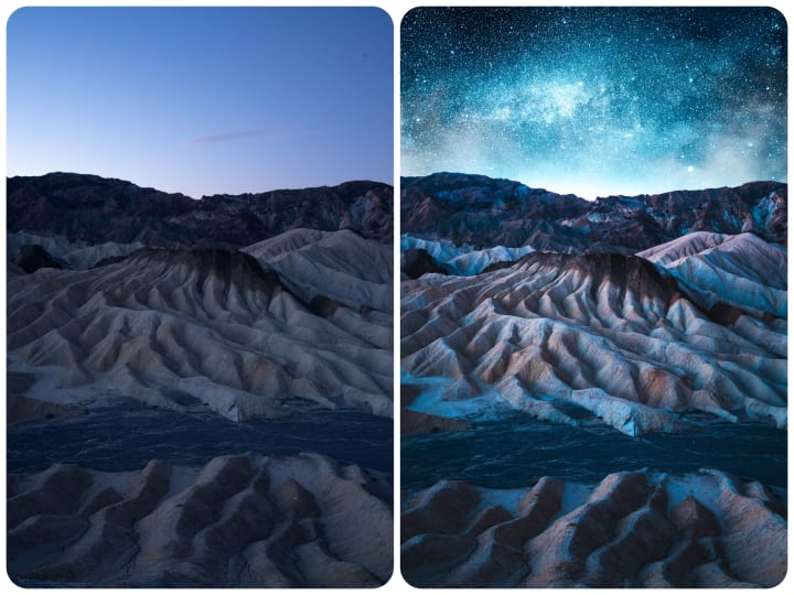
Finally, after I have finished all of the necessary adjustments in Lightroom, I then bring the image over into Photoshop for the final touches. Generally, these final touches are just an Orton effect and some color balancing. But if I am feeling creative, I might do some compositing to create something super surreal.
Sometimes I might do this the old-fashioned way by cutting out the sky myself. Or other times I might let Photoshop's new SkySwap AI do the heavy lifting for me. It really just depends on how much control I need for the blend.
And that's about it. Once I'm all finished, I make sure to save the file and then I export a JPEG at 90% quality full-res to add to my edits collection and get ready for sharing online.
Conclusion
I hope you enjoyed this behind-the-scenes look at my editing workflow. I get a lot of questions about my post-processing, so hopefully this article can answer a few of those! If you'd like to learn more about everything involved in creating colorful photos, tap here to get on the waitlist for my masterclass. That will notify you next time I launch!
That's all for now.
Thanks for reading!
Website: www.calibreus.co
Instagram: @calibreus
About the Creator
Zach Doehler
Hi! My name is Zach and I am a landscape and nature photographer from British Columbia, Canada. I look forward to sharing with you the behind-the-scenes of some of my adventures!
Website: calibreus.co
Instagram: @calibreus
Keep reading
More stories from Zach Doehler and writers in Photography and other communities.
Behind The Shot: Endless Horizons
Post-production is one of the best ways to create a unique look to your imagery and stand out in a world filled with photographers. While the idea of editing and photo manipulation is still not widely 'accepted' by many in the world, I honestly believe that post-production is the future of photography. Every single photographer edits their images to at least some degree. In fact, Peter Lik, one of the world's most famous landscape photographers who has sold over $500 million worth of prints, heavily relies on post-production in order to make his images stand out and attract buyers.
By Zach Doehler3 years ago in Photography
The Ultimate Photography Tips For The Travel Photographer.
You may think that all you need to take quality travel photos is your camera, your smartphone, or even your digital SLR; and while that’s true, there are still many more things to consider before you press the shutter button, no matter what type of camera you’re using. The following photography tips will ensure that you get quality photos every time – regardless of whether you’re traveling across the globe, or just to the next town over.
By Vijay Mistry4 days ago in Photography
Good Picture
This comprehensive guide to photography focuses on capturing moments, emotions, and stories, not just clicking a button. It covers key principles and techniques such as composition, lighting, and camera settings, aiming to elevate photography to the next level.
By Praveen Pkabout 8 hours ago in Photography

Comments
There are no comments for this story
Be the first to respond and start the conversation.