
Designing with Colors: The Fundamentals of Color Theory
Color Theory

Insights
Color Theory! Let's have a look at what this course offers.
- About Color
- Color Wheel
- Color Parameters
- Combining Colors
- Color Systems
- Color Perception and Psychology
Introduction
Color helps to understand a piece of art, design, signage, fashion or anything visual. It can communicate meanings without text and affect user behaviors
It is essential to understand color theory and how to combine colors
- The Color of Light and Paint
- The Color of Light
All colors are mixtures of Red, Blue, and Green lights. Developed by Issac Newton.
The Color of Paint
All colors are mixtures of Red, Blue, and Yellow pigments. Developed by Moses Harris.
Primary, Secondary, and Tertiary colors
Primary Colors
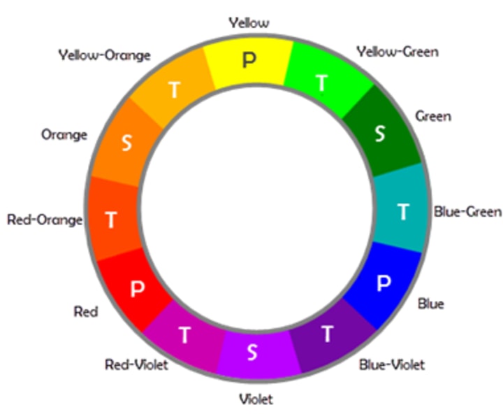
In a color system, the primary colors are those which cannot be produced by mixing other colors.
In this , we will follow the RYB color system that is most commonly used by designers and artists. The primary colors are
- Red
- Yellow
- Blue
Secondary Colors
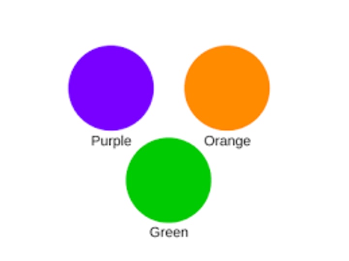
The secondary colors appear by combining two primary colors.
- Red + Blue gives Purple
- Blue + Yellow gives Green
- Red + Yellow gives Orange
Tertiary Colors
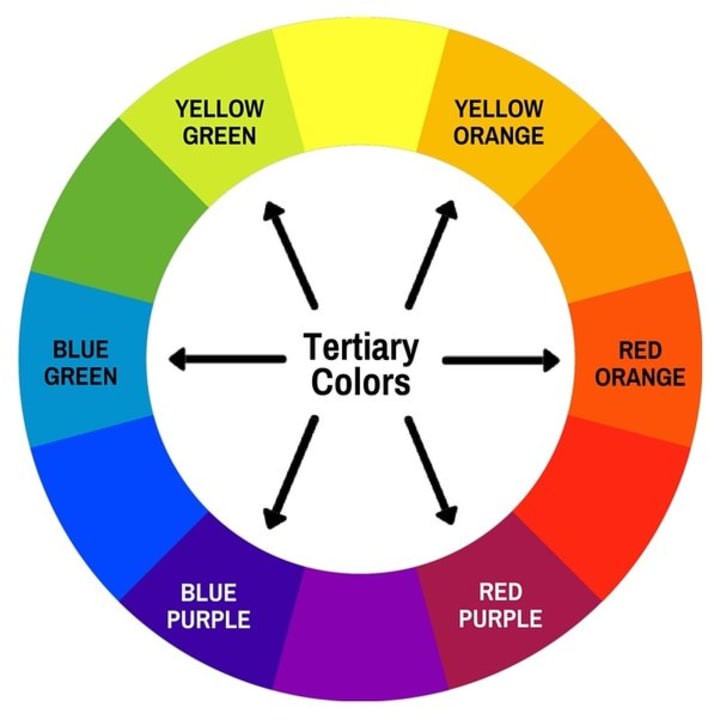
Tertiary colors are also known as intermediate colors that are created by combining equal portions of a primary color with a secondary color next to it on the color wheel.
- Red + Orange = Vermilion
- Orange + Yellow = Amber
- Green + Blue = Teal
- Blue + Purple = Violet
- Yellow + Green = Yellow-Green
- Purple + Red = Magenta
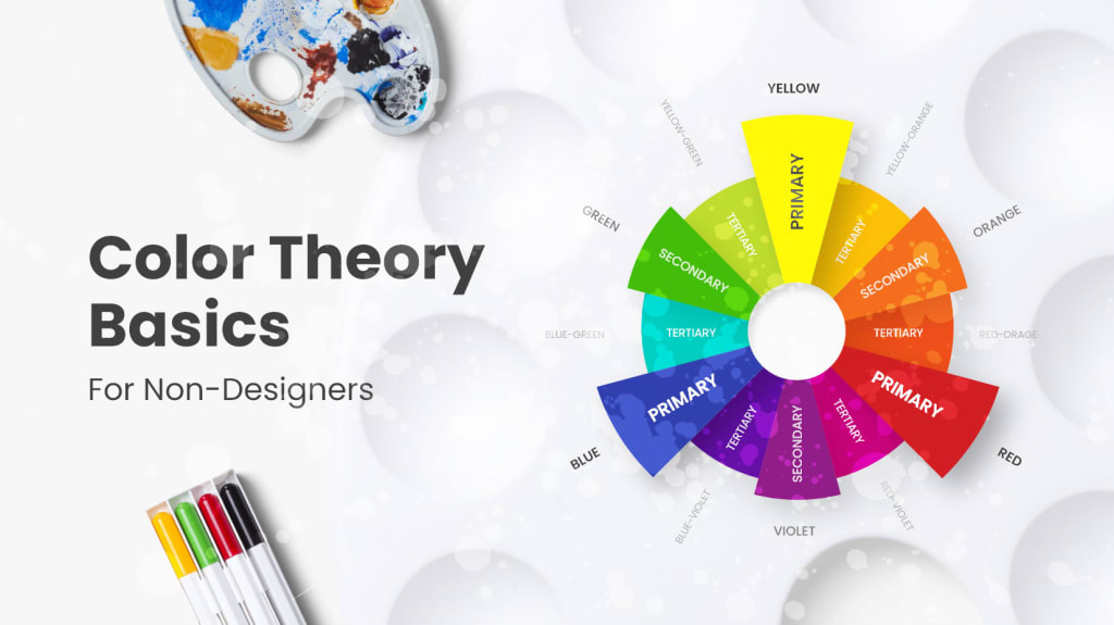
The Color Wheel
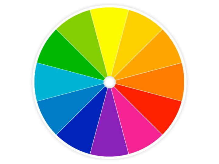
A color wheel is an arrangement of primary, secondary and tertiary colors in order. It helps you to create meaningful color schemes for your designs.
The most common color wheel used by designers and artists is the RYB color wheel model that consists of 12 colors.
Additive and Subtractive Colors

Colors can be blended by subtractive or additive processes.
Additive Process: The color is created adding light to a black background.
Subtractive Process: The color is created blocking white light using pigments of dyes.
That’s why most monitors use RGB, and printers use CMYK.
Warm, Cool, and Neutral Colors

Colors are classified into three based on their temperatures.
Warm Colors: The half of color wheel that consist of red, orange, yellow that give an impression of energy are called warm colors.
Cool Colors: The other half of color wheel which gives an impression of calm and soothing are called cool colors.
Neutral Colors: Colors like black, white and gray are neutral colors.
Hue
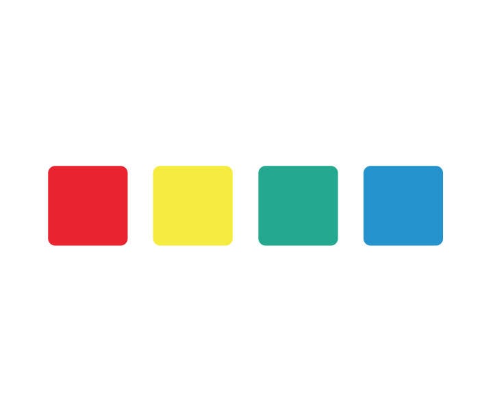
The attribute that differentiates colors as red, yellow, blue, is called Hue. It defines pure colors in terms of red, green or blue.
Saturation
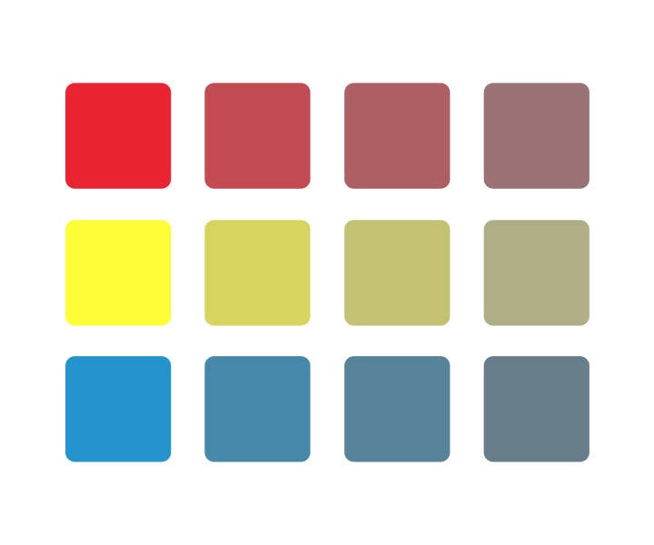
The attribute that defines the intensity of the color is called saturation. The color will be bright if the saturation is high.
Value
Value measures the variation among grays and refers to the darkness or lightness of a color. A hue can vary in value to form different colors. A red can change in value and become light pink or dark brown.
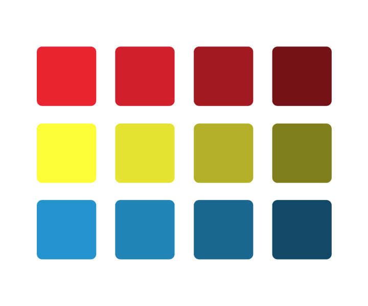
Chroma
Chroma defines purity of a color. It is the quality that embraces hue and saturation together. A pure color has high chroma and a muted color has low chroma.
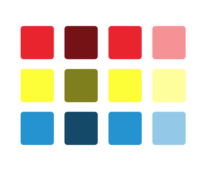
Tint
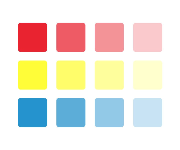
If you add white to an original real color, you get a tint and thereby it is lighter than the original color.
Shade
If you add black to an original color, you get a shade and thereby it is darker than the original color.
Tones

Tones are created by adding gray to a pure hue. The addition of gray slightly darkens the original color.
The color solid
The color solid represents the perceptual dimensions of color that show the relationship between hue, saturation, and value.
Color Gradient and Contrast
Color Gradients

Color gradient or color progression denotes a range of position-dependent colors used to fill an area. The colors generated by a gradient vary rapidly with position thereby producing smooth transitions.
Types of Color Gradients
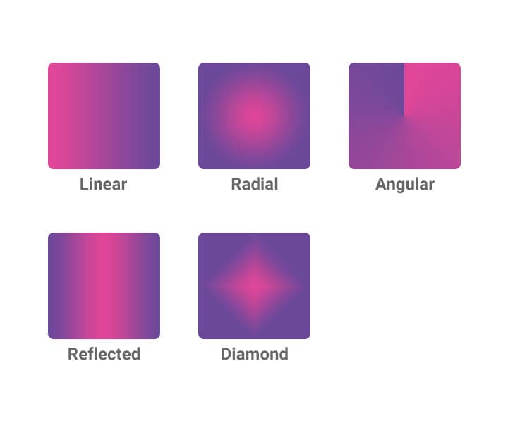
Linear: Colors are arranged in a straight line.
Radial: Colors are arranged in a circular pattern.
Angular: Colors that sweep around the starting point in a counterclockwise direction.
Reflected: The same linear gradient gets mirrored on either side of the starting point.
Diamond: Colors from middle to outer corners like that of a diamond pattern.
Color Contrast
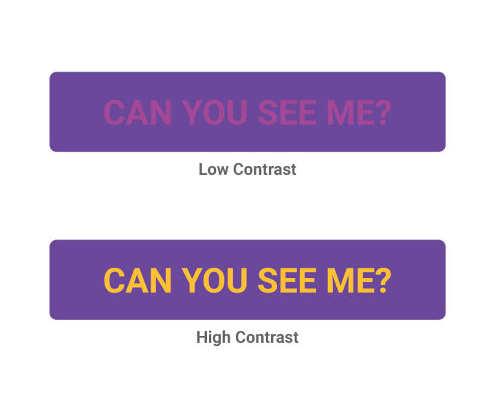
Color contrast is the variance between two colors. In a color wheel, the colors directly opposite to each other has the maximum contrast.
About the Creator
Bhuvaneshkumar S
Hi there, I'm Bhuvanesh, and I design products. I'll present several popular and helpful blogs; if you agree, let's connect and collaborate.
Keep reading
More stories from Bhuvaneshkumar S and writers in Photography and other communities.
The role of empathy in UX design
What is Empathy The ability to empathize is the ability to understand and experience the emotions of others. Empathy is a key component of UX design because it helps designers create products that are easy to use, intuitive, and enjoyable for users.
By Bhuvaneshkumar Sabout a year ago in Education
Capturing Magic
In the world of photography, timing is the key to everything. While skilled compositions and technical proficiency are undoubtedly crucial, the perfect lighting can create the perfect photo. Nowadays, we can determine any light ourselves and are no longer dependent on any natural light source, thanks to the developed technology. We can turn every day into a night by using the right filters. And we can illuminate every night to be seen as a day. A typical process, especially in the film industry.
By Krishan Mubashar15 days ago in Photography
Meet Insta360 Ace and Ace Pro
• Insta360 Ace Pro Introduction: In the dynamic world of professional content creation, the demand for cutting-edge tools that deliver exceptional results has never been higher. Enter the Insta360 Ace Pro, a revolutionary camera designed to empower filmmakers and content creators with unparalleled creative freedom and versatility. With its advanced features and intuitive design, the Ace Pro redefines the boundaries of what's possible in immersive storytelling, offering users an unmatched platform to capture, create, and share their vision with the world.
By quang trung le4 days ago in Photography
The Voyeur's Incandescent Reasoning
The woman sat nonplussed, in the Waiting Room. In a sort of daze, looking straight ahead patiently. She had already had three small breakfast's that morning and a nip of sherry, this was not unusual she would typically wait until an hour after she took her anti-depressant and was her morning routine. She was merely following instructions she assured herself, shifted slightly in her seat and feeling a little heart burn thought, maybe she should skip lunch. Dom had said to have the task done this week. She was well used to his methods and desired to get this over and done with soon. She glanced at her watch, smiled weakly at the Receptionist who was there for a moment and then gone.
By Canuck Scriber L.Lachapelle Author7 days ago in Fiction


Comments
There are no comments for this story
Be the first to respond and start the conversation.