
4 Ways Your Editing Environment May Affect The Color Balance Of Your Photos
And easy changes you can make to correct it.
Have you ever done all of your editing on your computer, but then see a color cast when you send them to your phone or iPad? Spent hours editing your photos, got the color just the way you wanted it, only to order prints that look drastically different? Then ordered test print after test print trying to get the colors to match better. Or spent all night color-correcting video clips, but in the morning all of that footage now looks pink.
You’ve probably heard that there can be some color variation between devices and printers. Sometimes having colors match across different devices or media isn’t a big deal. Other times you really don't want that white wedding dress look blue or your client's headshots look yellowish.
Did you know that your surroundings can have a huge impact on how you see colors? Everything from your light, wall color, and desktop wallpaper influence how you perceive colors.
Here are the best tips I’ve learned for creating a consistent color friendly environment.
1. Properly Calibrating Your Monitor

This is by far the most important thing you can do for accurate color. It gives you a baseline to start from to ensure that color profiles in various programs, such as Photoshop or PremierPro, can interpret colors consistently across devices using the same profile.
For best results do this at night with the lights off, in a completely dark room with no windows, or drape a black cloth over the monitor. This is to eliminate any color influence from room lighting both natural or otherwise. You can do a basic calibration of your monitor’s color in the display settings in your system preferences on a Mac or control panel on a PC. Simply select calibrate and follow the on-screen prompts.
To get even more precise color representation on your screen, I recommend purchasing a color calibration tool. They are a small device that sits on your screen while you calibrate to create a color profile customized to your monitor’s output. These typically run between $150 and $950. I personally use a version of X-Rite’s ColorMunki that runs about $175. Which you can check out here.
Once you have a calibrated color profile, it’s a good idea to recalibrate your monitor every six months or so. Over the life of your monitor, the color output can slowly change from usage. Depending on how much your screen is on you may need to recalibrate more or less often. If colors start looking off, it doesn’t hurt to recalibrate just in case.
2. Neutral Background on Your Screen
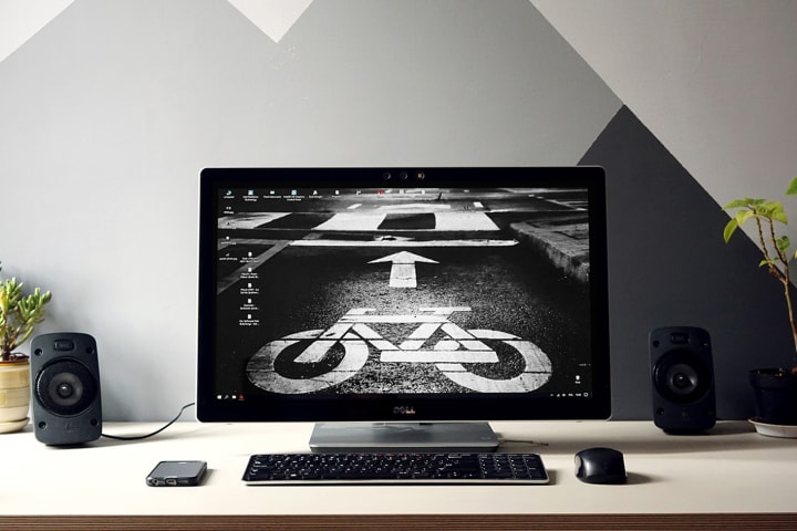
This tip is more for those who can actually see their desktop while editing images. For example, if you use Photoshop on a Mac with the application frame turned off which is not an option on PC, or if you have a second monitor. The reason being, having a bright or colorful image right next to the image you are editing can affect your relative color perception. One option is to change your background to one of the preinstalled solid grey options on a Mac or Dark Grey on PC.
If solid grey is not your thing, you can make a quick neutral version of your existing desktop wallpaper. Simply open the image in any photo editing program and pull the saturation all the way down to 0, and add a little bit of contrast to keep it from looking flat. And if you find a black and white wallpaper online, it doesn’t hurt to remove the saturation from it too. Just because it looks monochrome doesn’t mean that there isn’t a tint to it, especially if it’s an old photograph.
3. Edit Using Daylight
Daylight is the baseline for what our brain thinks a color should be. When things like artificial lighting and tinted windows add their own little bit of color, your brain tries to adjust. It’s the same thing that happens when you wear colorful glasses for a while, and then continue to see a different color for a minute after you take them off. As well as why judging clothing and makeup colors in a store can be nothing like what you see when you get home or outside.
So when you edit your photos near an incandescent lamp with a slight warm orange color to it, your images have a high chance of coming out looking cold and blue, when you look at them in daylight. Even though the color appears normal while you're editing. Since blue is the direct complementary (opposite on the color wheel) of orange.
The best way to avoid the lights from your environment impacting your images is to edit in daylight. Now, this doesn’t mean you need to rearrange your whole house or ask your boss for a corner office so you have better light to edit by. While it may help to set up your workspace somewhere lit by indirect or diffused natural light, you still have to deal with the light changing throughout the day. As well as the potential color cast from nearby trees or buildings. Not to mention, windows won’t make much difference if you tend to edit at night.
You can simulate daylight with daylight lamps and bulbs. But don’t just rush out a buy the first thing that says daylight on it. A lot of consumer “daylight bulbs” are just a random cold blueish light. You want to look for daylight neutral which has a color temperature of around 5500K - 5600K. Many of those “daylight” light bulbs are very cool-toned around 6300K - 7000K and will be a noticeable blue color when turned on. While I’m not going to go in-depth about color temperature in this article, keep this in mind when shopping for daylight lights.
One great option is to get a lamp with a variable color temperature like this one from TaoTronics. This gives you the option of switching the lamp from cool or neutral daylight temperatures for editing to a softer warm glow for reading. I’ve also used this lamp for filming too since it can adjust to match other lights on set.
4. Wall Color

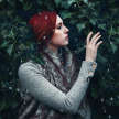
If you have colorful walls in the area where you edit this can affect your color perception in two ways. First, if the room gets a much amount of light from windows, you will reflect the color from the walls. In the image at the beginning of this section, the walls are a very bright aqua blue. While it adds vibrancy to the room, you can see how much color is reflected on to the backside of the subject and other objects in the room. This means that color is also reflecting off the computer screen, affecting everything you look at.
Second, if the wall directly behind your monitor is colorful, you are going to constantly have that color in your peripheral vision. To help understand how this can influence the colors you see, try this experiment. Stare at a solid colored image for about 30 seconds, then look at a white surface. Did you still see color for a few seconds afterward on the white surface? This is your eyes taking a moment to adjust. If you have a tendency to stare off into space while thinking (ie staring at the wall behind your monitor), your eyes are adjusting to that color, then having to readjust when you look back.
Now I’m not saying that either of these issues means you need to go paint your walls. Just that it is something to be mindful of, especially if you are having color issues. If you like having colorful walls, great! Keep them. If you don’t have a say in the wall color of your space, no worries. You can still control the color in your environment by:
• Controlling the light by blocking the light from the windows either with blackout curtains or at least reduce the window light by closing blinds or window shades if available. Use a daylight UV lamp (around 5500K) or switch your lightbulbs for reveal bulbs. Reveal bulbs aren’t quite as consistent as a UV lamp but they are an improvement over the soft white, compact florescent, or generic LED bulbs.
• Create a neutral backdrop for your workspace. You can create a non-permanent backdrop with something movable like curtains, a black and white or greyscale wall tapestry, or even a plain sheet. On a smaller scale, prop up a dry erase or chalkboard (not the green kind), black or white core board, or poster board. Most of these are useful in other ways around your desk or while shooting too.
I personally have a dark teal accent wall and a window right behind my monitor. However, I have neutral grey blackout curtains that I can pull closed while I’m editing. This allows me to block the glare from the window, control the light, and provide a neutral backdrop for my desk space. So don’t be afraid to creative and find a solution that best fits your space and allows you to have a room that you enjoy.
Bonus Tip - Use Color Balance Cards
This tip isn’t really related to your editing environment, so I’m not counting it with the other four tips. If you want to get a fast starting point for color balance, I recommend getting a white balance card. The most basic version is a small set of three neutral cards in black, white, and grey. They are about the size of a credit card on a lanyard like these which start around $6. Or for even more color accuracy you can get what is called a color-checker passport like this one from X-Rite, which works with along with a color calibration tool and your camera’s color profiles to provide you with the most accurate color possible. The passport I’ve linked has profiles for video and photo editing capability and runs around $360, but there is a similar version available for a little less that is just for photography.
Both of these work by taking a test shot in each lighting situation with the card in the image. When correcting your white balance, use the eyedropper to select one of the cards as your target white balance then sync the white balance for all image taking in the same lighting situation.
If you’ve been frustrated with color not turning out as you intended once your images leave your computer, give some of these a try. Then enjoy spending time on the creative side of editing instead of color issues. And if you want more tips on saving time in editing, check out my last article on 5 Photography Mistakes That Cost You Time In Editing!
About the Creator
Keep reading
More stories from Jean Harrison and writers in Photography and other communities.
5 Photography Mistakes That Cost You Time In Editing
As photographers, we love getting the shot. Typically we aren’t just taking one shot either. We are creating a series or capturing a variety of poses and expressions. For many photographers, the act of capturing images is far more exciting than sitting down to narrow and edit. Even for those who enjoy manipulating their images in photoshop, fixing redundant avoidable issues is time-sucking and annoying. And if you don’t do your own editing, it still takes extra time for your retoucher to fix.
By Jean Harrison4 years ago in Photography
Crafting Humble Brilliance
In a world dominated by social media and constant self-promotion, the art of sharing one's photography without appearing boastful has become a delicate balancing act. Crafting Humble Brilliance isn't just about showcasing your work; it's about doing so with grace, humility, and authenticity.
By Thomas Vasas6 days ago in Photography
Capturing Magic
In the world of photography, timing is the key to everything. While skilled compositions and technical proficiency are undoubtedly crucial, the perfect lighting can create the perfect photo. Nowadays, we can determine any light ourselves and are no longer dependent on any natural light source, thanks to the developed technology. We can turn every day into a night by using the right filters. And we can illuminate every night to be seen as a day. A typical process, especially in the film industry.
By Krishan Mubashara day ago in Photography


Comments
There are no comments for this story
Be the first to respond and start the conversation.