
Direct Painting: A How-To for Oils
Broken Down into Not-So-Tricky Steps


So you want to learn about painting with oils. That ancient, noble craft passed down from the Rembrabdts and the Caravaggios of bygone days, and the Monets and Picassos, a medium so adept at capturing the ideas of, well, anything! If you can imagine it, you can realize it in oils.
But beginning can be DAUNTING.
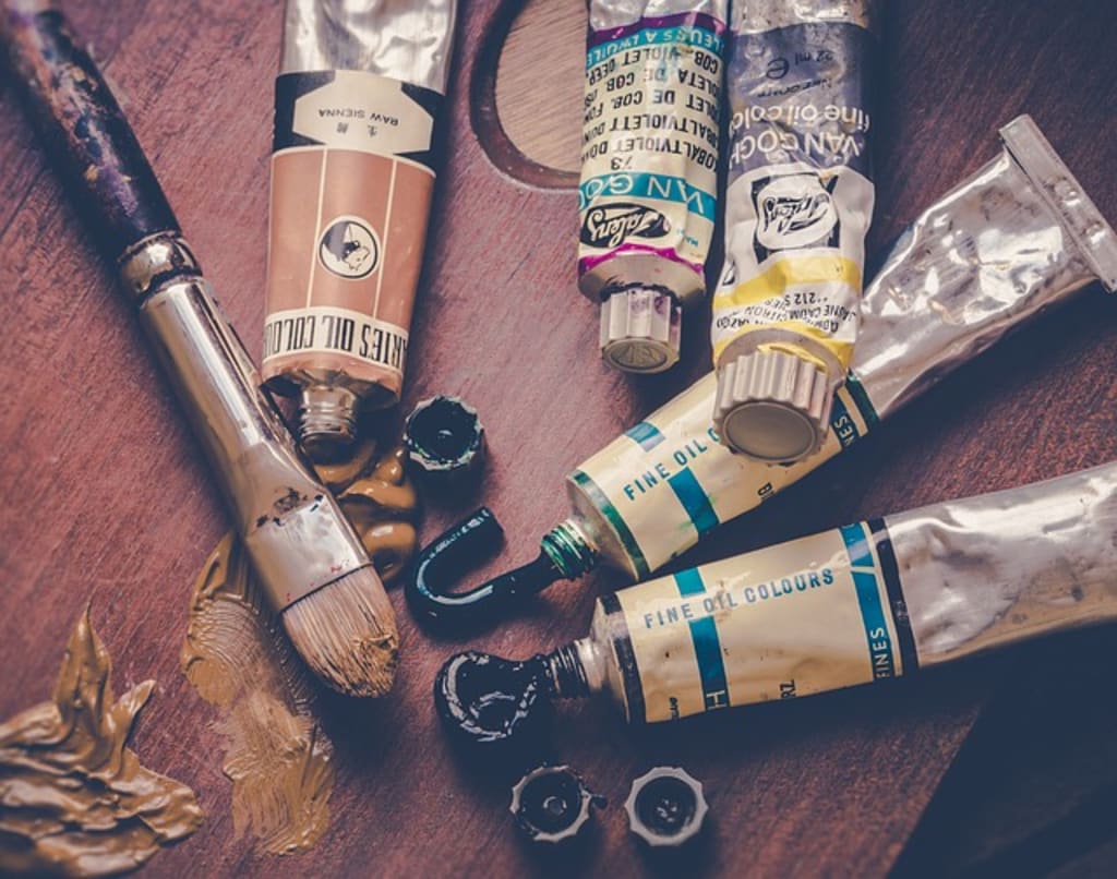
Where to start? And all those foreign terms! "Ciaroscuro," "impasto," "grisaille," and "ala prima." Ala blah-blah-blaaaaah! What's wrong with English?! Not to mention the questions of solvents, brushes, and paint brands. Confusing? It can be! As a teenager, I gave up on oils after trying and failing to teach myself, and swore them off forever as hopelessly miserable. Later, I began going to the Schissler Academy of Art in Colorado, and all these points and more were demystified. Now, I work in oils almost daily and ADORE them!
Now I'm going to try to demystify them for you! Oil painting definitely has its complexities, but it doesn't have to be mysterious. And what's more, I'll start you off with a term that has, somehow, escaped the Italian into English: "direct painting."
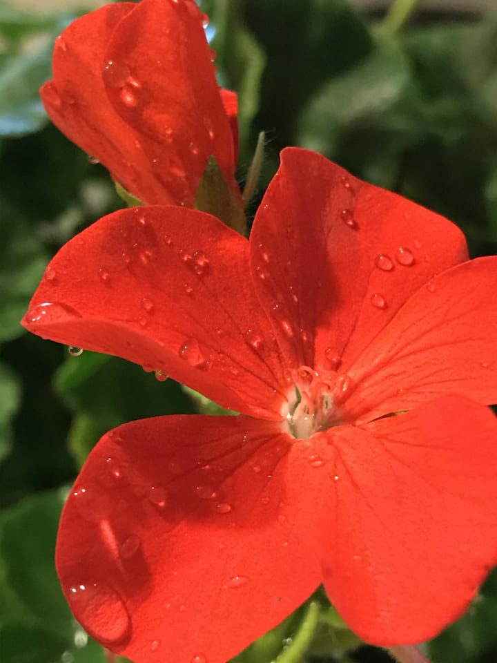
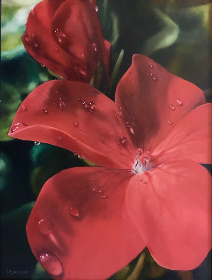
I took this photo of my mom's freshly watered geraniums.
This is my personal favorite method of laying down paint. Basically, it means you take the colors and place them directly onto the canvas, without the use of a grisaille (also called an underpainting, or dead layer—a completed greyscale version of your finished painting). By contrast, if you were going with a grisaille, the paint would be glazed on layer by layer to build up the correct colors and values. I do, however, recommend the use of a bistre in most paintings, but as the demo painting I'll be presenting didn't have one (the composition was simple enough, it was unnecessary). I'll save defining bistres and grisailles further for another article.
There. No more Italian. I promise.
Begin with a photo. Whatever floats your boat. I'm going to be using a picture of geraniums for mine.
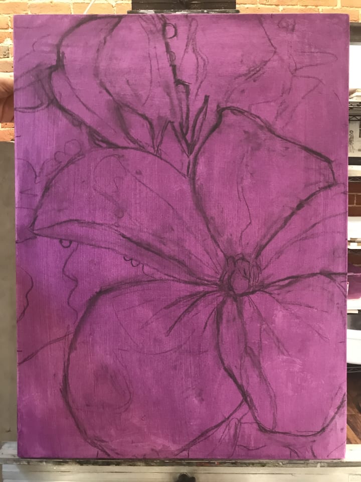
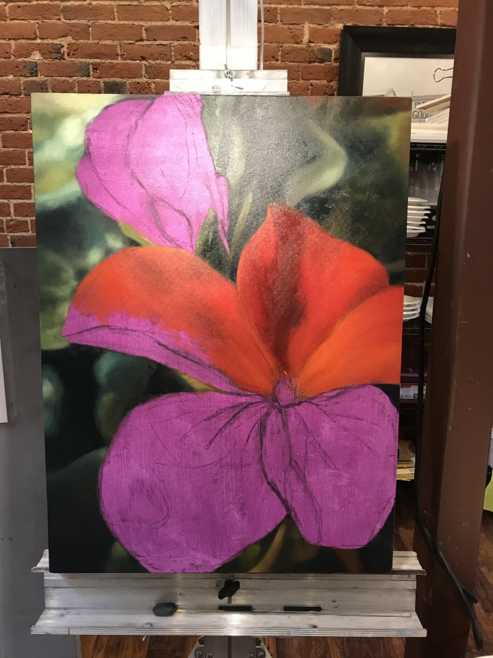
The finished sketch on the toned canvas.
Choose something simple to begin with. And pick a canvas of a comfortable size (I think mine is 16"x24", but you're probably better off starting much smaller. Can't go wrong with the old 9" x 11"!). There are many ways to get your sketch onto the canvas, but I'm going to offer you two: direct drawing and transferring. With transfers, you make your drawing on either colored transfer paper, newsprint or tracing paper, so you can tweak it as much as you like without ruining the canvas, and then rub the back of your drawing all over with charcoal and trace it onto your painting surface with a pen or pencil. If you're pretty confident, go ahead and draw straight on the canvas. I recommend using vine charcoal and a kneaded eraser. The vine charcoal is not very staining, lifts off easily, and can be moved around with the kneaded eraser. I'm an impatient rebel, so I drew directly onto the canvas.
"But wait!" you say, "Is that... purple?!"
It is, my friend. Some people are purists, and use umbers and ochres exclusively, and that's cool too, but I like exploring a bit more (although I also use the earth tones. Depends on the painting). This is "toning" your canvas, and it serves two purposes. First, it seals your drawing, so that it won't blur, rub off, or contaminate subsequent layers. Second, it covers over the white of your canvas, so it won't show through thin places in your painting, and harmonizes the colors throughout. Choose something complimentary to the colors in your chosen photo. I chose purple because it goes with literally everything, and would harmonize well with both the reds and the greens in the composition. I know of an artist who uses scarlet exclusively, and it works well with his compositions. But don't sweat your choices here; there isn't really a wrong choice as it isn't supposed to show through the finished work. But choosing the right color makes color-matching and assessing values far easier than pure white.
Also, I recommend using acrylic paint for toning, thinned with water. Rub it down with a lint-free cloth or soft paper towel to smooth out the brush strokes, and repeat two or three times until you've got a medium-light layer of color down. You can also use oil paint thinned with either linseed or walnut oil, but this can take a week or 10 days to dry. Acrylic dries immediately.
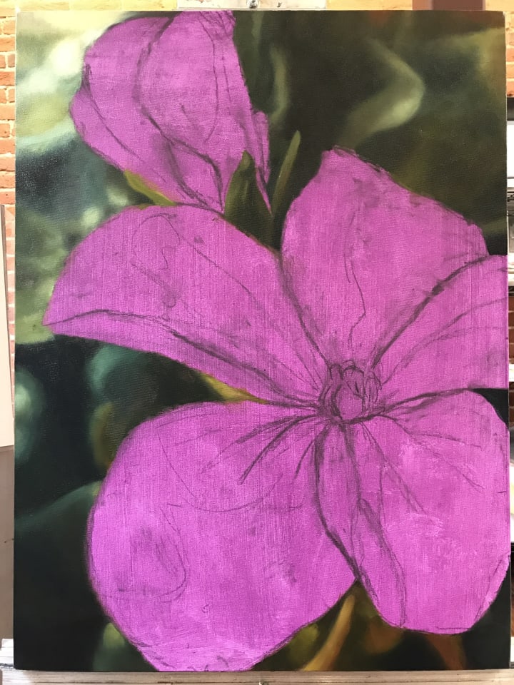
Blocking in the Background
In oil painting, you begin dark to light and back to front. In my demo, this means the greens. It may be irksome, not diving in to the juicy bits of central focus immediately, but it makes things so much easier in the long run. Bringing out the darks helps to establish a value scale, and doing your background first means that it won't overlap your finished subject. Plus, it helps to hone in on any areas of your sketch which may be off.
DON'T stress about bringing it to a finish yet! The first colors are part of the "blocking in" stage. Just putting shapes and colors down in their approximate places, for the express purpose of getting something down at all, to be tweaked and re-tweaked later at will.
Now we block in the main shapes. Keep simple shadows, don't add details. I like to call this the "ugly stage" because nothing looks right and it's all very childish, but it is an essential part of the process. Look at the colors, the forms. Gauge the falling of the light, how it shapes the whole. Use less oil to thin down your paint at this stage, it should be almost pure paint. Hence the age-old adage: "fat over lean." Subsequent layers get more oil, making it more flexible and less likely to crack with age. Of course, if it's not spreading optimally, by all means, add some oil, but easy does it!
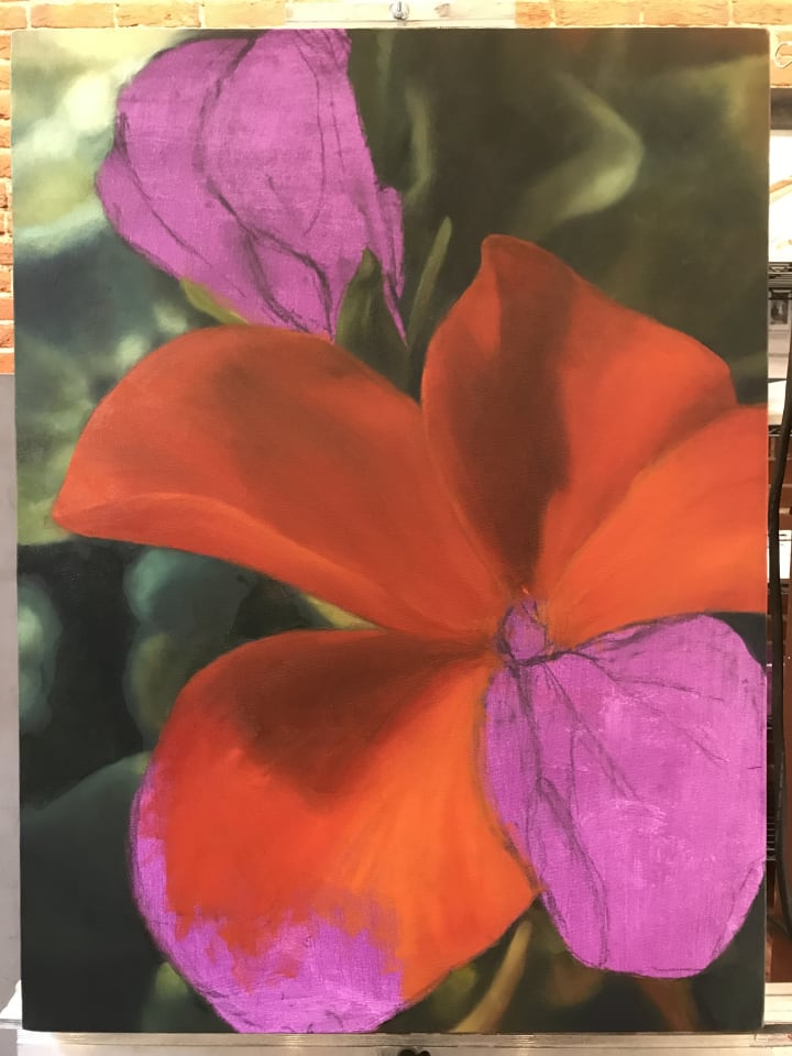
Cycle through the entire painting. Adjusting isn't important here—focus on covering up the undertone and getting your subject on the canvas. It's easier to make adjustments the more you have to work with. Besides, it's a waste of time to finish a small area and find later that it needs to be moved or re-sized!
There! No more purple. Begin honing your colors—look at your photo at least as often as you look at your painting. Check the balance of lights and darks, warms and cools. Mine was much too warm at this stage, so I ended up replacing the yellower tones with pink ones.
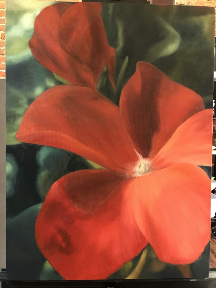
Once you feel like your bulk shapes and colors are well enough underway, then it's time to begin adding the finer details! This is my favorite part. It's where the magic happens, when life is infused into the subject and it leaps from the page!
REMEMBER: You can't ruin an oil painting!!! (Unless you burn it, maybe. Even then I'm sure there are options.) If your painting doesn't look right, it's just not finished yet. If you're still not getting it, then ask an honest friend, set it aside for a while, or turn it upside down. A lot of errors become apparent upside down. Try it!
Sorry for the crooked photo.
Adding veins, correcting colors. Don't forget to let your layers dry completely before adding more. If the paint is still tacky, you may pull up the existing layers with your brush (I speak from experience), and as the painting ages, the risk for cracking increases if it doesn't properly dry.
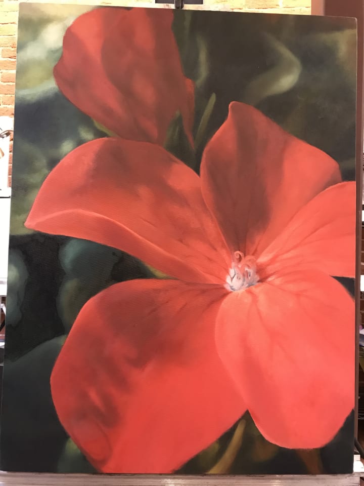
Finished!
Allow me to skip ahead to the finished article. Everything in-between is more of the same. Add shapes, tweak, dry, contemplate, repeat. Work large to small, light to dark, back to front, lean to fat. There you have it: an introduction to direct painting! I hope it seems easier now. If not, then find me on Facebook and I'll try to answer any questions or comments you may have! And don't forget to like, share and follow! 😉
And we've heard it enough to gag on it but...
Practice, practice, PRACTICE!
Keep at it. Peristence is key! You've got this, but you have to believe in yourself. It's time to stop fighting your art time and enjoy it for the great adventure that it is. Who knows what you can accomplish? Let's find out, shall we?
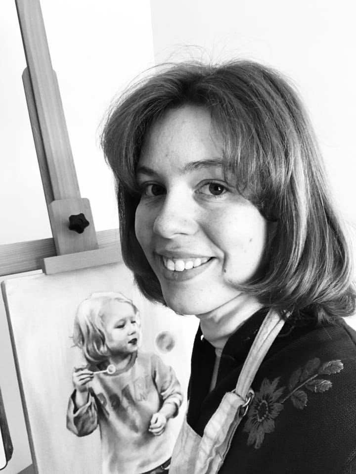
Moi. With an unfinished portrait commission.
If you enjoyed this article, please consider liking and sharing. Also, feel free to leave a tip to promote more valuable content!
Thank you for reading!
About the Creator
Shaking Bird Art
Shelby Lynne is a professional artist and art instructor. Her great passion is to share her knowledge of the art world with others, and promote a culture of curiosity, enjoyment and kindness through creativity.
Enjoyed the story? Support the Creator.
Subscribe for free to receive all their stories in your feed. You could also pledge your support or give them a one-off tip, letting them know you appreciate their work.
Keep reading
More stories from Shaking Bird Art and writers in Lifehack and other communities.
How to Charge for Art Commissions
Hooray! You're getting commissions! Congratulations, you now get to experience both the thrill of having your skills appreciated, and the paralyzing anxiety of new territory. It's not just about producing a pretty picture anymore. How much do you charge? What about contracts? How to package work for shipping? The list goes on.
By Shaking Bird Art3 years ago in Lifehack
Bless Me Father for I Have Sinned
So, here’s me sitting on the 7b bus heading into town. I shouldn’t be on the bus. I don’t want to be on the bus. I should be on a bike, legs pumping like pistons. The freedom of the open road. Direction where the tyres press, as the poet said.
By Brendan Donaghy6 days ago in Humor
Comments
There are no comments for this story
Be the first to respond and start the conversation.