
Vladimir Krull's Paint Color Picks for 2027 Homes
The shades designers are choosing for walls, cabinets and ceilings, and how to use them.
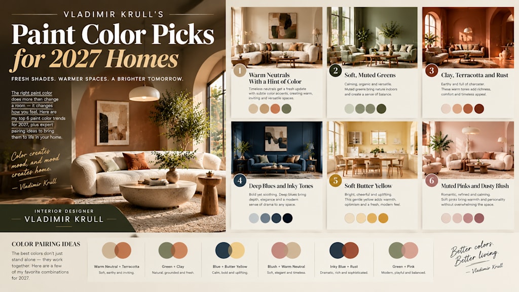
Choosing Paint Is Choosing a Mood
Paint is the fastest and most affordable way to change a home, and it is also the easiest to get wrong. As an interior designer, I have seen a single wall color transform a room, and I have seen the wrong shade make a beautiful space feel off.
Instead of naming brand-specific colors, I want to share the color families I am recommending for 2027, and explain how to use each one. Colors will always vary by brand and by light, so treat these as directions rather than strict rules.
The Big Idea: Warm, Natural and Grounded
If I had to sum up the palette I expect in 2027, it would be warm, earthy and calm. After years of cool grays and stark whites, people want colors that feel like nature: soil, clay, leaves, stone and sky.
These shades are easy to live with, they work with natural materials and they suit many styles. Let me go through my favorites.
1. Warm Neutrals With a Hint of Color
Pure white and cool gray are giving way to creamy off-whites, soft beige, warm stone and muted greige. The best ones carry a tiny trace of yellow, pink or green, which stops them from looking flat.
I use these in living rooms, hallways and open-plan spaces where a calm background is needed. They pair well with wood, linen and brass, and they make a room feel bright without feeling cold.
2. Soft, Muted Greens
Green remains one of my favorite choices. Sage, olive and mossy tones feel restful and connect a home to the outdoors. They are especially good in bedrooms, studies and kitchens.
For small spaces, pick a lighter, grayed green. For a bolder look, try a deep forest or bottle green on cabinets or a feature wall. Pair either with natural wood and white linen for a fresh, timeless feel.
3. Clay, Terracotta and Rust
Earthy reds and oranges add instant warmth. A soft clay on a dining room wall or a deeper terracotta in a hallway gives a welcoming, sun-baked feeling.
These colors look best in rooms with good natural light. In darker rooms, choose a gentler, pinker clay so the space does not feel heavy. Combine with cream, olive or dark wood for a balanced look.
4. Deep Blues and Inky Tones
For a dramatic, sophisticated room, deep blues are hard to beat. Navy, ink and blue-black shades add depth and make wood and brass glow.
I often suggest them for libraries, dining rooms, bedrooms and kitchen islands. If you are cautious about dark colors, try a deep blue on lower cabinets or built-in shelving, and keep the walls lighter.
5. Soft Butter Yellow
A gentle, creamy yellow is one of the most cheerful options I recommend. It feels sunny without being loud, and it works well in kitchens, breakfast nooks and north-facing rooms that need warmth.
Avoid bright, lemon-like yellows, which can feel harsh. Look for buttery shades with a little white or gray, and pair them with white trim or soft blue accents.
6. Muted Pinks and Dusty Blush
Dusty, earthy pinks are growing in popularity, particularly in bedrooms and cozy corners. The key is choosing a shade with some brown or gray in it, which keeps it grown-up and calming.
These tones flatter skin and warm up artificial light. They look lovely with deep green, charcoal or natural wood.
Pairing Colors Together
A single color rarely works alone, so I like to think in small palettes of three. Choose a main color for the walls, a quieter partner for trim or ceilings, and one accent for cushions, art or a door.
For example, a warm off-white can sit beautifully beside olive green and a touch of clay. Deep blue pairs well with butter yellow accents. Keep the proportions simple: roughly sixty percent main color, thirty percent partner and ten percent accent. That balance keeps a room cohesive without feeling dull.
How to Test Colors Properly
Whatever you choose, never decide from a small swatch. Paint a large sample board and move it around the room. Check it in the morning, at midday and in the evening with lamps on.
Remember that north-facing rooms make colors cooler, while south-facing rooms make them warmer. Also look at your floors, curtains and furniture, because surrounding colors change how paint appears.
Walls, Trim and Cabinets
Do not forget everything beyond the walls. Painting trim, doors and cabinets in a color adds a custom, designed feel. A slightly deeper shade on trim, or the same color in a different sheen, creates quiet interest.
For kitchens, durable, washable finishes are essential. For ceilings, a soft tint of the wall color can make a room feel cozy and complete.
Final Thoughts
The best paint color is not the most fashionable one. It is the one that makes you feel good when you walk through the door. Use these palettes as inspiration, test patiently and trust your own eye.
Start with one small room if you feel unsure. A thoughtful color choice can change how you feel at home, and that is always worth getting right.
About the Creator
Enjoyed the story? Support the Creator.
Subscribe for free to receive all their stories in your feed.
Comments