decor
Best workplace decor to bring to your office; be it at home, in a corporate building, or in a shared space.
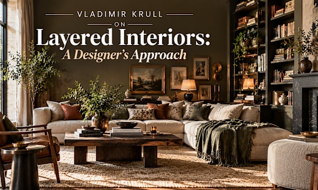
Vladimir Krull on Layered Interiors: A Designer's Approach
What Are Layered Interiors? A layered interior is a room built in stages, with different textures, colors, patterns, lights and objects working together. Instead of a single bold gesture, the room gains depth from many thoughtful details that sit on top of one another, like the layers of a well-made meal.
By Vladimir Krull3 days ago in Journal
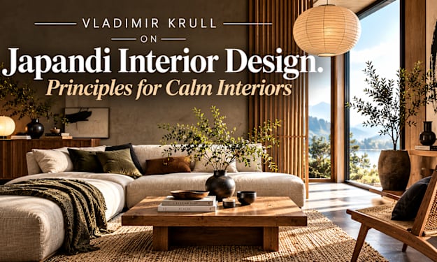
Vladimir Krull on Japandi Interior Design: Principles for Calm Interiors
What Is Japandi Interior Design? Japandi interior design is a blend of Japanese and Scandinavian design. The name itself joins "Japan" and "Scandinavian," and the style borrows the best qualities of both: the quiet simplicity and craftsmanship of Japanese interiors, and the warmth, comfort and light of Nordic homes.
By Vladimir Krull3 days ago in Journal
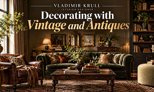
Vladimir Krull on Decorating with Vintage and Antiques
Some of my favorite moments as a designer happen in antique shops and flea markets. I may be searching for a small table, and I find a carved chair or a brass lamp that instantly gives a room a story. New furniture rarely offers that.
By Vladimir Krull7 days ago in Journal
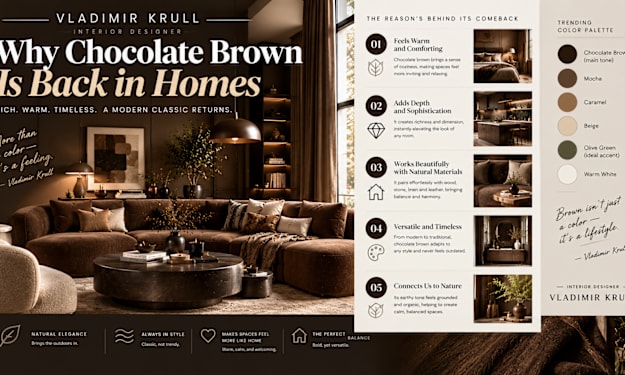
Vladimir Krull: Why Chocolate Brown Is Back in Homes
A Color I Never Stopped Loving For years, designers were told to avoid brown. It was linked to dated furniture and heavy, dark rooms. Yet I never stopped believing in it. Brown is the color of wood, soil, leather and coffee, which means it is one of the most natural shades we can bring indoors.
By Vladimir Krull7 days ago in Journal
Confession Is Not a Performance
Confession is not a performance. It is not a speech you rehearse so the priest will be impressed. It is not a therapy session with a stole. It is the sacrament in which a baptized person names their sins out loud to a priest and receives absolution. The Church has kept this practice because it does what private regret cannot do. It restores the soul. That is why ordinary Catholics still get in the line, even when the line is short and the hour is inconvenient.
By Overdrive Records8 days ago in Journal
The Mass Is Not a Meeting
The Mass is not a meeting. It is not a weekly gathering where Catholics share thoughts and then go home. It is not a lecture with better music. The Mass is the sacrifice of Christ made present. The Eucharist is the Body and Blood of the Lord. That is why ordinary Catholics, including those who grew up with cassette decks and parish basements, still come back for it. They are not there for the bulletin. They are there because something happens that does not happen anywhere else.
By Overdrive Records8 days ago in Journal
The Saints Are Not Museum Pieces
The saints are not museum pieces. They are not statues you walk past on the way to a better exhibit. They are not names on a calendar that exist to fill empty dates. They are men and women who lived, died, and now stand before God. The Church keeps their memory because their lives still argue with the way we live. Most of the time the argument is simple. They did the ordinary things we avoid. They did them long enough to become holy. That is why ordinary Catholics still learn their names and still ask them to pray.
By Overdrive Records8 days ago in Journal
The Rosary Is Not a Background Prayer
The Rosary is not a background prayer. It is not a string of beads you keep in a drawer for emergencies. It is not a Catholic version of a short verse you can scroll past and still claim you prayed. The Rosary is a full way of walking through the life of Jesus with Mary. Each decade asks you to stay with one scene long enough for the story to do its work. That is why it still teaches the Gospel better than a line on a screen.
By Overdrive Records8 days ago in Journal
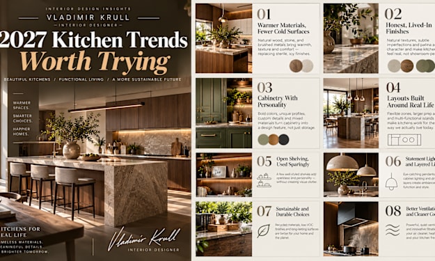
Vladimir Krull on 2027 Kitchen Trends Worth Trying
The Kitchen Is Still the Heart of the Home Whenever I start a new project, the kitchen is almost always where the conversation gets serious. It is where we cook, talk, work, do homework and gather with friends. It is also the most expensive room to change, so mistakes cost real money.
By Vladimir Krull8 days ago in Journal
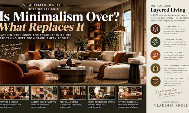
Vladimir Krull: Is Minimalism Over? What Replaces It
A Question I Hear Every Week Clients often ask me, "Is minimalism finished?" My honest answer is both yes and no. Minimalism as a strict, empty, all-white style is losing ground. But the best ideas inside it, like clear thinking, good proportions and careful editing, are not going anywhere. As a designer, I think what we are seeing is not an ending but a correction. Let me explain what is changing, what is replacing it and how you can decide what suits your own home. What Minimalism Got Right Before criticizing it, I want to give minimalism credit. It taught us to remove clutter, respect negative space and buy with intention. Those lessons are valuable, and I still use them in nearly every project. A calm room with room to breathe is a good room, regardless of style. The problem was never the discipline. The problem was the coldness that often came with it. Where It Went Wrong for Many People Strict minimalism can feel sterile. Bare walls, empty shelves and a handful of neutral objects look impressive in a photo, but many people find them hard to live with. There is nowhere to put your things, nothing personal on display and little warmth. Life is messy and full of objects: books, hobbies, souvenirs, family photographs. A style that has no place for any of this eventually feels like a hotel rather than a home. What Is Replacing It: Layered and Personal The direction I see growing is layered design. It keeps the order of minimalism but adds depth, color, pattern and personality. Think of it as minimalism with a heart. Rooms are gaining more texture, richer color, art that means something and furniture with character. The look is still tidy, but it is no longer empty. It feels collected and confident. Pattern and Color Are Coming Back One of the clearest signs is the return of pattern. Stripes, checks, florals and bold prints are appearing on curtains, cushions and upholstery. Color is also getting braver, with deeper tones on walls and in soft furnishings. If this feels intimidating, start small. A patterned lampshade, a striped cushion or one painted wall can change the mood. Keep one rule: repeat a color somewhere else in the room so the pattern feels connected. Display What You Love Open shelves do not have to be bare. I like to fill them with a mix of books, ceramics, plants and framed pieces, leaving some breathing space between groups. This is sometimes called curated maximalism, though I prefer to say it is simply personal. A useful method is the rule of grouping. Arrange objects in small clusters of three or five, vary their heights and let each group have some space around it. That keeps a full shelf from looking cluttered. Furniture With Character Instead of plain, anonymous furniture, people are choosing pieces with history or craftsmanship. Vintage chairs, carved wood, upholstered headboards and statement lighting all add personality. I often suggest one hero piece per room. It might be a dramatic floor lamp, an antique cabinet or a sculptural armchair. Build a calm setting around it and let it be the memory of the space. How to Find Your Own Balance You do not have to choose between extremes. Here is how I help clients find the middle. Start by asking what you love and what you truly use. Keep your clear surfaces in the places that matter, such as entryways and kitchen counters. Then add personality where it brings joy, such as a reading corner, a bedroom wall or a dining room. Edit as you go. If something does not earn its place, let it go. That is the minimalist lesson worth keeping. A Room-by-Room Example Let me make this practical. In a living room, I might keep the sofa simple and calm, then layer in a patterned rug, a few art pieces in mixed frames and a lamp with a character shade. The bones stay tidy, and the personality sits on top. In a bedroom, I would keep the bed area uncluttered for rest, but add a richly colored wall, a good reading light and a small shelf of treasured objects. In a kitchen, clear counters are still wise, yet one open shelf of favorite plates and jars can make the room feel lived in rather than staged. Mistakes to Avoid The most common mistake is adding too much at once. Layering works best when it develops slowly, one piece at a time. Another is ignoring structure. Even a rich, colorful room needs a clear layout, good lighting and enough space to move. Without these, layered design can slide into chaos. Finally, do not follow the swing blindly. If you genuinely love a pared-back home, keep it. A trend should never overrule your own comfort. Final Thoughts So, is minimalism over? In its strictest form, I think it is fading. But its wisdom lives on in a warmer, more personal style that values both order and expression. The best interiors in 2027 will not be the emptiest or the busiest. They will be the ones that feel true to the people living in them. Keep what is useful, add what you love and let your home grow with you.
By Vladimir Krull9 days ago in Journal
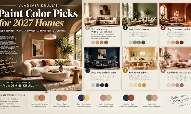
Vladimir Krull's Paint Color Picks for 2027 Homes
Choosing Paint Is Choosing a Mood Paint is the fastest and most affordable way to change a home, and it is also the easiest to get wrong. As an interior designer, I have seen a single wall color transform a room, and I have seen the wrong shade make a beautiful space feel off. Instead of naming brand-specific colors, I want to share the color families I am recommending for 2027, and explain how to use each one. Colors will always vary by brand and by light, so treat these as directions rather than strict rules. The Big Idea: Warm, Natural and Grounded If I had to sum up the palette I expect in 2027, it would be warm, earthy and calm. After years of cool grays and stark whites, people want colors that feel like nature: soil, clay, leaves, stone and sky. These shades are easy to live with, they work with natural materials and they suit many styles. Let me go through my favorites. 1. Warm Neutrals With a Hint of Color Pure white and cool gray are giving way to creamy off-whites, soft beige, warm stone and muted greige. The best ones carry a tiny trace of yellow, pink or green, which stops them from looking flat. I use these in living rooms, hallways and open-plan spaces where a calm background is needed. They pair well with wood, linen and brass, and they make a room feel bright without feeling cold. 2. Soft, Muted Greens Green remains one of my favorite choices. Sage, olive and mossy tones feel restful and connect a home to the outdoors. They are especially good in bedrooms, studies and kitchens. For small spaces, pick a lighter, grayed green. For a bolder look, try a deep forest or bottle green on cabinets or a feature wall. Pair either with natural wood and white linen for a fresh, timeless feel. 3. Clay, Terracotta and Rust Earthy reds and oranges add instant warmth. A soft clay on a dining room wall or a deeper terracotta in a hallway gives a welcoming, sun-baked feeling. These colors look best in rooms with good natural light. In darker rooms, choose a gentler, pinker clay so the space does not feel heavy. Combine with cream, olive or dark wood for a balanced look. 4. Deep Blues and Inky Tones For a dramatic, sophisticated room, deep blues are hard to beat. Navy, ink and blue-black shades add depth and make wood and brass glow. I often suggest them for libraries, dining rooms, bedrooms and kitchen islands. If you are cautious about dark colors, try a deep blue on lower cabinets or built-in shelving, and keep the walls lighter. 5. Soft Butter Yellow A gentle, creamy yellow is one of the most cheerful options I recommend. It feels sunny without being loud, and it works well in kitchens, breakfast nooks and north-facing rooms that need warmth. Avoid bright, lemon-like yellows, which can feel harsh. Look for buttery shades with a little white or gray, and pair them with white trim or soft blue accents. 6. Muted Pinks and Dusty Blush Dusty, earthy pinks are growing in popularity, particularly in bedrooms and cozy corners. The key is choosing a shade with some brown or gray in it, which keeps it grown-up and calming. These tones flatter skin and warm up artificial light. They look lovely with deep green, charcoal or natural wood. Pairing Colors Together A single color rarely works alone, so I like to think in small palettes of three. Choose a main color for the walls, a quieter partner for trim or ceilings, and one accent for cushions, art or a door. For example, a warm off-white can sit beautifully beside olive green and a touch of clay. Deep blue pairs well with butter yellow accents. Keep the proportions simple: roughly sixty percent main color, thirty percent partner and ten percent accent. That balance keeps a room cohesive without feeling dull. How to Test Colors Properly Whatever you choose, never decide from a small swatch. Paint a large sample board and move it around the room. Check it in the morning, at midday and in the evening with lamps on. Remember that north-facing rooms make colors cooler, while south-facing rooms make them warmer. Also look at your floors, curtains and furniture, because surrounding colors change how paint appears. Walls, Trim and Cabinets Do not forget everything beyond the walls. Painting trim, doors and cabinets in a color adds a custom, designed feel. A slightly deeper shade on trim, or the same color in a different sheen, creates quiet interest. For kitchens, durable, washable finishes are essential. For ceilings, a soft tint of the wall color can make a room feel cozy and complete. Final Thoughts The best paint color is not the most fashionable one. It is the one that makes you feel good when you walk through the door. Use these palettes as inspiration, test patiently and trust your own eye. Start with one small room if you feel unsure. A thoughtful color choice can change how you feel at home, and that is always worth getting right.
By Vladimir Krull9 days ago in Journal
Vladimir Krull on Why Perfect Homes Are Out in 2027
The Showroom Look Is Losing Its Shine For years, the goal in home design seemed clear: make every room look finished. Matching sets, spotless surfaces, perfectly plumped cushions and not a single object out of place. I have designed plenty of rooms like that, and I understand the appeal. They photograph well. But more and more, I notice my clients saying something different. They tell me they are afraid to sit on their own sofa. They feel guilty leaving a book on the table. That tells me the showroom look has stopped serving the people who actually live there, and I expect that to shape design in 2027. A Home Is Not a Photograph Here is the idea I come back to again and again: a home should be built for living, not for display. A room can look beautiful in a picture and still feel cold when you stand in it. The spaces that stay with me are the ones with small signs of life. A worn leather chair, a stack of books by the window, a blanket that is clearly used. These details are not flaws. They are what make a house feel like somebody's home. Why People Are Tired of Perfection I see three main reasons for this shift. First, social media taught us to compare. Constant images of flawless rooms created a standard nobody can maintain, and people are exhausted by it. Second, many of us now work, rest and entertain in the same space. A home that is too precious to use simply does not work anymore. Third, people want meaning. Mass-produced matching furniture rarely tells a story, while a handmade or inherited piece always does. Embrace Handmade and Imperfect Materials One of my favorite ways to soften a room is through materials that show the touch of a person. Hand-thrown ceramics with slightly uneven glazes, rough linen, woven baskets, and wood that keeps its natural marks all add warmth. Look for finishes that age gracefully. Unlacquered brass darkens over time, natural stone develops character, and solid wood can be refinished. These materials improve with use, which is the opposite of the showroom approach, where everything must stay new. Mix Eras, Styles and Origins A perfectly matched room can feel flat. I prefer to mix. A vintage side table next to a modern sofa, an old rug under new chairs, or a flea market mirror above a clean console all create depth. The trick is to keep a thread running through the mix, such as a repeated color or a similar material. That way the room feels collected rather than random. If you are unsure, begin with one old piece and build around it. Let Everyday Objects Be Part of the Design Instead of hiding everything in cabinets, I encourage clients to display things they genuinely use and love. Good cookware on open shelves, a record player with a few albums, art supplies in a nice jar, or a basket of throws near the sofa. I call this styling with honesty. Nothing is staged, yet it looks considered because the objects were chosen with care. The key is editing. Keep what is beautiful or useful, and let the rest go. Imperfect Does Not Mean Messy This is an important point. I am not suggesting you abandon order. A relaxed home still needs good bones: sensible layout, comfortable seating, proper lighting and enough storage. The difference is in attitude. You plan the room well, and then you allow it to breathe. A cushion slightly crooked, a plant that leans toward the light or a rug with a gentle wrinkle should not bother you. Clean and cared for is the goal, not flawless. Practical Ways to Start If you want to make your home feel less staged, here is where I would begin. Choose one hard-working corner, such as a reading nook, and fill it with things you actually use. Swap one mass-produced accessory for something handmade. Replace a matching furniture set with a mix of two or three styles. And add a warm lamp, because soft lighting forgives imperfection beautifully. Do these slowly. A home that develops over time almost always feels richer than one that was finished in a single weekend. Patience is a design tool, and it rarely disappoints. Think About Durability and Care Imperfect design only works if the pieces are well made. A scratch on solid oak looks like character, while a scratch on cheap laminate just looks damaged. That is why I recommend investing in fewer, better items. Choose fabrics that hide wear, such as washed linen or textured wool. Pick finishes that can be repaired. A home meant to be lived in needs materials that can take it. Final Thoughts Perfect homes are not disappearing because they are ugly. They are fading because they ask too much of the people living in them. In 2027, I believe comfort, character and honesty will matter more than flawless styling. So the next time you feel pressure to make a room look flawless, pause and ask a simple question: would I be happy to actually live here? If the answer is yes, you have already designed it well.
By Vladimir Krull9 days ago in Journal