
Vladimir Krull on Warm, Earthy Interiors: Why Stark White and Gray Are Fading Out
Why homeowners are moving past cool neutrals, and how to add earthy warmth to any room without a full renovation.
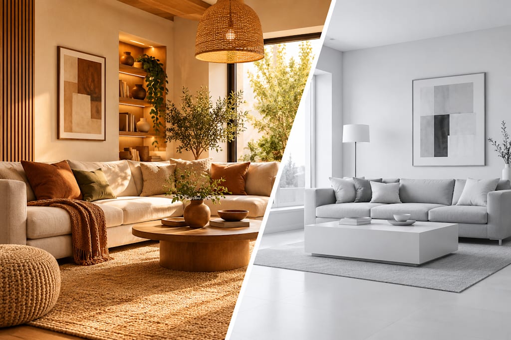
For about ten years, the safest choice in interior design was a white wall paired with a gray sofa. I understand why it caught on. Those colors photograph well, they read as clean, and they promise a blank canvas for whoever owns the house next. But the mood is changing. More homeowners now say they want rooms that help them relax rather than rooms that impress visitors. Houzz's 2026 U.S. Fall Design Trends Report points the same way, describing a growing appetite for warm color schemes, individual touches, and materials drawn from nature. In this article I'll explain why the shift is happening, what "warm and earthy" really means, and how you can bring it into your home without tearing anything down.
Why Cool Neutrals Started to Feel Empty
Stark white and gray are not bad colors. The problem is how they were used: everywhere, all at once, and often with very little texture to support them. A room built from a single flat, cool tone can look finished and still feel strangely unlived in. Light behaves differently in those spaces too. On a cloudy afternoon, cool walls can look dull and a bit chilly, which is exactly when people want their home to feel comforting.
There is also the question of how we use our homes today. When one house has to work as an office, a gym, a dining room, and a place to unwind, the atmosphere matters more than it used to. People are realizing they do not want to live inside a showroom. They want depth, softness, and a space that reflects the people who actually live there.
What "Warm and Earthy" Really Means
Warm does not simply mean beige, and it certainly does not mean painting every wall orange. Think of the colors you would find outdoors: clay, sand, moss, tobacco, oatmeal, and the soft brown of weathered wood. Each of these has a hint of yellow or red in it, which makes natural light look golden instead of flat.
Materials matter just as much as paint. A warm room usually contains surfaces you want to touch: a wool throw, a linen curtain, an oak table with visible grain, a ceramic lamp with a slightly uneven glaze. This is why designers talk so much about layering. One warm color on its own can look like a decision made from a paint chip. Several warm tones and textures together look like a space that grew naturally over time.
Undertones deserve attention as well. A creamy white with a touch of yellow sits beautifully beside terracotta, while a bright blue-white will fight with it. Before I commit to any shade, I hold the sample next to the flooring, the fabrics, and the lighting. The goal is harmony, not an exact match.
Easy Ways to Add Warmth Without Starting Over
You do not need a full renovation to move in this direction. Begin with the elements that change quickly:
Paint a single wall or room in soft clay, sand, or olive, and live with it for a week before going further.
Replace cool-toned bulbs with warmer ones. Lighting alone can transform the mood of a room.
Layer textiles, such as a chunky rug, linen pillows, and a heavier throw.
Bring in natural wood through a side table, picture frames, or open shelving.
Add something handmade, like a ceramic bowl or a woven basket.
If you are ready to do more, consider switching cold-toned hardware to brass or bronze, or updating a backsplash with a handmade-style tile. These details add personality without demanding a full remodel.
Room-by-Room Ideas
In the living room, a warm off-white on the walls with a deep green or rust accent chair makes a quiet but noticeable difference. In the kitchen, many homeowners are moving away from all-white cabinets toward wood tones, soft greens, or creamy neutrals paired with natural stone. In the bedroom, layered bedding in oatmeal, sand, and clay creates a restful mood without feeling heavy. Even a small bathroom can benefit from warm plaster-style walls, a wooden stool, and brass fixtures.
The same principle applies everywhere: choose a few related warm tones, vary the textures, and let natural light do some of the work.
Mistakes to Watch For
The most common error is going too warm too fast and ending up with a room that feels heavy. Keep a few lighter surfaces so the space can breathe. Another mistake is mixing too many undertones; a pink-leaning beige, a green-leaning gray, and a yellow cream rarely sit well together. Finally, do not throw out everything you own. White trim or a gray sofa can often stay if you surround it with richer, warmer elements. A change in direction does not have to be all or nothing.
A Home That Feels Like You
Trends will keep moving, and warm earthy tones will eventually give way to something new. What I hope remains is the idea behind them: a home should comfort the people inside it. If a color, a fabric, or a piece of wood makes you feel more at ease when you walk through the door, it deserves a place in your space, whatever the season's headlines say. Start small, trust your instincts, and let each room develop its own character.
About the Creator
Enjoyed the story? Support the Creator.
Subscribe for free to receive all their stories in your feed.
Comments