
UX Design Portfolio Project 2: Coffee Drinkers App
My second UX Design Project, originally created back in 2020.


Case study: Maximising users enjoyment of specialty (Campos) coffee
The Problem:
Users love their coffee. The research conducted came to the conclusion that 66% of users interviewed enjoy 2-3 cups of coffee a day, equating to around 14-21 cups of coffee a week. Users want to enjoy their coffee for a myriad of reasons; yet they’re not willing to spend any more than $4 for a cup of coffee - even for a large; and yet they still want to consume a quality, speciality coffee bean. These users are busy people and professionals such as Lawyers who are time poor, and of who appreciate the benefits that drinking coffee provides them.
Why this problem needs to be solved/the barriers:
Users are time poor, and therefore are keen on convenience while not paying any more than $4 for a cup of coffee (even for a large cup).
Users love their coffee; predominantly for the caffeine/energy rush, intellectual stimulation, and due to their (coincidentally) European backgrounds.

- These users drink coffee at home (percolated and coffee pods to name); yet they seek the enjoyment and convenience of enjoying a barista made brew when it suits them while out - predominantly alone, and sometimes with others.
- Users interviewed also benefit from some slow, quality time with themselves while at a cafe/coffee shop. For example, reading a magazine while sipping on some coffee.
- For these same users, drinking coffee outside of the home is also enjoyable with at least one friend present with them.
The COVID-19 Pandemic has impacted the users coffee consumption habits outside of the home, and they still want to enjoy their Campos coffee in great times, and in the not so great times - economically speaking.
Empathise
For a similar project, I interviewed four (4) users, while the other nine (9) interviews came from other group members. The initial rationale was to develop an app for the City of Sydney to keep users safe in pandemics and other natural disasters, as Australia was deeply hit with the bushfires prior to the COVID-19 Pandemic happening immediately thereafter. I was working with a group of four (4) UX Designers, and this app would help users know in advance if their favourite bar, restaurant or cafe was open when they wanted to go; and if the area would be safe for them to do so. This idea was scrapped right after the research was synthesised; and therefore this project had to be re-iterated and run on an individual basis, in order to help coffee drinkers find their nearest and/or most affordable cafe/coffee shops (and yes, those daily 10 cents a day savings for example do add up over time).
The interview gave rich insights into the users daily coffee consumption habits, as well as their coffee preferences (for example a latte with milk). I wanted to observe the same users ordering a coffee from a coffee shop/cafe, as well as observe the baristas at work - like a contextual inquiry; yet the epitome of the COVID-19 Pandemic meant that only social distancing based interviews and usability testing were possible.
From there, I was able to draw up an empathy map that will assist greatly in synthesising the research findings:

Define
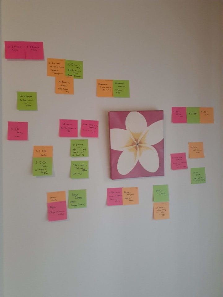
The problem statement was confirmed when beginning to synthesise the research after creating an empathy map. The next steps were to collaborate individually on this occasion - all due to having to self-isolate under Doctors orders due to the COVID-19 Pandemic, despite not having this illness; yet on the initial project, this was done with my team of four people (including myself). The rationale was to record the key research findings on post-it notes (different coloured post-it notes for each user), and engage in the affinity mapping/journey mapping process. From there it was confirmed that the key users drink coffee quite regularly (2-3 cups a day), and they also enjoy drinking barista made coffee away from the home. Therefore there was a viable proposition in designing an app to help users find their nearby cafe/coffee shop that knew how to make their Campos coffee just the way they like it, while choosing their price point in advance.
This affinity mapping process purported that users are not too concerned about using keep cups, and using loyalty cards; hence why there was no mention as such in the app prototype. Providing information and data that isn’t fussed by the user is counterproductive, and also promotes clutter. Not necessary.
People have their own coffee preferences; yet what was interesting is that all users drink their coffee with milk, and are willing to pay no more than $4 for a cup of coffee; even for a large. The affinity mapping process allowed for deep synthesis and design thinking to surface:

In further defining the problem, and therefore coming up with a solution; it was important to synthesise the research further and ascertain whether or not there is any real value in coming up with an app that allows users to find their nearest Campos coffee, according to their coffee preferences.
Assessing the needs of the users meant that a viable and valuable opportunity (like a MVP) came forth in pressing on with the second round iterations of this project through using the Value Proposition Canvas as another key UX deliverable:

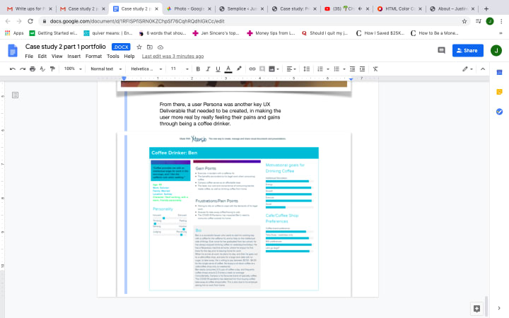
From there, a user persona was another key UX deliverable that needed to be created, by making the user feel more real, in really feeling their frustrations and joys through being a regular coffee drinker:

Regarding the below image; I want to be the best UX Designer I can be. I love the mental and emotional challenges that come with being a UX Designer, as well as demonstrating high levels of empathy towards the target audience of users...(I digress a bit, yet back to the coffee finders app project.)

Iterate
Again, there were a few weeks in between iterating this project from the initial project to create an app that allows users to know in advance if their favourite bar, cafe or restaurant is open in special situations in particular - as in a fire, pandemic, or other emergency. This idea was dumped due to the COVID-19 Pandemic (as soon as Sydney went into lockdown), with restaurants being closed in particular.
The project was then re-reviewed from a group to now an individual based project in order to forge ahead with my UX Design career despite the COVID-19 Pandemic, while building some more resilience into the coffee drinkers niche with Campos coffee as a fictional client.
This meant that new users needed to be recruited for the interviewing and UX research process to begin from scratch. During the affinity mapping process, post its were constantly relocated in order to spot trends and more meaningful data. There were also a couple of iterations made on Figma during the wire-framing stage, with minor tweaks to the content in the app.
Prototyping & User Testing
The initial sketches:

User testing was conducted on paper only, while adhering to the 1.5 metre social distancing measure with the same users interviewed, all due to COVID-19:
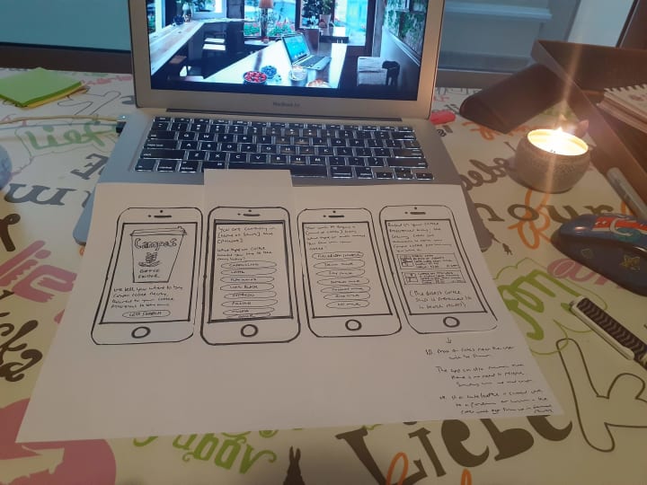
The users pressed the right buttons to get the coffee they wanted. The KISS philosophy was adopted. It was not deemed necessary to allow the user to reserve their coffee on the app, as cafes and coffee shops are well known for serving customers quickly; and therefore allows the customer to enjoy more human interactions with their barista/coffee shop staff - as well as allowing them to pay for their coffee as they choose; even with cash, despite being in times where contactless/card payments are preferred. They understood that the ‘no milk’ option on the third screen would only appear if long black, espresso, or other was chosen on the second screen. This is simply to confirm that they want a black coffee. If a user picks a choice of any of the other coffees mentioned on screen two; they have to choose what type of milk they want before the app gives them a small list (maximum of four nearby coffee shops) of these nearby cafes/coffee shops that serve Campos coffee the way they like it.
The app is simple. There is no need to register, and although the app has the capability to track the users location on their smartphone device; the users do not need to be concerned about their privacy. This app is only designed to give them the details of nearby cafes that serve Campos coffee to their coffee preferences, while paying no more than $4 for a cup of coffee at any given moment.
Wire-framing in Figma on initial attempt; and exporting wireframes from Figma:

From the above, I have learnt the hard way that PDF files are not ideal when exporting wireframes from Figma. JPEG files are. If you keep a good sense of humour, and can accept constructive feedback; then that is key to being a great UX/UI Designer.
Conclusion and final thoughts
This is my second and most recent design sprint UX Design case study. I can see a significant improvement, despite keeping it together through an unexpected pandemic turned economic recession, with another major personal setback during this process.
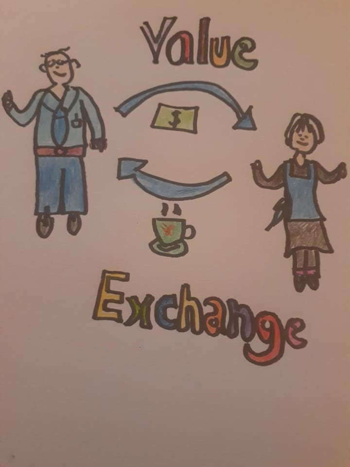
In conclusion: By designing this app, regular coffee drinkers (those who drink 2-3 cups of coffee a day, and equally for others who drink barista made coffee less or even more frequently) will be able to quickly plan ahead and locate a nearby cafe/coffee shop that is able to make a Campos coffee for them their way, and to know how much they need to pay for their coffee in advance. This app is helping to promote Campos coffee, as well as further supporting nearby coffee shops who brew Campos coffee. The user saves time and money (10 cents a day can make the world of difference). For example, if a user likes their coffee with (say) almond milk; they will know in advance which cafe/coffee shop allows users to enjoy their Campos coffee with almond milk - rather than just showing up at said cafe, and hoping for the best. This builds loyalty and trust, thereby encouraging repeat business for an impulsive, regularly consumed drink. There is a fair value exchange going on. I drew/designed the below concept just for fun, of which sums up the epitome of this project's viability/MVP:
NB: I (the author) have chosen to transfer my User Experience (UX) Design portfolio onto my Vocal Media work, due to undertaking a cost/benefit analysis of continuing to host the justinecrowley.design website. Executive decision: It will be defunct in September 2023. The $15 USD a month in web hosting fees is an expense that is no longer justified in this freelance work of mine, as I am happy with the ad-hoc clients that I am receiving in this work, as well as being at maximum capacity in my content moderation work on TikTok. This portfolio will still serve as a purpose for future IT work for being published on Vocal Media. Thank you so much.
Project originally created back in early 2020, while as a Student UX Designer for the Interaction Design Foundation.

About the Creator
Justine Crowley
Freelance Internet Moderator/UX Writer/UX Consulting Designer/Graphic Designer
http://smashwords.com/profile/view/JustineCrowley
linkedin.com/in/justinecrowley
Lives in Sydney, Australia. Loves life.
Keep reading
More stories from Justine Crowley and writers in Journal and other communities.


Comments (1)
Well written!