
How art of my characters can reach out to my audience deeper
All artwork done by Carol Makky
It all started with a voice calling out to me, a grieving father’s voice to be exact. He was telling me about his only daughter Barbara. He was telling me about her killer.
He said to me, jaw clenched and his eyes raw and red from endless tears, “Before that son-of-a-bitch gets the needle, I have to look at him in the eye.”
And that was several years ago when I couldn’t let go of such a passionate father’s stance, to gain justice and overcome such a burning issue gathering in a growing, melancholy heart—and I couldn’t ignore it no matter how hard I tried. That was when I first started The Half Paper Moon. I had started it here on Vocal. It gained a good following of almost seventy hearts and almost two-hundred reads, but it was not a top story.
Steven, Barbara’s father, and Connie, Barbara’s main love interest, were the core voices of this story. Their emotions poured from me, their passions, or lack of passions—-their extreme grief and anger and fear, all of it, was coming from a real place.
A storm that I was working through that my characters needed to fight as well. To gather the courage to keep up the faith through trauma and anger and sadness. That is what I really wanted to say in this book and when I decided to finally publish it through Amazon’s self publishing option, I knew that I needed a way to reach out to my readers in a way that could show them my true love for my stories: art.
I needed to grab your attention, and yes I mean your attention.
The cover is the first thing anyone looks at and of course if you don’t feel anything for the cover, or the title, you won’t pick it up and read that first page. So, I sought out the attention of my very talented artist friend Carol Makky, who dabbles in animation and many different forms of media and art, to create this vision. Mainly, to bring my characters to life for you all to enjoy and embrace as I have, for the many years I have known them.
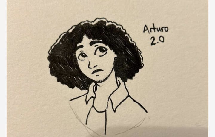
This book also centers around another short story titled Carnivorous, which entails and follows a young Columbian man Arturo who immigrated to the United States at a young age, and who growing up, had his own identity complications and body dysphoria that intermixed with a dark secret of his young adult life. This is personal as I have been having these same experiences since my early teenage years and I personally relate to Arturo is that same way. The narrative is a gritty mystery composing of four people (including Arturo of course!) and their interlinked destiny and how they all found a way to make or break that chain, to save themselves, or save each other—-who knows? Only time will tell how their fates will align in this dangerous game of drug cartels, brothels with affluent clientele that have odd tastes and odd meet cute moments in coffee shops filled with lots of bubbling up passion.
So getting to the meat of this article, I will share with you all the art, and concept art.
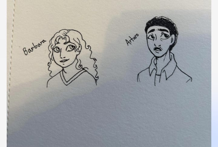
Here is early concept art for Barbara and Arturo, all copyright and rights to Carol Makky.
Here is later stage version of how Arturo actually looks in the novel:
Here is a later stage version of John from The Half Paper Moon:
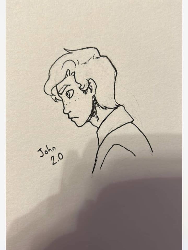
I hope you can get a feel of all of their personalities through these sketches and get a sense of who and what they are. I feel Carol’s visions embodies my characters in a way that is truly important to their overall experience and expression of culture, feelings, memories and hopes and dreams.
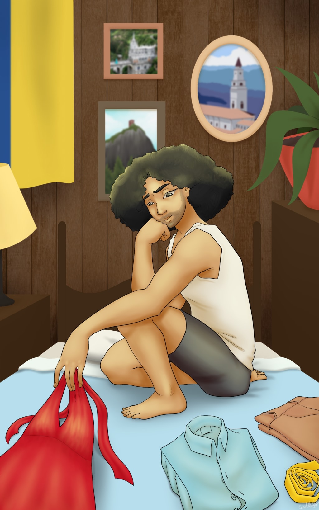
And now to the big one, the grand enchilada, the big reason y’all came to read this in the first place, the front cover:
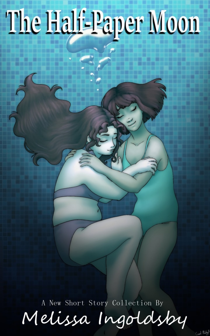
This one is my favorite as this shows Barbara and Connie and their true love and affection for one another. This comes from a scene directly in the book, from an impromptu late night swim together, that unfortunately is their last. Their expressions and body language is very important and shows intimacy and strength, warmth and deep trust, and their long term friendship is at the forefront as they always used to dive down deep in Barbara’s father’s pool together and make faces(to see who went up first to laugh!).
I hope you enjoyed this art review and if you’re looking for something new to read please check out this page, and hope you enjoy my stories and find yourself in between the spaces of my words.
-Melissa Ingoldsby
About the Creator
Melissa Ingoldsby
I am a published author on Patheos,
I am Bexley by Resurgence Novels
The Half Paper Moon on Golden Storyline Books for Kindle.
My novella The Job and Atonement will be published this year by JMS Books
Reader insights
Outstanding
Excellent work. Looking forward to reading more!
Top insights
Expert insights and opinions
Arguments were carefully researched and presented
On-point and relevant
Writing reflected the title & theme
Excellent storytelling
Original narrative & well developed characters
Compelling and original writing
Creative use of language & vocab
Heartfelt and relatable
The story invoked strong personal emotions
Masterful proofreading
Zero grammar & spelling mistakes
Eye opening
Niche topic & fresh perspectives
Easy to read and follow
Well-structured & engaging content
Keep reading
More stories from Melissa Ingoldsby and writers in Journal and other communities.
What is AI Prompt Engineering?
AI Prompt Engineering is a cutting-edge approach in the field of artificial intelligence that focuses on designing and optimizing prompts to generate desired outputs from AI models. This technique plays a crucial role in fine-tuning AI systems to produce specific responses or outcomes by providing tailored instructions or cues to the model. By understanding the principles and methodologies behind prompt engineering, researchers and developers can enhance the performance and capabilities of AI models across various applications.
By Sphinx Shivraj7 days ago in Journal
Mama’s Boy
I’ve been a fiancé for four years and three months. We’ve been together for six and a half years total, and we have a two-month-old son together. I can’t help but think that we’ll never get married. We haven’t even decided on a wedding date. When I bring it up, he tries to escape the room as if he’s late for something more important.
By Real Poetic3 days ago in Chapters


Comments (4)
I definitely think pictures, artwork and the first few lines of a story make a huge difference. The sketches are lovely and do add to your characters.
You are so right! And put it into words so eloquently. :)
You are so right, the cover, the title and the first few lines are all so important. I personally like the art work and think they are fitting for the stories.
Wow! This so well done and laid out. You have a smooth pen and a wonderful voice. I enjoyed seeing how you developed this. 🥰