
10 Tips on Typography in Web Design
Typography is one of the key components in web design

It plays a critical role in establishing the tone and personality of a website, as well as helping to communicate information to users.
Good typography can make a website look polished and professional, while poor typography can make it appear amateurish and difficult to read.
In this blog post, we’ll explore 10 tips for using typography in web design.
Choose the Right Font
One of the most important decisions you'll make when designing a website is selecting the right font.
There are countless fonts available, and it can be tempting to choose a font simply because it looks cool or interesting.
However, it's important to choose a font that is appropriate for the content and purpose of your website.
For example, a fun and playful font might work well for a children's website, but would not be appropriate for a legal website.
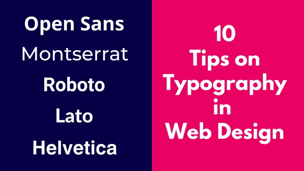
5 Best Modern Fonts for Websites
Fonts play a critical role in website design, as they can affect readability, user experience, and overall aesthetics.
When it comes to choosing a font for your website, there are countless options to choose from.
However, here are five of the best modern fonts that are commonly used in website design:
Open Sans: Open Sans is a versatile sans-serif font that has become increasingly popular in recent years. It has a clean and modern look, making it ideal for corporate websites, blogs, and online publications. It's also a popular choice for mobile design, as it's easily legible on smaller screens.
Montserrat: Montserrat is another popular sans-serif font that is known for its bold and geometric appearance. It's a modern and edgy font that is popular for technology and startup companies, as well as fashion and design websites.
Roboto: Roboto is a sans-serif font that was specifically designed for the Android operating system, but has since become popular in website design. It has a contemporary and minimalistic look that is ideal for websites with a focus on technology and innovation.
Lato: Lato is a versatile sans-serif font that has gained popularity in recent years for its clean and contemporary look. It's a popular choice for websites with a focus on design, fashion, and lifestyle. It's also ideal for body text, as it's easily legible and has good spacing.
Helvetica: Helvetica is a classic font that has been around for decades, but has remained popular in modern website design. It has a clean and simple look that is ideal for websites with a focus on professionalism and clarity. It's also a popular choice for branding and logo design.
Overall, the choice of font will depend on the brand's identity, the website's purpose, and the target audience.
These modern fonts provide a good starting point for creating a contemporary and professional look for a website.
Limit Your Font Choices
While there are many fonts to choose from, it's important to limit your font choices to just a few.
Using too many different fonts on a website can make it look cluttered and unprofessional.
Stick to one or two fonts for your main content, and use a third font sparingly for headlines or subheadings.
Use Contrast
Using contrast in typography is a great way to create visual interest and make certain elements stand out.
For example, you might use a bold font for headlines, and a lighter font for body text.
This helps to create a clear hierarchy of information, and makes it easier for users to scan and navigate your website.
Pay Attention to Size
The size of your typography is also important. Body text should be large enough to read comfortably, but not so large that it takes up too much space on the page.
Headlines should be larger than body text, but not so large that they dominate the page.
It's also important to use consistent font sizes throughout your website, to create a cohesive and polished look.
Use Whitespace
Whitespace is an essential component of good typography. It helps to create a sense of balance and harmony on the page, and makes it easier for users to read and navigate your website.
Use whitespace to separate paragraphs, create margins around your text, and add breathing room between headlines and body text.
Be Consistent
Consistency is key in web design, and typography is no exception. Use the same font and font sizes throughout your website, and be consistent in your use of colors, spacing, and formatting.
This helps to create a cohesive and polished look, and makes it easier for users to navigate your website.
Don't Forget About Line Spacing
Line spacing, also known as leading, refers to the amount of space between each line of text.
Proper line spacing is important for readability, as it helps to prevent the lines from blending together and making the text difficult to read.
As a general rule, the line spacing should be about 1.5 times the size of the font.
Use Hierarchy to Guide Users
Hierarchy is an essential component of typography in web design. It helps to guide users through your website, highlighting the most important information and making it easier for them to find what they're looking for.
Use different font sizes, colors, and formatting to create a clear hierarchy of information.
Be Mindful of Readability
Readability is crucial in web design. If users can't read the text on your website, they're not going to stick around for long.
Use fonts that are easy to read, and pay attention to factors like font size, line spacing, and contrast.
Use high contrast colors for text and background, and avoid using decorative fonts that can be difficult to read.
Test and Iterate
Finally, it's important to test your typography and iterate as needed. After designing your website, take the time to test it on different devices and screen sizes, to ensure that your typography looks good and is easy to read.
You may also want to ask for feedback from users or colleagues, to get a fresh perspective on your typography choices.
Use this feedback to make adjustments as needed, and continue to refine your typography until you're satisfied with the results.
Here's an expert tip from Pune based Web Design Company Webwingz's UX designer Ritika:
"When it comes to typography in web design, it's important to not only consider the aesthetic elements, but also the functional aspects. Always keep in mind the purpose of the text, and design the typography accordingly. For example, if you're designing a website that has a lot of text-heavy pages, consider using a font that is easy to read and has good legibility. Additionally, use appropriate line spacing and margins to make it easy for users to scan and read the text. By keeping these functional elements in mind, you can create typography that not only looks great, but also enhances the usability of your website."

In conclusion, typography is an essential component of web design. By following these 10 tips, you can create typography that is both visually appealing and easy to read, helping to improve the overall user experience of your website.
Remember to choose the right font, limit your font choices, use contrast, pay attention to size, use whitespace, be consistent, don't forget about line spacing, use hierarchy to guide users, be mindful of readability, and test and iterate as needed.
By incorporating these tips into your web design process, you can create websites that are both functional and beautiful, and that effectively communicate your message to your audience.
About the Creator
David Smith
David is a Travel Enthusiast. He loves to explore various places, write about experiences, and capture scenic photos. He is in creative writing since 2018.
Keep reading
More stories from David Smith and writers in Journal and other communities.
4WD Vs 2WD Tractors - Which One is Better for You?
Are you into an agro-industry? Or, running your own farm? Then you must have heard of tractors. Rather, you may have already spent hours both online and offline, to get the right specification, as there are plenty of different models with a wide range of features available in the market.
By David Smith2 years ago in Journal
Another Factor That Separates Sages From Masters
Read to the End to Help "Change The World" with our Earth Week Impact Launch Initiative! --- In my article The 8 Stages to a Quality Career, I detailed each of the steps one must go through to advance to the highest levels in any Industry.
By Cody Dakota Wooten, C.B.C.6 days ago in Journal
Online Impact: Most Important Pages For Website
In website topology and digital marketing, the significance of a website for businesses cannot be overstated. The importance of having a website for businesses must be emphasized more. A website acts as the online storefront, representing your brand digitally and serving as the main platform for connecting with your audience. However, it's essential to recognize that only some pages on a website hold the same level of importance.
By Elli Brice3 days ago in Journal


Comments
David Smith is not accepting comments at the moment
Want to show your support? Send them a one-off tip.