
A Filmmaker's Simple Guide to The Gothic and Place in Horror
Study, Experience, and Analysis


(This article is intended to teach. Before reading, make sure you have seen the film The Woman in Black as it will feature as a prominent part of the article).
As a amateur filmmaker and someone who has a general interest in "the gothic" and its ability to make you uncomfortable, I always find myself asking the same question: "well, what's so important about place?"
What is it about a setting or location that can bring out or reflect these feelings of discomfort? Is it all really just down to spooky forests and haunted mansions—or can there be better ways to explore the use of space in a certain location?
Of course there is!
The first thing that filmmakers deal with when exploring gothic devices are the most simple ones the audience will recognise. In this case, we're dealing with darkness.
Part I: The Function of Darkness
According to Dani Cavallaro (prominent research and all-round gothic genius) in his book The Gothic Vision, "darkness is the locus of torment, punishment, mystery, corruption and insanity... defenceless victims are trapped, often in the unwelcome company of dismal apparitions and abject creatures..." (Cavallaro, 2002, p.27)
We have so many things to work with in this statement—let's just take some time to have a look at each one individually.
1. "The locus of torment..."
The place where torment is possible and also highly likely.
Now, this doesn't just mean torment for the characters, but for the audience as well. You could use space and place as a fear ranging from wide-open space phobias (i.e. agoraphobia) or closed-space phobias (i.e. claustrophobia). Torment could also be put into a metaphor through the use of place—a place can bring back/harbour bad memories. For example, take the Eel Marsh House in The Woman in Black—no it is not a haunted house but instead harbours dark secrets and bad omens. The torment is only released when the gates are opened. Have a look at the way it is approached—isolated and far away as if it were a bad memory itself.
The use of the camera's wide angle shots are amazing for really capturing the distance between the town and the house—the cuts between close-ups of Radcliffe looking worried and these wide angles are brilliant when they are put together. One representing the personal memory of children and one pushed out because of a bad memory to do with children. Both about to come together in a union of horror and torment.
2. "Punishment, mystery, corruption and insanity..."
(The idea that horror locations harbour mysteries has been on-going and a weak point that I would like to cover in a light that doesn't include conspiracy theories of cursed movie sets).
The location of punishment is probably one of the greatest uses of a horror "place." It is a place where your main character is going to go through utter Hell before they can either: make it out alive, become part of the opposing team or they could possibly just go completely insane. This is what the rest of the quotation is about. It deals with a process, not exclusive items.
Process in Question:
The character is punished by entering the location and disturbing whatever was there. Therefore, the character becomes curious and begins to explore the location—enforcing the mystery question further. The character then either joins the opposing team after much torture and persuading or they corrupt themselves when finding that there isn't a way to escape. Finally, the character goes insane/meets someone insane and this leads to/causes their death.
It is a simple enough idea in theory—but let's see what happens when it's put into practice as this can be used in a different way.
Example: Insidious: Chapter 2
Possibly one of my favourite horror movies to use in analysis. Not because it's perfect but because it uses simple models of horror that have been used so many times, but managed to make them work as if they were brand new.
When we're looking at the Gothic "place" we're looking at the way in which darkness, the uncomfortable and the unknown, are portrayed through action and reaction, space and levels, use of opening, closing, light, dark and even the use of volumes within this location. Insidious: Chapter 2 shifts the medium of the Gothic place by taking the "haunted" aspect away from the location and putting it instead, within the child themselves.
So, as above—we have this model of horror that the child is being punished, but not from entering a forbidden location. The child is punished with haunting as he is his father's son. (As seen in Insidious). Other characters then explore the "place" and location in order to solve the problem. So even though there is a distance between the haunting of the child and the place that they live in—there is still a certain amount of curiosity linked to the use of space and place. The red door is a great thing to analyse if your interest lies here.
Just take a look at this:
Notice how the house itself is not being "haunted" but instead it concentrates on the child with this object moving by itself, in the dark. Now—it is easy to say that it is an object that belongs to the newly born child, but then again there is something about the where it moves to and from that suggests the house is spacious. If the house is spacious then it is perfect for a haunting. We then see this figure of a woman dressed completely in white. Now, the idea here is to trick our minds into maternal instincts because she looks like a nurse. But, the use of place is incredible as she looks as if she were from a bygone time that doesn't match the house. Therefore, it cannot possibly be the house that is haunted. Exterior and interior—the house looks quite new. But the lady doesn't match that setting. Therefore, the "place" lies to us—it makes us believe that it is haunted whereas, there is no correlation between the spirit/ghost/entity and the location.
3. "...defenceless victims are trapped..."
This is a quotation that works so well with horror, darkness, the gothic and the understanding of place. The idea of being trapped/restrained physically is scary for literally anyone. The gothic location can use this in an infinite number of ways. Here are a few you could try (+ examples) for yourself and see how they work out:
1. The Woods
The forest can be a dark and scary place, but what makes it dark and scary isn't the fact that it's a playing field for hide and seek. It's the fact that once the character is in the middle they can look forward and backward and see the exact same thing. Endless rows of trees. It is this unfamiliarity to the character that sends them into a fit of fear—they are trapped by the overly similar acres of the woods.
Have a look at this:
Here we see some clear elements of horror. The first is darkness, the second is panic, and the third is the location. The fact that it is dark is not the thing that makes us uncomfortable and for the most part, it isn't even the unknown factor. The main element here is that they are trying to get out of the Salem forest and they can't. The feeling of being trapped and actually being trapped collide and therefore, things start to go horribly wrong. This is where the feeling of the unknown comes in. Once the character is trapped in an unfamiliar location—it is only key to make everything within the location unfamiliar to them and thus, cause the fear of harm or death.
2. The Location of Familiarity and Danger in a Safe Haven.
This one is used in Insidious, The Woman in Black, Black Christmas, The Exorcist, Texas Chainsaw Massacre and even in Psycho. A living space that is typically considered to be safe and trustworthy becomes a space for horrible and dangerous events that unfold over the course of the film. To do this completely right, your house/living space must look as normal as physically possible as being relatable to you audience and their own living spaces is key. But there can be some hinderances with using a normal living space as a gothic place. The idea of the defenceless victim being trapped seems quite odd as it is their own house. Therefore, are they really trapped?
It's a good thing that The Strangers (2008) answered this question for us. Let's have a look how they did it then:
Now, the brilliant thing that's used here is levels. We see that the villains aren't any strange being/entity—but only normal humans. It looks like Bryan Bertino (Writer and Director) tried to capture the setting as something safe, almost romantic and even slightly away from actual reality. Therefore, the way in which he solves the problem of normalisation and over-normalisation is by setting it in a getaway instead of the actual home of the individual characters. This, in a way would make it even more uncomfortable—not because of the fact that the space is not actually the main living space and yet they're being invaded. It is actually because of the limited supplies that would be in this location. Overall, it is great for city horror and tension between the exterior and interior. Instead of the horror starting inwards and then being projected outwards —it begins on the outside and is projected inside, forcing the characters to stay indoors and therefore trapping them.
3. The Remote Campouts
Popularised by the legendary Friday the 13th and its hockey-mask wearing torturer, Jason. This location is known for its entrapment of people—and children especially. The fact that the killer/villain etc. is amongst them isn't the only thing that makes it frightening. It is actually the fact that there are so many different combinations of place and space within one location. You can have anything from a broom closet and a bathroom to a wooded area and a massive lake. The fact that the vast majority of these horror films have huge lakes is something we are going to focus on. The element of adding a huge body of water isn't unknown—but putting it in such as remote location that the parent has the child to is uncomfortable just to think about.
Take a look at this:
The idea here is to use space, light, and dark to ensure that everything is made incredibly clear and simple. There's no fancy over-the-top chilling and creepy squeaking noises made by different entities. There's no fancy design. The very fact that there is a body of water there to use as a means of either drowning people or trapping them in the campsite is something that would make an audience feel very unnerved. The body of lake is also there to suggest the idea of escape—not just the idea of entrapment. The escape is obviously done by the person harming everyone. But, the victims are trapped at all costs. The risk of breadth and depth in the body of water is too much to consider when stuck in camp with a possible psychopathic killer. It is a brilliant idea.
4. "...often in the unwelcome company of dismal apparitions and abject creatures."
We've already discussed a lot of these, but for this one I'm going to look at something ever so slightly different and how it has been adapted for the film. We have looked at the hauntings of "dismal apparitions" such as The Woman in Black and "unwelcome company" such as The Strangers and even looked at the "abject creature" (either physically/mentally) through Friday the 13th. But there's a film that sums up the way in which to use this perfectly. The idea is not to trap the victim, but to trap the possessor—the film will then work wonders. The Sixth Sense is a complex narrative regarding a young boy. The choices of place make everything more uncomfortable as it is being constantly normalised—but Shymalan also answers the same question as Bertino did: why would he be defenceless in familiar places?" He's the possessor, that's why. The child is constantly in the company of these unwelcome guests and shrouds it by acting as a normal child, only making it worse. Instead of getting rid of the problem, the child decides to speak with the company and help them. The idea of a child helping ferry the dead is another dark and uncomfortable idea.
We're going to have a look at a scene from The Sixth Sense and try to think about the answers to some of these questions that I'm going to leave for you underneath the video:
The Questions:
- How is the scene set-up?
Examine the way in which space and speed is used to detach the boy from the living space he is in.
- How does the location give space to the "unwelcome company" and why?
Analyse the act of darkness within space—where do we get moments of terror and why? How is the tension built up through the way in which we receive this darkness?
Note: Look at the tracking shots and how they accompany the darkness, preparing us for the meeting with the "unwelcome company."
- How are we introduced to the company and what does this give to the horror in the film?
Examine the introduction of the company and how the cinematography is used to both be in POV with the boy and to be focussed on the "unwelcome company" being established. They are both used in tandem and it's done amazingly.
Part II: Spatial Darkness
In this section, you will learn about creating and using spaces and where things and people can/should be placed. The latter is quite subjective but the main concepts still remain the same. The main rule for this is to make sure you do not spend too much time cluttering the atmosphere with period drama-esque sets if making a horror in a different time a la The Woman in Black. Just look at some set pictures from the movie—clutter is only used to present the papers and otherwise, they steer completely clear from it.
The space is instead used in different lights. I say that quite literally—the spaces are lit according to threat to the character at the time of the character being in those particular spaces. This illuminates and darkens spaces and thus makes them look bigger, smaller, more or less threatening, scarier, nicer, messier, tidier etc. Light can have so much of an impact on that particular setting and how the eye is drawn to it.
Let's have a look at some set pictures from The Woman in Black and see exactly how spatial darkness has been used to darken some places over others and why.
"The Woman in Black" Set Picture #1
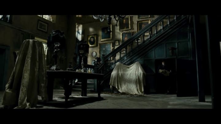
Here we clearly see the protagonist (Kipps) make his way out of the darkest place of the set; a room I'm going to assume is the cellar since it is placed underneath the stairs. The idea of him emerging from this place with thousands of papers only suggests the supernatural element of horror that stands beside these papers and within them; due to what they represent.
If we look at the rest of the picture we see that the stairs are illuminated only by a slight natural light—the frame purposefully cuts off the top of the stairs as they get darker as the stairs ascend. Since the darkness in this frame is unparalleled to the cellar, the eye is naturally drawn to it. It is the space of confusion—or as Cavallaro better puts it "related to the labyrinth of the character of troubling location" (Cavallaro, 2002, p.30).
The character of troubling location is the woman haunting the town as she is yet so far removed from it (see: previous section) in her own living space and yet, she is able to still be feared as the primary suspect when it comes to the violent deaths of children. The labyrinth of the character is all concealed within those papers that Kipps brings up the stairs.
The darkened space is small, effective and—most importantly, it is smaller that the vast majority of other things within the frame. Notice how the table is closer to the forefront and therefore casts a shadow that is seen in frame as the only bit of darkness close to the cellar door. This is on purpose. This is done to associate the lighting of the cellar door/Kipps/the papers with a "shadow" or unknown entity—in this case, the Woman in Black.
"The Woman in Black" Set Picture #2

Just look at how much effort has gone into this perfect frame of the descent on the stairs. This is incredible—and I want to show you why. I ask you, where is the brightest part of the frame? The door at the bottom of the stairs.
The natural light floods slightly through the door and is obscured by a character standing in the way. The fact the character obscures the light only suggests that the rest of the frame will tell us something about how things will continue in this scene for him. Let's have a look at the stairs, shall we?
The stairs are nearly always shot in the exact same lighting technique—it gets slightly darker as it ascends—not so much that you pick it up but just enough for you to recognise that something is not quite right. There are many examples of this from the movie, the best one being the next picture we will cover. The frame of the top of the stairs and the landing of the next floor.
The fact that the stairs are always shot in the exact same way implies that there must be something unknown on the next floor. As this is only suggested through the dark ascent, it therefore plants the seed of fright before you get to the climactic points of the film. Theoretically, this should be thought of as a cliché, but it is the rest of the frame that tells us exactly how well it is actually used.
Look at the colours of things—the scheme is so important. People tend to say that everything is dark, but in fact everything is in a deep colour not a dark colour. The deep colours are then obscured by the grey dust on top of them and as deep colours naturally deceive the eye in their depth, the grey dust looks almost as if it were naturally placed there. If we look at this in correlation with the staircase—we can see that there is clearly an effort to make this house look absolutely huge and therefore, have a very domestic gothic element to it a la The Red Room in Jane Eyre. The idea of having hidden rooms is an intense hope.
"The Woman in Black" Set Picture #3

This is brilliant, just look at the use of depth here and admire it. Yes it may be overused, but this shot is an absolute masterpiece. Notice how the candles are lit and yet, darkness still prevails. Notice how the shadows are reflecting an almost prison-like picture on to the floor. Check out the tasteful deep colours again—the dark red that creates that focus of contrast that makes us perceive the darkest space of this frame as being much deeper and further away than it actually is. This is probably my favourite shot from the film and you'll see why.
Cavallaro states that space can be used to show the character's "wandering entrapment" (Cavallaro, 2002, p.30) and thus how the character functions. This means, the space can be used to ask and answer questions about the themes and ideas that are considered to be at the epicentre of the storyline. In this case, the woman herself, children and the background story of the conflict.
Notice how certain colours are used to contrast others and why they are even there. We've spoken about the deep red walls already, but also the yellowish part of the scheme in curtains, floors and picture frames (right). This shade of yellow infers the ageing nature of the frame, the picture is quite old and the floor is covered in dust, so our brains are going to assume that the curtains do the same thing. They add this sudden crack in the depth of the red walls and surprises the audience with its split. This is most noticeable in the way the yellow curtains are ever so slightly elevated from the floor—almost suggesting that the depth of the red walls and the whole space of the house is a deception that only conceals more and more darkness.
Fascinating, isn't it?
Well, let's move on to Cavallaro's next statement on spatial darkness as he explores and teaches us about "dark places:"
According to The Gothic Vision, a "dark place" must have the "ability to expose complex historical, ideological and psychological realities..." (Cavallaro, 2002, p.37). But what does this mean and what does it do?
In The Woman in Black, the "dark place" is the Eel Marsh House and therefore it is assumed that there must be some sort of story behind it (which there is). In terms of "exposing" all the different realities—let's see how it does that.
1. Historical Realities
Ext: The Eel Marsh House

Notice how it looks like it has aged, even in the time in which the film is set it has become abandoned and old with moss climbing the walls. The presentation of the house only suggests how long it hasn't been attended to, but there are other elements that suggest age.
Pay attention to the windows. Look at how some of them are broken and others are easy to see through. Although, there are some that are completely obscured—there are still a select few in which a background of sheer black can be seen. (Again, the deception of the house).
The display of historical realities is shown through the house's ability to exhibit the time in which the film is set (19th Century) and then make itself look older and therefore more detached from everything else in the film, by all this natural wearing atop the architecture and up the walls.
2. Ideological Realities
Int: The Eel Marsh House Nursery

The ideological reality of the story behind the Eel Marsh house amongst the townspeople is most prominently seen through two screencaps. There's this one - and there's also the one of the wall once the paper has been peeled off to reveal a message. I love this frame as it has all the elements to make the haunting into a concept rather than a story. It is no longer a legend, it is a truth that Kipps must accept.
The ideological reality is probably best represented in this frame by the way in which the suicide by hanging in the nursery is seen - the table is knocked over and we can only make out the slight shadow of a lady hanging by the neck. This is done by the light coming in from the window - otherwise, it is unknown to us.
The fact that it takes place inside a nursery also bears that reality that connects the ideology of children in the film to the woman and how she takes her revenge. The addition of the candles in the nursery only suggests that someone in this room, or someone who used to stay in this room has/had died. This isn't the woman - but instead, it's her son who drowned in the marshlands.
But the most amazing thing has to be the use of half-light and half-dark to only just illuminate the hanging. What was once a town legend has now become an ideology.
3. Psychological Realities
For this one, I'm going to go through several different pictures with a summary of information and a question - so that you can think of your own reasons and solutions on how effective something is.
The violent deaths of innocent children is a big theme that plays on juxtaposition and irony at the same time - allowing the audience to become uncomfortable at the very thought of the idea. The way it is carried out - however - is so completely amazing that you cannot go without noticing it.
Int: The Tea Party Suicide

The first to go are these girls in the famous prologue regarding: the tea party suicide. Notice how they're all playing with toys and look very calm, relaxed and innocent. Their innocence is portrayed through the plain clothes and average hair—the niceness of the play between the girls represents that they're either friends or related (in fact, they are sisters). The psychological reality here is that the innocence in appearance is purposefully opposing the violent ends. This is done through light. Notice how the space the girls are sitting in is fairly lit and everywhere else is scattered with black furniture in dark corners—foreshadowing a truth we learn later on in the film.
The angle at which this frame is shot is quite odd. I believe it is trying to show every girl's reaction plus all the dolls in frame. But the lower level of the shot is able to show the doll being discarded in the background on the floor. A very interesting shot, I think.
Question: Is there anything else that represents innocence in this frame and how is it used to represent the psychological reality of darkness in the story?
Ext: A First Glance at Victoria Hardy

Victoria Hardy, as we know, dies from lye poisoning in a police station after Kipps arrives back from his visit to the Eel Marsh House. In this frame, we may not realise it on first watch—but we see Victoria for the first time as an innocent girl with an unavoidable death.
In this frame, the innocence is most represented by the fact that she too, is dressed and looks like the girls from the "tea party suicide" and is also playing with a doll—just like they were. Victoria is also the character furthest forward against the gates—a way of making her look like she is in prison and trapped. Her death is a trap by the woman in black.
The colours may be slightly brighter than those of the previous picture—but the girl's colour scheme looks relatively the same. Thus, the innocence comes through to us and the psychological reality of darkness is represented against the darker surroundings in the shot.
Question: What do you think is the impact of using a bricked background of the house against the blackened gates? What does this add to the darkness?
Ext: The Death of Nicholas Daily
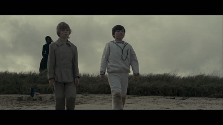
Now, this shot is the only shot we have of the death of Nicholas Daily—everything else about his death is dialogue. The most interesting thing about this shot is the angle at which it is taken. We can only just about see her in the distance and she stands behind the grass land—there's an obvious distance between them but she's in the perimeter. As for the angle, it is made to show the neutral and almost hypnotised expression of Nicholas Daily walking towards the sea to drown.
The colour of Nicholas' outfit directly contrasts that of the woman and this is used for that psychological reality of darkness—they are two completely different people to us. The woman is sinister and horrible and Nicholas is sweet and innocent.
Question: Why do you think it was effective to set Nicholas' death on a beach?
Other Examples of Dark Places and Using Place Effectively in Horror and Gothic Filmmaking
- The Blair Witch Project (1994) - Salem's Lot
- The Conjuring (2010) - The Warren's House
- Battle Royale (2000) - The Island
- The Exorcist (1972) - Reagan's Bedroom
Conclusions: What is a "dark place" when looking at exploring the Gothic notions of a horror film?
1. What it seeks to do:
A dark place seeks to heighten levels of fear, encompass older ideologies of religion and historical context surrounding the fearful and the unknown and increase either familiarity or unfamiliarity accordingly.
2. Why we use them:
They are naturally malleable. Gothic settings and horror settings are the most expansive settings in all of film—endless possibilities exist if all used within reason.
3. When they are most effective:
They are most effective when they portray the horror but don't feed it. They need to give us a certain feeling that attaches us and detaches us at the right times. When making your film, make sure you are fully aware of the following things: time, place, colour, sound, angle, volume, and depth.
Good luck on your next project!
About the Creator
Annie Kapur
200K+ Reads on Vocal.
English Lecturer
🎓Literature & Writing (B.A)
🎓Film & Writing (M.A)
🎓Secondary English Education (PgDipEd) (QTS)
📍Birmingham, UK
Keep reading
More stories from Annie Kapur and writers in Geeks and other communities.
Soundtrack Inspiration: Horror
I'm going to show you that pretty much any song can fit into a horror film if used properly. Experimental horror is becoming more popular now and with the rise of this genre, I want to have a look at some oddly chosen but workable soundtracks you could use for your next project. Hopefully, these will inspire you and give you a sense of direction if you're struggling. In my last article entitled "Horror Film: Soundtracks for the Modern Age" we looked at some of these new and experimental horror film tracks that were shifting away from our usual high-pitched strings and moving towards more rock, dance and folk tunes. I want to explore how you can use these sounds to your advantage and how normal songs and music can actually have a bigger effect as it normalises the situation in question — making it subconsciously familiar to the audience and therefore, more frightening. So here comes song choices and how they could be used in your next experimental horror film:
By Annie Kapur7 years ago in Geeks
5 Feelgood Stories Of Kids In The Entertainment Industry
Viewers everywhere are still reeling from the horrifying revelations in the recent documentary Quiet On Set: The Dark Side of Kids' TV. The depth of Producer Dan Schneider's inappropriate behaviour around the sets of his Nickelodeon TV shows is apalling, even more so the series of missed warnings and adult failures that led to then-child star Drake Bell's sexual abuse at the hands of his acting coach, Brian Peck.
By Kristy Anderson20 days ago in Geeks
Why Dionne Quan Is The Perfect Voice For Toph In The New 'Avatar: The Last Airbender' Movie
It's going to be an exciting few years for fans of the Avatar: The Last Airbender franchise. Aside from the live-action Netflix series, which has renewed for a further two seasons (thus confirming a full adaptation of the original animated series), an animated film is currently slated for releasein October 2025.
By Kristy Anderson4 days ago in Geeks


Comments
There are no comments for this story
Be the first to respond and start the conversation.