
The Small Bistro That Needed to Feel Less Small
When Clara and James took over the little bistro on the corner, they promised each other they would not change too much.
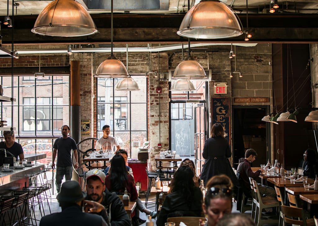
The old owner had run it for nearly eighteen years. People in the neighborhood still remembered the tomato soup, the handwritten menu, and the small table by the front window where an elderly couple sat every Friday night. The place had history, and Clara did not want to erase it.
But history can make a room stubborn.
The bistro was narrow, with a front door that opened directly into the dining area. The counter sat along one side, the kitchen was in the back, and the restroom door was unfortunately visible from several tables. There were twelve tables in total, though James privately believed only nine of them were comfortable.
At first, Clara thought the problem was decoration.
The walls looked tired. The lighting was uneven. Some chairs were darker than others. The framed photos near the counter had faded so much that nobody could tell whether they showed the restaurant or somewhere else entirely.
“We just need to make it warmer,” she said.
So they changed the lampshades. They added plants. They replaced two frames. They bought new candles for the tables.
The bistro looked better.
But it did not feel better.
During dinner service, servers still squeezed between tables with plates held too high. Customers waiting for takeaway orders stood near the entrance and made seated guests feel watched. The table near the restroom was almost always the last one chosen. When a party of four arrived, staff had to move chairs in a way that made the whole room pause.
One Friday night, Clara saw a server carrying pasta stop three times before reaching a table.
Not because the restaurant was full.
Because the path was wrong.
After closing, she sat at the counter and admitted what James had been thinking for weeks.
“It isn’t just the look. The room doesn’t know how to move.”
The next morning, they measured everything: the entrance, counter, kitchen door, restroom path, window, table sizes, and the space staff needed to pass safely. Then they used a restaurant floor plan tool to test the room from above.
The first version simply copied the current layout.
That was useful, because it showed the problem clearly. The tables had been arranged to maximize seats, not comfort. The takeaway waiting area was not really an area at all. It was just a place where people happened to stand. The server path crossed the customer path too often. The table near the restroom could not be fixed with a candle.
They tried several new layouts.
One version removed two tables, which felt painful. Another kept all the tables but made the center aisle too narrow. A third version moved the counter waiting spot closer to the entrance, but that blocked the door during busy hours.
The final plan was quieter.
They removed one table, not two. They turned two square tables into flexible two-person tables that could join when needed. The takeaway pickup spot moved to a small shelf near the counter but away from seated guests. A narrow divider with plants softened the view toward the restroom without making the room feel closed. The staff path from kitchen to dining area became clearer.
On paper, they had lost two seats.
In reality, they had gained a restaurant that people could sit in without feeling like part of an obstacle course.
Once the layout felt right, Clara returned to the question of atmosphere. This time, she did not begin with candles or frames. She used ai interior design to imagine how the bistro could feel warmer while still keeping its old character.
She tested soft wall colors, warmer lighting near the front window, darker wood tones, and a few simple ways to display the old photos without making the room look cluttered. Some ideas were too modern. Some looked too expensive. Some made the bistro feel like a completely different place.
The best version was modest.
Warm cream walls. Better light over the tables. Fewer but clearer photos. Small plants near the divider. Nothing shiny. Nothing that shouted.
James liked it because it still felt like the old bistro.
Clara liked it because it finally felt awake.
They made the changes over two quiet Mondays. Regular customers noticed immediately, though not always in specific words.
“Did you make it bigger?” one woman asked.
They had not.
“It feels calmer,” said another.
That was closer to the truth.
The elderly couple who used to sit by the front window came back on Friday. Clara worried they might dislike the changes, but they sat at their usual table, looked around for a moment, and ordered the tomato soup.
After dinner, the woman touched the new wooden shelf near the counter and said, “It still feels like here.”
Clara almost laughed from relief.
That had been the whole goal.
Not to make the bistro look new.
Not to make it look like every other small restaurant online.
Just to help it work better without losing the quiet memory people had already placed inside it.
A small restaurant is never only a room with tables. It is a path, a pause, a seat by the window, a server’s turn between chairs, a place to wait without feeling in the way.
When those small things begin to fit, the food tastes a little more at home.
About the Creator
Enjoyed the story? Support the Creator.
Subscribe for free to receive all their stories in your feed.
Comments
There are no comments for this story
Be the first to respond and start the conversation.