
How to Design a Methodology Figure for a Research Paper
A practical guide to turning a method description into a readable Figure 1, with emphasis on structure, hierarchy, labels, and prompt design.

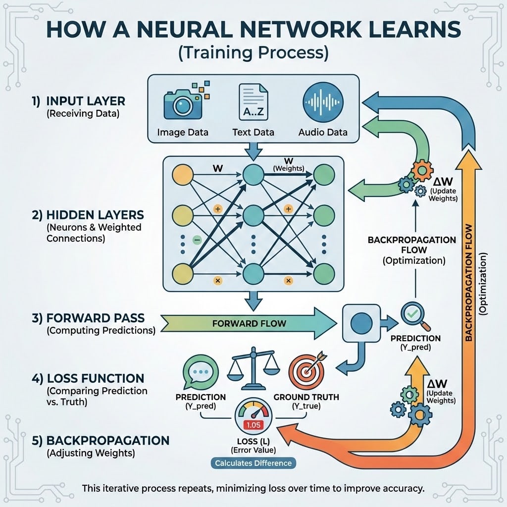
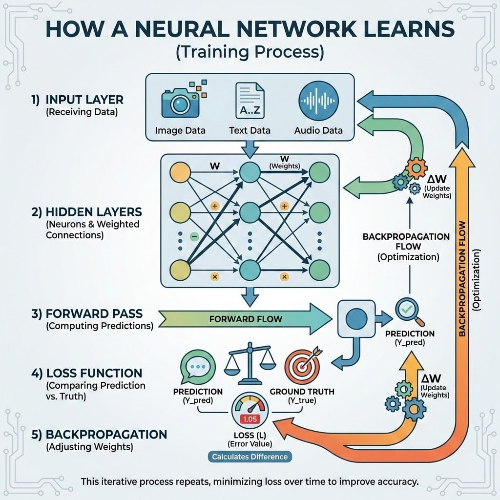
A methodology figure is not a decorative summary of a paper. In most research articles, it functions as an orientation device: it tells the reader what enters the system, what transformations occur, where the proposed contribution sits, and what comes out. If the figure fails at that level, visual polish will not compensate for it.
The most common mistake is to start from implementation detail. Authors often begin by drawing every layer, every loss term, and every auxiliary signal. The result may be technically sincere, but it is rarely readable. A better starting point is to ask what the figure must help the reader understand before they read the formal method section.
## Start with the figure's claim
Before drawing boxes, write a one-sentence claim for the figure:
> This figure explains how the proposed encoder-decoder system transforms an input sequence into an output sequence through contextual representation and autoregressive decoding.
That sentence becomes the boundary of the figure. Anything that does not support it should be moved to the caption, the method section, or a supplementary figure. A methodology figure is usually strongest when it explains the primary mechanism, not every engineering decision.
This step is useful because it prevents an overloaded Figure 1. If the figure's claim contains three separate claims, it may need to become a multi-panel figure or a sequence of figures.
## Reduce the method to a small number of functional units
Most methods can be represented as three to seven functional units:
- input or data construction
- representation learning
- the proposed mechanism
- external memory, retrieval, or tools
- training objective or feedback
- output or downstream decision
These units are not necessarily the same as code modules. They are conceptual units for the reader. For example, a retrieval-augmented model may have many implementation details, but the figure can often use only four regions: query, retriever, context fusion, and generator.
If the diagram requires more than nine major boxes, consider grouping. Grouping is not simplification in the negative sense. It is a way to show that several details belong to the same conceptual operation.
## Choose one spatial logic
Scientific figures become hard to read when they mix too many layout grammars. Common layouts include:
- left-to-right flow for pipelines and system diagrams
- top-down flow for stacked architectures
- a central hub with surrounding modules for multi-agent or coordination systems
- two columns for baseline-versus-proposed comparisons
Select one primary direction and make it explicit. A left-to-right data pipeline with a small feedback loop is usually fine. A left-to-right pipeline, a radial system, and a top-down hierarchy in the same panel is usually not.
When in doubt, match the temporal or logical order of the method. If the method transforms data sequentially, use a left-to-right layout. If the method stacks layers, use a vertical layout. If the contribution is a feedback mechanism, make the loop visible and label the feedback.
## Label arrows, not only boxes
Boxes identify components. Arrows identify relationships. In a weak diagram, arrows merely imply that components are connected. In a strong diagram, arrows explain what is being transferred:
- `features`
- `retrieved context`
- `attention scores`
- `gradient update`
- `tool result`
- `revision signal`
Arrow labels should be short. They do not need to explain the full operation. Their purpose is to reduce ambiguity. If two arrows both leave the same module, labels often matter more than the shapes of the boxes.
## Keep text inside the figure short
A figure is not the place for paragraph-length prose. Long labels create two problems. First, they make the visual layout unstable. Second, they increase the probability of typographic errors when generated by an image model.
Use short labels in the figure and longer explanations in the caption:
- Figure label: `Context Fusion`
- Caption explanation: The context fusion module combines encoder representations with retrieved evidence before decoding.
This division of labor is important. The figure should support scanning. The caption should support interpretation.
## A structured prompt for a methodology figure
If you use an AI image tool to create a first draft, prompt structure matters. A reliable prompt should separate goal, components, layout, style, and constraints:
```text
Goal:
Create a publication-quality methodology figure for a research paper. The figure should explain how a retrieval-augmented model processes an input query and produces a final answer.
Components:
- Input Query
- Query Encoder
- Vector Retriever
- Retrieved Context
- Context Fusion
- Response Generator
- Final Answer
Layout:
Use a left-to-right pipeline. Place the Vector Retriever below the Query Encoder, connected to an external Document Store. Route the retrieved context back into the Context Fusion module. Use labeled arrows: "embedding", "top-k documents", "context", and "answer".
Style:
Clean academic vector diagram, white background, navy and teal palette, thin arrows, consistent rounded rectangles, readable sans-serif labels. Suitable for a machine learning conference paper.
Constraints:
Do not add decorative background elements. Do not add extra modules. Do not use paragraph text inside boxes. Avoid crossed arrows.
```
The goal is not to produce a final camera-ready figure in one attempt. The goal is to obtain a coherent structural draft that can be reviewed, corrected, and refined.
## Review the figure like a reviewer
After generating or drawing the first version, inspect it as if you were reviewing the paper:
- Can the reader identify the input and output within five seconds?
- Is the proposed component visually distinguishable?
- Are the arrows logically directed?
- Are the labels short and readable?
- Does the figure introduce unexplained components?
- Does the figure imply a relationship that the method does not actually have?
The last question is especially important. A beautiful diagram that misrepresents the method is worse than an unpolished but faithful one.
## When to use automation and when to intervene manually
AI-assisted figure generation is useful for producing layout alternatives, improving visual consistency, and converting rough sketches into cleaner diagrams. It is less reliable for exact mathematical notation, dense labels, and final typographic control.
For that reason, a conservative workflow is often best:
1. Generate a structural draft.
2. Correct modules and arrow semantics.
3. Refine spacing, color, and typography.
4. Manually verify all labels, symbols, and numeric values.
5. Export the final version for the target venue.
Tools such as PaperBanana can accelerate the first three steps, especially when starting from text or a rough sketch. The final responsibility remains with the author. A methodology figure is part of the scientific argument, not merely an illustration.
About the Creator
paperbanana
Scientific researcher by day, visual creator by heart. 🔬🎨 I specialize in academic illustration, helping researchers turn complex theories into clear, stunning, and publication-ready scientific figures.
Enjoyed the story? Support the Creator.
Subscribe for free to receive all their stories in your feed.
Comments
There are no comments for this story
Be the first to respond and start the conversation.