
Data Visualisation Best Practice
Our guide to getting the best from your dashboards


Contents
- Have a PLAN
- Know your audience
- What type of dashboard?
- Data Types
- Use Appropriate Charts
- Make best use of space
- Refine the design
- Examples of Good and Bad
Dashboards are a great way to present the data your audience needs to know. But, if they done wrong, they can do more harm than good.
This best practices guide for creating dashboards walks you through the key steps to consider when designing a dashboard.
The key to a good dashboard is to make it simple yet informative. It should be easy for your audience to understand the message you’re trying to convey and quickly take action on any insights or recommendations.
Its important to remember that the best dashboards are built iteratively with input and feedback from the end users
Have a PLAN
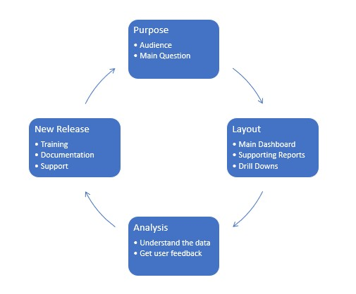
P L A N stand for Purpose, Layout, Analysis and New Release, this cycle ensures that the dashboard is fit for purpose and continues to be as the needs of the end user may change over time
Try to follow a standard process as much as possible when introducing new dashboards
Aim for consistency with design, layout and flow of the information
Diagram showing key stages of business intelligence dashboard design,
Know your audience
Understand the needs of the end user.
Design the dashboard at the relevant level for that audience.
e.g. a CEO will be likely want a high level overview, whereas a HR manager will tend to be focussed on people, skills and training.
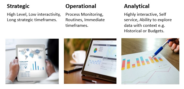
Types of Dashboards
Different Types of Data
Types of data and understanding their nuances is a prime factor, from categorical and nominal data, to Ordinal and Quantitative
Categorical Data and Nominal Data
Nominal data is the name given to types of data that describes a group or category, the word Nominal relates to name.
This type of data has no specific ranking order to it, with examples being things such as Country names, People’s names or department names
It can be words, numbers or any mixture of characters such as a vehicle registration
Ordinal data
Ordinal data is similar to nominal data in that is based on a name, but those names do have an order to them for ranking purposes
Examples of Ordinal data could be Gold, Silver and Bronze or High, Medium, Low
Typically these data types need to have an associated field by which to sort them
Quantitative Data
Quantitative data is used to collect items that have a measured value, such as Sales, Prices or times
Which charts to use for which types of data
Understanding which type of chart to use for the most efficient presentation of your data type and timescales
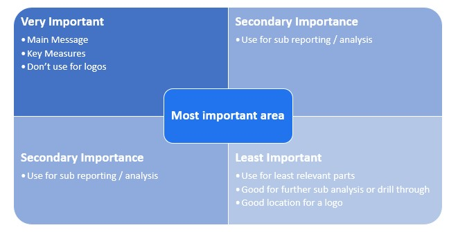
Space is a significant limiting factor in dashboard design, but not all space is created equal, the human eye is drawn to specific areas more than others
Bullet Graph
A bullet graph is a horizontal type of gauge, it is a great of showing progress against a specific target such as Sales v Budget

Bar Graph
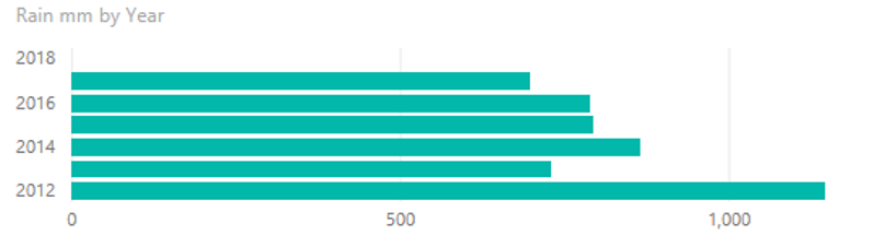
A bar graph is good for comparatives, being space efficient and easy to see relative values
Stacked Bar Chart
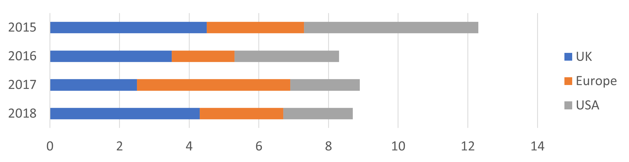
Stacked Bar Charts are use to combine a headline view, with a high level breakdown of the relative composition of sub categories within a category
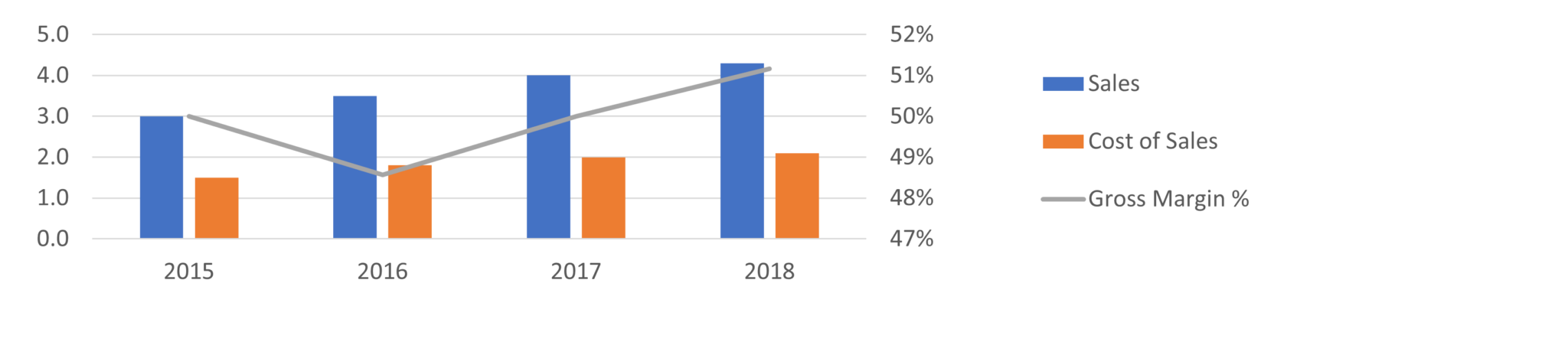
Combination Chart
Combination charts are useful when you need to show values that have a different scale but want to see the trend of multiple variables at the same time in the same space
For example, Showing Sales values and Gross margin percentages over time
Sparklines
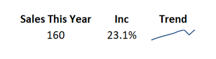
Sparklines are a very compact space efficient way to show an underlying trend. Typically shown alongside a value in a table to give the single value more context
The below example shows that the sales this year are on an upward trend
Box Plots
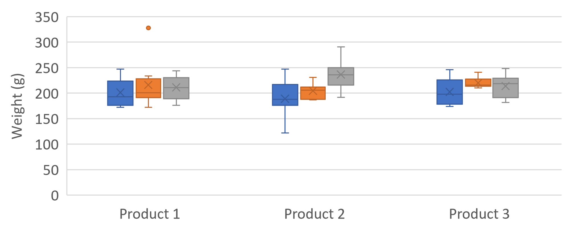
useful to present distribution of data around a median, with upper and lower values, e.g. defect rates
Tree Maps
Tree maps are a space efficient way of breaking down a hierarchy by values, to quickly visualise contributions to the whole

Pie Charts
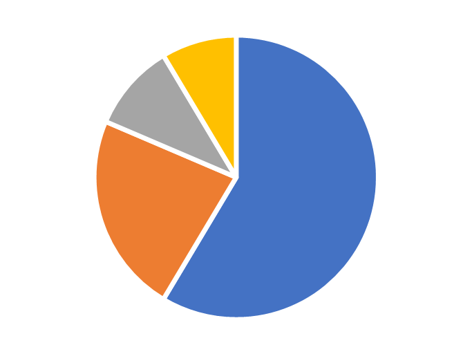
Let’s start by identifying some potential problems with pie charts
Pie charts are not as space efficient as other chart options, requiring a lot of white space due to the circular shape
It can be very difficult to care the size of angles to each other so reading accurate values can be difficult, and this gets worse as the pie chart gets smaller
As more segments are added to a pie chart the need to have multiple colours or patterns can make them even more difficult to use
But, the real strength of pie charts is that they are widely understood and if used carefully they can be a user friendly option
By avoiding the weaknesses of pie charts, keeping the number of options to less than say five segments, using call out values to highlight percentages for easy comparison and using them in conjunction with other visual objects they can add a visual interest
Using pie charts as interactive filters on reports and dashboards can be a very useful tool
Tables
Tables for many people are more readily understood than a chart, it is often worth just presenting data in the form of a simple clear table
Maps
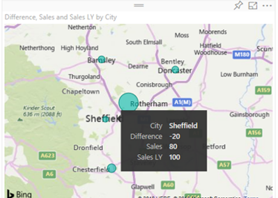
Maps are useful to measure relative geographic data which could be difficult to see any other way
The example below shows sales cannibalisation in Sheffield from a new store opening in nearby Rotherham
Make the best use of Space
Space is often a significant limiting factor, using this layout template can be a good way to try to keep a familiar look and feel
These best practice tips are suitable for a wide range of business intelligence tools, the examples were created using Microsoft Power BI, but can equally be applied to Tableau, Google Data Studio or even Excel
Watch our video for more examples and tips
Including an example of a badly laid out dashboard and all the reasons for it and examples of how to improve the layout of a dashboard
This Data Visualisation Best Practice guide is just one of our many tips and timesavers you will find in our Blog
Our Business Analytics Timesavers are selected from our day to day analytics consultancy work and are the everyday things we see that really help analysts, SQL developers, BI Developers and many more people. Our blog has something for everyone, from tips for improving your SQL skills to posts about BI tools and techniques. We hope that you find these helpful!
About the Creator
Simon Harrison
I am the founder and director of Select Distinct Limited
A Chartered Management Accountant with a passion for data analytics.
With real business experience in FTSE 100 organisations, I love turning business data into actionable insights
Enjoyed the story? Support the Creator.
Subscribe for free to receive all their stories in your feed.
Comments
There are no comments for this story
Be the first to respond and start the conversation.