

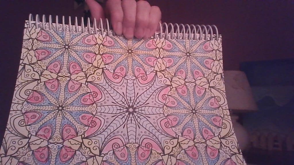
Design Shapes (my own)
When I first saw this design, I wasn't sure what it was going to look like. I started at the center with a light blue moving on to a yellow then to a slightly darker blue, then using a red for a little contrast surrounding the rest with a light orange. To me these could be flowers or maybe they are just odd designs. It could make a good tablecloth or even an apron pattern.
About the Creator
Mark Graham
I am a person who really likes to read and write and to share what I learned with all my education. My page will mainly be book reviews and critiques of old and new books that I have read and will read. There will also be other bits, too.
Enjoyed the story? Support the Creator.
Subscribe for free to receive all their stories in your feed.
Comments
There are no comments for this story
Be the first to respond and start the conversation.