
How do you make a good album cover?
They say that music speaks for itself, but visuals are often one of the most crucial - and painstakingly created – aspects in the industry.


The best-loved albums of all time only seem to stand out in our memories (and the shelves) when they are wrapped in bright and beautiful album art.
Think Fleetwood Mac’s Rumors, depicting Mick Fleetwood and Stevie Nicks in black-and-white chiffon, en-pointe and tight-trousered underneath a swirling album title. Or how about Gorillaz’s 2005 offering, Demon Days, with heavily-stylised portraits of their cartoon alter-egos in a quadriptych staring moodily off-cover.
David Bowie appears with his iconic red coiffure and red and blue lightning bolt on the front of Aladdin Sane, The Beatles are sugar-coated, flower-laden and surrounded by cult-figures on the front of St Pepper’s Lonely Hearts and the prismatic triangle of Pink Floyd’s Dark Side Of The Moon are all images that spring to mind when we pose the question: what makes a good album cover?
In the new and ever-expanding age of streaming and digital downloads, it wouldn’t be frowned upon to say that it may feel pointless for musicians to invest so much time into the aesthetics of their products. But that would go against the age-old link between visuals and audio.
When we look at how we consume music in the present, whether it be on smartphones, YouTube or streaming services like Spotify, each platform still highlights the space for aesthetics. Even the resurgence of vinyl has strengthened this link between the importance of art and the music it is encompassing.
Seeing visuals stretched across twelve inches of a cover, as opposed to the four inches of a CD case, draws the eye. From there, the listener can begin to form their own opinions over how they’d expect the artist to sound or how it will represent their lyrical-content and mood – as humans have similarly done with book covers for hundreds of years.
So what do musicians themselves look for when commissioning album art?
The relationship between a musician and artist working on creating pieces for a particular album can be a close, collaborative one.
Both want to produce something that usually reflects a lyrical “story” that an album often tells, or poses a nod to the musician themselves through a depiction of something personal. Alternatively, it could be a purely aesthetic process, with the both parties aiming to create something that looks good and will actively stand out on the shelf or in the charts.
It can be a laborious and long task, especially when an artist has to translate something transient into a very visible, physical product.

Natalie McCool is a BBC Radio 1 Award-Winning artist, musician and singer-songwriter. The artwork for her newest album, ‘The Great Unknown’ came from working closely with a commissioned artist and photographer and openly discussing key themes from her music that would shine through visually.
“I think both visual artist and music artist need to start the conversation about the songs, about the atmosphere of the record, the record title and what it all means to the musician.
“During this conversation and trade of ideas, I found a central theme, image or metaphor starting to crystallise – but it needs to be original, attractive and give an audience a clear idea of what kind of music or emotion the music artist is creating.”
McCool decided she wanted her album to utilise photography as opposed to illustration, which is just one of a number of creative choices that musicians can choose between when creating a visual representation of their album. Typography, colour, shade and even physical touches such as paper or glossing are also options available – one of the many perks of the return of vinyl and rising popularity of physical music.
“For ‘The Great Unknown’ the keywords I gave the artist and photographer were: Light, Shadow, Contrast and Space,” she continues.
“I built a mood board based on that theme on Pinterest and sent it over. Ben, the artist, came up with the idea of using white building blocks over a white infinity curve to create different levels, different shadows, creating space and depth in the image.
“I loved the photo of the set-up he sent me in his studio – so we went in and did the shoot. I love the colour purple and always try to weave it into my images. Knowing this, also tinted the cover art in post-production. There’s so much in terms of personal details that goes into a finished piece.”
How exactly does a graphic artist go about creating a piece that has to please the musician and the listener?
Arguably, the visual artist has their work cut out for them when creating an album cover. So much rides on having an aesthetically cohesive piece, which works for both the commissioning artist and listeners old and new.
Knowledge of what to create in order to stand out is paramount, but also knowing when to stray away from “trendy” movements when creating the finished piece is key – lest the album becoming a visual representation of a particular era as opposed to timeless, which is often the underlying goal.
Kaye Wilson is an artist and graphic designer who has created album covers and single art for indie alternative singer Seafoal. She is a long-time-lover of album art in a painfully digital age, stating that there is something wonderful about someone justifying purchasing a physical copy when they already have access to music.
Often surrounded by “uninspired covers from artists who play it safe,” her artistic process is all about taking leaps of faith and never underestimating the power of visuals.
“So, the first very obvious step in the designing process is to actually listen to the music, but also understand the artist in terms of direction and their aesthetic.
“Music itself for me has a lot of visual associations, so I like to know that it matches with how the musician/band brand themselves. It’s normally not far off, but that definitely useful for tweaking or if you need a bit of guidance. If it’s a lose brief, I would then do some visual research.”
Wilson also stresses that there can be snags in communication between clients and artists, due to a “frustrating language barrier when they know something isn’t right about your work, but can’t vocalise it in a way that’s understandable to me.”
The process is often long and can be tiresome, with some artists creating upwards of ten concepts for album art… which end up scrapped.
But Wilson says that seeing the final product — when it is the best that it can be and when the musician loves it — is the best and most rewarding feeling you can get in the industry.
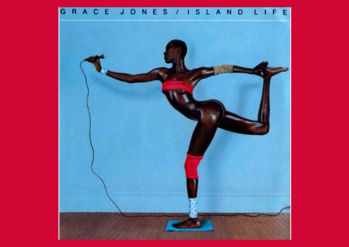
“There is also so much room for experimentation and art-styles with album art. Take Grace Jones’s Island Life. It’s a cover you only need to see once to have it ingrained in your head and you totally buy that Grace Jones’ body could just bend that way,” she adds.
“Lorde’s Melodrama has absolutely beautiful album art, and it’s a perfect accompaniment to the music.
“I personally love a lot of Riot Grrrl covers but that’s definitely not to everyone’s tastes. Lunachick’s Luxury Problem is one that always stuck with me as it’s just a really fun cover (I think I just want to be on it with them), and Huggybear’s Taking The Rough With the Smooch has a really nice DIY zine style finish to it despite looking quite polished.”
But what will happen to the future of album art?
Music and visuals do not always run in a linear fashion, or even sometimes alongside each other, but both artforms have stood the test of time and innovation by interlinking. As consumers become more impressed and concerned with the aesthetic value of the items they buy, from clothes, cars and even homes, the way their music is packaged has to be good enough to capture their attention.
Album art is crucial because it is borne from the relationship between the aural and visual. It has lasted because it has evolved with generations of musicians, artists and graphic designers who want to create something that will impact the general public. Music is beautiful – it only makes sense that it should look beautiful, too.
About the Creator
Lauren Entwistle
Girl wonder, freelance journalist and writer-person. Also known as the female equivalent of Cameron Frye from the 1989 hit, "Ferris Bueller's Day Off.'
Keep reading
More stories from Lauren Entwistle and writers in Beat and other communities.
Reading Junji Ito’s ‘Army of One’ in the Age of Isolation
I haven’t read manga in a long time. My early teen years were spent feverishly tearing through shōjo series, such as Fruits Basket and Tokyo Mew Mew, all borrowed from my secondary school’s library. I remember proudly showing my aunt how to read them – “you go from right to left…” - when I visited for dinner a few times.
By Lauren Entwistle3 years ago in Horror
Frankie's Song of the Week: Espresso - Sabrina Carpenter
A little something different from me while I deal with the strain of writers block. I thought I'd do a song of the week, because I have been surely annoying my neighbours and my friends with this absolute musical GEM. I am of course talking about Espresso by Sabrina Carpenter.
By Frankie Martinelli5 days ago in Beat
Exploring the Artistry of Wayne Dreadski in "Highroller"
Wayne Dreadski is an emerging artist hailing from the Gullah Geechee South Carolina corridor area. Influenced by the rich cultural heritage of his hometown, Wayne Dreadski's music reflects the vibrant spirit and energy of the region.
By mysoundMusicabout 6 hours ago in Beat


Comments
There are no comments for this story
Be the first to respond and start the conversation.