
Sofia Vashchenko on Embodiment, Vulnerability, Art Navigator Academy, and Contemporary Ukrainian Art
How does Sofia Vashchenko interpret contemporary Ukrainian art exploring embodiment, vulnerability, war, self-acceptance, and artistic development through Art Navigator Academy?


Sofia Vashchenko is a Ukrainian artist from Zaporizhzhia who is based in Kyiv and identifies herself as a student of Art Navigator Academy. Her figurative practice combines realistic and symbolic imagery. Art Navigator Academy is a Ukrainian educational and professional-development platform for artists, curators, art managers, designers, photographers, and other creative professionals. Founded in 2023 by Ukrainian curators and art managers Anna Avetova and Dasha Bilenko, the academy provides online education, mentorship, professional networking, and career guidance for people working within the contemporary art system in Ukraine and internationally. Its programs include Creative Career Compass, which focuses on professional positioning, promotion, career development, and navigation of the art market.
In this interview, Scott Douglas Jacobsen speaks with Sofia Vashchenko in connection with Art Navigator Academy’s presentation at ART KYIV Autumn Edition 2026 at Lavra Gallery in Kyiv. They discuss works by academy graduates Svitlana Glushko, Valentyna Khmil, Tetiana Tretiakova, and Alina Lobanova, examining embodiment, vulnerability, psychological experience, wartime disruption, self-acceptance, femininity, colour, texture, candlelight, electricity blackouts, artistic process, and professional development within Ukraine’s contemporary art scene.
Scott Douglas Jacobsen: What is your role?
Sofia Vashchenko: I am an artist and a student of Art Navigator Academy.
Jacobsen: Today, we’re looking at Svitlana Glushko, Valentyna Khmil, Tetiana Tretiakova, and Alina Lobanova. So, with the first pieces we’re looking at here, what is being conveyed by Svitlana?
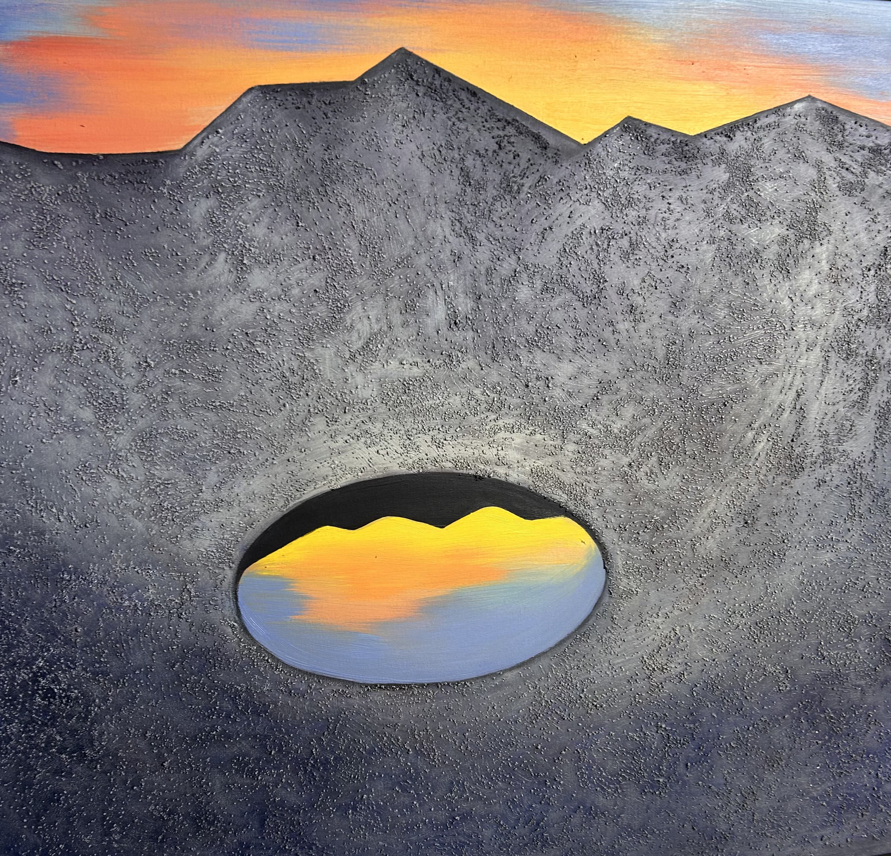
Vashchenko: These are several pieces that are connected to one another. They form a series of artworks called Another Reality. She created them as a afe place, somewhere to rest from everything troublesome. We feel very vulnerable at this time because of the war and everything that is happening around us. So, for me, these works suggest finding a safe place.
Jacobsen: There is a decent amount of Ukrainian colours mixed into the general architectural thematics of the colour palette overall. I quite enjoy this piece and consider a feature, not a bug.
Vashchenko: Or maybe it’s symbolic, you see? That’s why she doesn’t give a full explanation of everything. I like your interpretation, that you noticed the colours look like the Ukrainian colours. I cannot say whether she did that intentionally or not. It’s interesting not to know exactly what she was thinking when she made them. There is a description of the series.
Jacobsen: The background is canvas, but the surface has this granular, tactile quality. Why does she want the work to have that physical feeling, to make you feel something, or to make parts of it stand out in this way? Because it adds a lot of texture.(c) Svitlana Glushko
Vashchenko: Because this is how she feels it. She is an artist. I think when artists create something, their choices usually have a purpose. This is how she feels it, and that’s why she uses texture paste. There doesn’t have to be another purpose beyond that. You feel something, and you want to make it that way. That can be enough, I think, for choosing the material.
Jacobsen: I mean, you know the qualities and properties of the material, and you know your intention, so you choose the material accordingly. At the top, it looks as though the sections were marked out with a ruler or separated with tape and then painted over.
Vashchenko: This is absolutely handmade. You know why? Because if you look really closely, you can see slight imperfections. That is part of working by hand. For me, it is different from the kind of exact precision you might expect in an architectural or design drawing. We do this by hand.
Handmade, that’s the main thing. Even though the lines look quite straight compared with the others, even the skyline, you see, is slightly wavy because it’s all done by hand.
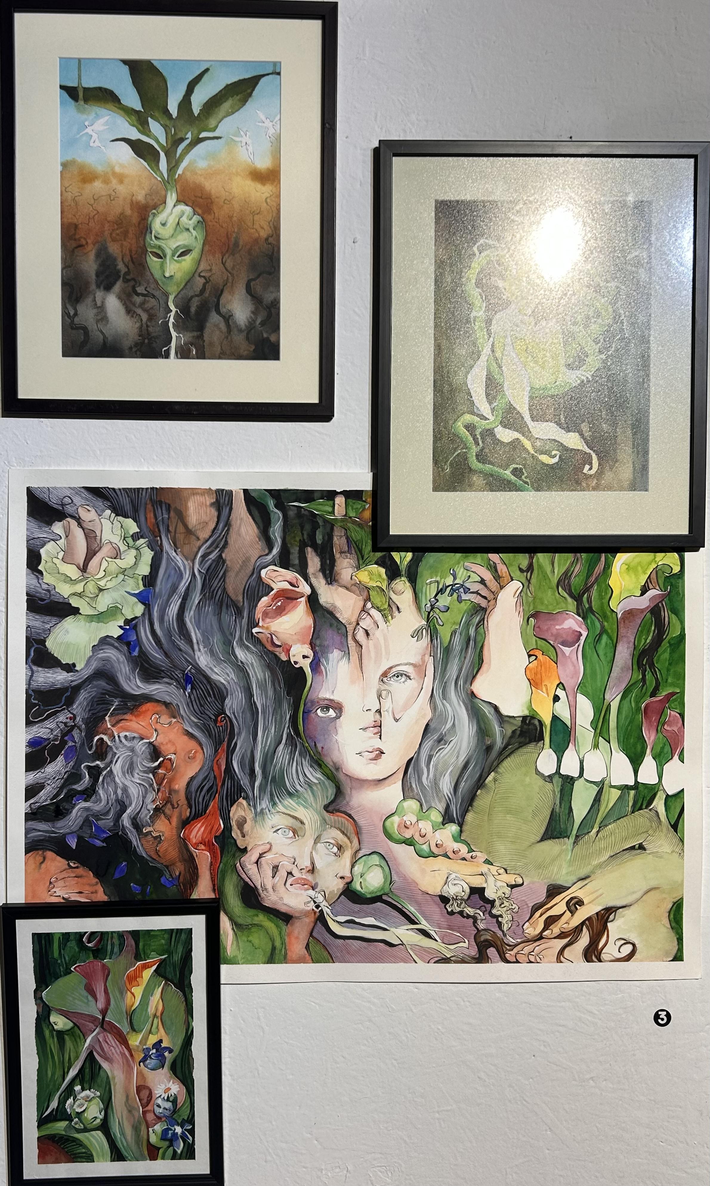
Vashchenko: Now, this artist is Valentyna Khmil.
Jacobsen: I don’t want to make direct comparisons between artists. That’s probably not appropriate. Stylistically and thematically, though, there are elements of taking parts of the body and reforming them, almost in a surrealist way, like Picasso. She warps things, in the way that you might see with Dalí. She does both at the same time.
Vashchenko: Say that again? I like how you describe it.
Jacobsen: Like a melting clock of Dalí, with something of Picasso in it.
Vashchenko: Nice description.
Jacobsen: A lot of these forms seem to suggest both growth and vegetation, living things, but there is also a kind of vivacity to them, a lot of life. I feel my eyes being drawn upward because of the hair and the fine physical details, so to speak. From your conversations with her, what would she be feeling?
Vashchenko: For this artist, these artworks are not very easy to make. They are about rather traumatic experiences and, to some extent, unpleasant feelings. But the end result is actually wonderful. This artwork is the main work in the series, and it is called In This Body.
She was thinking about why people are always looking at themselves in such a large mirror, paying attention to the smallest imperfections, feeling insecure, and feeling bad about something.
Jacobsen: That’s a very feminine frame.
Vashchenko: Yeah, a feminine thing. Why do we do this, even though we are also creatures of nature? We can appreciate the beauty of flowers and the beauty of nature, but we cannot see that beauty in ourselves. That is kind of unfair and a little painful. She has been trying to accept herself and everything about herself. It is not only about appearance, but something internal as well.
She wanted to show this through the way she combines parts of bodies with nature, flowers, and everything around them. It shows that we are part of something bigger, something natural, something organic, like I said, and that we are all connected.
That’s why it is depicted visually as well. Those two artworks are supposed to be together, but they can also be perceived separately. This one is like the process of creating an idea, a thought, how the thought is actually born and then begins to deepen, grow, and take form.
This artwork is called New Wings. You see, those things kind of resemble wings? New Wings. It means that you stop living the way you lived before, but you don’t yet know how to live in a new way. You are somewhere in between. You have those wings, but they are not working yet. You are not flying yet. It’s such an interesting painting.
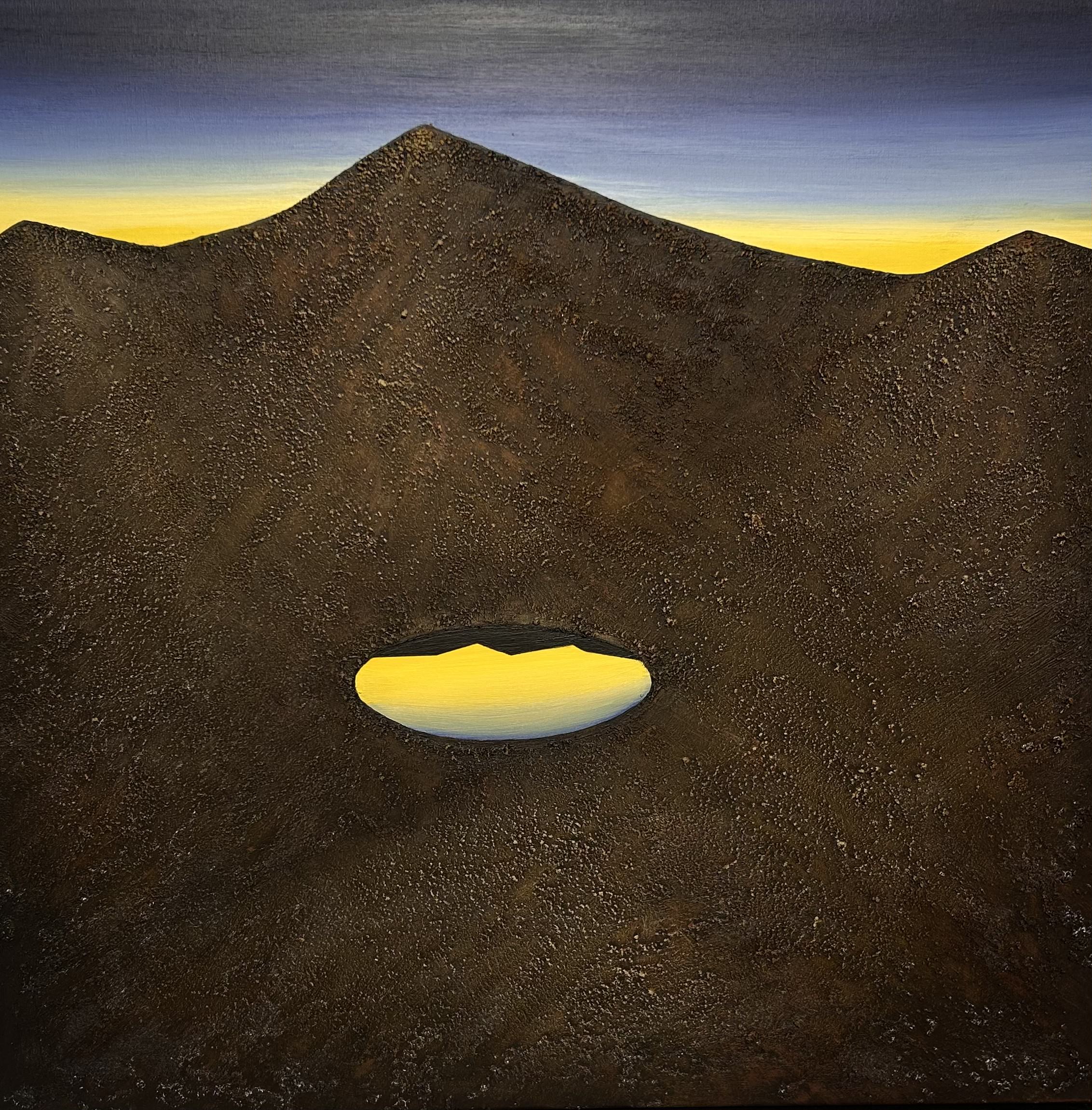
Jacobsen: This one is softer on the eyes. The brown is soft, but in a kind of flat way. It feels earthly. It’s earthy. This one adds shades of orange. Does that signify anything, or is it just more of a sunset?
Vashchenko: This has exactly the same feeling and meaning as the previous one. I think she created several safe places so that each piece can find its viewer, and each viewer can find their own piece, somewhere they feel safe. They just feel different. They have different vibes, colours, character, and moods, but the meaning is the same.
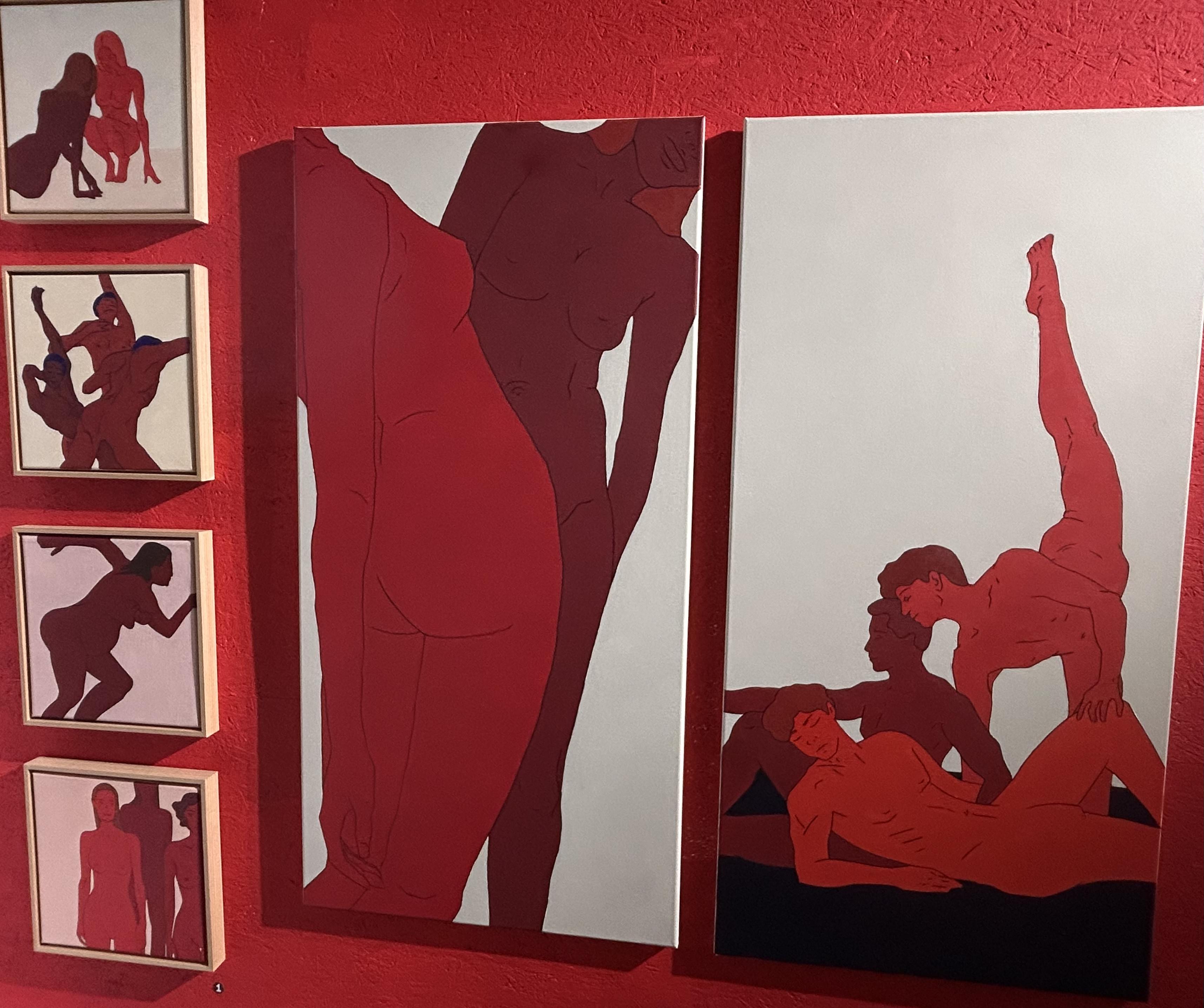
Vashchenko: This is a very interesting series of works. It is actually much bigger. Only several of them are represented here. Unfortunately, we don’t have the cards anymore. There were cards where you could see the whole series.
The main idea of this series, as you guessed, is the body and how we experience being in our bodies. She looks at our bodies as sources of experience, at how we live through things with our bodies and how our bodies change.
She wants people to realize that things about our bodies that make us different or special are not flaws or something bad. We need to accept these things in ourselves. She believes that accepting ourselves helps us accept other people, judge them less, and become kinder in general. It can lead to a better relationship with other people and with the world.
Here, these artworks mainly depict people in different social contexts and social roles. This work, for example, opens the series to a wider range of experiences because she also depicted women after breast cancer, women after giving birth, and pregnant women. It looks so touching, actually, because you look at them and you see these things that I cannot even call imperfections.
They are simply particular features of their bodies, and you do not think of them as imperfections because she depicts them beautifully. When you look at these paintings, you understand that this really is beautiful, and it helps you appreciate these things much more.
The red colour and the different shades of red represent a passion for life. We think it is very symbolic to see our booth in red because this idea is very important for Ukraine now, to feel a passion for life. It is, I think, vitally important.
Jacobsen: In the shading, I’m noticing almost a brown-red in some of the hair, particularly on the men. Then, on the men on the left, though not the one on the right, there is a very deep, rich blue with a hint of purple.
Vashchenko: Yeah, kind of bluish.
Jacobsen: Yeah, but it’s not precisely navy blue. It’s a little offbeat.
And in terms of the reds, some are very brown-tinted reds. On several of the women’s bodies, the pregnant woman, the woman standing in the background facing us, and also the man in the middle here, I’m seeing a lot of that brownish red. Others are just bang, bang, bang, bang, bright red.
Then there are these figures, this gentleman and these three gentlemen. They have different shades, almost an oily patchwork of the various colours. If you look here, though, it’s solid.
Vashchenko: You mean the colour is smooth here, and here it has more shading, right?
Jacobsen: Yeah.
Vashchenko: Wow, I hadn’t noticed that before you said it, actually. I’ve been looking at this for quite a while and hadn’t noticed it so closely.
Jacobsen: And then there are two cases I have question marks about. I’m not sure why. They are basically orange.
Vashchenko: Here?
Jacobsen: Mm-hmm. Slightly.
Vashchenko: You’re so attentive. I’m shocked. I’ve been looking at this for quite a while, all day, and haven’t noticed these details so closely.
Jacobsen: The other differences are all very subtle.
Each of the canvas backgrounds, the base colours, is actually different, except for these two. They’re basically the same. But this one with the men has a black lower section.
Here, it’s almost a peach-white. Here, similarly, but more white. Toward this one, it becomes more yellowish.
This one is the only one that has a foundation like this. It gives a sense of grounding. Those women are sitting and doing something. Maybe one of them is having some kind of social problem. She looks upset.
She’s leaning down to talk to her, and then they’re unclothed. There’s a kind of nakedness in the physical presentation, but I think it is really showing vulnerability metaphorically.
And the men, unlike the women, are somewhat desexed. Not in their overall forms, but the women have nipples and breasts clearly depicted, pregnancy is present, and the genital area is suggested. With the men, those sexual characteristics are much less emphasized.
But here, too, you don’t really see those details on the people. In general, I think that’s the point. It’s realistic. I mean, the anatomy and the dynamics are realistic, but some details are deliberately neglected.
Interesting. And they’re very... They’re almost like a kind of high-fidelity impressionism, in the sense that there are solid lines and clear forms, but they’re rendered in a very basic visual style. I don’t mean “basic” as unsophisticated.
Vashchenko: Yeah, I know. You mean it as a style.
Jacobsen: Exactly.
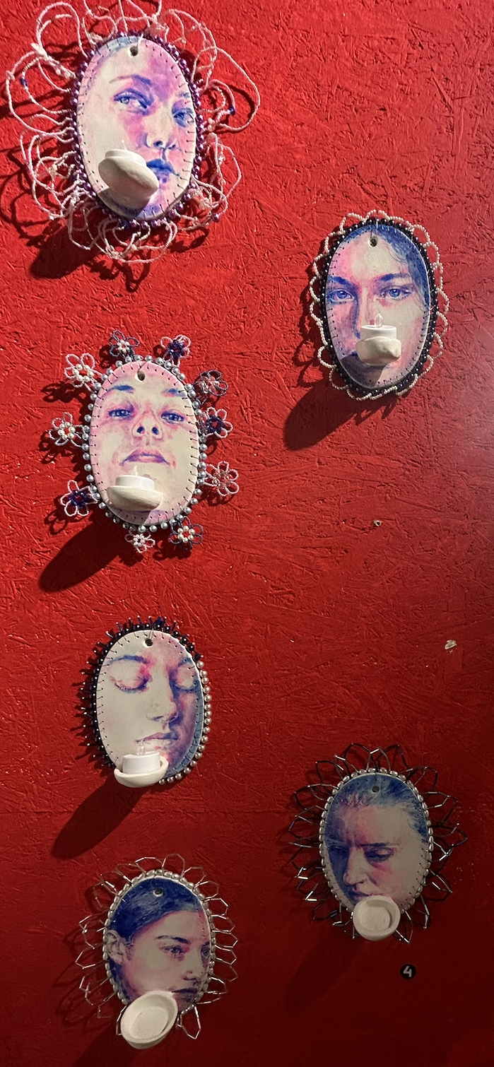
Jacobsen: Now, these ones, I’m told one of them has been sold. We’re seeing wire, decorative elements, candles, and faces shown at slightly different angles, almost as though the head has been rotated by the neck. So, what is Alina Lobanova trying to do here?
Vashchenko: There are, of course, several meanings in this series. There are supposed to be seven artworks. One has been sold, so six remain here.
Each represents a particular emotion and a particular kind of mask that we put on ourselves in everyday life. There are seven of them, like the seven days of the week.
Another part of the concept came from her experience in 2024, during severe electricity blackouts in Ukraine. We were often without electric light, so candles were always around. She became interested in the way candlelight played across people’s faces.
She pays a lot of attention to details. She focuses strongly on facial expressions and gestures. She also works a lot with female experience and femininity in general.
Jacobsen: Now that you say that, there are a lot of women’s faces.
Vashchenko: Yes, a lot. And you can feel that they all have different moods. She depicted different emotions.
What’s interesting is that when the candles are lit, the faces become more alive. The contrast becomes stronger, and certain colours stand out. As the light changes, there is a warmer light across the faces, while the shadows become less cold. The faces begin to look more lifelike.
It’s very impressive. If there is a blackout, you can actually see the effect. When we were setting up our booth here, there was a total blackout, and there were blackouts every day. Today, for some reason, there hasn’t been one.
And everything here is handmade. The material is... I’m not sure how to say it in English.
Jacobsen: Is it like ceramic? Like a tile?
Vashchenko: It’s something like air-dry modelling clay, a ceramic-like self-hardening material. You don’t need to fire it in an oven for it to harden. It hardens by itself. She made all of these elements herself and developed the whole concept.
There is supposed to be a real candle in the holder here, but we can’t use open flames at the art fair, so we put an artificial candle there instead.
Jacobsen: And there’s also the blue, this exaggerated fleshy pink, and these large areas of white. It feels almost hyperreal. It feels like I’ve put on LSD glasses or something.
Vashchenko: Yeah, it has that kind of saturation.
Jacobsen: What’s your favourite piece? Are you allowed to say?
Vashchenko: I have two favourites: the one that was bought and this one. This one is here, and the one that was bought was here.
I don’t know, there’s something in this face. She looks kind of disturbed and sad, but strong and calm at the same time. I feel very safe looking at her. She looks like she has seen many things. She seems very wise, as if she knows something but doesn’t want to argue about it. I don’t know. There’s something very deep in her expression.
Jacobsen: This looks like the face of a woman who has tried something and failed over and over again. Now she’s seeing the same thing happen to someone else, maybe a friend, colleague, or another woman, and she knows that intervening probably won’t change anything. So she just has that wise expression of, “Okay, yes. I’ve seen this before.”
Vashchenko: Yes, something like that. And there’s a tiny spark in her eyes that is very visible. This girl has the same spark. I like it very much. So those are my favourites.
Jacobsen: And these look like real faces because there are real asymmetries.
Vashchenko: Yes, they are real faces.
Jacobsen: These eyes aren’t symmetrical, for example. With some of the others, it’s harder to tell because of the angle, but this one is definitely asymmetrical.
Vashchenko: They are very realistic, yes.
Jacobsen: And I’m guessing these two are the same woman, and those two are also the same woman.
Vashchenko: And these are two different women, I think. I assume so, but I’m not sure because Alina didn’t tell me who these people are. I don’t want to make up stories about them.
Jacobsen: And which one is your favourite? I mean, which one catches your attention most?
Vashchenko: Of all the artworks?
Jacobsen: No, I mean among these.
Vashchenko: The ones that haven’t been sold?
Jacobsen: Yeah.
Vashchenko: I mean, you asked me which one I like most, and I’m wondering which one you like.
Jacobsen: This lady. She still has hope. This lady still has hope. Also, the ears aren’t present.
Vashchenko: Yeah, in some of the pieces they aren’t present.
Jacobsen: No, no. This is the only one where an ear is actually visible.
Vashchenko: Wow, really? Wow, you’re so attentive. You’ve actually helped me look at this differently. Maybe she can still listen to something because she still has hope. I don’t know.
Jacobsen: Maybe we can move quickly to Art Navigator. What exactly is it?
Vashchenko: Art Navigator Academy is an educational platform for artists, curators, art managers, designers, photographers, and other creative professionals. When I say artists, I don’t mean only painters. It works with people across different areas of the art world.
It helps people understand how to build a career in the art world and art business, where to begin, how to position themselves, and how to promote their work professionally.
One of its main programs is called Creative Career Compass. All of us completed that program, and now we can take part in events like this. The academy helps introduce artists to the professional art world and teaches you how that system works.
They work like mentors, and they have different courses for different professional goals. It is very useful for building an artistic career and finding your direction.
The academy was founded in 2023 by Anna Avetova and Dasha Bilenko. They are Ukrainian art curators and art managers with extensive experience in Ukraine and internationally.
They share very valuable knowledge and professional connections. I really think it’s a wonderful academy.
It doesn’t depend on one physical location because the educational programs are online, so people can participate from different places. We have Ukrainians studying from abroad as well as people who are here in Ukraine. We stay in touch and work together on different art projects, so I think it’s very valuable.
Jacobsen: Thank you very much for the opportunity and your time, Sofia.
Scott Douglas Jacobsen is a blogger on Vocal with more than 200 publications on the platform. He is the Founder and Publisher of In-Sight Publishing (ISBN: 978–1–0692343; 978–1–0673505) and Editor-in-Chief of In-Sight: Interviews (ISSN: 2369–6885). He writes for International Policy Digest (ISSN: 2332–9416), The Humanist (Print: ISSN, 0018–7399; Online: ISSN, 2163–3576), Basic Income Earth Network (UK Registered Charity 1177066), Humanist Perspectives (ISSN: 1719–6337), A Further Inquiry (SubStack), Vocal, Medium, The Good Men Project, The New Enlightenment Project, The Washington Outsider, rabble.ca, and other media. His bibliography index can be found via the Jacobsen Bank at In-Sight Publishing, comprising more than 10,000 articles, interviews, and republications across more than 200 outlets. He has served in national and international leadership roles within humanist and media organizations, held several academic fellowships, and currently serves on several boards. He is a member in good standing in numerous media organizations, including the Canadian Association of Journalists, PEN Canada (CRA: 88916 2541 RR0001), Reporters Without Borders (SIREN: 343 684 221/SIRET: 343 684 221 00041/EIN: 20–0708028), and others.
Image Credit: Scott Douglas Jacobsen.
About the Creator
Scott Douglas Jacobsen
Scott Douglas Jacobsen is the publisher of In-Sight Publishing (ISBN: 978-1-0692343) and Editor-in-Chief of In-Sight: Interviews (ISSN: 2369-6885). He is a member in good standing of numerous media organizations.
Enjoyed the story? Support the Creator.
Subscribe for free to receive all their stories in your feed.
Comments
There are no comments for this story
Be the first to respond and start the conversation.