
Stories Behind The Peugeot's Logo
Peugeot's culture

While this era of Stellantis was huge for Peugeot, the French car company's history dates back to 1810 when it produced umbrella frames and coffee grinders. Nearly eight decades later, Peugeot was renamed a successful car manufacturer, and in 1889, the French multinational company launched its first car bearing the Peugeot logo. According to Peugeot, it is "the second oldest car manufacturer in the world and the oldest continuous automotive brand".
Given the car brand's long history and its solid roots in France, it's no surprise that even the logo is so noble that stands for one of the most powerful and powerful wildlife and most elegant. But Peugeot isn't the only major company to choose King of the Jungle as its corporate logo. The Metro-Goldwyn-Mayer (aka MGM) is perhaps the most notable lion symbol in the world.
In addition, MGM Grand, Holden, MAN AG, Roewe, Proton, ING Group, Royal Bank of Canada, Pringle of Scotland, INKAS, and Lonsdale London have also chosen the lion as their brand identity symbol. Not only that but there are also various football and sports clubs that have lions in their teams. More importantly, different car companies have chosen the lion for their logos. However, this is not surprising if you consider the lion as a symbol of power, strength, independence, and majesty. Now that we know what the lion stands for, let's take a look at what it means as a Peugeot symbol.
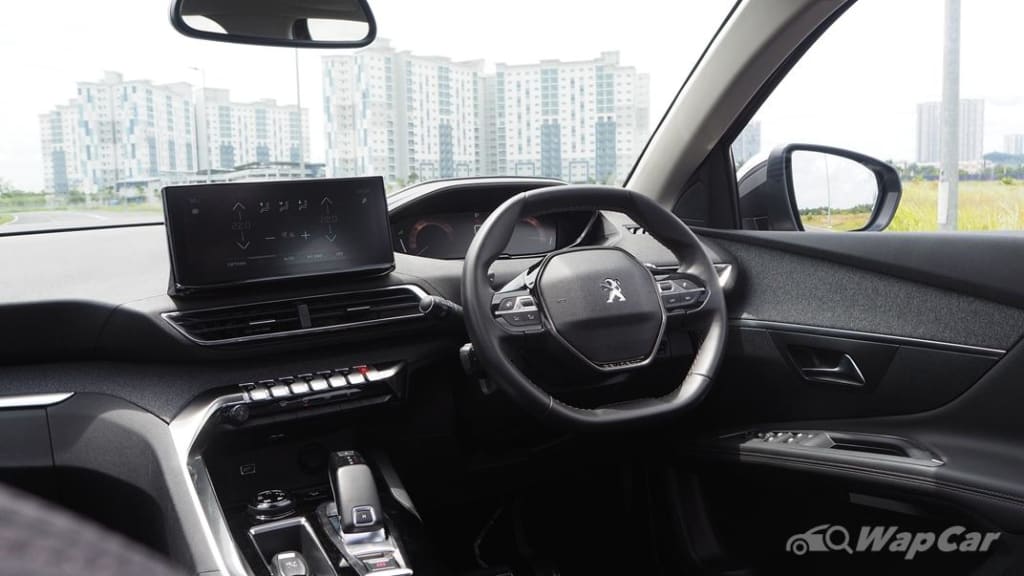
It is reported that Peugeot, beginning with the late 1840s - early 1850s, had made the ferocious lion a symbol of the French automobile company. At that time, the company did not manufacture cars but made steel products, and the lion, a strong and aggressive animal, was the best choice for a company that made products. sharp steel. Finally, in 1858, Peugeot trademarked the lion, and since 1948, cars made by the French company have had the lion emblem. Needless to say, over the years various changes have been made to the logo and the graphic designers at Peugeot have continuously revised different versions of the symbol until it becomes a logo. modern as we know it today.
"As the Peugeot brand began to gain traction, the Peugeot family knew they needed a powerful symbol to represent it," said Perth City Peugeot. "Enter the lion symbol."
There is no doubt that the lion is a great choice for a brand logo because it represented everything a company wanted to be at the time. This is all the more true when Peugeot produces sharp steel products that are said to be associated with strength, power, royalty, and boldness.
Let's face it, as adorable as rabbits and cats are, no car company with any self-respect would want them on their logo. In contrast, ferocious lions, wild horses, leopards, and jaguars are a completely different story.
As we mentioned above, the Peugeot logo has undergone a great change over the past decades. The original version was monochrome and featured a perfectly detailed, well-drawn lion on an arrow as the company's logo. Fast-forward to 1850 when the lion was less detailed and the Peugeot design team used black extensively, although the lion retained the same body, shape, and position on the tip. After the release of the first Peugeot car, the logo was once again revamped. The design of the lion this time is less colorful and the Peugeot team does not abuse the boring black tones as with its predecessor. Essentially, in the first century, Peugeot mainly used bold black, but the design elements remained indistinguishable.
Icons used between 1905 and 1910 have elements of Art Nouveau design. Additionally, the word "Peugeot" appears for the first time written above the lion, while "Paris" is written below the animal. The letters, flowers, and curves that match the design elements of the time have a unique charm. However, branding experts will tell you that this design aesthetic no longer works today. The new rebranding came after 1910, when the lion became more aggressive, roaring at something in the distance. This time, the lion is holding the arrow instead of sitting on it, and the animal's body looks stronger and more fierce. In addition, the lion looks east instead of the west as in the old Peugeot logos.
Then a significant change occurred when the icon was completely renewed. From 1936 to 1948, Peugeot added color to its logo (yellow) and simplified its design. In addition, the lion is placed inside a shield. Over the decades, Peugeot has continued to modify its emblem, while continuously making significant changes. So in the 1960s, the logo only featured a lion's head, so the body disappeared from the shield. Today, Peugeot uses the shield and lion face that was popular in the 1960s, although the colors of the shield are different and the letters are written in a contrasting font. If beauty is subjective, the logo used in the period 2010-2021 looks the most modern, with a 3D design effect.
About the Creator
Keep reading
More stories from Kevin E Todd and writers in Wheel and other communities.
Geely and electrification
Zhejiang Geely Holding (ZGH) launched another car brand in China last week when it announced its Radar RD6 to the world, amid much speculation about where it will actually go on sale. While the company says it intends to begin offering the RD6 to Chinese consumers in the fourth quarter. At the same time, it also researches Southeast Asian markets to look for potential customers as well as golden opportunities. And the company also seems to be taking the possibility of entering the US market into consideration.
By Kevin E Todd2 years ago in Wheel
Off-Roading On A Budget: Driving In Rugged Terrains Without a Lift Kit
Off-roading is more than just a hobby but a thrilling adventure that allows you to explore beyond the pavement. You can experience breathtaking landscapes, sandy trails, and the excitement of conquering challenging terrains. These factors may push your vehicle to its limits, so many would say you will need a tricked-out truck with lift kits, robust wheels, and chunkier tires to enjoy the expedition. Some drivers hesitate because these upgrades entail hefty costs to make your vehicle off-road-ready. As a budget-minded adventurer, you can still relish the rugged terrains. Conquer moderate terrains without breaking the bank or sacrificing the everyday usability of your rig.
By Jen Demkinabout 4 hours ago in Wheel


Comments
There are no comments for this story
Be the first to respond and start the conversation.